


How to Create Website Mockups People Actually Love
Learn how to create website mockups that bridge the gap between idea and reality. Our guide covers tools, principles, and developer handoff.
Build beautiful websites like these in minutes
Use Alpha to create, publish, and manage a fully functional website with ease.
Before you ever open a design tool, creating a great wireframe starts with some crucial prep work. It’s tempting to jump straight into sketching boxes and buttons, but that's a recipe for a confusing, ineffective design. The real magic happens when you lay a solid, user-focused foundation first.
Think of it this way: you wouldn't build a house without a blueprint, and you wouldn't draw a blueprint without knowing who's going to live there and what they need. This initial phase is all about strategy—translating your big ideas into a structured plan that solves real problems for real people.
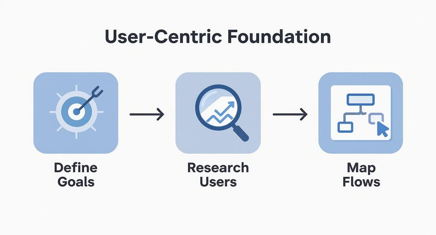
Define Your Core Goals
First things first: what is this website or app supposed to do? You need to nail down its primary purpose. Is it all about selling products? Generating leads for a sales team? Simply providing clear information?
Your core objectives will dictate every single layout decision you make. For an e-commerce site, the wireframe will naturally highlight product pages and a dead-simple checkout flow. A blog, on the other hand, needs a design that prioritizes readability and makes it easy for visitors to discover more content.
Key Takeaway: Having a clear goal is your North Star. It keeps you from getting lost in the weeds of "feature creep" and ensures every element you add has a distinct purpose.
Understand Your Users and Their Journey
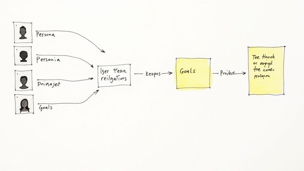
Once you know your "what," you need to figure out your "who." Who are you building this for? This is where user personas come in—fictional profiles that represent your ideal audience, complete with their goals, frustrations, and motivations. Getting into your users' heads is a cornerstone of solid user experience design fundamentals.
With your personas in hand, you can start mapping out their journey. A critical part of building a user-centric wireframe is knowing exactly how to create a customer journey map. This exercise helps you visualize every step a person takes to accomplish something on your site, from the moment they land on the homepage to the final click.
The infographic below breaks down these foundational steps.
This kind of strategic planning isn't just a "nice-to-have" anymore; it's become a standard part of the design process. The numbers back this up, too. The global wireframing software market was valued at USD 5.55 billion in 2024 and is projected to hit USD 6.29 billion in 2025. It’s clear that businesses are investing heavily in getting this foundational stage right.
Choosing the Right Wireframing Tools
The tool you choose for wireframing can either be your best friend or your biggest bottleneck. I've seen teams get bogged down by overly complex software when a simple sketch would have done the job. There's no single "best" tool out there—the right choice really depends on your project's complexity, your team's needs, and of course, your budget.
Sometimes all you need is a quick, low-fidelity sketch to get ideas flowing in a meeting. Other times, you need a highly detailed blueprint that leaves no room for interpretation. The first step is figuring out which of these you actually need for the task at hand.
Fidelity and Functionality
When you're focused purely on structure and user flow, low-fidelity tools are your go-to. I often recommend Balsamiq for this stage. It's brilliant because it intentionally uses a sketchy, hand-drawn look. This forces everyone—clients, stakeholders, even other designers—to concentrate on the layout and functionality, not argue about button colors. It’s perfect for early brainstorming.
But when you need something that feels closer to the final product, you'll want to step up to a high-fidelity tool. This is where industry powerhouses like Figma, Sketch, and Adobe XD come in. They give you the precision you need with vector editing, reusable components, and pixel-perfect controls, creating a wireframe that’s a clear and direct precursor to the final visual design.
Pro Tip: Ask yourself where this wireframe fits in your design process. If you’re just getting started and need to validate an idea quickly, a low-fi tool will get you there faster. If you're creating a detailed spec for developers, you absolutely need the precision of a high-fidelity tool.
Key Factors for Selecting a Tool
When you're weighing your options, there are a few things I always tell people to consider. Nailing this decision will make the entire process of how to create wireframes so much smoother.
Here's a quick rundown of what to keep an eye on:
Collaboration: How well does the tool let your team work together? Figma is king here; its browser-based platform makes real-time collaboration a breeze. Sketch, on the other hand, is a Mac-only app and often needs help from other tools like Zeplin for a smooth developer handoff.
Learning Curve: How quickly can you get up and running? A tool like Balsamiq is something you can pick up in an afternoon. Figma and Adobe XD have much more to offer, but they also require a bit more time to truly master.
Prototyping: Can you make it interactive? Most modern tools have this built-in. Being able to create a simple clickable prototype to show a user flow is a game-changer for getting buy-in.
Integration: Does it play nicely with the other software you use? Check for integrations with team communication tools like Slack or project management platforms like Jira. A connected workflow saves a ton of headaches.
In the end, you want a tool that supports your process, not one that forces you into a box. While a solid wireframe is a critical milestone, it's just one piece of the puzzle. To see how these blueprints evolve, check out our guide on how to create website mockups, which is the logical next step.
Building Your Wireframe From the Ground Up
Alright, you’ve got your goals locked down and a tool ready to go. Now comes the fun part: turning those abstract ideas into a concrete structure. This is where we move from planning and research to actually drawing the blueprint for your website.
Think of it as translating your user flows and sitemap into a visual language.
First things first, let's talk about visual hierarchy. This is just a fancy way of saying you need to organize the page so a user’s eye naturally lands on the most important stuff first. Your main call-to-action (CTA) button, for example, should never have to compete for attention with the link to your privacy policy.
Getting this right is absolutely fundamental. Without a clear hierarchy, visitors get lost, confused, and frustrated. They don't know where to click, and that’s a fast track to a high bounce rate.
Structuring Your Content with Layouts and Grids
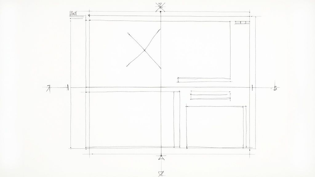
To keep everything looking clean, consistent, and organized, you need a grid system. A grid is the invisible scaffolding that holds your entire design together. It ensures every element on the page is perfectly aligned and balanced, giving your site that polished, professional feel.
Nearly every design tool worth its salt, from Figma to Adobe XD, has built-in grid features you can easily customize. My go-to starting point for desktop layouts is a standard 12-column grid. It’s incredibly versatile, giving you the flexibility to create all sorts of arrangements—from a classic main content area with a sidebar to a three-column product showcase.
A solid grid system does a few things for you:
Consistency: It creates a familiar underlying structure across every page for a seamless user experience.
Efficiency: It takes the guesswork out of placing elements, which seriously speeds up the design process.
Responsiveness: It makes adapting your design for tablets and mobile phones a whole lot easier down the line.
The layout you choose is also deeply tied to your overall site architecture. For a much more detailed look at this, our guide on how to plan website structure is the perfect companion piece to help you make smarter layout decisions right from the start.
Defining Key UI Elements
With your grid in place, you can finally start dropping in the building blocks of your user interface. This is where you physically map out all the core components that people will actually see and interact with.
I like to start big by blocking out the main sections: the header, the footer, and the primary content area. Once those are defined, I start placing the key UI elements where they make the most sense.
You’ll want to account for all the usual suspects:
Navigation Menus: How will people find their way around?
Buttons and CTAs: These are your most important action-drivers.
Forms: Think contact forms, newsletter sign-ups, or checkout fields.
Image Placeholders: Simple boxes, often with an 'X' through them, are perfect for marking where visuals will live.
Text Blocks: You can use placeholder text like "Lorem Ipsum" to represent headlines, paragraphs, and other copy.
Pro Tip: Don't get fancy. A wireframe’s job is to be functionally clear, not pretty. Stick to basic shapes, lines, and grayscale. This intentional simplicity forces everyone—you, your team, your client—to focus on structure and usability, not argue over a shade of blue.
Testing Your Design with Interactive Prototypes
A static wireframe is a great start—it’s the blueprint. But it's flat. It shows where things go, but it can’t tell you how the site feels to use. That's where interactive prototypes come in.
This is the moment you breathe life into your design. By making your wireframe clickable, you’re no longer just showing a plan; you're telling a story. It lets you test your assumptions and spot usability problems way before any developer gets involved. It’s the difference between showing someone a map and letting them actually walk the path.
From Static to Interactive
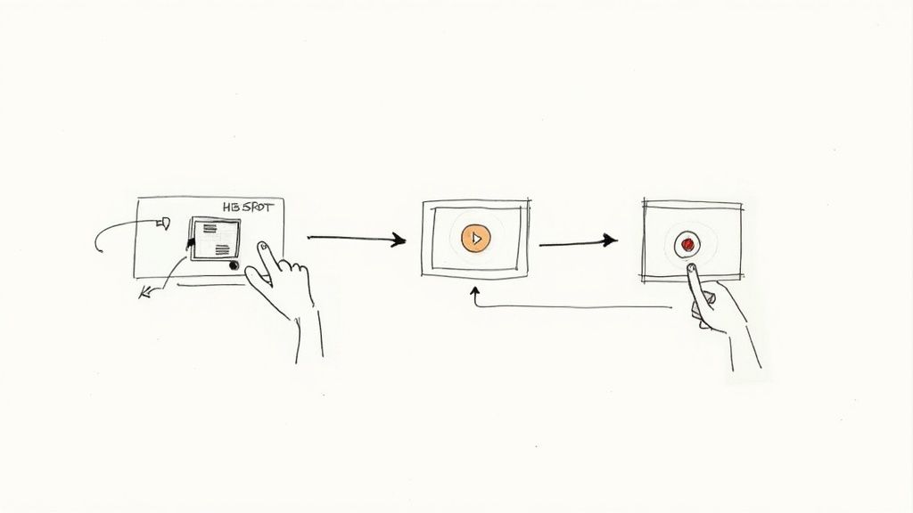
Thankfully, modern design tools like Figma or Adobe XD make this leap incredibly easy. The whole idea is to string your different screens (or "artboards") together to mimic how a real person would move through the site. You can link the "Sign Up" button on your homepage wireframe straight to the "Create Account" screen, for example.
To do this, you define "hotspots"—the interactive parts of your wireframe. You're basically telling the software, "When someone clicks this element, send them to that screen."
Here are the must-haves for your first interactive prototype:
Navigation Links: Connect every item in your main menu to its respective page.
Button Clicks: Make sure your calls-to-action actually go somewhere.
Form Submissions: Show what happens after a user hits "Submit" on a contact form.
Linking these elements creates a tangible journey that your team, stakeholders, and test users can click through. It's a powerful way to confirm that your design flows logically and feels intuitive. If you want to dive deeper into this, check out this comprehensive guide on creating product prototypes.
The Role of AI in Modern Prototyping
Let's be real: AI is changing the game here, too. Creating wireframes and prototypes is getting a serious boost from artificial intelligence, which is no longer some sci-fi concept. These tools are already baked into our workflows, automating tedious tasks and offering insights backed by data.
And this isn't a niche trend. By 2025, it's expected that over 75% of UX teams will be using AI tools in their design process, with wireframing being one of the top use cases. Think about it: AI can spit out multiple layout ideas in seconds, suggest a better content hierarchy, or even flag potential accessibility problems automatically. That's a massive time-saver.
Key Insight: Interactive prototypes aren't just about layout; they're for testing functionality and flow. They're the single best way to get real user feedback early, saving you from expensive headaches during development.
At the end of the day, turning your wireframe into a prototype is a non-negotiable step in user-centered design. It’s how you stop guessing and start getting real-world feedback, ensuring the final website is more than just pretty—it's usable.
Gathering Feedback and Iterating Your Design
It’s easy to get attached to your wireframe, but remember this: it’s not a final product. It’s the start of a conversation. The real magic happens when you get it in front of people to gather input and make it better. This collaborative loop is what elevates a good wireframe to a great one.
Think of that first draft as your best guess—a hypothesis about what your users need and how they’ll behave. The feedback stage is where you get to put that hypothesis to the test. Sharing your wireframes with stakeholders, developers, and (if you can) a few potential users will give you perspectives you simply can't see on your own. You’ll uncover blind spots and find new ways to improve the flow.
How to Ask for Genuinely Useful Feedback
Here's a hard-earned lesson: how you ask for feedback completely changes the answers you get. If you just send over a link with a vague "What do you think?" you're going to get vague, unhelpful comments back. You have to guide the conversation.
Get specific with your questions. Instead of being open-ended, try asking things like:
"Does this flow for finding product pricing feel intuitive to you?"
"Is the information on the homepage organized in a way that makes sense?"
"Where does your eye go first on this page? Can you easily spot the main call-to-action?"
This kind of pointed questioning forces reviewers to think about structure and function, which is the whole point of a wireframe. It stops people from getting sidetracked by colors and fonts that aren't even there yet. Modern tools like Figma are brilliant for this; they let people drop comments right onto the design elements, keeping all the feedback organized and in context.
A wireframe's true value is unlocked through collaboration. Your goal isn't to defend every decision, but to listen, understand different perspectives, and find ways to make the design stronger.
This tight-knit collaboration between designers and developers isn't just a nice idea—it's become the industry standard. As of 2025, a striking 84% of designers say they work with developers at least once a week. And more importantly, 67% of both groups feel that partnership is effective. The tools we have today make this kind of real-time teamwork seamless. You can dig into more of these collaboration trends in Figma's official report.
Preparing for a Smooth Handoff to Developers
As you refine the wireframes based on feedback, your next big hurdle is the developer handoff. A clean handoff is everything. It prevents the kind of misinterpretations that lead to frustrating and costly rework down the line.
Your wireframe needs to clearly communicate not just the what (the layout) but also the how (the intended behavior). This is where annotations become your best friend.
Annotations are just brief notes added directly to the wireframe to explain things a static image can't. They’re crucial for clarifying functionality. For example:
Error states: What happens if a user types in the wrong password?
Interaction logic: How should that dropdown menu behave? What’s the hover effect on this button?
Content rules: Are there character limits for headlines? What are the required image dimensions for this module?
A well-annotated wireframe saves everyone a massive headache. It bridges the gap between your design vision and the code, ensuring the final product actually works the way you imagined it. This step transforms your wireframe from a simple sketch into an actionable blueprint for the development team.
Answering Your Top Wireframing Questions
Even with the best guide, you're bound to have questions as you start wireframing. That’s perfectly normal. Let's walk through some of the most common things people ask, so you can get past the tricky parts and start creating with confidence.
How Much Detail Should I Include? Lorem Ipsum or Real Text?
This is a classic question. The honest answer? It really depends on what you're trying to accomplish at that specific moment.
For those initial, rough, low-fidelity sketches, placeholder text like "Lorem Ipsum" is your best friend. It keeps everyone focused on the big picture—the layout, the flow, the structure—without getting distracted by the specific wording.
But once you transition to high-fidelity wireframes, using real (or at least realistic) text is a game-changer. It’s the only way to spot potential problems, like a headline that’s too long and breaks awkwardly, or a paragraph that pushes a critical button below the fold. Placeholders just can't show you that kind of thing.
What's the Real Difference Between a Wireframe and a Mockup?
I get this one all the time. The best analogy I've found is building a house.
A wireframe is the blueprint. It lays out the fundamental structure: where the rooms are, how you move between them, and where the doors and windows will be. It's all about function, flow, and skeletal structure, which is why it’s almost always just black, white, and gray.
A mockup, on the other hand, is the fully staged, decorated model home. It builds on that blueprint, adding all the visual details—the paint colors, the exact typography, the real images, and all the brand elements. It shows you what the house will look like when it's finished.
Key Distinction: A wireframe is all about structure and function. A mockup is about visuals and feel. You absolutely need a solid wireframe before you can even think about creating a great mockup.
Do I Need Fancy, Expensive Software to Start?
Not at all. In fact, I'd strongly advise against it when you're just starting.
Some of the best ideas I've ever seen have started on a simple whiteboard or a piece of paper. Sketching by hand is incredibly liberating. It’s fast, it’s collaborative, and it forces you to think about core concepts instead of getting lost in a jungle of software menus and tools.
Only when you've got those rough ideas down should you jump into a digital tool like Figma or Sketch. Use them to refine, share, and collaborate on the concepts you’ve already worked out.
How Do I Know When My Wireframe Is Actually "Done"?
A wireframe is finished when it has achieved its purpose: to clearly communicate the plan for a specific screen or user journey.
It doesn't have to be pretty or pixel-perfect. But it does have to be clear enough for the next person in line. A designer should be able to look at it and start building a mockup, and a developer should be able to understand what they need to build. If it answers all their questions about layout, hierarchy, and functionality, you can consider it done.
Ready to stop sketching and start building? With Alpha, you can bring your vision to life without the steep learning curve. Our AI-powered platform helps you create a professional, conversion-focused website in hours, not weeks. Get started with Alpha today!
Build beautiful websites like these in minutes
Use Alpha to create, publish, and manage a fully functional website with ease.