


How to Create Website Mockups People Actually Love
Learn how to create website mockups that bridge the gap between idea and reality. Our guide covers tools, principles, and developer handoff.
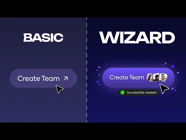
Build beautiful websites like these in minutes
Use Alpha to create, publish, and manage a fully functional website with ease.
In the dynamic world of digital interaction, a website is more than just a digital storefront; it's a critical touchpoint for user engagement and brand identity. The website design trends shaping 2025 move beyond mere aesthetics, focusing on creating smarter, more intuitive, and deeply immersive online experiences. These shifts are not arbitrary; they are direct responses to evolving user expectations for speed, personalization, and accessibility. For entrepreneurs, marketers, and business owners, understanding and implementing these concepts is no longer optional-it's essential for capturing audience attention and fostering meaningful connections that drive growth.
This comprehensive guide delves into the ten most impactful website design trends you need to know. We will explore everything from the intelligent automation of AI-powered design and the growing demand for sustainable, green web practices to the subtle sophistication of micro-interactions and the tactile appeal of glassmorphism. Each section provides not just an explanation of the trend but also actionable insights and real-world examples to help you effectively integrate these powerful ideas. Prepare to discover how to build a website that is not only visually stunning but also functionally superior, ensuring your digital presence is both current and compelling.
1. AI-Powered Design and Chatbots
Artificial intelligence is no longer a futuristic concept; it's a practical and powerful tool reshaping the landscape of website design trends. This trend moves beyond simple automation, focusing on creating dynamic, personalized, and highly efficient user experiences. AI algorithms analyze user behavior in real-time to adapt everything from content recommendations to interface layouts, making each visitor's journey unique.

We see this in action with Netflix's homepage, which customizes its layout and artwork based on your viewing history, and with intelligent chatbots like Intercom that provide instant, context-aware customer support. These systems not only enhance user engagement but also free up human resources by automating repetitive tasks. The goal is to make websites feel less like static pages and more like interactive, intelligent partners.
Why It's a Top Trend
AI-powered features are becoming a key differentiator in a crowded digital marketplace. They directly address user demand for personalization and immediate assistance. For businesses, this translates to higher conversion rates, improved customer satisfaction, and valuable data insights that drive strategic decisions.
How to Implement AI in Your Design
Start Small with Chatbots: Integrate a pre-trained AI chatbot to handle common customer queries. This provides immediate value without requiring extensive development.
Leverage AI for Personalization: Use AI tools to recommend products, articles, or content based on user browsing history and preferences.
Utilize AI Design Assistants: Tools like Adobe Sensei can automate tedious design tasks, such as image cropping and color palette generation. For a deeper dive into specific AI applications in design, consider exploring the 12 Best AI Tools for Designers in 2025.
Ensure Transparency and Fallbacks: Always inform users when they are interacting with an AI. Provide a clear and easy way to connect with a human agent if the AI cannot resolve their issue.
2. Dark Mode Design
Dark mode has transitioned from a niche preference to a mainstream user expectation, solidifying its place among key website design trends. This design approach utilizes a dark color palette, typically dark gray or black backgrounds with light-colored text and elements. The primary goal is to reduce eye strain, especially in low-light environments, and improve readability by minimizing screen glare. It can also offer the practical benefit of conserving battery life on devices with OLED or AMOLED screens.

This trend has been widely adopted by major platforms like YouTube, Twitter, and GitHub, which offer users the choice to switch between light and dark themes. Driven by operating system-level support from Apple's iOS and Google's Android, users now expect this functionality as a standard feature. Offering a dark mode is no longer just a stylistic choice; it's an important consideration for accessibility and user comfort.
Why It's a Top Trend
Dark mode directly addresses user well-being by reducing digital eye strain and is often perceived as more modern and sophisticated. For businesses, providing this option demonstrates a commitment to user experience and accessibility. It caters to a growing user preference, potentially increasing engagement and the time users spend on a site, particularly during evening hours.
How to Implement Dark Mode in Your Design
Avoid Pure Black: Instead of a stark
#000000background, use a dark gray. This reduces harsh contrast and is often easier on the eyes.Prioritize Accessibility: Ensure your text and UI elements have sufficient contrast ratios against the dark background to meet WCAG standards for readability.
Provide a User Toggle: Always give users the choice to switch between light and dark modes. An easy-to-find toggle is the best practice.
Test Across Environments: Check how your dark mode design appears on different devices, screen types, and in various lighting conditions to ensure a consistent, high-quality experience.
3. Minimalism and White Space
Minimalism is a timeless design philosophy that continues to dominate website design trends by prioritizing simplicity and functionality. This approach involves stripping away non-essential elements, using a limited color palette, and employing clean typography to create an uncluttered, focused user experience. The strategic use of negative space, or white space, is crucial as it enhances readability and guides the user's eye toward the most important content and calls-to-action.

This trend is perfectly embodied by companies like Apple, whose product pages use abundant white space to create a sense of sophistication and highlight the product itself. Similarly, Google’s homepage is a masterclass in minimalism, removing all distractions to focus on its core search function. This "less is more" ethos not only improves aesthetics but also boosts site performance by reducing load times, making it a practical and elegant choice.
Why It's a Top Trend
In an era of information overload, minimalism cuts through the noise. It provides a calm, intuitive navigation experience that reduces cognitive load on users, allowing them to complete their tasks more efficiently. This focus on usability leads directly to higher engagement, lower bounce rates, and a perception of professionalism and confidence for the brand.
How to Implement Minimalism in Your Design
Prioritize Content Ruthlessly: Start by defining the single most important action you want a user to take on each page and eliminate any element that doesn't support that goal.
Use White Space Strategically: Think of white space as an active design element. Use it to create visual hierarchy, group related items, and improve legibility.
Stick to a Limited Color Palette: Choose one or two accent colors to use sparingly against a neutral background. This helps draw attention to key interactive elements like buttons and links.
Choose Clean, Simple Typography: Select a legible font and create a clear typographic hierarchy to structure your content effectively. For a deeper look into this and other core principles, explore these website design best practices.
4. Micro-Interactions and Animations
Micro-interactions are the small, purposeful animations that happen when a user interacts with a website. This website design trend focuses on providing subtle visual feedback that acknowledges a user's action, guides them through a process, and makes the interface feel more alive and responsive. These details are not just decorative; they are functional elements that enhance usability and create a more satisfying user experience.

Think of Facebook's animated "like" button, Slack's confirmation when a message sends, or the subtle bounce on a form field when you enter valid information. These tiny moments provide instant, clear feedback, reducing uncertainty and making the digital experience feel more human. Well-executed animations can turn a mundane task into something delightful, building a stronger connection between the user and the brand.
Why It's a Top Trend
In a competitive digital landscape, user experience is paramount. Micro-interactions directly improve usability by providing clear system status and preventing errors. They add a layer of polish and personality that makes a site feel high-quality and thoughtfully designed, which builds user trust and encourages repeat visits. These details are no longer a nice-to-have; they are an expected part of modern, intuitive design.
How to Implement Micro-Interactions in Your Design
Serve a Purpose: Ensure every animation has a clear function, such as providing feedback, showing system status, or guiding the user’s attention. Avoid animation for its own sake.
Keep It Brief and Subtle: Micro-interactions should be fast, typically under 300 milliseconds. The goal is to be helpful, not distracting.
Prioritize Accessibility: Always provide an option for users to reduce motion, as complex animations can be problematic for people with vestibular disorders.
Test for Performance: Check that your animations do not negatively impact site loading times or performance, especially on slower devices and connections. For insights on planning these details visually before development, you can explore how to create effective website mockups.
5. Voice User Interface (VUI) Integration
Voice User Interface (VUI) is moving from smart speakers into the core of web design, allowing users to navigate and interact with websites using spoken commands. This trend is a direct response to the rise of voice assistants and the growing demand for more accessible, hands-free digital experiences. Instead of clicking or typing, users can simply speak to search for products, fill out forms, or control website functions.
We see powerful examples of this with Google’s voice search functionality, which is now integrated into many websites, and Domino's voice-ordering system that allows customers to place a pizza order without touching their keyboard. These applications make websites more accessible for users with disabilities and add a layer of convenience for everyone, especially those multitasking or on the go.
Why It's a Top Trend
The increasing ubiquity of voice assistants like Alexa and Siri has conditioned users to interact with technology through speech. Integrating VUI into websites meets this expectation, creating a more modern and frictionless experience. For businesses, it opens up new avenues for engagement and can significantly improve accessibility, a key factor in modern website design trends.
How to Implement VUI in Your Design
Provide Clear Cues: Let users know that voice commands are available and provide examples of what they can say. Visual cues like a microphone icon are essential.
Implement Text Fallbacks: Always offer a traditional text-based input method as a fallback. This ensures the site remains usable for everyone, regardless of their environment or preference.
Test for Accents and Languages: If your audience is global, thoroughly test your VUI to ensure it accurately recognizes a wide range of accents, dialects, and languages.
Prioritize Privacy: Be transparent about how you handle voice data. Create a clear and accessible privacy policy that explains what data is collected and how it is used.
6. 3D Elements and Immersive Graphics
The line between digital browsing and immersive experiences is blurring, thanks to the integration of 3D graphics directly into websites. This trend moves beyond flat design, using technologies like WebGL and Three.js to create interactive, dynamic visuals that captivate users. It’s about transforming a standard webpage into an engaging, explorable environment.
We see this masterfully executed on Apple's product pages, where users can manipulate 3D models of the latest iPhone, and in BMW's virtual car configurator that offers a realistic preview. These interactive elements provide a deeper understanding of a product and create a memorable "wow" factor that static images cannot match. The goal is to make the user an active participant rather than a passive observer.
Why It's a Top Trend
3D elements are a powerful tool for storytelling and product demonstration. They can significantly increase user engagement and time on site by offering a more tangible and playful interaction. For e-commerce, this translates directly to higher consumer confidence and conversion rates, as users can explore products from every angle.
How to Implement 3D in Your Design
Start with Simple Models: Begin by incorporating a single, interactive 3D model of your hero product instead of building a fully immersive world.
Optimize for Performance: Ensure 3D assets are heavily optimized for the web. Compress files and use progressive loading techniques so complex scenes don’t slow down your site.
Provide Fallbacks: Design a high-quality 2D experience for users on older devices or slower connections that may not support WebGL graphics. For a fantastic example of a portfolio built entirely on this principle, check out Bruno Simon's award-winning site.
Test Extensively: 3D graphics can behave differently across various browsers and devices. Rigorous testing is crucial to guarantee a smooth experience for all users.
7. Sustainable and Green Web Design
As digital consciousness grows, sustainable and green web design is emerging as a critical website design trend. This approach prioritizes environmental responsibility by minimizing the carbon footprint of websites. It focuses on efficiency, from optimized code and compressed assets to choosing hosting powered by renewable energy, ensuring a lighter impact on the planet.
This philosophy is championed by organizations like Wholegrain Digital, which builds low-carbon websites, and the Green Web Foundation, which maintains a directory of green hosting providers. The goal is to create digital experiences that are not only user-friendly but also environmentally sound. This means making deliberate choices that reduce data transfer and server energy consumption, proving that a great website doesn't have to cost the earth.
Why It's a Top Trend
With growing consumer awareness around environmental issues, a sustainable website can be a powerful brand differentiator. It reflects corporate responsibility and appeals to eco-conscious customers. Beyond ethics, green design practices often lead to faster-loading, more efficient websites, which improves user experience and SEO performance.
How to Implement Sustainable Design
Optimize Your Images: Use modern, efficient formats like WebP instead of JPEG or PNG. Compress images to reduce file sizes without sacrificing quality.
Implement Lazy Loading: Configure media to load only when it enters the user's viewport. This significantly reduces initial page load data.
Choose a Green Host: Select a hosting provider that uses renewable energy to power its data centers.
Audit Your Carbon Footprint: Use tools like the Website Carbon Calculator to measure your site's environmental impact and identify areas for improvement.
Streamline Your Code: Minimize the use of heavy scripts, custom fonts, and unnecessary code to ensure your site is as lean and efficient as possible.
8. Neomorphism and Glassmorphism
Moving away from flat design, Neomorphism and Glassmorphism are website design trends that reintroduce depth and tactility to user interfaces. Neomorphism uses soft shadows and highlights to create an illusion that elements are extruding from the background, mimicking real-world objects. Glassmorphism achieves a similar effect through a frosted-glass look, using transparency, blur, and vivid backgrounds to make elements appear as if they are floating on layered panes.
These styles are prominently featured in modern operating systems. Apple’s macOS Big Sur and various iOS elements use Glassmorphism for their notification centers and toolbars, creating a sense of hierarchy and focus. Similarly, Microsoft’s Fluent Design System employs these translucent effects to build interfaces that feel light and modern. The goal is to create a visually rich and engaging experience that guides the user's eye and feels intuitive to interact with.
Why It's a Top Trend
These styles offer a sophisticated, futuristic aesthetic that sets a website apart from the flat designs that have dominated for years. They create a clear visual hierarchy by separating foreground and background elements, improving usability when executed correctly. This trend taps into our desire for interfaces that feel tangible and responsive, blending physical-world textures with digital functionality.
How to Implement Neomorphism and Glassmorphism in Your Design
Use Sparingly for Key Elements: Apply these effects to specific components like cards, modal windows, or navigation bars rather than the entire interface to avoid overwhelming the user.
Prioritize Accessibility: Neomorphism, in particular, can suffer from low contrast. Ensure all interactive elements like buttons and icons have sufficient contrast ratios and clear state changes (e.g., on hover or click).
Master the Blur and Transparency: For Glassmorphism, the key is balancing the background blur and element transparency. A subtle blur creates the frosted effect without making the background content distracting.
Provide High-Contrast Alternatives: Always test your designs against various backgrounds and consider offering a high-contrast mode for users with visual impairments.
9. Advanced Typography and Variable Fonts
Typography is evolving from a supporting player to a star performer in modern website design trends. This trend moves beyond simply choosing a readable font, embracing advanced techniques like variable fonts, custom pairings, and experimental layouts. Variable fonts are a game-changer, allowing a single font file to behave like multiple fonts by offering a range of weights, widths, and styles that can adapt dynamically.
We see this in action across platforms like Google Fonts and Adobe Fonts, which provide extensive variable font collections for designers. Brands like Airbnb with its "Cereal" font and The New York Times with its custom typography system showcase how a unique typographic identity can strengthen brand recognition and improve user experience. The goal is to use text not just to convey information but to create visual interest and personality.
Why It's a Top Trend
Sophisticated typography gives designers unprecedented creative control, enhancing both aesthetics and performance. Variable fonts, in particular, reduce file sizes and HTTP requests, leading to faster page load times. This focus on type as a primary design element allows brands to build a stronger, more cohesive visual identity that stands out in a crowded digital space.
How to Implement Advanced Typography
Explore Variable Fonts: Experiment with variable fonts from sources like Google Fonts to create fluid, responsive text that adapts to different screen sizes and contexts without loading multiple font files.
Prioritize Performance: Use the
font-display: swapCSS property to ensure text remains visible while custom fonts are loading, preventing a poor user experience.Ensure Readability and Fallbacks: Always test your typographic choices across various devices and browsers to guarantee legibility. Provide standard fallback fonts for older browsers that may not support variable font technology.
Create a Typographic System: Define a clear hierarchy with distinct font pairings, sizes, and weights for headings, subheadings, and body text to maintain consistency and guide the user's eye.
10. Personalization and Dynamic Content
Moving beyond the one-size-fits-all approach, personalization and dynamic content are now a cornerstone of modern website design trends. This strategy involves tailoring the user experience by dynamically adjusting content, layouts, and recommendations based on individual user data, such as browsing history, location, or past interactions. The goal is to make each visitor feel like the website was designed specifically for them.
We see this masterfully executed by platforms like Amazon, which curates its homepage with personalized product suggestions, and Spotify, with its algorithmically generated "Discover Weekly" playlists. These sites don't just present static information; they create an evolving dialogue with the user, increasing relevance and fostering a deeper connection.
Why It's a Top Trend
In a saturated digital landscape, personalization cuts through the noise. It directly addresses the user's desire for relevant, efficient, and engaging experiences, significantly boosting key metrics like time on page, conversion rates, and customer loyalty. For businesses, it transforms a website from a simple brochure into a powerful, intelligent sales and engagement tool.
How to Implement Personalization in Your Design
Start with Basic Segmentation: Begin by personalizing content based on simple data points like location or traffic source. For example, show different promotions to visitors from different countries.
Ensure Data Privacy Compliance: Be transparent about the data you collect and how you use it. Adhere strictly to regulations like GDPR and CCPA, giving users clear control over their personalization settings.
A/B Test Everything: Continuously test personalized experiences against non-personalized versions to measure impact and refine your strategy.
Leverage Dynamic Content Tools: To delve deeper into creating adaptable and personalized user experiences, explore real-world strategies for Mastering Elementor Dynamic Content. Integrating this approach is a key part of an effective website design process.
Website Design Trends Feature Comparison
Design Trend | Implementation Complexity 🔄 | Resource Requirements ⚡ | Expected Outcomes 📊 | Ideal Use Cases 💡 | Key Advantages ⭐ |
|---|---|---|---|---|---|
AI-Powered Design and Chatbots | High – advanced AI integration, data handling | High – AI models, real-time analytics, maintenance | Personalized UX, increased engagement, 24/7 support | Customer support, personalized content delivery | Data-driven personalization, automation |
Dark Mode Design | Medium – dual modes, contrast management | Low to Medium – color adjustments, testing | Reduced eye strain, battery saving, modern look | Apps/websites used in low-light conditions | Eye comfort, aesthetic appeal, energy efficiency |
Minimalism and White Space | Low to Medium – layout simplification | Low – fewer assets, cleaner code | Faster load times, improved focus, timeless design | Content-centric sites, mobile-first designs | Clarity, performance, accessibility |
Micro-Interactions and Animations | Medium to High – animation coding and performance tuning | Medium – animation libraries, testing | Enhanced engagement, better feedback, perceived speed | Interactive apps, e-commerce, forms | User delight, improved usability |
Voice User Interface (VUI) Integration | High – speech recognition, audio processing | High – voice tech, privacy safeguards | Hands-free navigation, improved accessibility | Accessibility needs, hands-free interaction | Natural interactions, accessibility enhancement |
3D Elements and Immersive Graphics | High – 3D modeling, WebGL, performance optimization | High – graphics rendering, device testing | Highly engaging visuals, memorable branding | Product showcases, tech-focused sites | Immersive experience, differentiation |
Sustainable and Green Web Design | Medium – optimized coding and hosting | Low to Medium – efficient assets, green hosting | Reduced environmental impact, cost savings, SEO boost | Eco-conscious brands, performance-focused sites | Sustainability, faster loading, positive branding |
Neomorphism and Glassmorphism | Medium to High – visual effects, consistency | Medium – design assets, accessibility testing | Modern, tactile look with depth | Modern UI, dark mode compatible interfaces | Visual appeal, depth without heavy graphics |
Advanced Typography and Variable Fonts | Medium – font tech integration, scaling | Medium – fonts licensing, testing | Improved readability, brand expression, flexible layouts | Branding-focused, editorial, and content-heavy sites | Font flexibility, reduced file sizes |
Personalization and Dynamic Content | High – data integration, dynamic layouts | High – data processing, maintenance | Higher engagement, relevant content, loyalty | E-commerce, media, and user-centric platforms | Customized experiences, increased conversions |
Ready to Build the Future? Putting These Trends into Action
The digital landscape is in constant motion, and the website design trends we've explored are more than just fleeting fads; they represent a fundamental shift towards more intelligent, human-centric, and engaging online experiences. From the automated efficiency of AI-powered chatbots to the immersive depth of 3D graphics and the subtle delight of micro-interactions, the common thread is a deep focus on the end-user. The goal is no longer just to present information but to create a seamless, intuitive, and memorable journey.
Embracing trends like dark mode, minimalism, and advanced typography demonstrates a commitment to both aesthetic appeal and user comfort, reducing eye strain and improving readability. Meanwhile, integrating VUI, personalization, and dynamic content shows that you are listening to your audience, adapting to their needs, and delivering a bespoke experience that builds loyalty and drives conversions. The future of web design is not about flashy gimmicks; it is about purposeful innovation that serves a genuine user need.
From Inspiration to Implementation: Your Next Steps
Navigating these advancements can feel daunting, but the key is strategic implementation rather than a complete overhaul. You do not need to adopt every single trend at once. Instead, start by analyzing your specific audience and business goals to determine which innovations will deliver the most significant impact.
Consider these actionable steps to get started:
Audit Your Current Site: Identify areas where user experience feels dated or clunky. Are there opportunities to introduce micro-interactions for better feedback, or could a minimalist redesign improve your conversion funnel?
Prioritize Based on Impact: Which trend aligns most closely with your brand's objectives? If customer support is a bottleneck, an AI chatbot could be a priority. If you want to showcase a complex product, 3D elements might be the answer.
Start Small and Test: Implement one or two trends on a specific landing page or section of your site. Use analytics and user feedback to measure the results before committing to a site-wide change. For example, A/B test a personalized content block against a static one.
By selectively integrating these modern website design trends, you can create a digital presence that not only looks current but also performs exceptionally. The most successful websites of tomorrow will be those that masterfully blend aesthetic innovation with functional, user-focused design, ensuring every element has a purpose. This strategic approach will future-proof your online presence, captivate your audience, and set you apart from the competition.
Feeling inspired to upgrade your digital presence? You can implement these cutting-edge website design trends without writing a single line of code. Alpha leverages AI to build a stunning, professional website for you in minutes.
Build beautiful websites like these in minutes
Use Alpha to create, publish, and manage a fully functional website with ease.