


How to Create Website Mockups People Actually Love
Learn how to create website mockups that bridge the gap between idea and reality. Our guide covers tools, principles, and developer handoff.
Build beautiful websites like these in minutes
Use Alpha to create, publish, and manage a fully functional website with ease.
Analyzing website traffic isn't just about watching numbers tick up. It's about using a powerful tool like Google Analytics 4 to understand what people are actually doing on your site. By tracking core metrics like user sessions, bounce rate, and where your visitors are coming from (traffic sources), you can uncover how they behave, which marketing efforts are paying off, and where you can make changes to really move the needle on your business goals.
Setting the Stage for Smart Traffic Analysis
Before you get lost in a sea of charts and graphs, the most important thing is to know what you're looking for. Real traffic analysis isn't a passive activity; it’s an investigation. It all starts with asking the right questions—the ones that lead to answers that actually help your business grow.
If you don't have a clear purpose, you’ll find yourself chasing vanity metrics that look impressive but don’t contribute a single dollar to your bottom line. The whole point is to connect your findings to real-world business objectives. So, instead of just celebrating a jump in visitor numbers, you need to ask: are these the right visitors? Are they turning into leads, buying products, or reading the content that matters most?
Of course, to get reliable answers, you need clean, accurate data. This is why a proper Google Analytics 4 (GA4) setup is non-negotiable. Getting your tracking right from day one saves you from making bad decisions based on bad data down the road.
Foundational Elements for Your Analysis
A solid traffic analysis strategy is built on a few simple, yet critical, pillars:
Define Your Primary Goals: What are you actually trying to achieve? Is it generating more qualified leads for the sales team? Growing your newsletter subscriber list? Driving more sales through your e-commerce store? Your goals will tell you which metrics you need to obsess over.
Establish Key Performance Indicators (KPIs): With your goals in place, you can pick specific KPIs to track your progress. For a lead generation site, your main KPI might be form submissions. For an online shop, it could be the add-to-cart rate or, even better, the number of completed purchases.
Ensure Data Integrity: This one’s huge. You have to make sure your analytics tool is installed correctly on every single page of your website. Tools like Google's Tag Assistant can help you verify that your data is being collected properly.
Getting this foundation right gives you a clear, immediate snapshot of your website’s performance, much like what you see in a standard Google Analytics dashboard.

This kind of dashboard gives you a quick health check, showing top-level metrics like users, sessions, and engagement rates at a glance.
Remember, the purpose of analytics is not just to report numbers but to uncover the story behind them. Why did traffic from a certain channel spike? What caused the drop in user engagement last week?
This initial groundwork turns your data from a static report into an active tool for growth. It also helps you put your own numbers into context. For example, knowing that Google was the most visited website worldwide in August 2025 with an incredible 101.35 billion monthly visits helps frame your own goals realistically. You can find more of these kinds of insights on platforms like Semrush.
Pinpointing Your Most Valuable Traffic Sources
Knowing how many people land on your site is a good starting point, but the real power comes from knowing where they came from. It's a common mistake to treat all traffic the same. The reality is, some sources bring in window shoppers, while others deliver motivated buyers ready to convert. Figuring out that difference is how you stop wasting your marketing budget and start investing it.
Your analytics dashboard, whether you're using Google Analytics or the tools built right into Alpha, will break down your traffic into a few main channels. Think of these as the major highways leading people to your digital doorstep.
Unpacking Your Main Traffic Channels
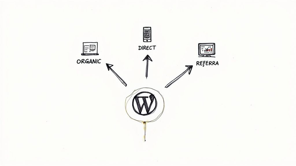
Before you can dig in, you need to speak the language. Most platforms group your traffic into a handful of core categories, and understanding what each one represents is the first real step in your analysis.
Organic Search: This is anyone who found you through a search engine like Google without clicking on an ad. High organic traffic is a fantastic sign of solid SEO and growing brand authority.
Direct: These are the folks who typed your URL straight into their browser. It's often a mix of repeat visitors, loyal customers, and people who heard about you offline (like from a business card or word-of-mouth).
Referral: Clicks that come from a link on another website. A link from a respected industry blog is gold—it sends highly relevant visitors your way.
Social: This is all the traffic coming from platforms like Instagram, LinkedIn, or Twitter. It's a direct reflection of how well your social media strategy is working.
Paid Search: Visitors who clicked on one of your paid ads on a search engine. This channel offers immediate, highly targeted traffic if you've got the budget for it.
Let's make this real. A B2B SaaS company I worked with discovered their most valuable leads weren't from paid ads, but from Referral traffic—specifically from a single guest post they'd written for a popular tech blog. On the flip side, an e-commerce brand selling custom art might find that Social traffic from Instagram converts at 2x the rate of any other channel.
The goal here is to get past simply counting clicks. You need to draw a straight line from each traffic source to a real business outcome, whether that's a new lead in your pipeline or a completed sale.
From Channels to Campaigns
Once you're comfortable with the main channels, it's time to dig a level deeper. This is where you find the truly actionable insights. Within each channel, you can often isolate the specific campaigns, keywords, or content pieces that are doing the heavy lifting.
Instead of just looking at your "Organic Search" number, you can see which specific keywords are bringing in users who actually engage and convert.
For a service-based business, for example, identifying the exact blog posts that attract high-quality leads is a game-changer. By setting up conversion tracking, you can follow a visitor's journey from a specific article all the way to a signed contract. That's how you calculate the true ROI of your content. In fact, building a strong content engine is one of the most effective lead generation best practices you can focus on.
When you connect traffic sources to your actual business goals, you stop guessing where to put your time and money. The data tells the story, showing you which channels are fueling your growth and which ones are just adding noise. This is how you start making confident, data-backed decisions that really move the needle.
Decoding Your Audience and Their On-Site Behavior
Getting people to your website is one thing. Figuring out who they are and what they do once they arrive? That's where the real magic happens. This is how you find the insights that actually move the needle, shifting your focus from just counting visitors to truly understanding them.
Start by digging into the demographics. Your analytics platform is a goldmine for information like visitor age, location, and even their general interests. This is your first reality check. If you’re a local business in Austin but see a flood of traffic from California, there’s a clear mismatch between your marketing and your target audience.
Tracing the User Journey
Once you know who is visiting, the next question is what are they doing? This is where you uncover what people actually want from your site. A great place to start is by looking at your most popular pages or blog posts. These are the content pieces hitting the mark and often serve as the main doorways to the rest of your site.
From there, you can start to follow the breadcrumbs. Do people typically land on a blog post, click over to a related service page, and then check out your pricing? Or do they hit the homepage, get confused, and leave immediately? Mapping these common paths shows you exactly how people navigate your site—and where they get stuck.
The process is fairly straightforward once you get the hang of it.
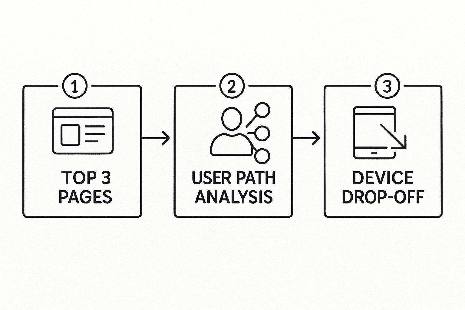
This simple flow helps you connect the dots from what content is working to how users move through your site and, crucially, where they’re dropping off.
Your job is to hunt down the friction. For example, high exit rates on certain pages are a massive red flag. If you see a ton of people bailing from a critical service page, something is broken. Maybe the copy is confusing, the page is painfully slow, or the call-to-action is buried. Fixing these hiccups is at the core of good user experience design.
The most valuable insights often come from understanding why people leave. Don't just look at where they go; investigate the pages they abandon. That's where your biggest opportunities for improvement are hiding.
Key User Behavior Metrics Explained
To really understand what's happening on your site, you need to get familiar with a few key metrics. This table breaks down the essentials.
Metric | What It Measures | Why It Matters |
|---|---|---|
Bounce Rate | The percentage of visitors who leave your site after viewing only one page. | A high bounce rate can indicate that the page content isn't relevant to what the user was looking for or that the user experience is poor. |
Pages per Session | The average number of pages a user visits during a single session on your site. | More pages per session often suggests higher engagement and that users are finding your content valuable and easy to navigate. |
Average Session Duration | How long, on average, a visitor stays on your website. | Longer sessions usually mean users are engaged with your content. Short sessions could point to usability issues or uninteresting content. |
Exit Rate | The percentage of visitors who leave your site from a specific page. | Unlike bounce rate, this applies to any page in a user's journey. A high exit rate on a key page (like a checkout page) is a major problem. |
Think of these metrics as the vital signs of your website. They tell you where things are healthy and where you need to perform some immediate triage.
Why Device Segmentation Is Non-Negotiable
Looking at your audience as one big group is a rookie mistake. One of the most important ways to slice your data is by device: desktop, mobile, and tablet. The experience on a big monitor is worlds away from a tiny smartphone screen, and your analytics will reflect that.
If your mobile bounce rate is sky-high compared to your desktop rate, that’s your cue to investigate. The mobile experience probably needs some serious work.
And this isn't a minor detail. As of mid-2025, mobile devices drive about 64.35% of all global web traffic. That's a staggering jump from just 0.72% back in 2009. Mobile officially overtook desktop way back in late 2016, a clear sign of how much user habits have changed. You can dig into these mobile traffic trends to see just how dominant this segment has become.
By comparing how your site performs across devices, you can spot specific issues. Maybe a form is impossible to fill out on a phone, or a button is too small to tap. These aren't just small annoyances; they're conversion killers. This is about using data to build a website that works brilliantly for everyone, no matter how they access it.
Using Segmentation to Uncover Hidden Opportunities
If you're only looking at your audience as one giant, faceless group, you're absolutely going to miss the most valuable insights hiding in your data. Real progress happens when you start slicing that data into smaller, more meaningful groups. That’s the power of segmentation, and it’s how you go from making broad observations to finding specific, actionable opportunities.
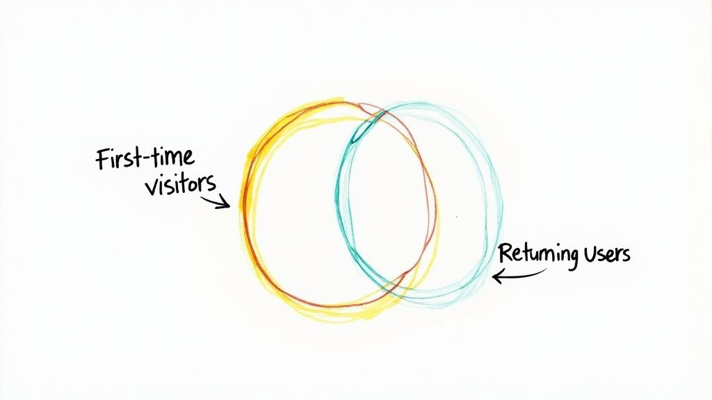
Think about it this way: instead of just staring at your overall bounce rate, you could compare the bounce rate of first-time visitors against your returning ones. That simple split can immediately tell you if your site is doing a good job of re-engaging people or if it's only good at making a first impression. These are the kinds of granular comparisons that lead to genuine breakthroughs.
Creating Your First Custom Segments
Getting started with segmentation is actually easier than it sounds. Most analytics platforms, especially Google Analytics, have built-in tools that let you create and save custom audience segments pretty easily. You can build these based on just about any characteristic you can track.
Here are a few powerful segments you can create right now to see what I mean:
By Traffic Source: Isolate visitors who came from a specific ad campaign. Are they viewing more pages or spending more time on your site compared to your organic traffic? The answer tells you a lot about your ad's effectiveness.
By Behavior: Create a segment of users who viewed a specific product but never added it to their cart. This is a classic way to spot friction points before the checkout process even begins.
By Conversion Goal: Group together everyone who abandoned their shopping cart. Digging into their on-site journey might reveal a confusing shipping page or a broken discount code field that's quietly costing you sales.
To really dig into what's possible, you should explore some of the top customer segmentation techniques. Applying different methods will help you understand your audience in ways you hadn't considered.
Segmentation is about finding the story within the data. It's the difference between saying "our conversion rate is 2%" and saying "our conversion rate for mobile users from our email campaign is 5.5%, but it's only 0.5% for desktop users from the same campaign." The second statement gives you a clear problem to solve.
Unlocking Geographic Insights
One of the most powerful—and often overlooked—ways to analyze your traffic is by geography. User behavior can be wildly different from one country or region to another, influenced by everything from local culture to internet speed. This is absolutely critical information for shaping your localization and market-targeting strategies.
For a bit of perspective, look at traffic scale on a national level. In 2022-2023, Google saw 171 million unique monthly visitors in Canada, while in India, it got around 14.6 billion visits every month. Meanwhile, China's unique digital ecosystem is led by Baidu, with 195.7 million monthly visits, which shows just how much local platforms can dominate.
By creating segments for your top countries, you might discover that users in Germany have a much higher conversion rate for a particular product, while users in Australia have a higher bounce rate. This is the kind of insight that allows you to create targeted campaigns, translate key pages, or tweak your product offerings to better fit specific markets. It’s a direct path to more relevant and effective marketing.
Turning Traffic Insights into Actionable Growth
Finding an interesting insight in your analytics is a great start, but it’s really just step one. The real magic happens when you turn those numbers into a concrete plan for making your site better. Otherwise, all you have is a list of fun facts, not a strategy.
What you're aiming for is a repeatable process. You need a system that takes you from spotting a weird number in your reports to launching a real-world test on your website. This is how you close the gap between seeing a problem and actually fixing it.
Diagnosing Common Issues
Let's walk through a classic example. You notice one of your key landing pages has a ridiculously high exit rate. People land there, take one look, and leave without clicking anywhere else. Don't just start guessing what's wrong—get methodical.
Here's the kind of checklist I run through whenever I see this pop up:
Content Relevance: Is the headline a perfect match for the ad or link that brought them here? Any disconnect between what they expected and what they see is a bounce-rate killer.
Page Load Speed: Pop the URL into a tool like Google's PageSpeed Insights. I’ve seen sites lose tons of visitors just because of a few seconds of lag. Unoptimized images are the usual suspect.
Call-to-Action (CTA): Is it painfully obvious what you want the user to do next? If your main CTA is buried, confusing, or just plain uninspiring, people will give up.
Mobile Usability: Seriously, pull it up on your phone. Can you read the text without pinching and zooming? Are the buttons big enough for a thumb to tap? A clunky mobile experience is an instant dealbreaker for most of your audience.
This simple diagnostic process turns a vague problem ("high exit rate") into a set of specific, testable ideas. Maybe the headline needs work. Maybe the images are too big. Maybe the button color is all wrong. Now you have things you can actually test, which is the entire point of good conversion rate optimization.
Your analytics data doesn’t give you answers; it gives you clues. Your job is to follow those clues, form a hypothesis, and then test it to see what actually moves the needle.
Creating a Custom KPI Dashboard
If you want to track your progress without getting lost in a sea of data, you absolutely need to focus on the metrics that matter to your business. A generic, out-of-the-box dashboard is full of distractions. Do yourself a favor and build a custom one that only shows your key performance indicators (KPIs).
For an e-commerce store, I’d want to see these front and center:
Conversion Rate (broken down by traffic source)
Average Order Value (AOV)
Shopping Cart Abandonment Rate
But for a SaaS company, the dashboard would look totally different:
Trial Sign-ups (specifically from the blog)
Demo Request Form Submissions
Lead-to-Customer Conversion Rate
This kind of focused view tells you at a glance whether the changes you're making are actually working. It cuts through the noise and keeps everyone on the same page about what drives growth. Once you establish this feedback loop—analyze, act, measure, repeat—you’ve officially turned traffic analysis from a boring reporting task into a powerful engine for improving your website.
Got Questions About Website Traffic? We've Got Answers
Jumping into your analytics dashboard for the first time can feel like you're trying to read a different language. It’s completely normal to have questions. Let's walk through a few of the most common ones I hear from people just getting started.
How Often Should I Actually Check My Data?
This is a great question, and the answer is probably less often than you think. It's so tempting to refresh your stats every day, but that's usually a recipe for chasing ghosts. A single spike or dip rarely means anything significant.
You'll get a much clearer picture by looking at your data week-over-week or month-over-month. This method smooths out those daily jitters and reveals the real trends.
If you’ve just kicked off a big marketing campaign, a weekly check-in makes sense. But for a general pulse-check on your site's health, monthly is the way to go.
What’s a "Good" Bounce Rate, Anyway?
Ah, the classic bounce rate question. The truth is, there's no magic number. A "good" bounce rate completely depends on the type of page you're looking at. In fact, a high bounce rate isn't always a bad sign.
Blog Posts: Someone might land on your article, find the exact answer they were looking for, and leave. Mission accomplished! A bounce rate between 70-90% can be totally fine here.
Contact Pages: Similarly, if a visitor pops onto your contact page to grab your phone number and then closes the tab, the page did its job.
Homepages: This is where a high bounce rate (say, over 60%) should get your attention. It often means visitors aren't finding a clear path forward or what they expected to see.
The real question isn't "what's a good number?" but "is this page doing what it's supposed to do for the visitor?" Context is everything.
Why Is My "Direct Traffic" Number So High?
In the world of analytics, "Direct" is the mystery box. It's supposed to be people typing your URL right into their browser, but it's really the default bucket for any traffic source that the analytics tool can't identify.
So, what gets tossed in there?
Clicks from emails (especially if you're not tagging your links).
Traffic from many mobile apps.
People visiting from a bookmark.
Visitors using private or incognito browser modes.
On one hand, a lot of direct traffic could mean you've built fantastic brand awareness. That's a huge win! On the other hand, it might just mean your tracking is a bit messy. The best way to clean this up is to get disciplined about using UTM parameters on your links for email, social media, and ad campaigns. This gives your analytics tool the information it needs to sort traffic correctly.
Ready to stop wrestling with complicated analytics and start building a website that converts? Alpha uses AI to help you create a stunning, optimized website in hours, not weeks. With built-in analytics, you can track performance and make data-driven decisions effortlessly. Turn your vision into a reality with Alpha today!
Build beautiful websites like these in minutes
Use Alpha to create, publish, and manage a fully functional website with ease.