


How to Create Website Mockups People Actually Love
Learn how to create website mockups that bridge the gap between idea and reality. Our guide covers tools, principles, and developer handoff.
Build beautiful websites like these in minutes
Use Alpha to create, publish, and manage a fully functional website with ease.
So, what exactly is brand identity design? It’s the art of creating a whole sensory experience for your brand. It’s not just about a logo; it's the complete, thoughtfully crafted package of visuals, messages, and feelings that tells your story and makes you instantly recognizable.
The Foundation of a Recognizable Brand

Think of your brand as a person. How do they talk? How do they dress? What kind of energy do they bring into a room? Answering these questions is the core of brand identity design. It’s about intentionally crafting every single thing a customer sees, reads, or touches, making sure it all sends the same clear message about your values.
This goes way beyond just one graphic. The goal is to build an entire system—a design toolkit—that governs how your business looks, feels, and sounds. This ensures that no matter where someone encounters you—on social media, your website, or your product packaging—they get a consistent and familiar experience.
Let's clear up some common confusion right away with a quick comparison.
Brand Identity at a Glance
What Brand Identity Is (The Full Picture) | What Brand Identity Isn't (Common Misconceptions) |
|---|---|
A complete system of visual and verbal elements. | Just a logo. |
The strategic expression of your brand's personality and values. | Simply your branding or marketing materials. |
A consistent experience across all customer touchpoints. | A one-time design project. |
The tangible "how" you present your brand to the world. | Your reputation (that's the brand itself). |
This table helps frame the conversation: brand identity is the comprehensive, intentional design system, not just one or two of its parts.
More Than Just a Pretty Logo
One of the biggest mistakes businesses make is thinking their logo is their brand identity. The logo is a star player, for sure, but it’s just one member of a whole team. A strong brand identity system needs all its players working together in harmony.
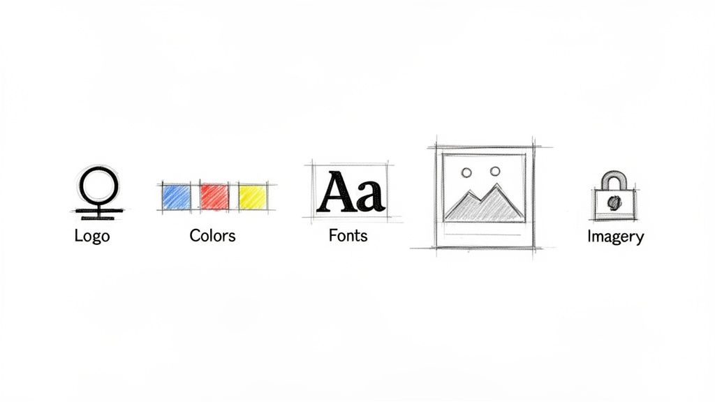
These are the foundational components every great brand identity has:
Logo and Variations: The core symbol of your brand, plus versions that work in different sizes and contexts.
Color Palette: A curated set of colors that triggers the right emotions and makes your brand distinct.
Typography System: The specific fonts you use for everything from headlines to body copy, shaping your brand's voice.
Imagery Style: Clear rules for photography, icons, and illustrations to maintain a consistent aesthetic.
Tone of Voice: The personality that comes through in all your writing, from website copy to customer service emails.
When all these elements click, they create a powerful sensory fingerprint. A solid identity is like a firm handshake—it builds trust and recognition from the very first interaction. It tells people what to expect from you before they’ve even tried your product.
Why a Cohesive Identity Matters
In today's crowded market, being memorable is everything. A well-defined brand identity makes you stand out and helps build a loyal following. When your visual and verbal cues are consistent everywhere, you build familiarity. People trust what they know.
A cohesive identity isn’t just a nice-to-have; it delivers real results. It transforms a faceless company into a familiar presence, making it easier for customers to pick you over the competition because they know exactly who you are and what you're all about.
This consistency has a direct, measurable impact on the bottom line. Think about this: 75% of consumers can recognize a brand by its logo alone, which shows how powerful strong visual recall is. Even better, one analysis found that companies see an average revenue increase of 23% when they apply their identity consistently. As these brand recognition stats show, good design is simply good business.
Ultimately, investing in your brand identity is an investment in clarity, recognition, and long-term growth.
The Building Blocks of a Memorable Brand Identity
To really get what brand identity design is all about, you have to look at the individual pieces. Think of it like a recipe. A strong identity relies on a specific set of ingredients, and each one is picked for its unique flavor and purpose. When you combine them the right way, they create a seamless experience that tells your brand's story without uttering a single word.
Each component has a strategic job to do, working together to build recognition and trust. These are the tangible things you'll use to show your brand's personality, share its values, and deliver on its promise.
Let's break down these essential building blocks.
The Logo: Your Brand’s Signature
Your logo is the face of your company. It’s the single most recognizable part of your brand identity and the visual shorthand that shows up on everything from your website to your packaging. A truly great logo is simple, memorable, and versatile—it's the cornerstone of your entire visual system.
Logos come in a few different flavors, and each one gives off a different vibe:
Wordmarks: These are font-based logos that put the business name front and center, like Google or Coca-Cola. They project confidence and a no-nonsense personality.
Symbols or Pictorial Marks: This is an iconic, graphic-based logo, like the Apple logo or the Twitter bird. They work incredibly well once a brand has built up widespread recognition.
Combination Marks: This style brings together a wordmark and a symbol, giving you the best of both worlds. Brands like Adidas and Domino's use this approach for greater flexibility and brand recall.
To get a better handle on this crucial component, it’s worth digging into the fundamental logo design principles. A well-designed logo should feel timeless, not trendy. This ensures it remains a strong, effective asset for years to come.
The Color Palette: The Emotional Cue
Color is an incredibly powerful psychological tool. The shades you pick for your brand aren't just for decoration; they’re your fastest way to communicate a feeling or personality at a glance. In fact, studies show that the right color can boost brand recognition by up to 80%.
Your palette should have a clear set of primary and secondary colors that match the feeling you want to evoke. For instance, blues often signal trust and stability, which is why you see them all over the financial industry. Greens suggest nature and well-being, while reds can create a sense of passion and urgency. A consistent color scheme is what makes your brand feel instantly familiar, no matter where people see it.
Typography: The Voice of Your Brand
If the logo is your brand's face, typography is its voice. The fonts you choose have their own distinct personalities and can completely change how your message comes across. They can make your brand feel modern, traditional, playful, or dead serious.
You'll generally be working with two main categories:
Serif Fonts: These have little "feet" or lines attached to the ends of the letters (think Times New Roman). They often feel classic, elegant, and trustworthy.
Sans-Serif Fonts: Lacking those little feet (like Arial or Helvetica), these fonts look clean, modern, and much more approachable.
It’s also critical to establish a clear typographic hierarchy. That just means defining which fonts you'll use for headlines, subheadings, and body text. This simple step is key for readability and gives all your communications a professional, polished look.
Typography is the silent ambassador of your brand. The right font choice reinforces your message and personality, while the wrong one can create a disconnect that confuses your audience and undermines your credibility.
Imagery and Graphics: The Visual World
The final core piece of the puzzle is your imagery style. This covers everything from the photos on your website and the icons in your app to the illustrations you post on social media. A consistent visual language creates a distinct world for your customers to step into.
Will your photography be bright and airy, or dark and moody? Will your illustrations be quirky and hand-drawn, or clean and geometric? Nailing down these rules ensures that every single image you use reinforces your brand's identity. It's this level of consistency that separates a professional, memorable brand from one that just feels messy and forgettable.
Understanding Brand, Branding, and Brand Identity
In business, you’ll often hear the terms brand, branding, and brand identity used interchangeably. While they're all related, they represent very different pieces of the same puzzle. Getting the distinctions right isn't just about semantics—it's fundamental to building a business that people recognize and trust.
Let's break it down with a simple analogy. Think of your business as a person.
Your brand is your reputation. It’s that gut feeling people have about you. It's what they say about you when you’re not in the room. You can't directly control it, but you can definitely influence it.
Branding is the act of shaping that reputation. It’s everything you actively do—from your marketing campaigns and customer service to the stories you share and the promises you keep.
Your brand identity is the collection of tangible tools you use to do all that. It’s your logo, your color palette, your typography—all the visual and sensory elements that make you recognizable.
So, the relationship is pretty straightforward when you look at it this way. You use your brand identity (the tools) to execute your branding (the actions) to build a powerful brand (your reputation).
Clarifying the Concepts
Let's try another angle. Think of a master chef. Her brand is her reputation for creating innovative, delicious food. The act of designing menus, sourcing ingredients, and running her kitchen is her branding. The specific knives, signature plating style, and even the restaurant's decor are all part of her brand identity—the tools that make her work distinct and memorable.
You wouldn't say her favorite knife is her reputation, but it’s a critical tool she uses to build it. In the same way, your logo isn't your brand, but it’s a vital piece of your identity toolkit.
The relationship is simple: Brand identity is the "what" (the visual assets), branding is the "how" (the strategic actions), and brand is the "why" (the resulting perception and reputation).
To make these distinctions even clearer, it helps to see them side-by-side. For more practical advice on this topic, check out our guide covering essential small business branding tips.
Differentiating Brand Branding and Brand Identity
Here’s a quick table to help solidify the difference between these closely related concepts.
Concept | Definition in Simple Terms | Example Analogy |
|---|---|---|
Brand | Your company's gut-level reputation and how people perceive it. | A person's reputation. |
Branding | The ongoing strategic actions you take to shape that perception. | The actions a person takes to build their reputation. |
Brand Identity | The collection of tangible visual and verbal assets you use. | The clothes, voice, and style a person uses. |
At the end of the day, brand identity design is what gives you the tangible components to execute your branding strategy. Without a cohesive identity, your branding efforts will feel disjointed and confusing, which ultimately weakens your brand.
Every element needs to work in harmony to tell the same story. This ensures that every time a customer interacts with your business, you're reinforcing the exact reputation you want to build. That strategic alignment is what turns a simple business into a memorable, trusted name.
How to Create a Powerful Brand Identity Step by Step
A great brand identity never happens by accident. It's the result of a deliberate, thoughtful process that takes your company's abstract ideas and turns them into something people can see, feel, and connect with.
This five-step roadmap will walk you through that journey, giving you a clear path from big-picture strategy to real-world application. It’s a framework that works whether you're a founder just starting out or a marketer looking to sharpen your brand's edge. A big part of this process involves collaboration, which is why it helps to understand the partnership process of how a branding agency works with clients to build authentic brand identity.
Step 1: Discovery and Strategy
Before you even think about colors or logos, you have to nail down your strategy. This is, without a doubt, the most important part of the entire process. Everything you design later will be guided by the "why" you establish right here.
Skip this, and you'll end up with a collection of nice-looking graphics that don't actually mean anything.
This is your soul-searching phase. It's about asking the big, fundamental questions and doing the research to back up your answers:
Define Your Mission: Seriously, why are you in business? Beyond making money, what impact do you want to have?
Identify Your Target Audience: Who, exactly, are you trying to reach? Get specific about their values, their problems, and what they truly want.
Analyze the Competitive Landscape: Take a hard look at your competitors. What are they doing right? More importantly, where are the gaps you can fill?
Getting this clarity gives you a North Star for every single design decision that follows.
Step 2: Visual Exploration and Mood Boards
Once your strategy is solid, it's time to start translating those ideas into a visual language. This isn't about finalizing designs yet—it's about exploring aesthetics and finding a look that genuinely captures your brand's personality.
The best tool for the job? A mood board.
Think of a mood board as a collage for your brand's soul. You'll pull together images, textures, color swatches, and bits of typography that all evoke a certain feeling. As you collect these pieces, you'll start to notice a consistent theme emerging, whether it’s rugged and natural or minimalist and futuristic. This sets the entire creative direction.
Step 3: Design and Development
This is where the magic happens. Guided by your strategy and mood board, you or your designer will start creating the actual assets that form your visual identity. This is the moment when abstract words like "trustworthy" or "innovative" become tangible design choices.
The core deliverables you’ll create in this phase are:
Logo Design: This is your brand's primary symbol. You'll need the main logo plus a few variations that work in different sizes and contexts.
Color Palette: You'll lock in your primary, secondary, and accent colors—the hues that will set the emotional tone for your brand.
Typography System: Here, you'll choose the specific fonts for headlines, body text, and everything in between to create a consistent voice.
This is where your identity truly comes alive. And it matters more than you might think; users form an opinion about a website in just 0.05 seconds, and visual elements account for 55% of that first impression.
Step 4: Documenting Your Brand Style Guide
You've created all these beautiful, strategic assets. Now what? You need to create a brand style guide to protect them. This document is your brand's rulebook, explaining exactly how to use every element correctly and consistently.
A brand style guide ensures that no matter who is creating content for your brand, the result always looks and feels like it came from the same source. It is the single source of truth for maintaining brand cohesion.
A solid style guide will show the dos and don'ts for your logo, list all the color codes (HEX, RGB, CMYK), define the typography hierarchy, and provide guidance on image style. This simple document is the key to preventing your brand from getting messy and diluted over time.
Step 5: Implementation and Application
The final step is to take your shiny new brand identity and roll it out across every single place your customers interact with you. This is where your identity leaves the design file and enters the real world to start building recognition.
Consistency is everything here.
From business cards and social media profiles to, most importantly, your website, every touchpoint needs to align. Visualizing how these elements will look online is a critical step. For a deeper dive into that specific part of the process, check out our guide on how to create website mockups.
This flow chart shows how all these pieces fit together to ultimately build your brand's reputation.

As you can see, your tangible identity (the visual toolkit) empowers your strategic branding (your actions), which is what ultimately builds your brand (your reputation in the market).
Bringing Your Brand Identity to Life on Your Website

Your website is the main stage where your brand identity gets to perform. All that hard work—the logo, color palette, and typography you painstakingly chose—moves from a static style guide into a living, breathing experience for your audience. This is where you make your first impression, digitally speaking.
The entire point is to make your website feel like a natural extension of your brand. You want every visitor to instantly get a sense of who you are, building trust and recognition with every click. Consistency is everything here; in fact, 73% of consumers say they trust a brand more when its marketing is consistent across the board.
A well-executed website isn’t just a digital brochure. It’s the front door to your business, and it needs to perfectly reflect what’s inside.
Translating Your Style Guide to the Web
So, how do you take a brand identity guide and actually apply it to a website? It's more than just plopping your logo in the corner of the homepage. It's about intentionally weaving every element into the very fabric of your site's design.
Here’s how the core pieces come together online:
Color Palette: Your primary colors should define the big-ticket items like backgrounds and hero sections, while secondary colors guide the user’s eye to buttons, links, and other interactive elements. It creates a familiar and predictable environment.
Typography: The fonts you selected need to be used consistently for all your text. That means one style for main headlines (H1), another for subheadings (H2, H3), and a clear, readable font for your body copy. This reinforces your brand's personality and makes your content easy to read.
Imagery and Graphics: Every photo, illustration, and icon has to feel like it belongs. If your brand is playful, your images should reflect that. If it’s professional and serious, your visuals need to match that tone.
Tone of Voice: Your brand’s personality isn't just visual. It has to come through in the words you use, from the headlines to the button text. You can learn more in our guide on how to write website copy that truly connects.
Applying these elements with intention is what transforms a generic website template into a genuine brand asset.
Your website isn't just a container for information; it's the most immersive expression of your brand identity. Every layout choice, button color, and font selection is a chance to reinforce who you are.
Simplifying Implementation with Modern Tools
Not long ago, getting this level of consistency across an entire website was a tedious, code-heavy job. One small change could mean hours of work.
Thankfully, modern platforms have made this a whole lot easier. Tools like Alpha are built to help you apply your brand identity with precision, without needing to be a designer or developer.
For example, you can set your brand’s core colors and fonts in a single, central design panel. Once you lock those in, these styles are automatically applied across every page and component on your site. When you add a new section, it instantly adopts the right look and feel.
This centralized approach means you can update your entire website’s aesthetic with just a few clicks. It makes brand refreshes a breeze and completely removes the guesswork, bridging the gap between having a great brand identity and flawlessly executing it online.
Avoiding Common Brand Identity Traps
Even with the best intentions and a solid strategy, it's surprisingly easy to fall into a few common traps that can seriously undermine your brand identity. Knowing what to watch out for ahead of time can save you a ton of headaches, money, and rework down the road.
Building a brand is a real investment. The market for corporate identity design is huge—estimated at $8.62 billion in 2024—and considering that about two-thirds of small businesses are ready to spend over $500 on a logo alone, you can't afford to get this wrong. You can learn more about the growing corporate identity market to see just how high the stakes are.
Let's break down the mistakes I see most often.
Mistake #1: Designing for Yourself, Not Your Audience
This one is probably the most common pitfall. It happens when personal preference dictates design choices. You might be obsessed with a particular shade of green or a quirky font, but if it doesn't click with the people you're trying to reach, it's just noise. A brand's identity isn't for you; it's for your customers.
How to sidestep it: Keep your customer personas front and center. Before you sign off on any design, ask the most important question: "Will this speak to my ideal customer? Does it reflect what they care about?" That simple gut-check keeps the entire project on track.
Mistake #2: Chasing Fleeting Design Trends
Jumping on the latest design trend can feel like an easy way to look current, but it’s a short-term game that almost always backfires. Trends die, and fast. An identity built on what’s hot right now can make your brand look dated and out of touch in just a year or two. Great brand identity is built to last.
How to sidestep it: Aim for timelessness. Instead of chasing fads, anchor your design in core principles like simplicity, clarity, and authenticity. A classic, well-crafted identity will stand the test of time and build recognition that a trendy design never could.
A strong brand identity is a long-term asset, not a short-term fashion statement. The goal is to build something that feels relevant for years, not just for a season.
Mistake #3: Forgetting the Brand Style Guide
So you've got a beautiful logo and a killer color palette. Great! But that’s only half the job. Without a formal brand style guide to govern how those assets are used, consistency goes right out the window. Different people on your team will inevitably start making their own calls, creating a disjointed and unprofessional look across your marketing.
How to sidestep it: Document everything. Put together a comprehensive style guide that spells it all out: correct logo usage, color codes (HEX, RGB, CMYK), typography rules, and the right tone for imagery. This guide becomes your brand's bible, the single source of truth that keeps everyone on the same page.
Got Questions About Brand Identity? We’ve Got Answers.
Alright, we’ve covered a lot of ground on what brand identity design is all about. But a few common questions always seem to pop up once people start thinking about the practical side of things. Let's tackle those head-on.
Think of this as tying up the loose ends, so you can move forward with a clear plan for building and managing your brand.
How Often Should I Update My Brand Identity?
This is a big one. The idea of changing your brand can feel daunting, but it doesn't always have to be a massive project.
A full-blown rebrand—we're talking a complete overhaul—is a serious move. You'd typically only do this if something massive changes in your business, like a merger, a major pivot into a new industry, or if your identity just feels completely out of sync with who you've become. It's a strategic reset, not something you do on a whim.
What’s far more common is a brand "refresh." This is more like a touch-up. You might make subtle tweaks to modernize your logo, adjust your color palette, or choose a new font. A good rule of thumb is to consider a refresh every 5-10 years. This keeps your look current and relevant without confusing the audience you've worked so hard to build.
Can a Startup Design Its Own Brand Identity?
Absolutely. When you're just starting out and every dollar counts, a DIY approach to your brand identity is often the only way to go. And that's perfectly okay. The secret isn't a huge budget; it's a solid strategy. If you take the time to really nail down your audience, your core values, and where you fit in the market, you're already most of the way there.
With today's design tools, you can create a pretty professional-looking set of assets to get started. Later, as your business grows and you have more resources, you can always bring in a professional designer to polish and expand on that foundation. It's a natural and smart progression.
The most important part of brand identity isn't the slickness of your logo. It's how consistently you use it. A simple identity applied consistently will always beat a brilliant one that's all over the place. Consistency is what builds recognition and trust.
Does Brand Identity Affect SEO?
This is a great question. While your brand identity isn’t a direct ranking factor in the same way keywords or backlinks are, it has a huge indirect impact on your SEO.
Think about it: a strong, professional identity builds trust. That trust leads to a better user experience (UX) on your website. When people trust your site, they stick around longer and bounce less. Search engines pick up on these positive signals.
Even more, a memorable brand gets people searching for you by name. When users start typing your company name directly into Google, it sends a powerful message that your brand is an authority in its space. A strong identity helps you become a destination, not just another search result.
Ready to bring your brand identity to life on a stunning, professional website? Alpha uses AI to make it incredibly simple. Describe your vision or drop in a URL for inspiration, and watch as our platform builds a site that perfectly reflects your brand—no coding required. Start building your website with Alpha today!
Build beautiful websites like these in minutes
Use Alpha to create, publish, and manage a fully functional website with ease.