How to Create Website Mockups People Actually Love
Learn how to create website mockups that bridge the gap between idea and reality. Our guide covers tools, principles, and developer handoff.

Build beautiful websites like these in minutes
Use Alpha to create, publish, and manage a fully functional website with ease.


When you design a website, you’re telling a story. Visual hierarchy is how you make sure your audience follows the plot. It's the subtle art of arranging everything on the page—from headlines to buttons—to guide a visitor's eye from the most important point to the least.
Think of it as the invisible hand that makes a webpage feel natural and easy to use. By playing with size, color, and placement, you're essentially creating a roadmap for your visitor's attention.
What Is Visual Hierarchy and Why It Matters
Ever grab a newspaper? You don't have to think about what to read first. Your eyes instantly jump to the huge headline, then maybe to the smaller subheadings or a compelling photo. Only after that do you decide if the smaller article text is worth your time. That’s visual hierarchy in its classic form, and it's just as crucial for web design.
Without this deliberate structure, a website is just a mess of information. It's like walking into a library where all the books are thrown in a giant pile. Visitors get overwhelmed, confused, and quickly click away.
The Foundation of User Experience
At its heart, visual hierarchy turns a wall of visual noise into a clear, focused conversation. It’s about presenting your story in the right order so people don't have to struggle to find what they're looking for. This is absolutely critical online, where you have seconds, not minutes, to make an impression.
Consider this: most people read only 20% to 30% of the text on a webpage. A smart visual hierarchy makes sure your most important messages land squarely within that tiny window. You can dive deeper into guiding user attention with these excellent insights on The Orange Byte.
This thoughtful organization is what separates a good design from a frustrating one, and it has a direct impact on your goals.
It Improves Usability: A clear path makes the site feel intuitive and effortless. No one has to guess where to go next.
It Boosts Engagement: By highlighting key content and calls-to-action (CTAs), you encourage people to interact instead of just scrolling past.
It Increases Conversions: You can gently lead visitors toward the actions you want them to take, like signing up or making a purchase.
A great design isn't just about what you see; it's about what you don't see. The structure should feel so natural that the user never has to think about where to look next.
Ultimately, a strong visual hierarchy is about control—thoughtfully guiding a user’s journey from the moment they land on your site to the final click. It builds trust, communicates your message quickly, and turns a simple webpage into a powerful tool that gets results. Without it, even the most beautiful website is just pretty decoration that fails to connect with its audience.
The Core Elements of Visual Hierarchy
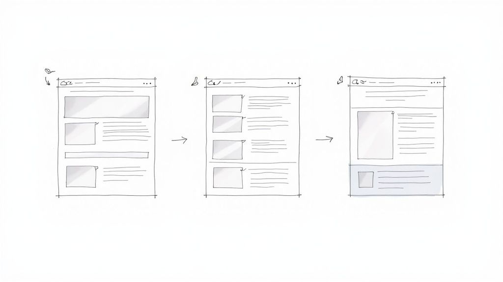
If you want to get good at visual hierarchy, you first need to get familiar with the tools designers use to point the user's eye where it needs to go. These aren't abstract, artsy rules; they're practical, everyday techniques that create a clear path for your visitors. Think of them as the visual grammar of your website—each one has a specific job in telling your story well.
When you start arranging these elements with intention, you stop just placing stuff on a page and start actually guiding people through an experience. This thoughtful approach gets your most important messages seen first, making the user's journey feel completely natural and effortless. Let's break down these essential building blocks.
Size and Scale Signal Importance
The easiest and most effective tool you have is size. It's just human nature—our brains are wired to notice bigger things first and automatically assume they're more important. A huge, bold headline doesn't just ask for attention; it shouts, "Look at me first!"
On the flip side, smaller elements tend to fade into the background, letting the user know they're secondary details or extra info. This concept of visual weight is how you establish a clear pecking order for your content without ever having to write a word.
This infographic gives a great overview of how a solid visual hierarchy can lead users, drive more clicks, and just make the whole experience better.
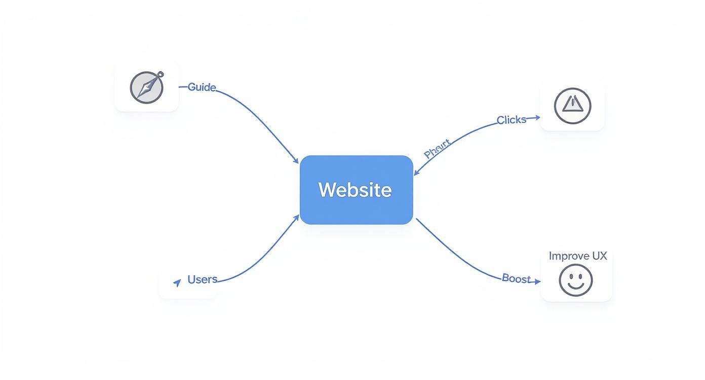
It's a good reminder that a well-structured website isn't just for show. It's a hard-working tool that directly helps you hit your business goals.
Color and Contrast Draw the Eye
Color and contrast are your go-to tools for creating focal points and encouraging people to take action. Bright, bold colors naturally pop off the screen and pull the eye toward them. There's a reason call-to-action (CTA) buttons are almost always a vibrant color that stands out from the rest of the page—it makes them impossible to ignore.
But contrast is more than just color. It’s the difference between any two things on the page. It could be a dark box on a light background, a rough texture on a smooth surface, or a sleek, modern font paired with a classic one. High contrast grabs attention and makes key information, especially text, much easier to read and access. If you want to dive deeper, our guide to website design best practices covers readability in much more detail.
Typography Creates Structure
Typography is way more than just picking a pretty font. It’s how you build a clear structure for your information by playing with different font sizes, weights (like bold or light), and styles. A well-thought-out typographic hierarchy makes your content scannable and way easier to digest.
I like to think of it in three levels:
Primary Level: Your main headlines (H1, H2). These should be the biggest and boldest, grabbing attention right away.
Secondary Level: Subheadings (H3, H4). They're a bit smaller and are perfect for breaking up long sections of text, guiding readers through the page.
Tertiary Level: Your body text. This is the smallest and uses a regular weight, since it needs to be comfortable to read for longer stretches.
A strong typographic scale acts as a silent tour guide for your text. It tells readers what’s most important, what’s a supporting point, and what are the finer details, all before they’ve read a single word.
Whitespace Provides Breathing Room
Last but not least, the empty space between your elements is just as important as the elements themselves. This is often called whitespace or negative space, and it's anything but wasted. It's a powerful design tool that cuts down on clutter and actually helps people understand what they're looking at.
Whitespace works in two ways. First, it groups related things together. When you place elements close to each other, our brains automatically see them as a single, related unit. Second, it creates separation. Giving important things like CTAs or headlines some breathing room helps them stand out and get noticed. Good use of whitespace makes your entire layout feel more balanced, organized, and professional.
How Users Actually Scan Websites
https://www.youtube.com/embed/1g2cs5HwTRs
To get visual hierarchy right, you have to accept one hard truth about how people use the internet: they don't read, they scan. They’re on a mission, hunting for a specific piece of information, and their eyes follow very predictable patterns while they search.
Designing with these patterns in mind is like leaving a trail of breadcrumbs for your visitors. Instead of making them work to understand your layout, you’re guiding them naturally. It makes the whole experience feel intuitive, which is the secret sauce of great web design.
The F-Pattern for Content-Heavy Pages
When a page is loaded with text—think blog posts, news articles, or search results—people almost always scan in an F-Pattern. Eye-tracking studies have shown this time and time again.
A user's gaze shoots across the top of the page, then drops down the left side, occasionally making shorter horizontal scans when something catches their eye. It looks just like the letter 'F'.
To work with this behavior, not against it, you should:
Put your most important headline right at the top. This forms the first horizontal bar of the "F."
Line up your subheadings, bullet points, and important keywords along the left side. These become signposts along the vertical stem of the "F."
Front-load your sentences and paragraphs with the good stuff. Get straight to the point.
Knowing how to apply this is a game-changer, especially if you're working on a blog and looking for practical blog tips for beginners.
The Z-Pattern for Simpler Layouts
For pages with less text and more visual breathing room, like a landing page or a simple homepage, users tend to follow a Z-Pattern.
Their eyes move from the top-left to the top-right, slice diagonally down to the bottom-left, and then finish by scanning across to the bottom-right. It’s a clean, simple "Z" shape.
The Z-Pattern is the natural path your eyes take across an uncluttered space. It connects the four main corners of the page, giving you four prime spots to place your most important elements.
This pattern gives you a simple but powerful roadmap for your layout. You can place your logo in the top-left, a secondary call-to-action (like a "Login" button) in the top-right, guide their eye with an interesting image along the diagonal, and place your primary call-to-action ("Sign Up Now!") in the bottom-right, right where their journey ends.
Seeing Visual Hierarchy in Action: Real-World Examples
It's one thing to talk about the principles of visual hierarchy, but it's another to see them in the wild, expertly woven into the websites we use every day. To truly get a feel for how these concepts create compelling user experiences, let's break down how a few top-tier brands put them to work.
By looking at these successful designs, we can move from abstract rules to concrete strategies. You'll see how size, color, and spacing aren't just aesthetic choices—they're powerful tools that communicate, persuade, and convert. These examples show how a clear visual path makes a site feel less like a puzzle and more like a conversation.
Apple: The Master of Product Focus
Apple's design philosophy is famously minimalist, but that simplicity is anything but lazy. They lean heavily on a strong visual hierarchy to make their products the undeniable star of every page. Their layouts are a masterclass in using scale and negative space to forge a single, powerful focal point. It's like they're guiding your eyes with a laser pointer.
Take a look at this product page—it perfectly captures their "product-first" approach.
The massive, crisp product image immediately takes center stage, leaving no doubt about what matters most. The headline is big and bold, but it plays a supporting role. And that little "Buy" button? Its high-contrast color makes it pop just enough to be noticed without stealing the spotlight from the product itself.
The New York Times: Taming the Chaos
News sites face a completely different beast: how do you organize a mountain of information without making readers feel like they're drowning in text? The New York Times nails this with a sophisticated typographic hierarchy that brings order to the chaos and guides users through incredibly dense content.
Here’s how they pull it off:
Font Size and Weight: The main story headline is always the biggest and boldest thing on the page, establishing a clear pecking order. Section headlines and article summaries are progressively smaller, telling your brain what to read first, second, and third.
Whitespace: They use generous spacing between articles and sections. This breathing room acts as a silent organizer, helping you mentally chunk related content together and scan the page without getting lost.
Subtle Color Cues: The design is mostly black and white, but color is used strategically for section labels or links. This draws the eye to key navigation points without adding distracting visual noise.
This structured approach lets readers quickly scan the day's biggest stories and dive deeper into what interests them. It’s a design built on respecting the user's time.
Great visual hierarchy makes complex information feel simple. It builds a clear path through the content, allowing users to find what they need without conscious effort, turning potential chaos into a seamless reading experience.
From Apple's bold simplicity to the structured complexity of a major news outlet, these examples reveal a universal truth: a strong visual hierarchy is the backbone of any great website. It's crucial to plan this flow from the very beginning. In fact, learning how to create website mockups is a great way to map out your user's journey before writing a single line of code. Think of these real-world designs as your blueprint for creating your own intuitive and effective layouts.
Designing for All Screens and All People
A brilliant visual hierarchy can't just look great on your big office monitor. It has to perform flawlessly for everyone, everywhere, on every kind of device. This is where two huge concepts in modern design come into play: accessibility and responsive design. The good news is that when you build a clear, logical hierarchy, you're already halfway to creating a more inclusive and adaptable experience.
Thinking about accessibility isn't just about ticking boxes to meet legal guidelines; it's about making sure every person can understand and use what you’ve built. A strong visual hierarchy is a massive part of that. For example, creating high contrast between your text and its background isn't just a stylistic choice to make things "pop"—it's an absolute necessity for someone with low vision.
In the same way, using a clear typographic scale does more than guide the eye. It gives screen readers a map to follow, allowing them to announce headings and paragraphs in the right order. This structural clarity ensures your message lands exactly as you intended, no matter how someone is accessing your site. If you want to go deeper on this, our post on what is web accessibility is a great place to start.
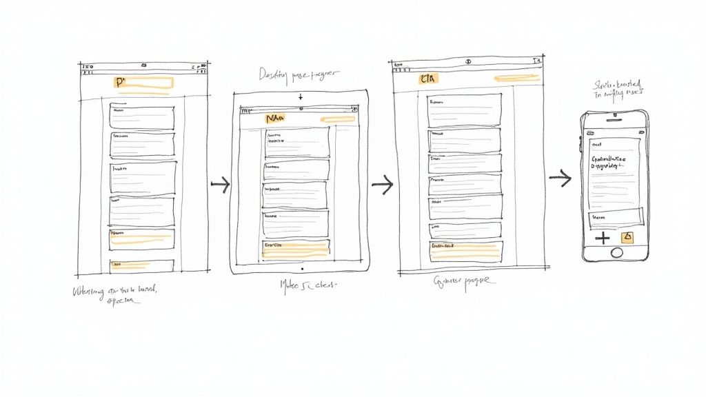
How Hierarchy Adapts to Mobile
When a design moves from a wide desktop to a narrow phone screen, your visual hierarchy has to be smart enough to follow. That three-column layout from your desktop view needs to gracefully stack into a single, scrollable column. The real trick is maintaining that same sense of importance without all the horizontal space to play with.
It all comes down to careful planning. You have to make sure your main headline still commands attention at the top, followed by the most critical info and a clear call-to-action.
To make sure your hierarchy works beautifully on mobile, you need to:
Be Ruthless with Priorities: Pinpoint the absolute most important element on the page. On a small screen, that’s what users need to see first. No exceptions.
Scale Everything in Proportion: As the screen shrinks, your headlines, buttons, and images can't just get smaller randomly. They must resize in a way that keeps their relative importance intact.
Make Touch Targets Bigger: Buttons and links need to be easy to tap with a thumb. This usually means giving them more visual weight and breathing room than they get on a desktop, where you have the precision of a mouse pointer.
A responsive design doesn't just shrink your website; it thoughtfully reframes it. The goal is to deliver the same clear, guided experience on a four-inch screen as you do on a twenty-four-inch monitor.
At the end of the day, designing with accessibility and multiple devices in mind makes your visual hierarchy in web design stronger. It forces you to focus on what's truly essential, leading to a more robust, flexible, and welcoming experience for every single visitor. By building a hierarchy that is both adaptable and accessible, you make sure your message is always effective, no matter what.
How AI and Personalization Are Shaping the Future
Visual hierarchy used to be a static blueprint, a fixed map laid out by a designer. Today, it’s becoming a living, intelligent system that adapts in real time to every single person who visits your site. This evolution is powered by the combination of artificial intelligence (AI) and deep personalization, and it's completely changing how we guide a user's attention.
Think about an e-commerce store that subtly rearranges its layout based on your past purchases, making the products you're most likely to want pop. Or a news site that reorders its headlines to match your reading habits, essentially creating a custom front page just for you. This is where visual hierarchy in web design is heading—it’s personal, predictive, and incredibly powerful.
From Static Layouts to Dynamic Experiences
For years, designers created one visual hierarchy for the "average" user—a concept that rarely fits anyone perfectly. Now, AI-powered tools can analyze user data in real-time, looking at everything from click patterns to browsing history, and then optimize the layout on the fly. This data-first approach ensures the most relevant content and calls-to-action are always front and center for each individual.
The business impact is massive. Companies that lean into advanced personalization see up to 40% higher revenue growth than their slower-moving competitors. That kind of lift happens when you create experiences that resonate with people on a personal level. You can see more on how these shifts are playing out in this graphic design trends report.
The Role of AI in Design Implementation
Getting this right doesn't have to be impossibly complex. New tools are making sophisticated, data-driven design more accessible than ever. For instance, platforms like Alpha use AI not just to analyze user behavior, but to help create the initial design itself. You can feed the AI examples of layouts you like, and it will generate a well-structured hierarchy to start with, ready for you to fine-tune and personalize.
Visual hierarchy is transforming from a one-size-fits-all map into a personalized GPS for every user, constantly recalculating the best route to what they need.
As AI's role in creative fields grows, understanding the evolving discussion around AI art vs human art is becoming more important for designers. This shift isn't just a trend; it's pushing visual hierarchy to be more effective and personal, turning it into a major driver of business growth through highly tailored user engagement.
Got Questions? Let's Talk Visual Hierarchy
Even when you've got the principles down, putting visual hierarchy into practice can throw you a few curveballs. It's one thing to know the theory, but another thing entirely to apply it on a live project.
Let's dig into some of the most common questions and sticking points that pop up for designers in the real world.
My Design Looks "Flat." How Do I Fix It?
We've all been there. You create a design, but it just feels... flat. Nothing really stands out, and everything seems to be shouting for attention at the same volume. This happens when there's no clear visual path for the user's eye to follow because too many elements have the same visual weight.
The fix? You have to be decisive.
Start by asking one simple question: "If my visitor could only do one thing on this page, what would it be?" Whatever your answer is, that’s your star player. Make it noticeably bigger, give it a punch of color, or use bold typography to make it pop.
From there, work your way down. What's the second most important thing? The third? Scale them down in visual importance. A little bit of extra white space around your main call-to-action can also work wonders, instantly giving it the spotlight it deserves.
A flat design is often a sign of timidness. Don't be afraid to make a strong statement. A great hierarchy is all about confidently telling the user what matters most by giving it the visual dominance it needs.
Can a Minimalist Design Still Have a Strong Hierarchy?
Absolutely. In fact, minimalism demands a strong visual hierarchy to be effective. When you have fewer elements on the page, every single choice about size, color, and spacing carries much more weight.
Think about it: in a clean, uncluttered layout, a single button with high contrast or an oversized, isolated headline becomes incredibly powerful. It's impossible to miss.
In minimalist design, whitespace is your best friend. It’s not just empty space; it’s an active tool you can use to group related elements together and create a clear separation between your primary goal and everything else. Stripping a design down to its essentials forces you to be laser-focused on the user's journey, making it a fantastic way to master the art of hierarchy.
Ready to skip the guesswork? Alpha uses AI to build websites with a powerful, effective visual hierarchy from the get-go. Just drop in a link to a site you love, and our AI will generate a professional layout you can tweak and launch in minutes. Start building for free with Alpha.
Build beautiful websites like these in minutes
Use Alpha to create, publish, and manage a fully functional website with ease.