


How to Create Website Mockups People Actually Love
Learn how to create website mockups that bridge the gap between idea and reality. Our guide covers tools, principles, and developer handoff.
Build beautiful websites like these in minutes
Use Alpha to create, publish, and manage a fully functional website with ease.
Let’s cut right to it. White space is the intentional empty area you leave between design elements. Think of it like the silence between notes in a song—it’s what makes the music feel powerful and clear.
This "negative space," as it's often called, isn't just wasted real estate. Far from it. It's an active, strategic tool that gives your content room to breathe, guides your visitor’s eye, and makes your entire website feel more polished and professional.
The Foundation of Clean Web Design

Picture walking into two different rooms. The first is cluttered, with stuff piled everywhere. It feels chaotic, and you don't know where to look. The second is clean and organized, with clear pathways and a sense of calm. You immediately know where to focus.
White space does the exact same thing for your website visitors. It's the unmarked space around your text, images, buttons, and menus. By deliberately leaving these areas empty, you build a visual hierarchy that tells users, "Hey, look here first." This simple act of adding "nothing" is a cornerstone of great design.
To quickly grasp the main ideas, this table breaks down the essentials of white space.
White Space Fundamentals at a Glance
Concept | Description | Primary Benefit |
|---|---|---|
White Space (Negative Space) | The unmarked, empty areas between and around design elements. | Creates visual breathing room and reduces clutter. |
Micro White Space | The small gaps between letters, lines of text, and list items. | Directly improves text readability and scannability. |
Macro White Space | The large empty spaces between major layout sections (e.g., header, sidebar, content blocks). | Guides the user's eye across the page and establishes a clear hierarchy. |
This table provides a snapshot, but understanding why this matters is key to creating designs that truly work.
Why This 'Emptiness' Is a Strategic Asset
Using negative space effectively is a core part of great user experience. To see how it fits into the bigger picture, it’s worth reviewing the fundamentals of user experience design. When you manage space well, you unlock some serious benefits:
Improved Readability and Comprehension: Just giving your text adequate breathing room can boost user comprehension by up to 20%. People absorb information better when it isn't crammed together.
Enhanced User Focus: It naturally draws the eye toward important elements, like your call-to-action buttons or key headlines.
A More Sophisticated Aesthetic: A clean, uncluttered layout simply feels more premium and trustworthy to visitors.
White space is not blank space. It’s a powerful design element that shapes perception, guides attention, and ultimately drives user action by reducing cognitive load.
Learning to embrace this "emptiness" is essential for building modern, effective websites. You can see this approach in practice when you explore the core tenets of minimalist web design principles. Ultimately, white space is the art of using absence to create presence—turning a crowded page into a clear and compelling journey for your audience.
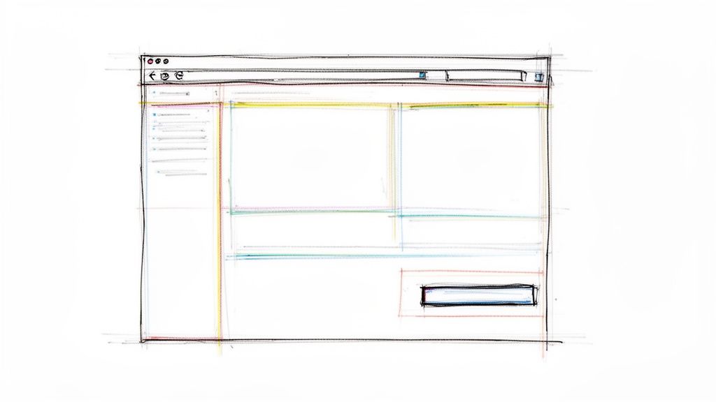
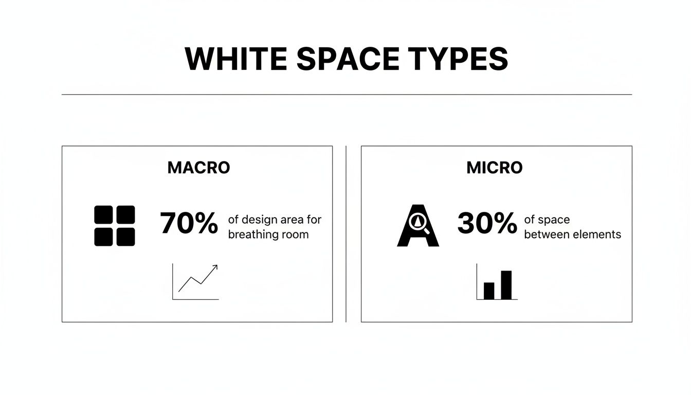
Understanding Micro and Macro White Space
To really get a handle on using white space, you need to know it comes in two flavors: macro and micro. It helps to think of it like building a house. Macro white space is the overall floor plan—the large, open areas like rooms and hallways. Micro white space is how you arrange the furniture and decorations inside each room. You need both for the house to feel livable and look great.
Macro white space is all about the big gaps, the major breathing room between the main parts of your page. We're talking about the space between your navigation bar and the hero image, the wide margins on either side of your content, or the separation between different sections as you scroll down. It’s the "big picture" spacing.
This is what gives a design that clean, uncluttered, and professional feel. It guides the eye from one part of the page to the next, preventing everything from blurring into one overwhelming mess. When you get macro spacing right, you establish a clear visual hierarchy, helping visitors instantly understand what’s important without even thinking about it.
The Finer Details of Micro White Space
If macro space is the floor plan, micro white space is all about the details up close. This is the small-scale spacing that makes the difference between content that’s a chore to read and content that’s effortless. It directly impacts readability and comprehension.
Micro white space covers the essentials like:
Line Spacing (Leading): This is the vertical breathing room between lines of text. Getting this right is crucial for preventing a "wall of text" effect and making reading feel smooth.
Letter Spacing (Kerning/Tracking): We're talking about the tiny gaps between letters and words. Proper adjustments here stop text from feeling either cramped or disconnected.
Paragraph Margins: The space between paragraphs is your best friend for breaking up long-form content into bite-sized, digestible pieces.
Good design requires a balance of both. Macro white space creates a sophisticated, organized layout, while micro white space ensures the content within that layout is clear, legible, and effortless to consume.
By mastering both types, you stop just filling a page with stuff and start intentionally guiding your visitor’s experience. Macro creates the path, and micro makes sure that path is easy and enjoyable to walk. Nailing this balance is a true sign of professional web design—it shows you’re thinking not just about looks, but about how people actually use and interact with what you’ve built.
How White Space Directly Boosts Website Conversions
Good design is about more than just looking pretty—it’s about getting results. When you use white space strategically, you’re not just creating an elegant layout; you’re actively guiding your visitors toward a specific goal.
Think about your most important call-to-action, like a "Buy Now" or "Sign Up" button. By giving that button plenty of breathing room, you make it stand out. It’s impossible to miss. This simple act of separation naturally draws the eye, which can dramatically increase the chances of getting that all-important click.
We’ve all been there: you land on a page with a form to fill out, and it's a mess. The fields are crammed together, the text is tiny, and it just feels overwhelming. What do you do? You leave. Generous spacing between form fields and sections makes the whole process feel less like a chore and more like a simple, manageable task. That’s how you turn a potential bounce into a valuable new lead.
Focusing Attention on What Matters
A clean, well-spaced layout helps people grasp what you're offering almost instantly. When your key benefits and features aren't all shouting for attention at once, the message lands with clarity and impact. This builds trust and gently nudges visitors down the path to conversion.
To do this right, you need to master both macro and micro white space. They work together to shape the entire user journey.
As you can see, macro space is like the architecture of your page—the large, structural gaps. Micro space is all about the fine-tuning—the spacing that makes sure every detail is crisp, legible, and easy to interact with.
By decluttering the user's path, you are not just improving aesthetics; you are actively removing friction from the conversion process. A clear path leads to a confident decision.
This isn't just a design theory; the numbers back it up. Research has found that a staggering 11% of a site's conversion rate is directly tied to its readability—something white space is a master at improving.
In one analysis, designers saw a 150% increase in visitor interaction just by adding more space between a banner and the content below it. The result? A nearly 20% lift in the overall conversion rate. After a few more tweaks, that same page’s conversion rate jumped from 6% to over 15%, boosting lead revenue by more than 70%.
From Browsers to Buyers
At the end of the day, white space is about respecting how the human brain works. It prevents cognitive overload, directs focus where it needs to be, and makes your message easier to absorb. Getting these principles right is fundamental to building an online presence that not only looks great but also performs. We cover these ideas in-depth in our complete guide to conversion rate optimization strategies.
The link between smart design and business growth is crystal clear. For a deeper dive, you can explore other strategies to improve website conversion rates. By prioritizing clarity, you can turn casual visitors into loyal customers—proving that sometimes, the most powerful thing in your design is what you leave out.
Common White Space Mistakes That Hurt Your Website
Knowing the theory is one thing, but seeing how it goes wrong in the real world is where the learning really clicks. You can have the best content and a killer offer, but a few common white space slip-ups can completely derail your design, damaging the user experience and making your site look amateurish.
Let's break down the most common pitfalls I see all the time. Spotting them is the first step to fixing them.
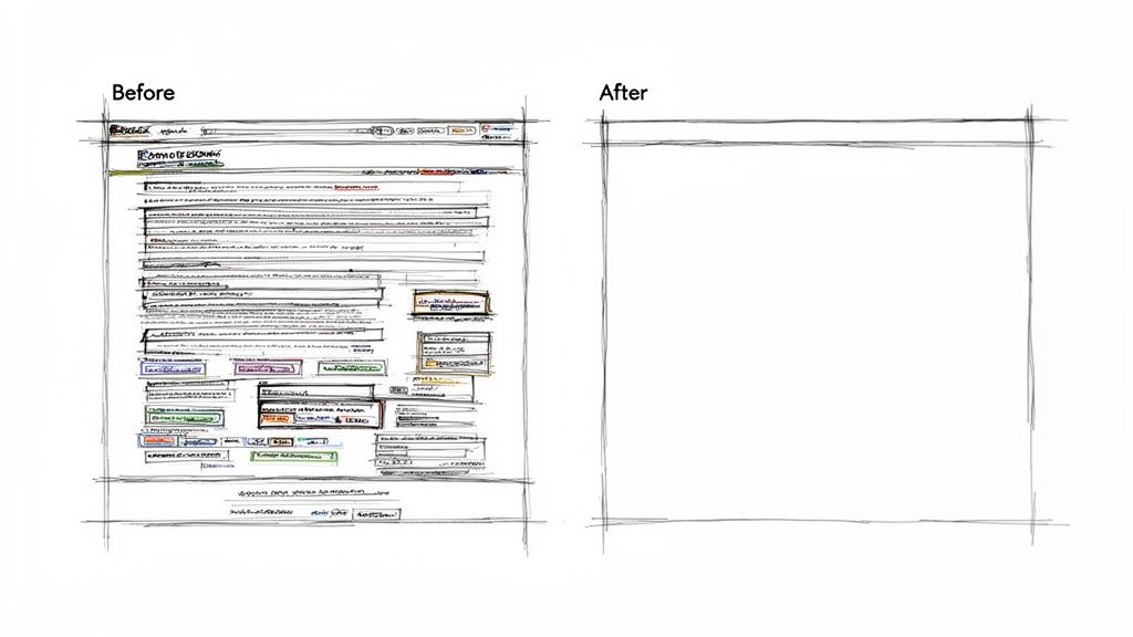
The biggest offender is cramming everything "above the fold." There’s a persistent myth that users won't scroll, which leads designers to stuff every last bit of information into that initial view. The result? A cluttered, chaotic mess that actually makes people want to leave. Trust me, people know how to scroll—what they won't tolerate is visual overload.
Another classic mistake is inconsistent spacing. When the gaps between your headlines, images, and paragraphs feel random, the whole design falls apart. It looks messy and unintentional, and worse, it makes it impossible for visitors to understand how different pieces of content relate to each other.
Avoiding Walls Of Text And Disconnected Layouts
Ever landed on a page and been greeted by a massive, solid block of text? That’s what happens when you neglect micro white space. Specifically, not giving your text enough line spacing (also called leading) is a surefire way to create an intimidating "wall of text." Most people won't even try to read it; they'll just skim or leave.
But you can also swing too far in the other direction. Using way too much white space between related items—like a headline and its introductory paragraph—can make the layout feel fragmented and broken. It leaves users wondering if the content is even connected or if something failed to load properly.
The goal of white space is to create clarity and connection, not isolation. Effective design uses negative space to group related items and separate unrelated ones, guiding the user's eye logically through the page.
To help you spot these issues on your own website, I've put together a quick cheat sheet. Think of it as a diagnostic tool for your design.
Common Mistakes vs Best Practices
This table breaks down some of the most frequent errors I encounter and provides a straightforward solution for each one.
Common Mistake | Why It Fails | Best Practice Solution |
|---|---|---|
Cluttered CTA Area | A call-to-action button gets lost in the noise, which kills your click-through rate. | Isolate the CTA button with a generous cushion of surrounding white space to make it pop. |
Dense Text Blocks | It's visually exhausting and makes users immediately tune out your message. | Increase line height (leading) for readability and break content into short, digestible paragraphs. |
Inconsistent Margins | The layout looks sloppy, disorganized, and unprofessional. | Establish and stick to a consistent spacing system (e.g., using multiples of 8px) for all elements. |
No Visual Hierarchy | Everything competes for attention, confusing users about where to look first. | Use macro white space to create clear sections and put a spotlight on the most important information. |
By consciously avoiding these mistakes, you’re already well on your way to creating a cleaner, more professional, and higher-converting website. It all comes down to being intentional with your empty space.
Getting White Space Right With Modern Web Tools
Mastering the art of white space used to feel like a secret handshake among seasoned designers. Thankfully, you don't need years of design school or a deep dive into complex theory anymore. Modern web tools make it incredibly simple to put these powerful principles into practice, even if you’re just starting out.
You no longer have to guess what "good spacing" looks like. AI-powered website builders like Alpha are built with these exact principles baked right in. They come loaded with templates already configured with balanced macro and micro white space, all based on solid user experience research. Your website starts with a professional, clean foundation from the get-go.
This completely sidesteps the tedious, pixel-pushing adjustments that used to eat up hours. Instead of nudging elements around, you can focus on your content, knowing the underlying structure is already set up for readability and conversions. It’s like having a professional designer guiding your every move.
Leverage What Already Works
One of the smartest ways to land on a great layout is to learn from the best. Alpha takes this a step further by letting you import the layout of any website you admire just by pasting its URL.
Imagine finding a competitor's site with a clean, high-converting design. With this feature, the AI analyzes its structure—the margins, padding, and overall use of white space—and applies a similar framework to your own site. It’s not just a time-saver; it’s a strategic shortcut to a proven design.
This is a huge advantage for entrepreneurs and small business owners who need professional results without the wait. Of course, before you build, it’s always wise to map out a clear structure. Our guide on how to create wireframes can help you plan your layout effectively. By starting with a successful layout, you ensure your site not only looks polished but is built for performance from day one.
The Impact of AI-Driven Design
It's not just about looks; strategic white space is proven to reduce cognitive load and guide a user's attention exactly where you want it. Research from the Nielsen Norman Group shows that clean, minimalist designs can boost conversions and engagement by up to 67% compared to cluttered ones. E-commerce sites often see a 35% increase in sales, while lead generation pages can capture 42% more qualified leads. For startups and solopreneurs building with Alpha, that’s a massive win. You can dig deeper into how simple branding increases conversion rates on dot2shape.com.
By using an AI tool that automatically optimizes layouts with white space, you are essentially cloning the success of top-performing sites without any manual effort.
This intelligent approach ensures every element on your page has just the right amount of breathing room. The result is a website that feels intuitive, trustworthy, and is engineered to turn visitors into customers. It's the perfect blend of sophisticated design principles and accessible technology, making professional-grade web design available to everyone.
White Space Isn’t Empty—It’s a Powerful Business Tool
Let's get one thing straight: white space isn't just "empty" space on a page. Thinking about what is white space in design means seeing it as a strategic asset. It's the invisible scaffolding that gives your brand a premium, organized, and trustworthy feel.
When you use spacing well, you’re doing more than just making things look pretty. You're directly influencing your bottom line by making your site easier to use, keeping people engaged, and encouraging them to stick around. That intentional clarity is what helps turn a casual visitor into a paying customer.
Think of white space as an investment, not a cost. Every pixel you leave empty is working hard to create a cleaner experience, deliver a clearer message, and ultimately, drive more conversions.
And this isn't just a design theory; the data backs it up. Right now, 63% of users prefer simple, minimalist designs that feature plenty of white space. On top of that, 72% of marketers report a jump in conversions after adopting more spacious layouts.
If you’re building your site with a tool like Alpha, you're already a step ahead, as the AI is built to create sites with this kind of optimized spacing from the get-go. With 78% of users saying they're more likely to return to a site that’s easy to navigate, features like Alpha’s URL-copy tool are incredibly handy for instantly replicating elegant, proven designs.
For a deeper dive into these trends, it's worth checking out these key web design statistics.
Frequently Asked Questions About White Space
Even after you get the hang of using white space, a few questions tend to pop up again and again. Let's clear those up so you can design with confidence and avoid some common pitfalls.
Think of this as the final check-in to make sure you've got these concepts down cold.
Can You Have Too Much White Space in a Design?
You absolutely can. While white space is a designer's best friend for creating focus, going overboard can make your page feel disconnected, sparse, or just plain empty. When elements are pushed too far apart, users might not see the relationship between them, leading to confusion.
This is often called "wasted space"—the point where helpful breathing room turns into a confusing void. The trick is to find that sweet spot where elements have enough space to stand out, but still feel visually related to guide the user's eye naturally.
Does White Space Have to Be White?
Nope! This is probably the biggest misconception about the term, which is really just a holdover from old-school print design. "White space" simply refers to the empty, unmarked space on a page.
A better, more accurate term is negative space. It can be any color, a pattern, a gradient, or even a background photo. Its job is always the same: to give your content room to breathe and help the user make sense of what they're seeing.
How Important Is White Space for Mobile Design?
It's not just important—it's critical. On a small screen, clutter is the enemy. Cramming too much into a tiny space is a recipe for frustration, forcing users to pinch and zoom just to read a sentence or tap a button. Your bounce rate will thank you for avoiding this.
On mobile, smart use of white space does a few key things:
Improves Tap Accuracy: More space around buttons and links means fewer accidental taps on the wrong thing. It’s a simple way to make your site feel less frustrating to use.
Boosts Readability: It breaks up text into digestible chunks, making content much easier to scan and read on the go.
Guides the User: It creates a clear path through your content, helping people find what they need without feeling overwhelmed by the interface.
A clean, well-spaced mobile design isn't a luxury; it's fundamental to creating an experience that people will actually stick around for.
Ready to build a website where the white space is balanced perfectly from the get-go? With Alpha, you can launch a stunning, high-performing site in hours. Use our AI-powered templates or import the layout of a site you love to get a proven design instantly. Start building for free.
Build beautiful websites like these in minutes
Use Alpha to create, publish, and manage a fully functional website with ease.