How to Create Website Mockups People Actually Love
Learn how to create website mockups that bridge the gap between idea and reality. Our guide covers tools, principles, and developer handoff.
Build beautiful websites like these in minutes
Use Alpha to create, publish, and manage a fully functional website with ease.
Before you can build a brand guide, you need to know what goes into one. At its core, this document is a comprehensive manual for your brand's visual and verbal identity. It specifically needs to cover your logo usage, color palette, typography, voice, and imagery. Think of it as distilling your brand's entire personality into a practical playbook that keeps every piece of content consistent and instantly recognizable. This is the bedrock of a strong, trusted brand.
Why Most Brand Guidelines Fail
Let's be honest. Most brand guides are destined to become digital dust bunnies, forgotten in a shared drive somewhere. They fail not because they're poorly designed, but because they’re treated like a restrictive rulebook instead of an empowering tool for growth. We're going to change that.
The real problem these documents solve is inconsistency. When your message, visuals, and tone feel different from one platform to another, it creates a subtle but very real confusion for your audience. That disconnect slowly chips away at the trust you’re working so hard to build.
Moving from Rules to a Playbook
A great brand guide is a small business’s secret weapon. It’s not about stifling creativity; it’s about giving your team a clear framework so they can create with confidence and speed. When everyone understands the core ingredients, they can innovate within the brand's identity, not outside of it.
This is exactly where so many companies stumble. There's a huge gap between creating guidelines and actually using them. It turns out that only 30% of brands have guidelines that are well-known and easy to find across the company. The fallout is predictable: nearly half of all brands admit to publishing off-brand content each year, and a staggering 77% have released materials that just don't align with their identity. You can discover more about the impact of brand consistency from recent industry stats.
The purpose of a brand guide isn't to say "no." It's to give your team a confident "yes" when they ask, "Does this feel like us?" It turns subjective opinions into objective, brand-aligned decisions.
This guide is designed to reframe that entire process. We’ll walk through creating brand guidelines that are practical, accessible, and actually built for daily use.
Here’s a quick overview of what we'll be covering. This table breaks down the key components you'll need to define to create a truly effective brand playbook.
Your Brand Guidelines Playbook at a Glance
Component | What It Defines | Why It Matters |
|---|---|---|
Logo Usage | Clear rules for logo placement, size, color variations, and what not to do. | Protects your most valuable visual asset and ensures it’s always recognizable. |
Color Palette | Your primary, secondary, and accent colors with their specific hex codes. | Creates emotional connection and makes your brand instantly identifiable at a glance. |
Typography | Your brand's official fonts for headings, body text, and other uses. | Ensures readability and communicates your brand's personality, from bold to elegant. |
Imagery & Photos | The style of photos, illustrations, and graphics that represent your brand. | Creates a consistent visual mood and helps your audience see themselves in your brand. |
Voice & Tone | How your brand speaks—the words you use, your personality, and your attitude. | Builds a relationship with your audience by making your brand sound human and familiar. |
By the end, you'll have a central source of truth for your brand. Every email, social post, and website update will work together to build a powerful, cohesive experience that connects with customers and drives real growth.
Establishing Your Core Visual Identity
This is where the rubber meets the road—where the abstract idea of your brand gets a face. A strong visual identity does more than just look pretty; it’s about forging an instant, gut-level connection with your audience. Think of it as the consistent uniform your brand wears, making it instantly recognizable in a sea of competitors.
To get there, we need to nail down three core pillars: your logo, your color palette, and your typography. These aren’t just separate elements; they're a system. Getting them to work together harmoniously is non-negotiable, as they’ll show up on everything from your website and social feeds to your business cards and invoices.
Defining Clear Logo Usage Rules
Your logo is the most potent, concentrated shot of your brand. To keep it that way, you need to set some firm, non-negotiable rules for how it’s used. Without them, your logo gets stretched, squished, or slapped on a busy background where it disappears—and your professional image erodes just as quickly.
Start with the absolute must-haves for your guidelines:
Clear Space: This is the logo’s personal bubble. It’s an invisible exclusion zone that prevents other text or graphics from crowding it. A common trick is to use a part of the logo itself, like the height of a letter, to measure the required "breathing room" on all sides.
Minimum Size: How small can your logo shrink before it turns into an unreadable smudge? You need to define this for both digital (in pixels) and print (in inches or millimeters). This is crucial for things like website favicons or tiny social media profile pics.
Color Variations: You need a version of your logo for every occasion. Specify the approved variations, which typically include the full-color primary logo, a solid black version, and a solid white (or "knockout") version for use on dark backgrounds. Sometimes, a single-color version using one of your primary brand colors is also useful.
This diagram shows how a complete brand playbook is built on these foundational pieces—logo, color, and voice—which all work together to drive consistency.
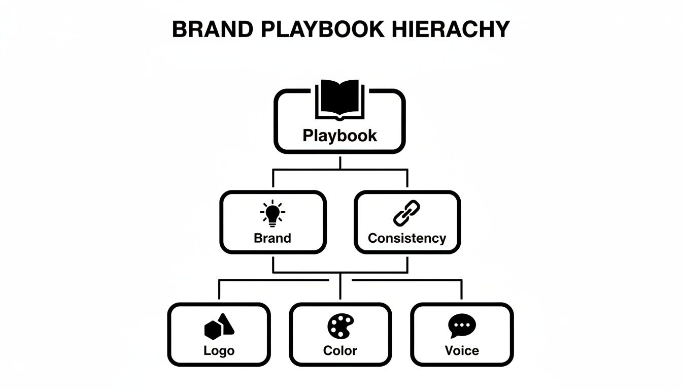
It’s a great reminder that tangible assets like your logo are the building blocks holding up the entire brand structure.
Building Your Brand Color Palette
Color is pure emotion. It telegraphs a feeling and a personality far quicker than words ever could. Think about it—you know Tiffany & Co. by its signature blue and Target by its unmistakable red. A consistent color palette makes your brand just as memorable.
Keep your palette simple but versatile. A solid structure usually includes:
Primary Colors: These are your workhorses. Pick one or two core colors that will dominate your brand's look and feel.
Secondary Colors: Think of these two or three colors as your supporting cast. They should complement the primary colors and are great for accents, call-to-action buttons, or subheadings.
Neutral Colors: You'll need these for backgrounds and body text. We're talking about your go-to shades of grey, beige, or a soft off-white.
For every single color, you must provide the exact color codes to get it right every time. Make sure to include HEX codes for the web, RGB values for digital screens, and CMYK values for anything that will be printed.
Your color palette isn't just a handful of pretty shades; it's a powerful business tool. The right colors can boost brand recognition by up to 80%.
Choosing Your Brand Typography
Typography is essentially your brand’s voice in written form. Fonts have distinct personalities—they can feel modern and sleek, timeless and classic, or fun and playful. The fonts you choose should be a direct reflection of your brand's character.
To make smart choices, it helps to look at some actionable small business branding tips that can help you stand out. This will ensure your decisions aren't just about what looks good, but what works strategically.
In your guidelines, the key is to create a clear typographic hierarchy. For most brands, two font families are plenty:
A Headline Font: This is for your main titles (H1, H2). It needs to grab attention and set the tone.
A Body Font: This is for paragraphs and longer blocks of text. Its number one job is readability. It should be clean and easy on the eyes.
Don't just name the fonts; get specific. Define the font family (e.g., Montserrat), weights (e.g., Bold for headlines, Regular for body), sizes, and even line spacing. This level of detail removes all the guesswork for anyone creating content for you.
If you want to go deeper, you can see how all these pieces fit together in our guide on what is brand identity design.
The need for this kind of visual consistency is backed by hard numbers. People can form an impression of a logo in just 10 seconds, and 93% of consumers say visual appearance is the key factor in their purchasing decisions. With a staggering 70% of brands admitting to publishing off-brand content, simply having and enforcing these rules gives you a huge competitive edge.
Defining a Brand Voice People Want to Hear
Your visuals give your brand a face, but your voice gives it a personality. This is the character that comes through in every headline, email, and social media post. It’s what can turn a simple transaction into a genuine connection with a customer.
Lots of people use "voice" and "tone" interchangeably, but they're fundamentally different. Getting this distinction right is the first real step to building a verbal identity that actually connects with people.
Brand Voice is your brand’s fixed personality. It’s who you are at the core—consistent and unchanging. Think of it this way: are you the expert guide, the witty friend, or the warm supporter? That core identity shouldn't shift.
Brand Tone is the emotional inflection you add to that voice depending on the situation. You wouldn't use the same tone to announce an exciting new feature as you would to address a customer's problem. Your tone adapts; your voice is constant.
Finding Your Voice with a Simple Framework
Trying to define a brand personality from scratch can feel a bit abstract and overwhelming. A surprisingly powerful and practical way to start is the “We are X, but not Y” framework. This exercise forces you to make clear choices about who you are by defining who you aren't.
This simple contrast helps add nuance and keeps your brand voice from becoming a one-dimensional caricature.
Here are a few examples to get the gears turning:
We are confident, but not arrogant.
We are playful, but not childish.
We are authoritative, but not intimidating.
We are empathetic, but not saccharine.
Set a timer for 15 minutes and come up with five to seven of these statements for your brand. This simple list becomes an incredibly useful gut-check for anyone who writes for you down the line.
Your brand voice is the common thread that ties all your communication together. It ensures that no matter who on your team is writing, everything sounds like it came from a single, consistent personality.
From Voice to Message
Once you've defined your brand's personality, you need to clarify what you're actually saying. Your core message and value propositions are the substance behind the style. These are the foundational ideas your content should always come back to.
Start by answering these key questions in simple, clear terms:
What problem do we solve for our customers? (The core pain point)
How do we solve it uniquely? (Your key differentiator)
How do we want our customers to feel after interacting with us? (The emotional outcome)
The answers to these questions are the pillars of your messaging. Every piece of content, from a landing page to a tweet, should connect back to these core ideas. For a deeper look at putting this into practice, our guide on how to write website copy will help you turn that brand voice into content that converts.
Creating a Practical Glossary
The final piece of your verbal identity guide should be a simple glossary. This isn't about creating a huge dictionary; it’s about giving clear, scannable direction on the language you use.
On-Brand Terms List a handful of words and phrases that feel just right for your brand voice. If you’re a tech startup, maybe you love words like "seamless," "intuitive," and "integrated." If you’re a wellness brand, it might be "nourish," "balance," and "mindful."
Words to Avoid This is just as important. Are there industry jargon, empty corporate-speak, or clichés you want to banish? Listing words like "synergy," "leverage," or "disrupt" can instantly make your writing feel more human and authentic.
For a deeper dive into crafting consistent messaging, there are some great resources out there on mastering tone in writing that can help perfect your brand's verbal identity. By defining your voice, clarifying your message, and providing practical language guidelines, you empower your whole team to communicate with consistency and confidence.
Nailing Your Visuals: Guidelines for Imagery and Layout
You’ve got your logo, colors, and fonts locked in. That's the foundation. But it's the imagery and layout—the photos, illustrations, and the space between them—that truly bring your brand’s personality to life.
These elements set the mood and guide how people feel when they interact with your brand. Get it wrong, and you end up with a confusing jumble of clashing photo styles and messy designs. Let's make sure that doesn't happen by defining how your visuals should look and feel, and how to arrange them with intention.
Defining Your Photography and Illustration Style
Every single image you use, from a hero banner on your website to an Instagram post, should feel like it came from the same creative mind. The goal isn't just to find pretty pictures; it's to build a cohesive visual library that tells a consistent story.
The best place to start is with a simple mood board. Just start collecting images that capture the feeling you're after. Once you have that vibe pinned down, it's time to get specific in your guidelines:
Subject Matter: What are you actually showing? Maybe your brand is all about people, using authentic shots of customers. Or perhaps you're product-focused, relying on clean, crisp studio photography.
Composition and Lighting: What's the mood? Are your photos bright and airy with tons of natural light? Or are they more dramatic, maybe a bit moody with high contrast? Decide if you lean towards candid, "in-the-moment" shots or something more posed and polished.
Color Treatment: How are your images edited? Should they be super vibrant and saturated, or more muted and understated? Defining a consistent color grade—like a "warm, slightly faded" filter—is one of the fastest ways to create a unified look.
Illustration and Icons: If you use custom graphics, what’s their style? Are they simple, single-color line drawings, or are they more detailed and dimensional? Be specific about things like line weight and color usage.
Also, don't forget the technical side. Images have a huge impact on website performance. Our guide on how to optimize images for web has some great tips for keeping your site fast without sacrificing quality.
The Unseen Power of Spacing and Grids
Layout rules sound boring, I know. But they are the invisible architecture behind every clean, professional-looking design. Consistent spacing is what creates a sense of order and calm, making your content a pleasure to read instead of a chore.
Think of spacing and grids as the grammar of your design. Without proper structure, your message gets lost in the noise. Consistent layout rules build subconscious trust by making your brand feel stable and well-organized.
You don't need a complicated system, especially when you're just starting out. A simple but incredibly effective trick is to establish a "base unit" for all your spacing.
For instance, you could decide your base unit is 8 pixels. From there, every margin and space is a multiple of eight (8px, 16px, 24px, 32px, etc.). This one small rule instantly creates a visual rhythm that makes everything feel intentional and harmonious.
The "Dos and Don'ts" Page: Your Most Useful Tool
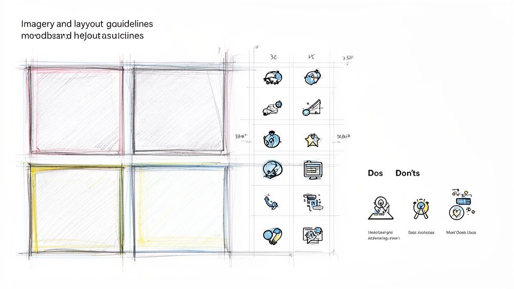
Want to know one of the most effective pages in any brand guide? A simple, visual "Dos and Don'ts" section. It’s a game-changer because it shows people what you mean instead of just telling them. It's quick, scannable, and helps prevent the most common design mistakes before they happen.
Here’s a quick example of what this could look like for your imagery and layout rules:
Do | Don't |
|---|---|
Do: Use high-resolution, professionally lit photos that align with our brand's color palette. | Don't: Use low-quality, pixelated, or poorly lit images. |
Do: Crop images to focus on the key subject and maintain a clean composition. | Don't: Use busy, cluttered photos where the subject is unclear. |
Do: Maintain consistent spacing and margins around text and image blocks. | Don't: Place text too close to the edge of an image or container. |
Do: Overlay text on images only when there is sufficient contrast for readability. | Don't: Place light text over a light background or vice-versa. |
This kind of visual cheat sheet is invaluable. It empowers anyone on your team—or any freelancer you hire—to make good design choices confidently, without having to re-read pages of text. It's the key to creating brand guidelines that people will actually use.
Putting Your Brand Guidelines into Action
So you’ve created a beautiful brand guide. That’s a huge step, but it’s worthless if it just collects digital dust in a folder. The real magic happens when you bring that guide to life, and there's no better place to start than your most important brand ambassador: your website.
Think about it—your website is often the very first place a potential customer interacts with you. It’s where first impressions are made and where trust is built (or broken). Getting your branding right here isn't just about looking professional; it's about creating a cohesive experience that can directly boost your bottom line. In fact, consistent branding across all platforms can increase revenue by up to 23%.
Time for a Brand Audit on Your Website
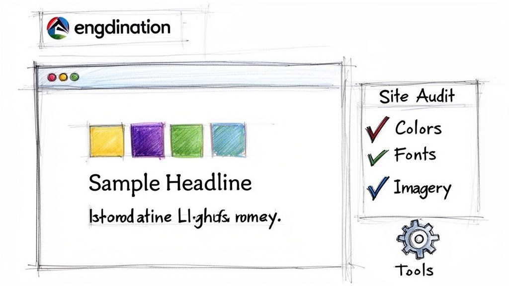
Whether you're starting from scratch or giving an existing site a refresh, a brand audit is your first move. This is simply a systematic review to make sure every pixel on your site aligns with the rules you just worked so hard to define. Grab your brand guide, open your website, and go through it page by page with a critical eye.
I recommend using a simple checklist to keep you on track. Focus on these core elements:
Logo Usage: Is your logo looking its best everywhere? Check for the proper clear space around it, make sure it’s not too small in the header or footer, and confirm you’re using the right color version for the background it’s on.
Color Palette: Are all the colors correct? Get a color-picker browser extension and spot-check the HEX codes on buttons, links, backgrounds, and text. Hunt down and eliminate any rogue shades that don't belong to your defined palette.
Typography: Does the text hierarchy make sense? Your H1s, H2s, and body copy should all use the right font family, weight, and size you specified. Even a small inconsistency here can make a page feel "off."
Imagery: Do all your photos and graphics look like they came from the same brand? Look for a consistent mood, editing style, and subject matter. It's time to swap out any generic stock photos that don't fit your visual identity.
Voice and Tone: Read your copy—all of it—out loud. Does it actually sound like your brand? Check everything from the main headlines to the tiny text on a button. If your voice is meant to be playful, a stiff, corporate-sounding call-to-action will stick out like a sore thumb.
Use Modern Tools to Make Consistency Easy
In the past, keeping all this straight was a tedious, manual slog. Thankfully, today’s website builders have completely changed the game, allowing you to bake your brand guidelines right into the platform.
For instance, if you're using an AI website builder like Alpha, you can set up your brand kit once and let the technology do the heavy lifting. The process is incredibly straightforward:
Upload Your Logo: The platform intelligently places it in the right spots.
Define Your Palette: You input your primary and secondary color HEX codes, and the AI applies them to buttons, links, and backgrounds across the site.
Set Your Fonts: Select your chosen fonts for headlines and body text, and the system enforces that hierarchy everywhere.
This approach transforms your brand guide from a static PDF into a dynamic, active part of your workflow.
The real goal isn't just to make your website 'on-brand' for launch day. It's to build a system where every future blog post, landing page, or minor update automatically follows the rules, guaranteeing long-term consistency with almost zero extra effort.
This is the secret to creating brand guidelines that actually stick. By integrating your rules into the tools you use every day, you shift from policing your brand to letting your systems maintain it for you. This frees you up to focus on growing your business, confident that every piece of content you create is working to strengthen your brand identity.
Common Questions About Creating Brand Guidelines
Even the best plans hit a few bumps. As you start to build and use your brand guide, you’ll naturally run into questions. I've pulled together answers to some of the most common hurdles I see founders and small teams face. Think of this as your go-to reference for navigating those tricky spots.
How Often Should I Update My Brand Guidelines?
Your brand guidelines should be a living document, not a dusty rulebook you write once and forget. I always tell my clients to schedule an annual review. It’s a simple check-in to make sure everything still feels right and aligns with where the business is headed.
You don't need to reinvent the wheel every year. Big overhauls are usually only necessary after a major business change, like a full-on rebrand or a merger. But small, thoughtful tweaks are a sign of a healthy, evolving brand. Maybe you need to add a new logo variation, introduce a secondary accent color, or sharpen your brand voice based on what you’ve learned about your customers.
The real goal here is relevance, not rigidity. Your brand guide should grow alongside your business, giving you a strong foundation that can still adapt. An outdated guide is just as useless as having no guide at all.
What's the Difference Between a Brand Guide and a Style Guide?
This is a big one, and it trips a lot of people up because the terms get thrown around interchangeably. They’re definitely related, but there's a key difference in what they cover.
A brand guide is the big picture. It’s more strategic, digging into the "why" behind your brand—your mission, your vision, your core personality.
A style guide is more tactical. It zooms in on the "how" of actually applying your brand. This is where you'll find the nitty-gritty visual rules for logo spacing, color codes, and font pairings.
Honestly, for most startups and small businesses, the best move is to combine them. A single, unified document that connects the strategic "why" with the practical "how" is far more powerful and easier for your team to use.
Can I Create Brand Guidelines Myself?
Absolutely! In fact, I highly recommend it. Sitting down and actually defining your brand’s core elements is one of the most clarifying things a founder can do. Nobody knows your business, your vision, and your customers better than you do. You're the perfect person to lay that initial groundwork.
Use this article as your roadmap. Document your logo rules, nail down your color palette and fonts, and put your brand's voice into words. That foundational work is priceless.
Down the road, as your business grows, you can always bring in a professional designer or brand strategist to help refine and expand on what you’ve started. The most important thing is just to get it on paper.
What Are the Most Common Mistakes to Avoid?
Knowing what not to do is just as important as knowing what to do. If you can steer clear of these three common pitfalls when creating your brand guidelines, your final document will be a thousand times more effective.
Making the Guide a Creative Straitjacket: If your guide is so restrictive that it dictates every single tiny detail, you’ll just frustrate your team and stifle creativity. It should be an empowering framework, not a set of handcuffs.
Being Too Vague: On the flip side, rules like "use friendly images" are meaningless. A guide without specifics leads to confusion and the very inconsistency you're trying to fix. Get specific.
Forgetting to Share and Enforce It: This is the cardinal sin. A brilliant brand guide is completely worthless if it’s buried in a folder no one can find. Make it easy to access, build it into your onboarding process, and make it part of your team's everyday workflow.
Ready to see your brand come to life online? With Alpha, you can build a stunning, on-brand website in a matter of hours. Just plug in your brand colors, fonts, and logo, and its AI-powered platform will generate a professional website that’s ready to go. Skip the complicated tools and start building your online presence the easy way. Create your website today.
Build beautiful websites like these in minutes
Use Alpha to create, publish, and manage a fully functional website with ease.
