How to Create Website Mockups People Actually Love
Learn how to create website mockups that bridge the gap between idea and reality. Our guide covers tools, principles, and developer handoff.

Build beautiful websites like these in minutes
Use Alpha to create, publish, and manage a fully functional website with ease.


Before you even think about colors or fonts, designing a beautiful website starts with a solid game plan. This initial strategy is the bedrock of your entire project, ensuring that every design choice you make has a clear purpose. A great-looking site is nice, but a great-looking site that actually works for your business and your audience? That’s the real goal.
Building Your Website Design Strategy
It's tempting to jump straight into the visual design—the fun stuff. But without a strong strategy, you're just decorating. A truly effective website is born from understanding its purpose first. Think of it as laying the foundation before you build the house.
You have to start by defining what success actually means for your website. Is the primary goal to sell products directly? Are you trying to capture leads for a service-based business? Or maybe you're building a portfolio to showcase your work and land new clients. An e-commerce site needs a completely different flow and focus than a creative's portfolio, so getting this right from the beginning is critical.
Define Your Ideal Visitor
With your goals locked in, it's time to get specific about who you're building this for. Forget vague demographic data; we need to create detailed user personas. These are like character sketches of your ideal customer, pieced together from market research and what you already know about your audience.
Give them a name, a job, and, most importantly, a reason for being on your site. What are they struggling with? What motivates them?
"Startup Sarah": A 30-year-old founder who's short on time and needs intuitive tools that don't have a steep learning curve.
"Creative Chris": A freelance designer hunting for inspiration and high-quality resources to use in his own work.
When you start designing for a real person like Sarah or Chris, your choices naturally become more thoughtful and user-centric. This initial planning is a non-negotiable part of the journey. To really nail the entire project, from concept to launch, it helps to understand the fundamental design process steps that guide professional designers.
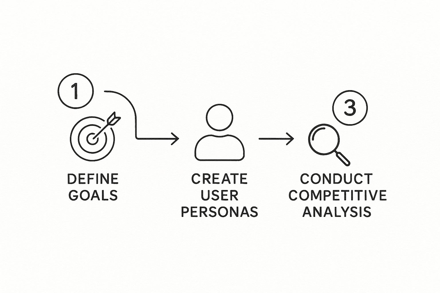
Analyze the Competitive Landscape
Finally, it’s time for a little friendly recon. Take a close look at what your competitors are up to online. Pick 2-3 of your closest rivals and do a deep dive into their websites.
Make notes on what you love and what makes you cringe. This isn't about stealing their ideas. It's about finding opportunities. Maybe their site navigation is a confusing mess, or perhaps their mobile experience feels like an afterthought. Those are your openings to create something far better.
This strategic work creates the blueprint for a site that’s not just beautiful, but brilliantly effective. To see how this fits into the bigger picture, you can check out our in-depth guide covering the entire website design process from start to finish.
Before moving on, it's helpful to summarize these core strategic elements. This checklist ensures you've covered the essentials before getting into the more creative aspects of design.
Essential Website Planning Checklist
Planning Element | Key Question to Answer | Why It Matters |
|---|---|---|
Primary Goal | What is the #1 action you want a visitor to take? | Guides the entire site structure and call-to-action placement. |
Target Audience | Who are you building this website for? (Be specific!) | Ensures the design, tone, and content resonate with real users. |
Key Differentiator | What makes you unique compared to your competition? | Helps you craft a distinct brand identity and user experience. |
Core Content Needs | What information must the site include to be successful? | Forms the basis of your sitemap and content strategy. |
Think of this table as your pre-flight check. Once you can confidently answer each of these questions, you're ready to start bringing your vision to life.
Defining Your Visual Identity
Okay, you've got your strategy nailed down. Now for the fun part: bringing your brand to life with a solid visual identity. This is where we move beyond spreadsheets and user flows and start crafting the look and feel of your website. It’s about so much more than just picking a few colors you personally like; it's about building a consistent, memorable experience that tells your brand's story from the moment someone lands on your page.
Every visual choice, from the biggest background image to the smallest icon, needs to work together. It all starts with color.
Colors carry a ton of psychological weight. Think about it—blues often feel trustworthy and stable, which is why so many banks and tech companies use them. Greens can bring to mind nature, health, and new growth, while a splash of red creates a sense of urgency or excitement.
Before you even look at a color wheel, ask yourself: how do I want people to feel when they're on my site? Calm and reassured? Energized and motivated? Your colors are your first handshake, setting the tone instantly.
Building a Balanced Color Scheme
One of the most common mistakes I see is what I call the "confetti" approach—too many colors competing for attention. It just looks chaotic and unprofessional. To avoid this, I always lean on the 60-30-10 rule. It’s an old trick from the world of interior design, but it translates perfectly to the web.
Here’s the simple breakdown:
60% Primary Color: This is your workhorse. It will dominate your design, likely as the background color, and sets the overall mood.
30% Secondary Color: This color is there to support the primary one. You'll use it for things like subheadings, highlighted sections, or secondary calls-to-action. It needs to contrast nicely without clashing.
10% Accent Color: This is your secret weapon. Use this bold, vibrant color sparingly to make key elements pop. Think "Buy Now" buttons, important links, or icons you need people to see.
This isn't a rigid law, but it’s an incredible framework for creating a look that feels intentional and polished.
Your visual hierarchy is one of the most important principles in design. It’s the art of presenting elements in a way that implies importance, guiding the user's eye naturally from the most critical information to the least.
Choosing Typography That Speaks Volumes
Now, let's talk about fonts. If your colors set the mood, your typography is your brand's voice. A classic serif font like Garamond can feel traditional and sophisticated, while a modern sans-serif like Montserrat feels clean, friendly, and straightforward.
The goal is to find fonts that are not only on-brand but, crucially, are easy to read. Nobody wants to squint at your paragraphs.
A great starting point is to find two fonts that work well together: one for your headlines and a different one for your main body text. For the body copy, a font size between 16px and 18px is usually the sweet spot for comfortable reading on a screen. When you're pairing fonts, look for a little contrast, but make sure they share some common DNA—maybe a similar height or width—so they don't feel like they're from two different worlds.
At the end of the day, your visual identity is your brand's silent ambassador. By being thoughtful about your color, typography, and hierarchy, you’re doing more than just decorating a page. You're actively building trust, guiding your visitors, and crafting a truly beautiful website experience.
Creating an Intuitive, User-Friendly Layout
Once you've locked in your visual identity, it's time to bring that style to life with a structure that feels effortless for people to use. A great layout is more than just aesthetics; it's a silent guide that steers visitors where they need to go, making it completely natural to find what they're looking for. This is all about anticipating user behavior.
Before you even think about code or templates, grab a pen and paper (or your favorite design tool) and start with a wireframe. A wireframe is basically the blueprint of your website. It’s a simple, low-fidelity sketch focused purely on structure—where the navigation sits, the placement of buttons, and the hierarchy of content on each page. Forget colors and fonts for now; this is all about the bones.
This skeletal framework forces you to map out the user's journey logically, helping you spot potential usability problems early on before they become a headache to fix. To get a better handle on this foundational step, our guide on how to create website mockups is a great place to start.
Understanding Common Reading Patterns
Let's be honest: people don't read websites word-for-word. They scan. Knowing how people typically scan a page lets you place your most important content directly in their line of sight.
Two of the most common patterns I see are the F-Pattern and the Z-Pattern.
The F-Pattern: This is classic for text-heavy pages like articles or search results. A user's eyes move across the top of the page, then down the left side, and then make another, shorter horizontal scan partway down. This means you want your most critical info at the top and along that left-hand side.
The Z-Pattern: Think of this for simpler, less dense pages, like a landing page. The eye travels from the top-left to the top-right, then cuts diagonally down to the bottom-left before moving across to the bottom-right. A perfect setup is your logo in the top-left, a key call-to-action in the top-right, and another strong CTA in that final bottom-right corner.
The real goal of a good layout is to minimize cognitive load. When users don't have to think about where to go next, they can focus entirely on what you're offering them.
The Power of White Space
One of the most effective—and most frequently ignored—tools in a designer's kit is white space. Also known as negative space, it's simply the empty area around the elements on your page. It’s not just "blank" space; it's an active design element.
Using white space effectively can improve readability by up to 20%. It gives your content room to breathe, breaks up long blocks of text, and gives your entire site a clean, high-end feel. A cluttered page is overwhelming, but a page with plenty of white space feels calm and easy to navigate.
To create a site that's both beautiful and functional, it's worth digging into these essential UI design best practices. When you master layout and the strategic use of space, you're not just designing a website; you're crafting an experience.
Using AI to Speed Up Your Design Workflow
https://www.youtube.com/embed/ItsKfNAoqTU
Let's be real: artificial intelligence in web design isn't just some futuristic concept anymore. It's a practical tool that designers are using right now to work faster and, frankly, more creatively. Think of AI as your new super-efficient assistant. It handles the monotonous, time-sucking parts of the job, which frees you up to focus on strategy and creativity—the stuff that really matters.
From the first spark of an idea to the final tweaks before launch, AI can be a game-changer. Instead of spending an entire afternoon hunting for the perfect color palette, an AI tool can whip up dozens of stunning, harmonious options based on a single photo or a quick brand description. This alone can shave hours off your iteration time.
Automating the Grunt Work
One of the most immediate benefits of bringing AI into your process is its knack for handling repetitive tasks. This is where you can literally get hours of your week back.
Custom Graphics on Demand: Need a unique icon for a new service? AI can generate a whole set of vector-ready options from a simple text prompt in seconds. No more endless searching on stock sites.
Instant Layouts: Tools like Alpha can take a basic description—or even a URL of a site you like—and generate a fully structured layout. It gives you an incredible starting point that you can then polish and make your own.
Smarter Placeholder Content: Some AI platforms can generate placeholder text that’s actually relevant to the project, which gives you a much better feel for the final design than "lorem ipsum" ever could.
This isn't just a niche trend; it's quickly becoming the standard. Recent data shows that nearly 93% of designers are already using AI tools for creating images and other media assets. It’s a clear sign of how valuable these tools are in a modern workflow. You can see more data on this in these web design statistics from Hostinger.
AI doesn't just make you faster; it makes you smarter. It can analyze data from thousands of successful websites to suggest design improvements that are proven to work.
Making Smarter Design Decisions with Data
Beyond just generating assets, AI provides a powerful way to make choices backed by actual data. Manually setting up A/B tests to figure out which button color or headline works best is a slow, often complicated process.
AI-driven platforms can completely automate this. These tools can test multiple design variations on live traffic, quickly pinpoint the top-performing version, and in some cases, even implement the winner for you.
This means your efforts to design a beautiful website are directly linked to real-world performance improvements, finally taking the guesswork out of optimization. If you want to go deeper, our guide on using AI to build a website is a great next step. By adding AI to your toolkit, you're not just working faster—you're building better, more effective sites from the get-go.
Mastering Responsive Design for Every Device
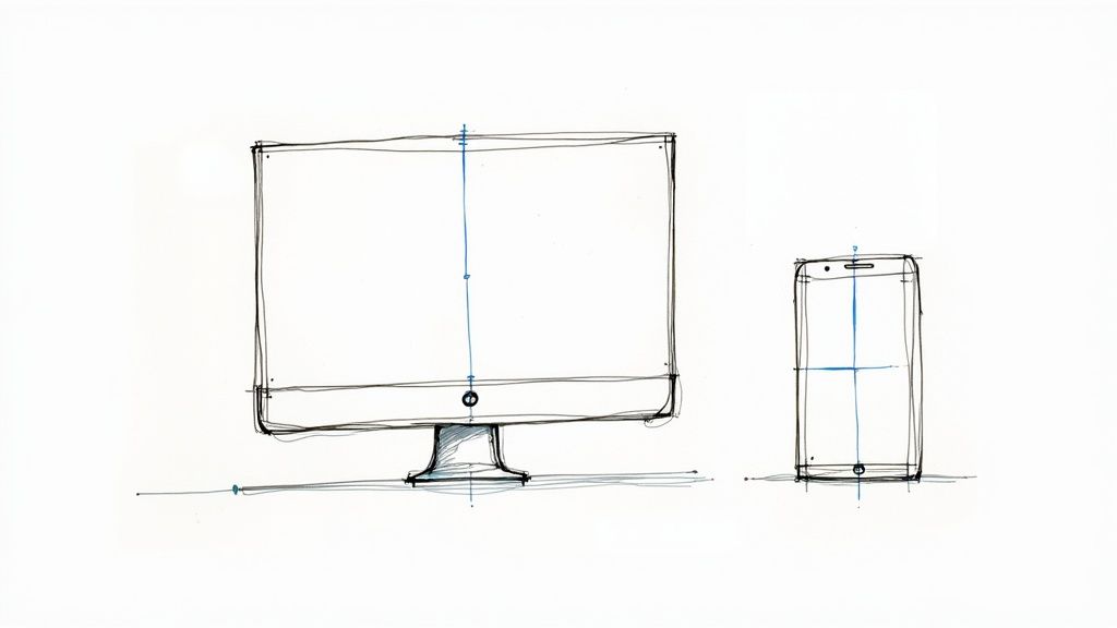
Let’s be honest: a beautiful website that only looks good on your big desktop monitor is a failed design. These days, with mobile traffic consistently crushing desktop, responsive design isn't just a nice-to-have feature. It’s absolutely essential. If your site doesn't adapt, you're giving a huge slice of your audience a clunky, frustrating experience.
This isn’t a new trend, it's the standard. By 2025, it’s estimated that 90% of all websites will be responsive. We're talking about 1.2 billion sites that understand the need to adapt. For a deeper dive into current trends, you can discover more web design insights on Hostinger.
But great responsive design isn't just about shrinking things down. It's about fundamentally rethinking the user's journey. A desktop visitor has a mouse and plenty of screen real estate. A mobile user? They’ve got a thumb and a tiny screen. To design a beautiful website that works for both, you have to be ruthless about prioritizing what truly matters on each device.
Adopting the Mobile-First Mindset
I’ve found the most effective way to nail this is by flipping the whole process on its head with a mobile-first approach. Forget starting with the sprawling desktop version and then trying to painfully cram it onto a phone. Start with the phone.
This simple switch in perspective forces you to focus on the absolute essentials. What is the single most important action a user needs to take? What’s the core content they came for? You build that clean, lean experience first. Then, as you move to larger screens like tablets and desktops, you can progressively enhance the design by adding secondary elements and more complex features.
The payoff for this approach is huge:
A Superior User Experience: Your mobile site feels zippy and intuitive because it was built for that purpose, not as a watered-down afterthought.
A Big SEO Boost: Google's crawlers primarily look at the mobile version of your site to determine rankings. A solid mobile design is no longer optional for good visibility.
A Practical Testing Checklist
Okay, so you've got your design. Now comes the part that separates the pros from the amateurs: rigorous testing. And I don't just mean resizing your browser window. You have to get as close to real-world conditions as you can.
A design that isn’t tested on real devices is just a theory. The goal is to ensure your beautiful design translates into a beautiful, functional experience for every single visitor, no matter how they find you.
Before you even think about launching, run through this quick checklist. Trust me, it’ll save you headaches later.
Test on Physical Devices: Grab an actual iPhone and an Android phone. Emulators and browser tools are great, but nothing exposes issues with touch targets or weird rendering glitches like a real device.
Check Key Browsers: Your site needs to play nice with Chrome, Safari, Firefox, and Edge. The developer tools in modern browsers have fantastic device simulators that make this part much easier.
Verify Image Loading: Do your images scale properly without looking blurry on high-res screens? More importantly, are they optimized so they don’t bog down loading times on a spotty mobile connection?
Confirm Interactive Elements: Use your finger to test every single button, form, and menu. Are buttons easy to tap? Is there enough space around them to avoid frustrating mis-taps?
Following a systematic testing process like this is what turns a good responsive design into a truly great one. It’s the final step in making sure your website is as effective as it is beautiful, everywhere it’s seen.
Optimizing Your Design for Engagement and SEO
A great-looking website is a fantastic start, but let's be honest—it's only half the battle. The real goal is to create a site that actually does something. This is where we shift from just aesthetics to performance, turning your beautiful design into a workhorse that drives engagement, leads, and sales. It's about making sure your design isn't just a pretty face, but a strategic tool for your business.
The single most important piece of this puzzle? The call-to-action (CTA). This is the button, link, or phrase that tells your visitor exactly what to do next, like "Get a Free Quote" or "Download the Ebook." Without a clear, compelling CTA, you're leaving visitors to guess, and most of them will simply leave.
Crafting Calls to Action That Actually Work
Getting CTAs right is part art, part science. They have to pop visually, which usually means using a bold, contrasting color that your eyes are naturally drawn to. The language needs to be sharp and action-focused, too. Forget a vague "Learn More." Get specific with "See Pricing Plans" or "Claim Your 30-Day Trial." That kind of clarity tells people exactly what to expect and gives them the confidence to click.
It’s shocking, but a reported 70% of small business websites lack a clear CTA on their homepage. That's a massive missed opportunity, especially when a well-placed button can significantly boost conversions. You can discover more insights on website conversion statistics here. For maximum impact, always place your main CTA "above the fold," meaning it’s visible the second the page loads, no scrolling required.
On-Page SEO: A Designer’s Responsibility
Think SEO is just for copywriters? Think again. As a designer, your choices have a huge impact on how well a site ranks on Google. Two of the biggest areas you control are image optimization and the site's structural hierarchy. We've all been there—a site that takes forever to load. More often than not, huge, uncompressed images are the culprit, and slow load times are a surefire way to kill your user experience and your search rankings.
Before you even think about uploading an image, run it through an optimization checklist:
Compress Your Images: Use a tool like TinyPNG or ImageOptim. They can shrink file sizes dramatically with almost no visible loss in quality. It's a game-changer.
Use Smart File Names: Instead of
IMG_1234.jpg, name your file something likemodern-kitchen-design-with-island.jpg. This gives search engines valuable context.Always Add Alt Text: This is the text that describes the image if it fails to load. It's also crucial for accessibility (screen readers use it) and gives search engines another clue about your content.
The way you structure your content with headings (H1, H2, H3, etc.) is also fundamental. This isn't just about styling; it creates a logical outline that helps both users and search engine crawlers understand what's important. Your H1 is the title of the page, H2s are the main section headers, and H3s are sub-points within those sections. It’s that simple.
To see how these elements come together, let's look at their direct impact on performance.
Design Impact on Key Performance Metrics
The table below breaks down how specific design choices can either help or hurt your website's core metrics. Paying attention to these details is what separates a good design from a truly effective one.
Design Element | Positive Impact | Negative Impact |
|---|---|---|
Call-to-Action (CTA) | Clear, contrasting CTAs guide users, increasing conversion rates and goal completions. | Vague or hidden CTAs confuse visitors, leading to high bounce rates and lost opportunities. |
Image Optimization | Compressed, properly tagged images lead to faster page loads, improving SEO and user satisfaction. | Large, unoptimized images cause slow load times, hurting search rankings and frustrating users. |
Responsive Design | A seamless experience across all devices retains mobile users and boosts mobile SEO rankings. | A poor mobile experience alienates over half of web traffic and is penalized by Google. |
Logical Headings | A clear H1, H2, H3 structure improves content readability, accessibility, and on-page SEO. | A lack of heading structure makes content hard to scan and difficult for search engines to index. |
Ultimately, the goal is to create a symbiotic relationship between your design and your performance goals. Every choice should serve a purpose.
Turning your beautiful design into a high-performing asset requires looking beyond the visuals. It means using data to understand how people actually interact with your site and making informed tweaks to guide them toward your goals.
This is where tools like heatmaps become your best friend. They show you exactly where people are clicking, how far they're scrolling, and what they're ignoring. Maybe that button you thought was obvious is being completely overlooked, or people are trying to click on something that isn't a link. Armed with that kind of real-world insight, you can stop guessing and start making data-driven decisions to build a site that isn't just beautiful, but undeniably effective.
Answering Your Top Website Design Questions
Jumping into a new website project often brings up a flood of questions. I get it. From figuring out the budget to setting a realistic launch date, getting some straight answers upfront can save you a world of headaches down the line. Let's walk through some of the most common questions I hear from people just starting out.
How Much Should a Website Really Cost?
This is usually the first question on everyone's mind, and for good reason. The truth is, there's no single price tag because every project is different. That said, for a professionally designed, basic website, you can generally expect the cost to land somewhere between $6,500 and $15,000. That's a pretty wide range, I know. The final number really depends on the complexity and scope of your project. If you want to dig deeper into what drives those costs, you can get a full breakdown of web design expenses.
What’s a Realistic Timeline for a New Website?
After budget, the next big question is always about the timeline. "How long is this actually going to take?" is something I hear all the time. If you're just looking for a simple landing page, you might be up and running in a couple of weeks. But for a more involved, multi-page site with custom features, you should plan for a timeline of about three to four months. That covers everything from our first strategy meeting to the day we go live.
I've seen it happen time and time again: the biggest mistake people make is rushing through the initial planning. A solid strategy, clear goals, and well-defined user personas are the bedrock of any great website. Skimp on this part, and you're almost guaranteed to face expensive and time-consuming revisions later.
What are the Biggest Mistakes to Avoid?
So, what are the common traps people fall into? Beyond rushing the strategy phase, a few missteps can really derail a project. Here are the ones I see most often:
Forgetting About Mobile: Designers get so focused on the beautiful desktop version that the mobile experience becomes an afterthought. The result? A site that's a nightmare for users on their phones.
Choosing Style Over Substance: It's easy to fall in love with a gorgeous, artistic font, but if it's a pain to read in a block of text, you're hurting your own message. Readability has to come first.
Weak Calls-to-Action: You’ve got visitors on your site—now what? If your CTAs are vague, hidden, or non-existent, your visitors will just leave, and you’ll have lost an opportunity.
By thinking through these questions and sidestepping these common pitfalls from the get-go, you're putting yourself on the path to a much smoother, more successful design process.
Ready to skip the headaches and build a stunning website faster than you thought possible? Alpha uses AI to turn your ideas into a fully functional, beautiful site in minutes. Drop in a URL of a site you admire, and let our AI create a unique design inspired by it. Start building your dream website with Alpha today!
Build beautiful websites like these in minutes
Use Alpha to create, publish, and manage a fully functional website with ease.