How to Create Website Mockups People Actually Love
Learn how to create website mockups that bridge the gap between idea and reality. Our guide covers tools, principles, and developer handoff.

Build beautiful websites like these in minutes
Use Alpha to create, publish, and manage a fully functional website with ease.


If you want to increase website conversions, you have to start with your value proposition. It needs to be crystal clear. A visitor has to know what you offer, who it’s for, and why you’re the best choice—all within about five seconds. If they can't figure that out almost instantly, they're gone.
The Foundation of a High-Converting Website
Before you get lost in A/B testing button colors, you have to get the basics right. The best conversion strategies are always built on a powerful core message that people understand immediately. This is more than just slick copy. It's about making sure everything above the fold—your main headline, subheading, hero image, and your primary call-to-action—works together to solve your visitor's problem on the spot.
Think of your homepage like a speed date. You’ve got just a few seconds to make a connection and convince them they’re in the right place. Vague promises like "Innovative Solutions for a Better Tomorrow" are meaningless. In contrast, something direct like "Create a Professional Website in 10 Minutes with AI" speaks to a specific goal and sets a clear, compelling expectation.
Audit Your Website Like a Customer
The quickest way to spot a weak value proposition is to see your site through fresh eyes. Grab a friend or colleague who isn’t familiar with your business and ask them to look at your homepage for exactly five seconds. Then, have them close the browser.
Now, ask them three simple questions:
What does this company do? Can they actually explain your product or service?
Who is this for? Do they have a good idea of your target customer?
What's the main benefit? Can they tell you the key value you provide?
If their answers are all over the place, you've got a foundational issue. Your message isn't connecting. Any other tweaks you make will be like rearranging furniture in a house that's about to collapse. This simple "five-second test" is one of the most powerful things you can do to figure out how to improve conversions from the ground up.
I see this all the time: companies use internal jargon and buzzwords that sound great in a meeting but mean absolutely nothing to a potential customer. Always choose clarity over cleverness. You want to make the user feel smart and understood, not confused by your vocabulary.
Aligning Messaging for Maximum Impact
Once you’ve spotted the weak points, it’s time to sharpen your message. Your value proposition should be the very first thing people see, usually in a bold headline supported by a clear sub-headline. For instance, a SaaS company could change a headline from "Next-Generation Workflow Management" to "The All-in-One Platform That Cuts Project Time by 30%." See the difference? The second one is specific, benefit-driven, and quantifiable.
While the strategies here apply broadly, different industries often need a tailored approach. For example, there are some proven ecommerce conversion rate optimisation tips that are essential for online stores.
Just look at the impact that simply clarifying your message can have on your most important metrics.
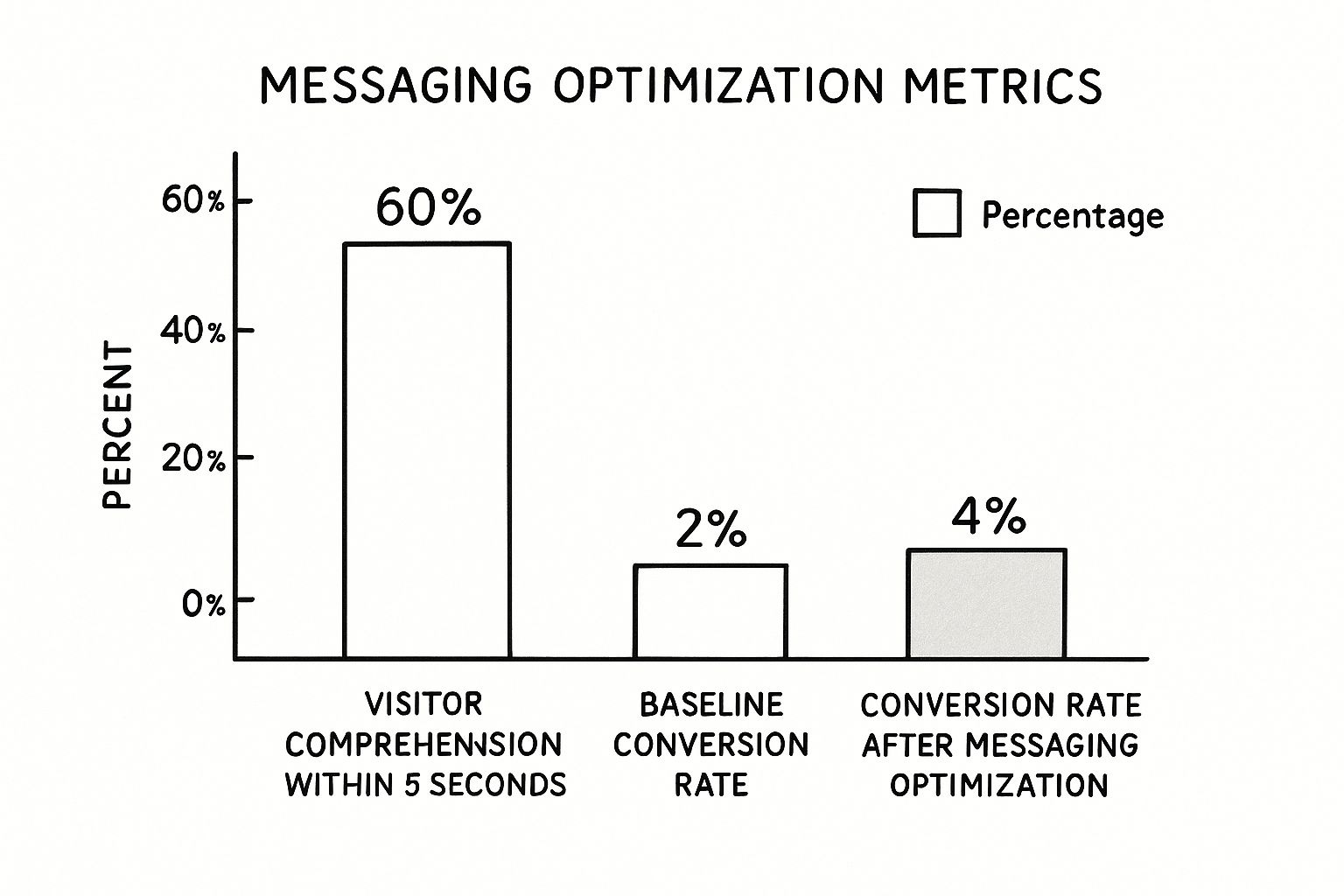
The data speaks for itself. Getting more visitors to understand what you do can literally double your baseline conversion rate. It proves that a strong foundation isn’t just important—it’s everything.
Designing a User Experience That Drives Action

Let's be honest: great design isn't just about looking good. It’s about making it dead simple for a visitor to do what you want them to do. A truly effective user experience (UX) is your best salesperson—it works silently in the background, guiding people from "just looking" to "take my money."
When you nail the UX, converting feels like the most obvious and natural next step for the user. This all starts with something deceptively simple: navigation. If people can't find what they're looking for fast, they're gone.
Building an Intuitive Navigation Structure
I like to think of a website’s navigation as the floor plan of a great retail store. When the aisles are clearly marked and the layout makes sense, customers find what they need, have a good time, and are more likely to buy something. A confusing, cluttered layout just leads to frustration and people walking out.
To avoid that, start by mapping out the absolute essentials. What pages must your users be able to find instantly? This is usually your services, about page, and contact info. Everything else can be organized logically under those main pillars.
Here are a few hard-won principles for navigation that actually works:
Keep it simple. Try to stick to seven or fewer main menu items. Any more than that and you risk decision paralysis.
Be specific. Vague labels like "Resources" are useless. Call it what it is: "Blog," "Case Studies," or "Webinars."
Stay consistent. Your main navigation should be a constant, reliable presence on every single page of your site. No exceptions.
If you want to go deeper on these fundamentals, our guide on user experience design fundamentals is the perfect place to start. Getting the UX right is the first real step in boosting your website's conversion rate.
The Power of Visual Hierarchy and White Space
Once people can find their way around, you need to direct their eyes. That’s where visual hierarchy comes in—it’s the art of using design to signal what’s most important on a page. Your value proposition and main call-to-action (CTA) should practically jump off the screen.
You can do this with basic tools like size, color, and placement. Make your headlines big and bold. Use a high-contrast color for your CTA button so it’s impossible to miss. It's about creating a clear path for the user's gaze to follow.
Just as critical is what you don't put on the page. I'm talking about white space. It's not just "empty" space; it's an active and powerful design element that gives your content room to breathe.
A smart use of white space can increase user comprehension by as much as 20%. It cuts down on cognitive overload, making your message clearer and your CTAs pop.
A Truly Mobile-First Approach
It’s 2024. Having a "mobile-friendly" site isn't enough. So many companies still treat their mobile experience as an afterthought, simply shrinking the desktop version down. This is a huge, conversion-killing mistake.
A genuine mobile-first strategy means you design for the smallest screen first, then adapt it for larger ones. This forces you to be ruthless with your priorities, focusing only on the most critical elements. The result is a cleaner, more focused experience that benefits everyone, no matter their device. Think big, tappable buttons and simple menus.
The data backs this up. Understanding where you stand is key, but the numbers can be all over the place depending on your industry and who's visiting your site.
Conversion Rate Benchmarks by Industry and Device
This table illustrates the significant variance in average eCommerce conversion rates across different product categories and highlights the persistent gap between desktop and mobile performance.
Industry / Device | Average Conversion Rate (%) |
|---|---|
Food & Beverage | 5.5% |
Health & Beauty | 3.3% |
Fashion & Apparel | 2.5% |
Home Goods | 1.8% |
Desktop (Overall) | 4.8% |
Mobile (Overall) | 2.9% |
Source: Network Solutions
Even though mobile traffic makes up a staggering 73% of all eCommerce visits, it converts at a much lower rate than desktop (2.9% vs. 4.8%). That gap is almost entirely a UX problem. A frictionless mobile experience is your single biggest opportunity to close it.
Optimizing Page Speed for Better Conversions
After all that work on design and UX, don't let a slow website torpedo your efforts. The data is brutal: a mere one-second delay in page load time can slash your conversions by 7%. In a world of instant gratification, a lagging site is a deal-breaker.
You don't have to be a coding genius to move the needle. Here are a few things you can do right now:
Compress your images. This is the low-hanging fruit. Huge image files are the number one cause of slow sites. Use a tool to shrink them down without losing visual quality.
Turn on browser caching. This lets a visitor's browser "remember" parts of your site, so it loads almost instantly on their next visit.
Use an optimized platform. Tools like Alpha handle a lot of the technical heavy lifting for you, automatically minimizing code to ensure your site is fast from day one.
By focusing on these core UX pillars—intuitive navigation, a clear visual path, a true mobile-first design, and lightning-fast speed—you create an online experience that doesn't just look pretty. It actively works to turn your visitors into loyal customers.
Crafting CTAs and Forms That Actually Convert
You can nail the design and create a flawless user experience, but it all comes down to two things: the call-to-action (CTA) and the form that follows. This is the moment of truth. It's where a visitor decides to take the leap, and frankly, it's where most websites drop the ball.
The goal isn't to trick anyone into clicking. It’s about making that next step feel so obvious and compelling that it’s irresistible. If your button is vague and your form looks like homework, you're building a wall of hesitation right when you need a clear path forward.
Rethinking Your Call-to-Action Buttons
Let's be honest: the days of using a generic "Submit" button are over. That one word tells a user what they have to do, but it gives them zero reason why they should bother. What’s in it for them? Your CTA copy needs to answer that question in a split second.
Think in terms of action and benefit. Ditch "Submit" and try something that actually communicates the value they're about to receive.
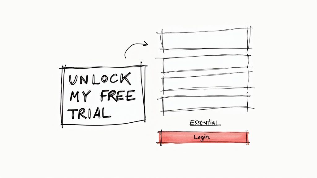
Instead of a generic trial button: Try "Start My Free Trial" or "Unlock 14-Day Access."
For a resource download: Go with "Get My Free Ebook" or "Download the Checklist Now."
When they're ready to buy: Use "Add to Bag & Get Free Shipping" or "Claim My Discount."
This simple language shift puts the focus squarely on what the user gets, which is infinitely more persuasive. A great rule of thumb is to have the button copy complete the sentence, "I want to..." From their perspective, "I want to submit" is meaningless, but "I want to get my free ebook" is a clear goal. If you're struggling to nail this, learning how to write website copy that speaks to your audience's core motivations is a great place to start.
Of course, it’s not just about the words. Your CTA has to pop. Use a high-contrast color that grabs the eye while staying true to your brand. Make it big enough to be easily tapped on a phone, and place it exactly where someone is most likely to make a decision.
A well-designed CTA isn't just a button; it's a visual cue that guides the user toward their goal. Make it look like the most important and helpful thing on the page, because in that moment, it is.
Designing Forms That Don't Frustrate
So, they clicked your brilliant CTA. Fantastic! Now, don't scare them away with a monstrous form. A long, intimidating list of fields is one of the fastest ways I've seen to kill conversion momentum. Your mission here is simple: eliminate friction.
Every single field you add creates a tiny bit of work for the user. Before adding one, ask yourself: do I absolutely need this information right now? For a newsletter signup, all you really need is an email address. You can always ask for their name later to personalize your messages.
For more involved forms, like checkouts or project inquiries, here are a few tactics that work wonders:
Use Smart Defaults: Pre-select the most common options, like a user's country in a dropdown menu.
Enable Social Logins: Let people sign up with Google or Facebook. It saves them the hassle of creating yet another password.
Implement Real-Time Validation: Instantly flag typos in an email address or a weak password. Don't make them wait until after they hit "submit" to find out they made a mistake.
Clearly Label Fields: Use labels above each input box. Placeholder text inside the field disappears the moment a user starts typing, leaving them to guess what they were supposed to enter.
The Case for Multi-Step Forms
This might sound counterintuitive, but breaking a long form into smaller, bite-sized chunks can actually increase website conversions. Staring at a single form with ten fields feels overwhelming before you even start.
A multi-step form, on the other hand, might start by asking for just a name and email. That's easy. Once a user completes that first step, they’ve made a small commitment. Psychologically, they're now much more likely to follow through and complete the rest. This approach transforms a daunting task into a simple, guided process that keeps them moving smoothly toward the finish line.
How Page Speed and Performance Impact Your Bottom Line
https://www.youtube.com/embed/CzRvl8OMYmI
When you're trying to win more conversions, speed isn't just a nice-to-have feature. It's the entire racetrack. A slow, clunky website is the digital equivalent of a shop with a jammed front door—no matter how great your products are, people will get frustrated and just go somewhere else.
Every single millisecond a user has to wait for your page to load is a moment they could be clicking away for good. The connection between a snappy user experience and a healthy bottom line is direct, and frankly, undeniable. This isn't just a job for your dev team; it's a core business strategy that directly influences user happiness and sales.
The True Cost of a Slow Website
It's easy to brush off a one or two-second delay, but the data tells a startling story. That tiny lag can be the difference between making a sale and losing a customer forever. A slow site doesn't just annoy people; it actively chips away at their trust and makes them question your brand's professionalism.
Site speed is a proven driver of higher conversions, and the real-world impact on sales is dramatic. Research shows that e-commerce pages loading in just one second can see conversion rates up to 2.5 times higher than pages that take five seconds. Compared to a site with a 10-second load time, that number jumps to a staggering five times higher. The link is crystal clear: faster sites keep people engaged, lower bounce rates, and lead directly to more sales. You can dig into more of these stats over at Wordstream.
Think of it this way: for every second your website takes to load, you're hemorrhaging potential customers. A fast site respects your user's time, making them far more likely to stick around and convert.
The good news? Improving your site's performance sounds technical, but many of the most effective fixes are surprisingly straightforward.
Actionable Steps for a Faster Website
You don’t need to be a web developer to make a real difference. By focusing on a few key areas, you can slash your page load times and, in turn, boost your website conversions. Many of these optimizations are actually handled for you on modern platforms like Alpha, which is built from the ground up to minimize code and prioritize speed.
But if you're managing your own site, here are some of the most impactful things you can tackle right now:
Optimize Your Images: This is the big one. Large, uncompressed images are the number one killer of website speed. Before you upload anything, use an online tool to shrink the file size without wrecking the quality.
Enable Browser Caching: This trick lets a visitor's browser "remember" parts of your site, like your logo and other assets. When they come back, the site loads almost instantly because their computer already has most of the files it needs.
Minimize Your Code: Bloated code, often from too many plugins or a poorly built theme, can really drag your site down. Do a regular audit and get rid of any plugins you aren't actively using.
For a deeper dive, check out our complete guide on how to improve website loading speed. It breaks all of this down even further.
Demystifying Content Delivery Networks
Another powerful tool in your speed arsenal is a Content Delivery Network, or CDN. It might sound complex, but the idea is actually pretty simple. A CDN is a global network of servers.
Instead of every visitor trying to load your website from a single server location (which could be on the other side of the world), a CDN stores copies of your site's files on its various servers. When someone visits your site, the content is delivered to them from the server that's physically closest.
This one change results in a much faster experience for everyone, no matter where they are. It’s a foundational piece of any high-performance strategy and directly supports your efforts to increase website conversions by ensuring a fast, reliable experience for a global audience.
Pinpoint Where Your Best Customers Are Hiding
It’s easy to get caught up in chasing more traffic. But more visitors don't automatically equal more sales. The real secret to growth isn't just about getting more people to your site; it's about attracting the right people—those with high intent who are actually ready to buy.
Treating all your traffic sources the same is a rookie mistake. A visitor from your email newsletter is in a completely different headspace than someone who just clicked a social media ad. Recognizing this is the first real step toward moving the needle on your conversion rates.
Find Your Most Valuable Channels
Pop open your Google Analytics account and head straight for the traffic acquisition report. This is your command center for understanding where your visitors come from. Ignore the vanity metrics for a second and zero in on the conversion rate for each channel.
This is where the gold is buried. You might find that organic search converts at a solid 4%, while your paid social ads are hovering around 0.5%. That doesn't mean you kill your ad spend tomorrow, but it’s a massive clue telling you where your most motivated audience hangs out.
Be sure to compare the usual suspects:
Organic Search: People actively searching for what you offer. High intent is the name of the game here.
Paid Search: Clicks from platforms like Google Ads. Can be a goldmine when your targeting is on point.
Email Marketing: Your subscribers. They already know you, so they’re often your warmest leads.
Social Media: Visitors from Instagram, Facebook, LinkedIn, etc. (both organic and paid).
Direct Traffic: Users who type your URL directly. These are often brand loyalists and repeat customers.
A real-world example: I once worked with a client burning cash on social ads with almost nothing to show for it. A quick dive into their analytics revealed their tiny email list was converting five times better. We immediately reallocated half their ad budget to growing that list. The result? Revenue doubled in just three months.
Double Down on What Works
Once you've identified your winners, it's time to figure out why they work so well and how to get more from them. The data almost always tells a story about user intent.
It's no surprise that some channels consistently outperform others. Direct traffic often leads the pack with an average 3.3% conversion rate, with email and paid search not far behind. Social media, on the other hand, tends to lag because the audience is often just browsing, not buying. You can find more details on these conversion statistics at Blogging Wizard.
Your path forward becomes crystal clear. Is organic search your top performer? Pour more resources into SEO and content. Is your email list a conversion powerhouse? Make growing it a top priority.
This is how you stop guessing and start making strategic decisions. You shift your budget and effort to the channels that attract people who are genuinely ready to become customers.
Answering Your Top Questions About Website Conversions
Getting into conversion rate optimization can feel like opening a can of worms. You make one change, and suddenly a dozen new questions pop up. It's totally normal to wonder if you're even moving in the right direction. To help clear things up, I've put together answers to some of the most common questions I hear from marketers and business owners.
Let's move past the theory and get into what actually works in the real world.
What Is a Good Conversion Rate?
Ah, the million-dollar question. The most honest answer I can give you is: it depends. There's no magic number. What's considered "good" is a moving target that changes drastically based on your industry, where your traffic is coming from, and what you’re actually trying to get people to do.
For example, the average e-commerce site globally pulls in somewhere between 2% and 4%. But if you're selling high-ticket B2B software, you might be celebrating a 0.5% conversion rate on demo requests. On the other hand, an email newsletter signup should be aiming much, much higher.
Here’s a better way to frame it:
Look at Industry Benchmarks: Start by getting a feel for your sector. Food and beverage brands can see rates around 5.5%, while home goods stores often fall below 2%. This at least gives you a ballpark figure.
Focus on Your Own Baseline: This is the number that truly matters. If you're currently converting at 1.2%, jumping to 1.8% is a massive win. The real goal should always be to beat your own last record.
Consider Traffic Quality: People clicking from a targeted email campaign are almost guaranteed to convert better than random visitors from a broad social media ad. You have to analyze conversions by channel to get the full story.
Forget about chasing some universal "good" number. The real measure of success is continuous, measurable improvement against your own data.
How Quickly Can I Expect to See Results?
How fast you'll see a change really boils down to two things: how big of a change you made and how much traffic your website gets.
Making a small tweak, like changing the color of a CTA button, might need a few weeks to show a statistically significant result, especially if you have a lot of traffic to validate the test. But a massive overhaul—like completely redesigning your checkout flow—could have a dramatic impact almost overnight, even with less traffic.
Patience and solid data are your best friends here. Don't pull the plug on a test after just a few days. You need enough data to make a smart call, which usually means letting tests run for at least two to four weeks. This helps smooth out any weird weekly fluctuations in user behavior.
Think of your changes in two buckets to manage expectations:
Quick Wins: Simple fixes like punching up a headline or decluttering a form can often deliver a noticeable lift within a month.
Major Overhauls: Redesigning key pages or user flows is a bigger lift. The potential reward is much greater, but it might take a couple of months to implement the change and accurately measure its full impact.
What's the Most Impactful Change a Beginner Can Make?
If you're just starting and want the biggest bang for your buck, laser-focus on your value proposition. Seriously, go to your homepage right now and ask yourself this: "Can a first-time visitor understand what I do, who I do it for, and why they should care within five seconds?"
This isn’t about fancy graphics; it’s about crystal-clear communication. The single most powerful lever you can pull is often sharpening your main headline and sub-headline to be specific and benefit-driven.
For instance, I've seen a vague headline like "Innovative Business Solutions" get swapped for something direct like "The All-in-One CRM That Saves Small Businesses 10 Hours a Week." That change alone can double conversions. It takes zero technical skill—just a deep understanding of what keeps your customer up at night.
How Do I Balance User Experience and Conversion Goals?
It’s a classic dilemma. Do you throw up an aggressive popup to grab more emails but risk annoying people? Or do you keep the experience super clean and potentially leave conversions on the table?
Here's the secret: the very best conversion strategies are born from an incredible user experience. A visitor who feels understood, trusts your brand, and enjoys being on your site is infinitely more likely to convert than someone who feels pressured or confused.
Think of it this way: Friction is the enemy of conversion. Anything that makes a user’s journey harder—a slow-loading page, a confusing form, a hidden call-to-action—is going to tank your numbers. So, your main goal should always be to make the path to conversion as smooth and intuitive as possible. When you genuinely put the user first, higher conversion rates are the natural result.
Ready to stop guessing and start building a website that actually converts? Alpha uses AI to create stunning, performance-optimized websites in minutes, not months. Our platform is designed from the ground up to turn your visitors into customers. Build your high-converting website today at https://www.alpha.page.
Build beautiful websites like these in minutes
Use Alpha to create, publish, and manage a fully functional website with ease.