


How to Create Website Mockups People Actually Love
Learn how to create website mockups that bridge the gap between idea and reality. Our guide covers tools, principles, and developer handoff.
Build beautiful websites like these in minutes
Use Alpha to create, publish, and manage a fully functional website with ease.
Forms are the unsung heroes of digital interaction, serving as the crucial bridge between a user's intent and a business's goal. Yet, they are often a major point of friction, leading to user frustration, high abandonment rates, and lost revenue. When every click matters, optimizing your forms isn't just a design choice-it's a critical business strategy. Bad form design creates invisible barriers, costing you leads and sales without you even realizing it.
This guide cuts through the noise to deliver 10 essential, actionable form design best practices. We'll explore exactly how to transform your forms from confusing roadblocks into intuitive, conversion-driving machines.
You will learn how to implement each principle with specific, practical tips tailored for Alpha’s AI-powered form builder, making it simple to apply these concepts immediately. From smart field validation to mobile-first layouts, we will cover the foundational elements that turn a frustrating user experience into a seamless one. The goal is to make your forms work for you, not against you, ensuring every submission is as easy as possible for your audience. Let's dive in.
1. Clear and Descriptive Labels
Clear and descriptive labels are the foundation of user-friendly forms. They act as signposts, telling users exactly what information to enter into each field. Without them, users are left guessing, which leads to frustration, errors, and ultimately, form abandonment. This principle is a cornerstone of effective form design best practices, as it directly impacts usability and accessibility.
Why It Works
Well-crafted labels eliminate ambiguity. A user should understand a field’s purpose instantly, without needing to seek clarification. This builds trust and momentum, guiding them smoothly from one field to the next. Pioneers in user experience like the Nielsen Norman Group have long advocated for this clarity, as it significantly reduces cognitive load and makes the form completion process faster and more intuitive.
Actionable Tips for Implementation
To ensure your labels are effective, follow these simple guidelines:
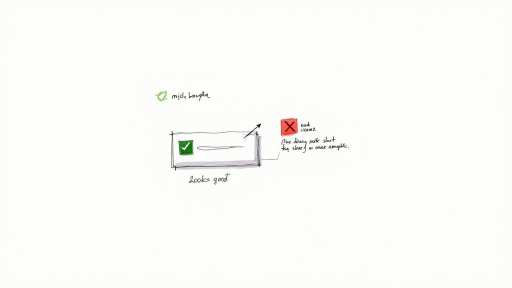
Be Specific: Use "Email Address" instead of just "Email." Use "First Name" and "Last Name" as separate fields rather than a single "Full Name" field, which can be ambiguous for users from different cultural backgrounds.
Position Above the Field: Always place labels directly above the corresponding input field. This creates a clear visual connection that is maintained even when the user starts typing. Avoid using placeholder text as a label, as it disappears on input and harms accessibility.
Keep It Concise: Aim for labels that are 2-5 words long. They should be descriptive but not verbose. For example, "Mobile Phone Number" is better than "Enter the phone number for your mobile device here."
Implementing clear labels is a fundamental aspect of creating a positive user experience. For a deeper dive into core usability concepts, you can explore the fundamentals of user experience design.
2. Single-Column Layout
Organizing form fields into a single vertical column is a proven method for improving completion rates and user satisfaction. This layout creates a clear, logical path for the user's eye to follow from top to bottom, minimizing distractions and potential confusion. By presenting one question at a time, it reduces cognitive load and makes the form feel less intimidating, which is a crucial element of effective form design best practices, especially on mobile devices where screen space is limited.

Why It Works
A single-column layout provides a natural, predictable rhythm for the user. Instead of their eyes jumping back and forth across multiple columns, they can proceed in a straight, uninterrupted line. This streamlined flow significantly speeds up completion time and reduces errors. Influential figures in web design, like Luke Wroblewski, have demonstrated through eye-tracking studies that single-column forms lead to a faster and more successful completion path compared to multi-column arrangements.
Actionable Tips for Implementation
To properly implement a single-column layout, consider the following advice:
Maintain a Vertical Rhythm: Ensure all fields and labels are aligned to a single vertical axis. This creates a visually cohesive and easy-to-scan structure. Tools like CSS Flexbox or Grid are perfect for achieving this.
Group Related Information: If you have related fields, like "City," "State," and "Zip Code," group them together visually within the single column using subtle spacing or a section header. This maintains the flow while keeping context.
Prioritize Mobile-First: This layout is inherently mobile-friendly, but always test your form on various screen sizes to ensure it scales correctly and remains easy to use without horizontal scrolling.
Adopting a single-column layout streamlines the user journey, making your forms more efficient and approachable. For more insights on designing for all users, check out Smashing Magazine's resources on responsive design.
3. Smart Field Validation
Smart field validation provides immediate, real-time feedback as users fill out a form, helping them correct errors before they attempt to submit. This proactive approach transforms a potentially frustrating experience into a guided, supportive one. Instead of seeing a list of errors after hitting "Submit," users receive instant confirmation of success or gentle guidance on what to fix. This is a crucial element of modern form design best practices because it significantly reduces user friction and increases completion rates.
Why It Works
This technique works by turning a monologue into a dialogue. The form communicates with the user in real time, preventing mistakes from piling up and causing form abandonment. By validating input as it's entered (or just after), you reduce the user's cognitive load and build their confidence. UX pioneers like Luke Wroblewski have championed this approach, noting that it makes the process feel more responsive and less like a test. Platforms like Stripe instantly validate credit card details, reinforcing trust and efficiency.
Actionable Tips for Implementation
To implement smart validation effectively, focus on being helpful, not disruptive:
Validate on Blur: For most fields, trigger validation when the user clicks or tabs out of the field (on blur), not on every keystroke. This prevents showing an error before they have even finished typing.
Use Clear, Instructional Messages: Avoid generic messages like "Invalid input." Be specific and helpful, such as "Password must be at least 8 characters long" or "Please enter a valid email address."
Show Success Visually: Use positive reinforcement like a green checkmark or border to confirm when a field has been filled out correctly. This builds momentum and reassures the user they are on the right track.
4. Visible Focus States
Forms must provide clear, distinguishable focus indicators that show which field is currently active. These visual cues are essential for keyboard navigation, helping all users understand their position on the page without relying on a mouse. Implementing visible focus states is a non-negotiable aspect of accessible form design best practices and a critical component of an inclusive user experience.
Why It Works
A visible focus state acts like a spotlight, highlighting the interactive element a user has navigated to. This is indispensable for users with motor impairments who rely on keyboards or other assistive technologies. As outlined by accessibility leaders like WebAIM and the W3C WCAG Guidelines, a clear focus indicator reduces confusion and prevents users from getting lost, ensuring they can complete the form efficiently and confidently.
Actionable Tips for Implementation
To create effective and accessible focus states, follow these key guidelines:
Never Remove Outlines: Avoid using CSS like
outline: none;without providing a highly visible alternative. Removing the default browser outline harms accessibility.Ensure High Contrast: The focus indicator, such as a border or
box-shadow, must have sufficient color contrast against the background to be easily seen. GitHub's distinct blue outline is a great example.Make It Obvious: The focus state should be noticeably different from both the default and hover states. This ensures users can instantly recognize which element is active.
Test with Keyboard Only: Navigate through your entire form using only the "Tab" key to confirm that every interactive element receives a clear visual focus.
Properly implementing focus states is a fundamental step toward building accessible digital products. To explore this topic further, you can find more information on the principles of web accessibility.
5. Minimize Required Fields
Only request information that is absolutely necessary for the immediate purpose of the form. Every additional field, especially a required one, increases the user's cognitive load and the risk of form abandonment. By keeping your forms lean and focused, you respect the user's time and significantly improve completion rates. This minimalist approach is a critical component of modern form design best practices because it directly reduces friction in the user journey.
Why It Works
A shorter form feels less intimidating and requires less effort, making users more likely to start and finish it. This principle, championed by conversion experts like the Baymard Institute and Luke Wroblewski, is rooted in psychology; the less you ask of someone, the more likely they are to comply. For example, Slack’s initial signup form only asks for an email address, removing barriers and getting users into the platform as quickly as possible.
Actionable Tips for Implementation
To effectively minimize your form fields, apply these strategic tips:
Justify Every Field: For each field, ask yourself, "Is this information absolutely essential right now?" If not, consider making it optional or collecting it later in the customer lifecycle.
Mark Optional Fields: Instead of cluttering your form with asterisks on required fields, clearly label the few that are optional (e.g., "Phone Number (optional)"). This makes the default assumption that all fields are required and cleans up the visual design.
Use Progressive Profiling: Don’t ask for everything at once. Collect the bare minimum initially, like an email address, and gather more details over time as the user engages with your service.
6. Clear Call-to-Action Buttons
The call-to-action (CTA) button is the final step in a user's journey through a form. Its design and text must be compelling and clear, leaving no doubt about the outcome of a click. A strong CTA removes hesitation and encourages completion, making it a critical component of high-converting form design best practices. It should stand out visually and use action-oriented language to guide the user to the finish line.
Why It Works
An effective CTA button acts as a clear directive, telling the user exactly what will happen next. Vague labels like "Submit" or "Go" create uncertainty, whereas specific text like "Create My Account" or "Download Your Free Guide" sets a clear expectation. This specificity, advocated by conversion optimization experts, reduces friction and increases user confidence. Companies like Stripe exemplify this by using "Add card" instead of a generic label, directly aligning the button's text with the user's immediate goal.
Actionable Tips for Implementation
To create CTAs that convert, apply these focused strategies:
Use Action-Oriented Verbs: Replace generic words with specific actions. Instead of "Submit," use "Create Account," "Get Your Quote," or "Join the Waitlist."
Create Visual Prominence: Use your brand’s primary color to make the main CTA button stand out from secondary actions like "Cancel." Ensure it has adequate padding (at least 12-16px) for easy clicking.
Communicate Button States: Clearly indicate when a button is active, disabled, or processing. Use a loading spinner and disable the button after a click to prevent accidental double-submissions and provide immediate feedback.
7. Grouped and Organized Fields
Grouping related fields is a powerful organizational technique that makes forms less intimidating and easier to comprehend. Instead of presenting a long, unstructured list of inputs, this approach segments the form into logical sections. This is a core tenet of effective form design best practices, as it breaks down a complex task into smaller, manageable chunks, significantly reducing the user's cognitive load.
Why It Works
A well-organized form tells a story. Each group of fields represents a chapter, guiding the user through the information-gathering process logically. This structure helps users understand the context of the questions being asked, allowing them to anticipate what comes next. Information architecture experts like Luke Wroblewski have shown that this "chunking" of information makes forms feel shorter and improves completion rates by creating a clear path forward.
Actionable Tips for Implementation
To properly group your form fields, apply these strategic tips:
Group by Context: Combine fields that are conceptually related. For example, all address information (Street, City, Zip Code) should be in one "Shipping Address" section, and payment details (Card Number, Expiration Date) in another.
Use Visual Separators: Employ whitespace, horizontal lines, or subtle background color changes to create clear visual boundaries between sections. This makes the form scannable and easy to navigate.
Add Section Headers: Label each group with a clear, descriptive header (e.g., "Personal Information," "Payment Details"). These headers act as signposts, informing users about the content of each section before they begin filling it out.
8. Mobile-First Responsive Design
With mobile traffic now dominating the web, forms must be built for the smallest screen first and then scaled up for larger devices. This mobile-first approach ensures a seamless experience for the majority of users, preventing issues like tiny text, untappable buttons, and horizontal scrolling. Adopting this strategy is a critical component of modern form design best practices, as it guarantees accessibility and functionality where users are most active.
Why It Works
Designing for mobile first forces you to prioritize essential elements and create a lean, efficient user flow. This focus on core functionality benefits all users, regardless of their device. Industry leaders like Brad Frost and Google's mobile-first indexing initiative have championed this methodology because it leads to faster, more accessible, and higher-converting forms. When a form works perfectly on a phone, it's far easier to adapt it to a desktop than the other way around.
Actionable Tips for Implementation
To build truly mobile-first forms, integrate these technical and design considerations:
Use Semantic HTML Inputs: Implement attributes like
type="tel"ortype="email"to trigger the correct mobile keyboards, simplifying data entry for users.Ensure Tappable Targets: Make all buttons and interactive elements at least 44x44 pixels. This provides an adequate touch target for fingers, reducing accidental taps.
Prevent Auto-Zoom: Set your font size to a minimum of 16px for input fields. This simple step prevents iOS browsers from automatically zooming in, which can disorient users.
Test on Real Devices: While browser emulators are useful, always test your forms on actual smartphones and tablets to catch device-specific quirks and ensure a smooth experience.
Mastering this approach is key to creating forms that perform well everywhere. To explore this topic further, check out this guide on responsive web design.
9. Helpful Error Messages and Recovery
Helpful error messages and recovery options are critical for a positive user experience. Instead of generic failure notices, effective error messages guide users by explaining exactly what went wrong and how to fix it. This approach turns a moment of friction into a constructive interaction, preventing frustration and form abandonment. Integrating this guidance is a key component of advanced form design best practices, as it directly supports users when they need help the most.
Why It Works
Clear, inline error validation transforms a potential dead end into a simple course correction. When a user makes a mistake, a supportive message that appears instantly near the relevant field reduces cognitive load and keeps them moving forward. Studies by usability experts at the Baymard Institute show that users can recover from errors much faster when guidance is immediate and specific. This prevents them from having to resubmit the entire form and re-enter all their correct information.
Actionable Tips for Implementation
To make your error messages supportive and effective, follow these guidelines:
Be Specific and Constructive: Instead of a generic "Invalid Input," use a precise message like "Password must include at least one uppercase letter." This tells the user exactly how to resolve the issue.
Use Supportive Language: Frame messages positively. Avoid accusatory or technical jargon. The goal is to help, not to blame the user for making an error.
Preserve User Data: Never clear the entire form when an error occurs. Keep all correctly entered information so the user only has to fix the specific field that is incorrect.
Suggest Corrections: For common typos, especially in email fields, provide a helpful suggestion. For instance, "Did you mean example@gmail.com?" can quickly resolve a simple mistake.
10. Progress Indicators for Multi-Step Forms
For longer forms that span multiple pages or sections, progress indicators are essential for managing user expectations and reducing fatigue. These visual cues, such as progress bars or step counters, show users where they are in the process and how much is left to complete. This transparency is a key component of effective form design best practices because it reduces the perceived effort required, which in turn decreases form abandonment rates.
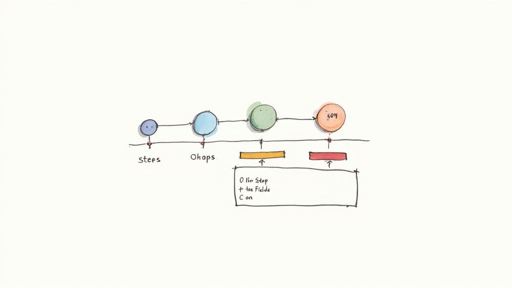
Why It Works
Progress indicators provide a sense of orientation and accomplishment. Knowing they are on "Step 2 of 4" gives users a clear understanding of the commitment and motivates them to continue. This technique, popularized by conversion optimization experts and SaaS platforms like Typeform, leverages the psychological principle of the goal-gradient effect, where people are more motivated as they get closer to a goal. It turns a potentially daunting task into a manageable, step-by-step journey.
Actionable Tips for Implementation
To make your progress indicators as effective as possible, consider these tips:
Visually Distinguish Steps: Clearly highlight the user's current step to provide immediate orientation. Use a different color or bolder font for the active step while keeping completed and upcoming steps visible but subdued.
Show Step Titles: Label each step clearly (e.g., "Shipping," "Payment," "Review"). This gives users a preview of what’s ahead and reinforces their understanding of the overall process.
Allow Navigation (If Possible): If the form logic allows, let users click on previous steps to review or edit their information. This gives them a sense of control and reduces the frustration of being locked into a linear path.
Top 10 Form Design Best-Practices Comparison
Pattern | 🔄 Implementation Complexity | ⚡ Resource Requirements | 📊 Expected Outcomes | 💡 Ideal Use Cases | ⭐ Key Advantages |
|---|---|---|---|---|---|
Clear and Descriptive Labels | 🔄 Low — copy + markup | ⚡ Low — content & semantic HTML | 📊 Fewer errors; higher completion & accessibility | 💡 All forms (signups, checkouts, surveys) | ⭐⭐⭐⭐ Improves clarity and screen‑reader support |
Single-Column Layout | 🔄 Low — layout decision | ⚡ Low — CSS layout work | 📊 Faster completion; better mobile usability (research-backed) | 💡 Mobile-first forms, simple signups, payment flows | ⭐⭐⭐⭐ Improves readability and reduces cognitive load |
Smart Field Validation | 🔄 High — timing & rules logic | ⚡ Medium–High — dev, testing, UX copy | 📊 Fewer submission errors; reduced support requests | 💡 Payments, account creation, complex inputs | ⭐⭐⭐⭐⭐ Real‑time guidance that prevents errors |
Visible Focus States | 🔄 Low–Medium — consistent styling | ⚡ Low — CSS + keyboard testing | 📊 Accessibility compliance; better keyboard navigation | 💡 Accessibility-focused apps, public services | ⭐⭐⭐⭐ Ensures WCAG compliance and clear focus |
Minimize Required Fields | 🔄 Medium — product & data strategy | ⚡ Low–Medium — UX research & policy | 📊 Higher conversion; faster completion (fewer abandonments) | 💡 Lead gen, onboarding, checkout guest flows | ⭐⭐⭐⭐⭐ Reduces abandonment and speeds conversion |
Clear Call-to-Action Buttons | 🔄 Low — copy + visual design | ⚡ Low — styling, states, small JS for loading | 📊 Increased conversions; fewer accidental submits | 💡 Submit-heavy forms, checkout, account flow | ⭐⭐⭐⭐ Clarifies intent and provides feedback (loading/disabled) |
Grouped and Organized Fields | 🔄 Medium — IA and visual grouping | ⚡ Medium — design & responsiveness work | 📊 Better comprehension; lower error rates on long forms | 💡 Long forms, multi-section applications, checkouts | ⭐⭐⭐⭐ Improves scanability and logical flow |
Mobile-First Responsive Design | 🔄 Medium–High — responsive patterns | ⚡ Medium — cross-device testing & adjustments | 📊 Higher mobile conversion; consistent UX across devices | 💡 Mobile-heavy sites, bookings, checkouts | ⭐⭐⭐⭐⭐ Optimizes mobile UX and reduces friction |
Helpful Error Messages and Recovery | 🔄 Medium — contextual copy & UX | ⚡ Medium — UX writing + dev to preserve state | 📊 Less frustration; fewer support tickets; faster recovery | 💡 Payments, validation-heavy forms, signups | ⭐⭐⭐⭐⭐ Actionable guidance that reduces abandonment |
Progress Indicators for Multi-Step Forms | 🔄 Medium — UI + state management | ⚡ Medium — design + implementation | 📊 Decreases abandonment (20–40% for multi-step) | 💡 Multi-step checkouts, applications, surveys | ⭐⭐⭐⭐ Orients users and lowers perceived effort |
Build Smarter Forms, Not Harder, with Alpha
Navigating the landscape of form design best practices can feel like piecing together a complex puzzle. Each element, from a clear single-column layout to smart, real-time field validation, is a crucial component in creating a seamless user experience. We have explored ten foundational principles that collectively transform a simple data-gathering tool into a powerful conversion engine. By prioritizing clarity, simplicity, and user guidance, you remove friction and build trust, encouraging more visitors to complete their journey.
The core takeaway is that exceptional form design isn't about flashy aesthetics; it's about empathy for the user. It's about anticipating their needs and paving the smoothest possible path to submission. When you group related fields logically, provide helpful error messages, and show progress on multi-step forms, you are communicating respect for your user's time and effort. This user-centric approach is the secret to boosting completion rates, improving data quality, and ultimately, driving business growth.
Turning Principles into Practice
Mastering these concepts is one thing, but implementing them consistently across all your forms is another challenge entirely. Here are your actionable next steps:
Audit Your Existing Forms: Review your current contact, signup, and checkout forms. Use the principles discussed in this article as a checklist. Where are the friction points? Are your labels clear? Is the design mobile-friendly?
Prioritize the Biggest Impact: You don't have to overhaul everything at once. Start with the forms most critical to your business. Improving a lead generation or payment form can yield immediate, measurable results.
Embrace Technology to Simplify Implementation: Manually coding for responsive design, focus states, and dynamic validation can be resource-intensive. This is precisely where a modern tool can provide a significant advantage, automating the technical details so you can focus on the user experience.
The power of these form design best practices lies in their synergy. A clear call-to-action button is effective, but its impact is magnified when paired with a clean layout and minimal required fields. This is why a holistic approach is so valuable. By integrating these strategies, you are not just building a form; you are architecting a conversation with your user, guiding them effortlessly from start to finish. Stop letting poor design be the bottleneck in your conversion funnel. It's time to build smarter, not harder.
Ready to implement these best practices without the technical overhead? Alpha’s AI-powered builder translates your descriptions into high-converting, beautiful forms that are optimized from the start. Build your first intelligent form in minutes and see the difference for yourself at Alpha.
Build beautiful websites like these in minutes
Use Alpha to create, publish, and manage a fully functional website with ease.