


How to Create Website Mockups People Actually Love
Learn how to create website mockups that bridge the gap between idea and reality. Our guide covers tools, principles, and developer handoff.
Build beautiful websites like these in minutes
Use Alpha to create, publish, and manage a fully functional website with ease.
Your landing page is your most critical digital salesperson. Yet, statistics show that the average landing page conversion rate hovers around a mere 2.35%. This means for every 100 visitors you fought hard to attract, 97 leave without taking action. The gap between a page that leaks visitors and one that generates leads is not about flashy graphics or complex code; it's about strategic design grounded in proven principles. Many businesses struggle because they treat their landing pages like a digital brochure, cramming them with information instead of guiding users toward a single, decisive action.
This guide cuts through the noise to deliver 10 essential, data-backed landing page design best practices. We move beyond generic advice like "make it look good" and provide actionable strategies you can implement immediately. You will learn how to structure a compelling value proposition that grabs attention in seconds, craft a single, irresistible call-to-action (CTA), and build trust using powerful social proof. We'll cover everything from mobile-first responsiveness and strategic content hierarchy to advanced techniques like form optimization and data-driven A/B testing. Mastering these fundamentals is the key to transforming your pages from passive information dumps into powerful conversion engines.
Each principle is a critical component of a high-performing page. To truly ensure your landing pages succeed and avoid common pitfalls, it's essential to master core principles. For another valuable perspective, explore these additional 9 Landing Page Design Best practices to round out your knowledge. By applying these focused strategies, you'll be equipped to build pages that not only attract visitors but consistently turn them into valuable customers and leads.
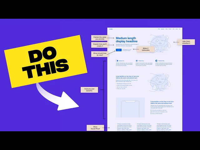
1. Clear and Compelling Value Proposition
A visitor should understand what your offer is, who it's for, and why they should care within five seconds of arriving on your page. This is the job of your value proposition. It’s a concise, powerful statement that communicates the unique benefit of your product or service, differentiating you from the competition. This critical element is typically the first thing a user sees, often presented as a headline and subheading "above the fold" (the visible area of the page before scrolling).
Without a strong value proposition, even the most beautifully designed page will fail to convert. It's the foundation of all effective landing page design best practices. If users are confused or unimpressed, they will bounce immediately, and you’ll lose a potential customer before you’ve even had a chance to make your case.
How to Craft a Winning Value Proposition
The best value propositions are clear, benefit-oriented, and specific. They avoid hype and jargon, focusing instead on solving a real problem for the target audience. Consider how Grammarly frames its offer: "Write with confidence and authenticity." This doesn't list technical features; it sells an outcome. It addresses a core user desire to communicate better.
Here are actionable tips for creating your own:
Focus on Benefits, Not Features: Instead of saying "Our software has a 256-bit encryption algorithm," say "Keep your data safe and secure." The first is a feature; the second is the benefit the user actually wants.
Be Specific and Quantifiable: Use data to make your claims more believable. Dropbox's classic "The home for all your work" is supported by its reputation for reliability and seamless file syncing. If you can, add numbers like "Join 2 million satisfied customers."
Use the "Headline + Subheading" Formula:
Headline: A short, punchy statement (5-10 words) that grabs attention and communicates the primary benefit. Example: Slack's "Where work happens."
Subheading: A slightly longer sentence that elaborates on the headline, explains what you do, and for whom.
A/B Test Your Messaging: Don't assume your first attempt is the best. Use A/B testing tools to pit different value propositions against each other and let the data tell you which one resonates most with your audience.
2. Single, Clear Call-to-Action (CTA)
Once you’ve captured a visitor's attention with your value proposition, you need to guide them toward the next step. This is the role of the call-to-action (CTA), a prominent, easily identifiable button or link that directs visitors toward your conversion goal. A landing page should have one primary objective, and therefore, one primary CTA to eliminate confusion and decision fatigue.
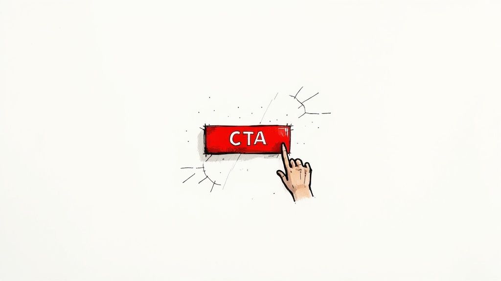
Without a clear CTA, visitors are left wondering what to do next. This friction can cause them to abandon the page, even if they are interested in your offer. A singular, compelling CTA is one of the most crucial landing page design best practices because it provides a direct, unambiguous path to conversion, transforming passive visitors into active leads or customers.
How to Design a High-Converting CTA
An effective CTA stands out visually and uses persuasive language to encourage action. It's not just a button; it's the culmination of your page's persuasive efforts. Consider how platforms like HubSpot use simple, low-commitment CTAs like "Get started free" to reduce friction and boost sign-ups.
Here are actionable tips for creating your own:
Use Action-Oriented Verbs: Begin your CTA text with a strong verb that tells users exactly what will happen. Words like "Get," "Start," "Download," or "Claim" are direct and compelling. Instead of a passive "Submit," try "Get Your Free Quote."
Create Visual Contrast: Your CTA button should be impossible to miss. Use a color that contrasts sharply with the page background and surrounding elements, drawing the user's eye directly to it.
Optimize for Mobile: Ensure your CTA button is large enough to be easily tapped on a mobile device. A height of 44-57 pixels is a commonly recommended range to avoid user frustration and improve accessibility.
Repeat Your CTA: For longer landing pages, don't make users scroll back to the top to convert. Place your CTA strategically throughout the page, such as above the fold, after a key benefits section, and at the very bottom.
A/B Test Your Button Copy: Small changes in wording can lead to significant differences in conversion rates. Test variations like "Start Your Free Trial" versus "Try for Free" to discover what resonates most with your audience.
3. Minimal, Distraction-Free Design
The goal of a landing page is to guide a visitor toward a single, specific action. Every element on the page should support this goal; anything that doesn't is a potential distraction that can lower your conversion rate. A minimal, distraction-free design removes clutter and focuses the user’s attention precisely where you want it: on your offer and call to action. This approach reduces cognitive load, making it easier for visitors to process information and make a decision.

This philosophy is a cornerstone of effective landing page design best practices because it honors the user's limited attention span. By stripping away non-essential elements like complex navigation, sidebars, and competing offers, you create a clear, linear path to conversion. Companies like Apple and Stripe master this by using generous white space and a strong visual hierarchy to make their primary message and call to action impossible to miss.
How to Implement a Minimalist Approach
Adopting a clean design doesn't mean your page has to be boring. It means being intentional with every pixel and ensuring each element serves a purpose. It's about clarity over complexity. The aim is to make the desired action the easiest and most obvious next step for the visitor.
Here are actionable tips for creating a distraction-free experience:
Remove Site Navigation: Your main website navigation menu gives users an easy way to leave your landing page. Unless it's absolutely essential, remove it to keep them focused on the conversion goal.
Use White Space Strategically: Don't cram elements together. Ample space around your headline, images, and CTA button makes them stand out and improves readability.
Limit Form Fields: Only ask for the information you absolutely need. Each additional field increases friction and can reduce form submissions. For a lead magnet, an email address might be enough.
Stick to One Primary CTA: Avoid presenting multiple, competing calls to action. Have one clear goal for the page and make sure every element supports it.
4. Mobile-First Responsive Design
With mobile traffic now dominating the web, designing for the smallest screen first isn't just a trend; it's a necessity. A mobile-first approach means you design the landing page experience for a mobile device and then adapt the layout for larger screens like tablets and desktops. This strategy forces you to prioritize the most critical elements, ensuring a lean, fast, and highly-focused experience for the majority of your visitors.
Ignoring a mobile-first philosophy is a critical mistake in today's digital landscape. A page that looks great on a desktop but is slow, clunky, or difficult to navigate on a smartphone will see its bounce rate skyrocket. Adopting this practice is a core component of modern landing page design best practices, as it directly impacts user experience, SEO rankings, and ultimately, conversion rates.
How to Implement a Mobile-First Approach
The key is to start with constraints. Designing for a small screen forces you to be ruthless with your content and design choices, focusing only on what truly matters. Companies like Airbnb and Uber excel at this, providing a seamless and intuitive experience on mobile that feels just as powerful as their desktop counterparts.
Here are actionable tips for creating your own mobile-first landing page:
Prioritize Above-the-Fold Content: On a small screen, the visible area is precious. Ensure your value proposition, primary call-to-action, and key visual are immediately visible without any scrolling.
Use Scalable and Legible Typography: Choose fonts that are easy to read on small screens. Use CSS to ensure text size adapts appropriately across different devices, avoiding the need for users to pinch and zoom.
Optimize Images and Media: Large image files can cripple mobile loading times. Use responsive image techniques (like the
<picture>element orsrcsetattribute) and compress files to ensure they load quickly without sacrificing quality. For a deeper dive, you can learn more about the fundamentals of responsive web design.Simplify Navigation and Forms: Replace complex menus with a simple "hamburger" icon. Design forms with large, easy-to-tap fields and labels placed above the input area to create a linear, user-friendly flow.
Test on Real Devices: Browser emulators are helpful, but nothing beats testing on actual smartphones and tablets. This allows you to identify real-world performance issues and interaction problems that emulators might miss.
5. Trust-Building Elements and Social Proof
When a user lands on your page, especially for the first time, they are naturally skeptical. They're asking, "Can I trust this company? Is this offer legitimate?" Addressing this hesitation head-on with trust-building elements and social proof is crucial for conversion. These are signals that validate your claims and show that other people have had positive experiences with your brand.
Popularized by Robert Cialdini's principle of social proof, this concept suggests that people conform to the actions of others under the assumption that those actions are correct. By showcasing testimonials, reviews, and client logos, you leverage this psychological trigger to reduce friction and build credibility. This is one of the most powerful landing page design best practices for turning a hesitant visitor into a confident buyer.
How to Effectively Showcase Social Proof
The key is to make your social proof authentic, specific, and visually prominent. Vague praise is easily dismissed, but a detailed testimonial with a real name and photo feels genuine and relatable. Companies like HubSpot and ConvertKit master this by weaving customer stories and data-backed case studies throughout their pages.
Here are actionable tips for integrating trust signals:
Be Specific with Testimonials: Instead of "Great product!", use a quote that includes a quantifiable result like, "We increased our lead generation by 300% in the first quarter." This adds significant weight and credibility.
Showcase Recognizable Client Logos: If you have well-known clients, display their logos prominently. This "borrowed credibility" immediately elevates your brand's status. Zendesk does this exceptionally well by featuring a "Trusted by" logo bar.
Use Trust Badges and Security Seals: For e-commerce or SaaS pages asking for sensitive information, displaying security seals (like SSL certificates) and trust badges (like G2 or Trustpilot ratings) is non-negotiable. Place them near your call-to-action to alleviate last-minute anxiety.
Incorporate Real Photos and Videos: Whenever possible, accompany testimonials with a high-quality photo or, even better, a short video of the customer. This humanizes the feedback and makes it much more persuasive.
6. Strategic Use of Visuals and Media
Humans process images 60,000 times faster than text, making visuals the most immediate way to communicate your offer's value. Strategic use of visuals and media involves carefully selecting images, videos, icons, and graphics that not only look good but also serve a specific purpose. They should demonstrate your product in action, build trust, and create an emotional connection that text alone cannot achieve.
Poorly chosen visuals, like generic stock photos or slow-loading videos, can actively harm your conversion rates by making your brand feel inauthentic or frustrating the user. Effective visuals are a core component of landing page design best practices because they guide the visitor's eye, break up text, and make complex information digestible. They are not just decoration; they are powerful communication tools.
How to Leverage Visuals for Maximum Impact
The best visuals are relevant, high-quality, and optimized for performance. They should support your value proposition, not distract from it. For instance, Dropbox uses simple, animated graphics to quickly explain how its file-syncing service works, which is far more effective than a long paragraph of text. Notion uses embedded videos to showcase specific features, allowing users to see the product's power firsthand.
Here are actionable tips for using visuals effectively:
Prioritize Authenticity: Use photos of your actual team, customers, or product instead of generic stock imagery. Authenticity builds trust and makes your brand more relatable.
Optimize for Speed: Compress all images using tools like TinyPNG and serve them in modern formats like WebP. Use lazy loading for images that appear below the fold to ensure the initial page load is lightning-fast.
Use Video Wisely: Keep videos short and engaging, ideally under two minutes. Add captions for accessibility and for users who watch with the sound off. A video can be used as a product demo, customer testimonial, or brand story.
Ensure Accessibility: Add descriptive alt text to all images. This not only helps visually impaired users understand the content but also provides SEO benefits by giving search engines context about the image.
7. Strategic Content Hierarchy and Scrollytelling
A high-converting landing page is more than a collection of elements; it's a guided conversation. Strategic content hierarchy organizes information in a logical flow, leading visitors on a compelling journey from initial awareness to final conversion. This practice, often called "scrollytelling," uses the act of scrolling to unfold a narrative, revealing information progressively to maintain engagement and build desire.
Without a logical narrative, you risk overwhelming or confusing visitors with a disjointed presentation of features, benefits, and calls to action. A well-structured hierarchy is a core component of effective landing page design best practices, ensuring that your most critical messages are delivered at the perfect moment in the user’s journey, making the final decision to convert feel like a natural conclusion.
How to Build a Compelling Narrative Flow
The goal is to answer a visitor's questions as they arise and build a case for your offer step-by-step. This means moving from the big picture to the finer details in a way that feels intuitive. Consider how Mailchimp masterfully reveals its features as you scroll, each section building on the last to paint a complete picture of its value.
Here are actionable tips for structuring your page's story:
Follow the Classic Conversion Funnel: A proven structure is Hero (value proposition) → Problem/Solution → Features & Benefits → Social Proof (testimonials) → Final CTA. This flow mirrors a visitor's natural thought process.
Create Visual Rhythm: Use consistent visual elements like colors, icons, and illustration styles to tie different sections together. Use distinct section breaks and visual separators to signal transitions in the narrative without jarring the user.
Ensure Logical Transitions: Each section should flow seamlessly into the next. For example, after showcasing a powerful feature, the next logical step is to display a testimonial from a customer who loves that specific feature.
Implement "Progressive Disclosure": Don't reveal everything at once. Introduce concepts one at a time. Start with the core benefit, then elaborate with specific features, and finally, back it up with proof. This keeps the user engaged and prevents information overload.
8. Form Optimization and Progressive Profiling
Your landing page form is the final barrier between a visitor and a conversion. A long, complicated, or intimidating form can single-handedly destroy your conversion rates, even if every other element on the page is perfect. Form optimization is the art and science of making this final step as frictionless as possible, encouraging users to complete the desired action without hesitation. This involves asking for only essential information upfront and strategically gathering more data over time.
This is where the concept of progressive profiling comes in. Instead of overwhelming a first-time visitor with ten form fields, you start by asking for the bare minimum, like a name and email. Once they become a lead, subsequent interactions can use smart forms to ask for new information, like company size or job title, gradually building a comprehensive user profile. This approach respects the user's time and builds trust, making it a cornerstone of effective landing page design best practices.
How to Implement Smart Form Design
The goal is to reduce cognitive load and make submission feel effortless. Every field you add increases friction and the likelihood of abandonment. Companies like HubSpot and Calendly master this by presenting incredibly simple initial forms. For instance, Calendly only asks for your email to get started, removing nearly all barriers to entry.
Here are actionable tips for optimizing your forms:
Reduce Fields to the Absolute Minimum: Start with what is non-negotiable (usually an email address) and critically question every additional field. Can you get that information later? Is it essential for this specific offer?
Use Smart Defaults and Pre-filled Fields: If a user is already in your system, pre-fill the information you know, like their name. This is a common practice on sites like LinkedIn, making the process faster and more user-friendly.
Implement Inline Validation: Provide real-time feedback as a user fills out the form. A green checkmark for a valid email is much better than a red error message after they hit "submit."
Break Long Forms into Multiple Steps: If you absolutely need to collect a lot of information, use a multi-step form with a progress bar. This makes the process feel less daunting and leverages the psychological principle of commitment and consistency. You can learn more about how this impacts your broader strategy in our guide to lead generation best practices.
Remove CAPTCHA: While important for spam prevention, traditional CAPTCHAs are notorious for increasing form abandonment. Opt for invisible reCAPTCHA or other modern, user-friendly alternatives.
9. Above-the-Fold Optimization
The "above-the-fold" area is the digital equivalent of a storefront window. It's the first part of your landing page a visitor sees without scrolling, and it has mere seconds to make a lasting impression. Optimizing this prime real estate is crucial for capturing attention, establishing relevance, and convincing users to explore further. If this section fails to communicate value instantly, visitors are likely to bounce, assuming the rest of the page isn't worth their time.
A well-designed above-the-fold section acts as a powerful summary of your entire offer. It should house your core value proposition, a visually supportive hero image, and a clear call-to-action. This strategic placement ensures that every visitor, regardless of their intent to scroll, understands what you do and what action you want them to take. Mastering this element is a fundamental part of effective landing page design best practices.
How to Maximize Your Above-the-Fold Impact
The goal is to provide clarity and motivation in a single glance. Every element should work in harmony to guide the user's journey. Companies like Asana excel at this by placing their value proposition ("Work on big ideas, without the busywork") and primary CTA directly above the fold, leaving no doubt about the page's purpose.
Here are actionable tips for optimizing your own:
Prioritize a Clear Hierarchy: Your headline should be the most prominent element, followed by your subheading, and then your CTA. Use size, color, and weight to guide the user's eye naturally through the most important information first.
Place Your Primary CTA Prominently: Don't make users hunt for the next step. Your main call-to-action button should be immediately visible and stand out from other page elements through contrasting colors.
Ensure Your Hero Image Adds Context: The main image or video should support your message, not distract from it. It should visually represent your product, service, or the positive outcome users will experience.
Include at Least One Trust Signal: Briefly mention a well-known client, display a star rating, or add a "Trusted by..." social proof element. This immediately builds credibility and reduces friction.
Optimize for Mobile Viewports: What's above the fold on a desktop is very different on a phone. On mobile, elements should stack vertically, with the headline, a concise benefit statement, and the CTA all visible on the initial screen.
10. A/B Testing and Data-Driven Iteration
Even with the best design principles, you can't be certain what will resonate most with your audience without testing. A/B testing, or split testing, is the practice of comparing two versions of your landing page to see which one performs better. By showing "Version A" to one half of your traffic and "Version B" to the other, you can gather empirical data on what drives more conversions, removing guesswork from your optimization efforts.
This data-driven approach is fundamental to achieving a high-performing page. Without it, you are relying on assumptions and intuition, which can be costly and ineffective. Systematically testing elements like headlines, calls-to-action, and images is one of the most powerful landing page design best practices for continuous improvement and maximizing your return on investment.
How to Implement Effective A/B Testing
The key to successful A/B testing is a methodical and patient approach. Start with a clear hypothesis about what change will improve performance and why. For example, your hypothesis might be: "Changing the CTA button color from blue to orange will increase clicks because it creates higher visual contrast." Tools like Google Optimize, Unbounce, and Optimizely make setting up and running these experiments straightforward.
Here are actionable tips for your testing process:
Test One Variable at a Time: To know what change caused a lift in conversions, isolate your variables. If you change the headline, the image, and the CTA all at once, you won't know which element was responsible for the outcome.
Prioritize High-Impact Elements: Begin by testing the elements most likely to affect user behavior, such as your main headline, value proposition, primary call-to-action, and hero image. Small tweaks to button copy can often yield significant results.
Wait for Statistical Significance: Don't end a test prematurely just because one version is ahead. Wait until you have enough data (typically a 95% statistical significance level and at least 100-200 conversions per variation) to make a reliable decision.
Document Everything: Keep a log of every test you run, including your hypothesis, the variations, the results, and what you learned. This document becomes an invaluable resource for future optimization. Learn more about how this fits into a broader plan with these conversion rate optimization strategies.
Landing Page Best Practices — 10-Point Comparison
Item | Implementation 🔄 | Resources ⚡ | Outcomes 📊⭐ | Ideal Use Cases 💡 | Key Advantages ⭐ |
|---|---|---|---|---|---|
Clear and Compelling Value Proposition | Medium — research + concise copy; needs testing | Low–Medium — copywriter, user research | High ⭐ — clarifies purpose; reduces bounce; improves conversions | New visitors, hero messaging, product launches | Immediate relevance; clear differentiation |
Single, Clear Call-to-Action (CTA) | Low — design + copy; straightforward to deploy | Low — design, minor dev, analytics | High ⭐ — increases conversion clarity; easy to measure | Signup, purchase, lead capture pages | Reduces decision fatigue; focused user journey |
Minimal, Distraction-Free Design | Medium — content pruning + focused layout | Medium — designer, front-end dev, testing | High ⭐ — faster load; better focus; lower bounce | Mobile-first sites, premium brands, simple funnels | Improved visual hierarchy; faster UX |
Mobile-First Responsive Design | High — responsive development + device testing | High — dev time, QA on devices, optimization | High ⭐ — better UX across screens; SEO gains | Mobile-dominant audiences, marketplaces, apps | Future-proofed experience; performance improvements |
Trust-Building Elements and Social Proof | Low–Medium — collect and display assets; placement | Medium — content sourcing, design, updates | High ⭐ — reduces hesitation; boosts credibility (20–34% uplift when effective) | New brands, B2B, high-consideration purchases | Increased credibility; social validation |
Strategic Use of Visuals and Media | Medium–High — production and optimization work | High — photography/video production, hosting | High ⭐ — raises engagement; demo clarity (video lifts 25–80%) | Product demos, emotional storytelling, feature showcases | Emotional connection; clearer product understanding |
Strategic Content Hierarchy and Scrollytelling | High — content strategy, UX and pacing design | Medium–High — copywriters, designers, testing | High ⭐ — increases scroll depth and retention; SEO benefits | Complex products, long-form campaigns, storytelling pages | Guides journey; improves information retention |
Form Optimization & Progressive Profiling | Medium–High — form logic + backend integration | Medium — dev, analytics, CRM integration | High ⭐ — higher completion rates; better lead quality (25–50% uplift on field reduction) | Lead-gen funnels, SaaS trials, scheduling flows | Reduced friction; improved lead data over time |
Above-the-Fold Optimization | Medium — design balance and testing | Low–Medium — copywriter, designer, quick tests | High ⭐ — strong first impression; 20–30% conversion improvement benchmark | PPC landing pages, first-time visitors, promos | Immediate relevance; quick impact on conversions |
A/B Testing & Data-Driven Iteration | High — analytics setup, hypothesis-driven tests | High — tools, traffic, analysts, time | High ⭐ (long-term) — validated incremental gains; institutional learning | High-traffic sites, ongoing optimization programs | Removes guesswork; compounds improvements over time |
Turn Your Insights Into a High-Converting Reality
We've journeyed through the ten foundational pillars of exceptional landing page design, from crafting a magnetic value proposition to the disciplined art of A/B testing. The path to a high-converting page isn't paved with a single "magic bullet" but is instead built upon a strategic framework. Mastering these landing page design best practices is what separates pages that simply exist from those that consistently deliver results.
The central theme is clear: a successful landing page is a masterclass in focus. It's about surgically removing distractions to guide your visitor toward a single, desired action. Every element, from the headline to the color of your CTA button, must serve this one purpose. You've learned the importance of creating a frictionless user experience, establishing immediate trust, and designing for the mobile-first world we live in.
From Theory to Tangible Results
Understanding these principles is the first crucial step, but the real growth happens when you translate this knowledge into action. It’s easy to get bogged down in the details, but remember the core loop of high-performance marketing: Build > Measure > Learn.
Here is your actionable roadmap to get started:
Audit Your Current Landing Page: Use the ten points in this article as a checklist. Where are the biggest gaps? Start with the low-hanging fruit, such as clarifying your headline or simplifying your form.
Prioritize Your Next Build: For your next campaign, commit to implementing at least three of these best practices from scratch. Focus on nailing your single CTA, embedding strong social proof, and ensuring your above-the-fold content is flawless.
Commit to Iteration: Launching the page is not the finish line; it's the starting line. Set up an A/B test for one key element, like your main image or call-to-action text. Let the data guide your next move.
The True Value of Optimized Design
Mastering these concepts is more than an academic exercise. It's about maximizing the return on every dollar and every minute you invest in driving traffic. A well-designed landing page respects your visitor's time, clearly communicates your value, and makes it easy for them to say "yes." This directly translates into lower acquisition costs, higher quality leads, and ultimately, accelerated business growth.
By applying a data-driven and user-centric approach, you move beyond guesswork and into the realm of strategic optimization. Each successful test and every implemented best practice compounds over time, creating a powerful conversion engine for your business. To truly turn your insights into a high-converting reality, you must also consider the broader context of your user's journey. Delving deeper into comprehensive strategies to improve website conversion rates will provide you with a more holistic view of how your landing page fits into your overall marketing funnel.
Ultimately, the goal is to create a seamless and persuasive experience that feels less like a sales pitch and more like a solution to a visitor's problem. By putting these principles into practice, you are not just building a webpage; you are building a relationship with your audience, one conversion at a time.
Ready to implement these best practices without the technical headaches? Alpha uses AI to generate stunning, high-converting landing pages that are optimized from the start. Stop wrestling with design tools and let AI build the foundation for your success. Try Alpha today and launch a page that converts.
Build beautiful websites like these in minutes
Use Alpha to create, publish, and manage a fully functional website with ease.