How to Create Website Mockups People Actually Love
Learn how to create website mockups that bridge the gap between idea and reality. Our guide covers tools, principles, and developer handoff.

Build beautiful websites like these in minutes
Use Alpha to create, publish, and manage a fully functional website with ease.


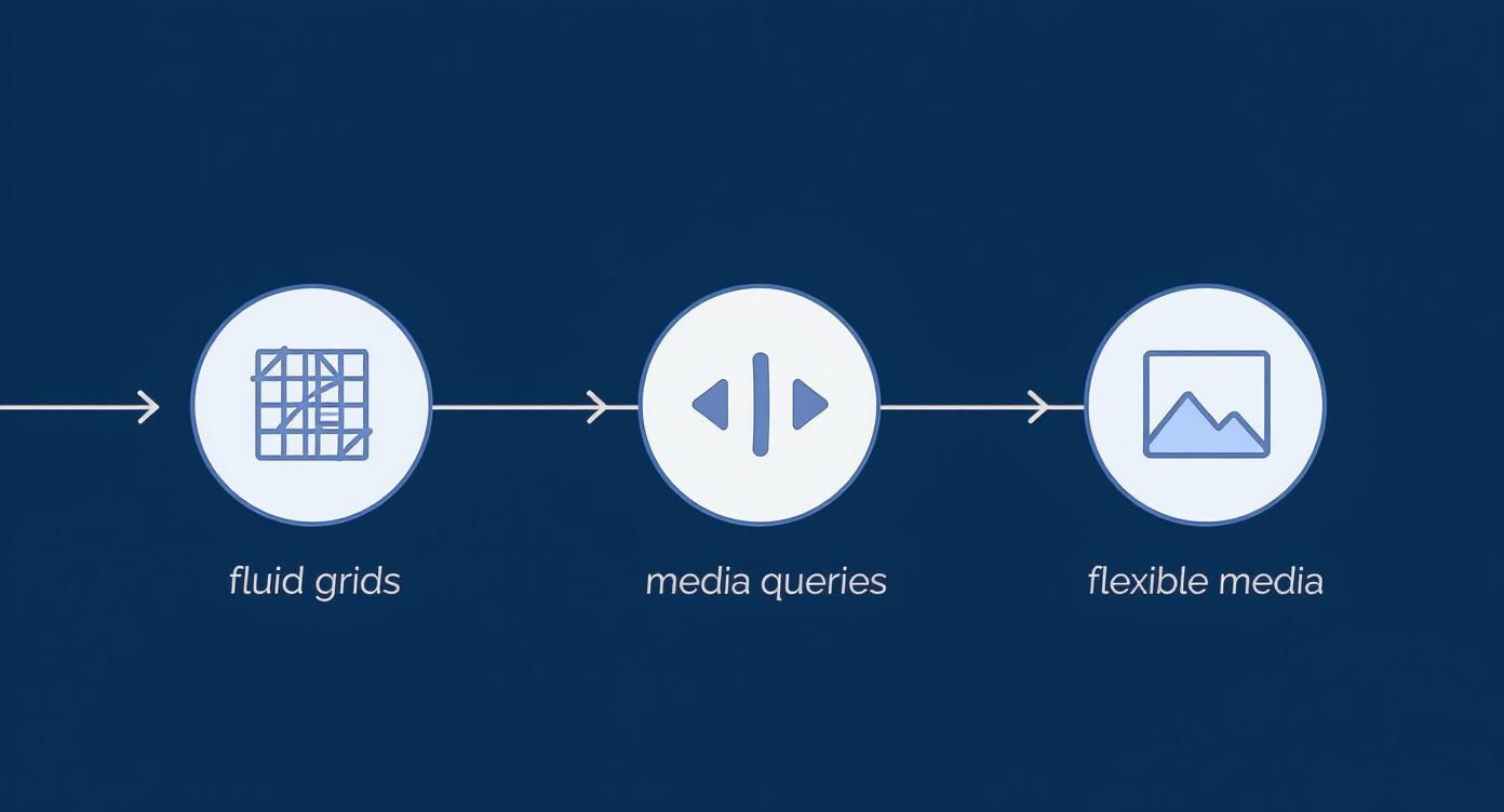
This tutorial is your guide to building websites that look fantastic on any device, from a tiny phone screen to a massive desktop monitor. We're going to break down the three pillars of responsive web design: fluid grids, flexible media, and media queries. Mastering these is no longer a "nice-to-have"—it's the absolute foundation of modern web development and the key to a great user experience.
Why You Can't Ignore Responsive Design Anymore
Think about the last time you tried to use a website on your phone and had to pinch-to-zoom just to read a single sentence. It’s frustrating, right? You probably gave up and left. That's precisely the disaster responsive design helps you avoid. It’s not just a feature; it's a baseline requirement for any website that wants to succeed today.
It wasn't always this way. In the early days, we designed for a single desktop monitor. Simple. But now, your audience is everywhere—on phones, tablets, laptops, and even smart TVs. A rigid, non-responsive site tries to cram that old desktop layout onto every screen, which inevitably leads to a broken, unusable mess for most people.
Mobile Isn't Just a Trend, It's the Standard
The shift to mobile browsing has completely taken over. Projections show that by 2025, a staggering 63.15% of all global web traffic will come from mobile devices. That's a huge tell for where your users are.
With 4.32 billion people—over 96% of all internet users—browsing on their phones, a seamless mobile experience isn't just an expectation; it's a demand. In fact, about 83% of users expect a website to work perfectly on whatever device they happen to be using. You can dig deeper into these mobile usage statistics to see just how critical this is for developers.
This mobile-first reality has massive consequences. Search engines like Google now prioritize mobile-friendly sites in their rankings. So, if your site isn’t responsive, it’s not just annoying your visitors—it’s also becoming invisible on search pages.
"A responsive design ensures that your website is accessible and easy to use for the largest possible audience, directly impacting user engagement, conversion rates, and your brand's overall perception."
If you don't adapt, you’re essentially shutting the door on the majority of your potential audience. This hits your bottom line directly, leading to higher bounce rates, less time spent on your site, and terrible conversion rates—all classic symptoms of a poor mobile experience.
Core Principles of Responsive Design
Before we jump into the code, let's get a handle on the three foundational concepts that make responsive design work. Each one tackles a specific challenge of adapting content to different screens. We'll explore them in detail, but this quick overview will give you a solid starting point.
Here's a snapshot of the core ideas we'll be building on throughout this tutorial.
Core Principles of Responsive Design at a Glance
Principle | What It Does | Why It Matters |
|---|---|---|
Fluid Grids | Uses relative units like percentages instead of fixed units like pixels for layout widths. | Allows your layout containers to stretch or shrink gracefully to fit the screen, preventing horizontal scrolling. |
Flexible Media | Ensures that images, videos, and other media elements scale down within their containing elements. | Prevents oversized images from breaking the layout on smaller screens and improves load times. |
Media Queries | Applies different CSS styles based on the device's characteristics, primarily screen width. | Enables you to create truly adaptive layouts, like changing a three-column desktop view to a single-column mobile view. |
Once you get a feel for how these three principles work together, you'll have the power to create websites that feel like they were custom-built for every device. That's what a great user experience is all about, and it's the goal of this entire guide.
Building a Solid Foundation with Fluid Grids
The first real pillar of responsive design is the fluid grid. This isn't just a technique; it's a complete mindset shift away from old-school, rigid layouts. Instead of locking your website containers into fixed pixel (px) dimensions, you start thinking in relative units like percentages (%).
This one change is what makes your design flow. It lets the layout gracefully expand and contract to fit whatever screen it's on, from a tiny phone to a huge monitor. It’s the secret to killing that dreaded horizontal scrollbar on mobile devices—a dead giveaway of a site that wasn't built to be responsive.
By using percentages, you're just telling each element how much space to take up relative to its parent container. This creates a flexible, adaptable skeleton for your site.
Moving From Pixels to Percentages
Let's make this tangible. Think about a classic, fixed-width blog layout. You might have a main container that's 960px wide. Inside that, there's a 600px content area and a 300px sidebar, separated by a 60px gap. Looks great on a standard desktop, but on a smartphone? It's a jumbled, unusable mess.
To fix this, we need a simple formula: target ÷ context = result.
Here, the target is the width of the element you're sizing (like the 600px content area), and the context is the width of the container it sits inside (the 960px wrapper).
Let's do the math for our blog example:
Content Area:
600px÷960px=0.625. So, your content area gets a width of 62.5%.Sidebar:
300px÷960px=0.3125. That makes the sidebar's width 31.25%.Gutter/Margin:
60px÷960px=0.0625. The margin between them becomes 6.25%.
This bit of arithmetic is the key to unlocking fluid layouts. It's the foundational first step in any good responsive web design tutorial, and everything else we do will build on this.
This whole process is about creating a seamless user experience, starting with the fluid grids we're working on now.
As you can see, fluid grids are the starting point. Media queries and flexible media come next, each one adding another layer of control to deliver that fully responsive experience.
Exploring Other Relative Units
While percentages are the workhorse for fluid grids, modern CSS gives us even more powerful tools that are tied directly to the viewport—the visible part of the browser window. Getting comfortable with these will give you a much finer degree of control.
"Mastering relative units is like learning the grammar of responsive design. It allows you to create layouts that not only resize but also maintain their intended proportions and readability across all devices."
Here are a few essential viewport units to have in your back pocket:
vw(Viewport Width): Onevwis exactly 1% of the viewport's width. This is a game-changer for things like full-bleed headers or background sections that need to stretch edge-to-edge.vh(Viewport Height): Just likevw, onevhis 1% of the viewport's height. It's perfect for those "hero" sections you want to fill the entire screen when a user first lands on the page.vminandvmax: These are your secret weapons for tricky situations.vmingrabs the value of the smaller viewport dimension (width or height), whilevmaxtakes the larger one. They're fantastic for maintaining the aspect ratio of elements when a device flips between portrait and landscape.
When you start combining these units with percentages, you can build some seriously sophisticated and dynamic layouts. For example, you might set a container's width in percentages but give it a minimum height using vh to make sure it always has enough visual impact, no matter the screen.
If you're using a tool like Alpha, its AI often handles these calculations for you, generating responsive layouts automatically. It's a great way to see best practices in action. But no matter what, understanding fluid grids is the most important step you can take toward truly mastering responsive design.
Using Media Queries to Create Adaptive Layouts
If fluid grids are the skeleton of responsive design, media queries are the brain. They're what allow your design to intelligently react and change based on the user's screen. Think of them as simple "if-then" rules in your CSS: if the screen is a certain size, then apply these specific styles.
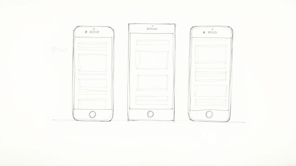
This is how you get a truly adaptive layout. Instead of just shrinking a desktop design down—which rarely works well—you can completely rethink the experience. A three-column layout on a big screen can seamlessly reflow into a clean, single column on a phone. The goal is to always present your content in the most readable and usable way, no matter the device.
The best practice here is a mobile-first approach. You start by writing the simplest CSS for the smallest screens. Then, you use media queries to add more complex styles as the screen gets bigger. This keeps your base code light and ensures a fast, clean experience on mobile, which is non-negotiable today.
Understanding Breakpoints
A breakpoint is simply the screen width where your media query activates a change. It's the point where your layout needs to adapt to avoid looking cramped or broken. A common mistake is to base breakpoints on specific devices, like the latest iPhone or a popular Android model. A much better way is to let your content be your guide.
Here's a practical tip: open your design in a browser and slowly shrink the window width. The moment things start to look weird—text lines get too long, elements overlap, or things just feel off—that's a natural breakpoint. That's where you need a media query.
"Don’t choose breakpoints based on specific devices. Instead, let your content determine where breakpoints are needed. This creates a more resilient and future-proof design that isn’t tied to today’s hardware."
If you need a starting point, these general ranges are pretty standard in the industry:
Small screens (phones): below 768px
Medium screens (tablets): 768px and up
Large screens (desktops): 992px and up
Just remember, these are guidelines, not rigid rules. Every design is different, so test and adjust until it feels right for your layout.
Implementing a Mobile-First Media Query
Let's walk through a quick example. Say we have a main content area and a sidebar. On mobile, we want them stacked vertically, one on top of the other. That’s our default style.
/* Default mobile styles first */
.main-content {
width: 100%;
}
.sidebar {
width: 100%;
margin-top: 20px;
}
Easy enough. Now, for screens that are 768px or wider, we want them to sit side-by-side. We'll use a min-width media query, which tells the browser to apply these new rules only when the screen is at least that wide.
/* Tablet and desktop styles /
@media (min-width: 768px) {
.container {
display: flex; / Flexbox is great for this */ }
.main-content {
width: 70%; /* Takes up 70% of the container */
margin-right: 5%;
}
.sidebar {
width: 25%; /* Takes up the remaining 25% */
margin-top: 0;
}
}
This approach keeps things clean and efficient. The simplest styles load first for everyone, and the more complex layout rules only get applied when needed.
This isn't just a "nice-to-have." The data is clear: over 73% of users report they'll leave a site if it isn't mobile-friendly. A bad mobile experience is a surefire way to lose visitors. For more on this, check out these key web design statistics that highlight just how crucial a responsive site is.
Beyond Screen Width
While screen width is what you'll use 90% of the time, media queries have a few other tricks up their sleeve. You can target other device features to add that extra layer of polish.
Here are a few other media features worth knowing:
orientation: Apply different styles forportraitvs.landscapemode. This is perfect for reconfiguring layouts when someone rotates their phone or tablet.resolution: Target high-resolution displays (like Retina screens) to serve crisper, higher-quality images.hover: Check if the user's main input device can hover. This lets you apply hover effects for mouse users without creating a clunky experience on touchscreens.
For a more thorough look at getting your site ready for smaller screens, our guide on how to optimize your website for mobile is a great next step. And if you're looking to speed things up, an AI website builder like Alpha often handles the heavy lifting by generating responsive code and optimized layouts for you right from the start.
Making Your Images and Media Truly Flexible
https://www.youtube.com/embed/fp9eVtkQ4EA
So you've wrestled with fluid grids and bent media queries to your will. You’re feeling pretty good about your layout. Then, a single, stubborn image blows it all up.
Nothing breaks a responsive design faster than a rigid, oversized image spilling out of its container and triggering that dreaded horizontal scrollbar. It's a classic mistake, but thankfully, it's also a straightforward fix. This brings us to the third pillar of responsive design: flexible media.
The whole idea is to make your images, videos, and iframes adapt just as smoothly as the rest of your layout. The core solution is surprisingly simple, but it’s a non-negotiable for any modern project.
The Essential CSS for Fluid Images
The go-to trick for taming unruly images is a single, elegant line of CSS. You'll find yourself typing this into almost every stylesheet you write.
By adding this snippet, you give the browser a clear, simple rule: an image can shrink to fit its container, but it can never be wider than it. As the container gets smaller, the image scales down right along with it, perfectly preserving the flow of your grid.
img {
max-width: 100%;
height: auto;
}
That height: auto part is just as crucial. It instructs the browser to maintain the image's original aspect ratio as the width changes. No more weirdly squished or stretched-out photos—they'll always look exactly as intended.
Pro Tip: This
max-width: 100%andheight: autocombo is the bedrock of flexible media. It’s the first thing you should add to your CSS reset to prevent images from ever breaking your layout.
Solving the Performance Problem
Okay, so your images now resize beautifully. But you're only halfway there. A massive, high-resolution desktop image might look fine scaled down on a phone, but the user still has to download the entire, heavyweight file. This is a recipe for slow load times and frustrated visitors, especially on spotty mobile connections.
A 4MB photo that’s fine on a gigabit fiber connection is an absolute performance killer on 4G. The real solution is to serve up different image files based on the screen's size and resolution. This is where modern HTML comes to the rescue.
Using Srcset for Resolution Switching
The srcset attribute is a game-changer for the humble <img> tag. It lets you feed the browser a menu of different-sized versions of the same image. The browser then gets to be the smart one, picking the most appropriate file based on the user's screen width and pixel density.
Here’s a quick look at how it works:
<img src="small.jpg" srcset="medium.jpg 800w, large.jpg 1200w" alt="A descriptive alt text for the image.">
In this example:
small.jpgacts as a fallback for old browsers that don’t getsrcset.The browser will likely grab
medium.jpgif the screen is around 800px wide.It'll opt for
large.jpgon bigger screens, like those around 1200px.
This approach ensures mobile users get a small, fast-loading image while desktop users still get the crisp, high-quality version they expect.
Advanced Control with the Picture Element
Sometimes, you need even more granular control. This is where the <picture> element shines. It’s perfect for what we call "art direction"—when you want to show a completely different crop of an image on different screens. Think of a wide landscape shot on a desktop that reframes to a tight, vertical crop of the main subject on mobile.
The <picture> element wraps a standard <img> tag and uses a few <source> elements, each with its own media query.
<picture>
<source media="(min-width: 900px)" srcset="desktop-image.jpg">
<source media="(min-width: 600px)" srcset="tablet-image.jpg">
<img src="mobile-image.jpg" alt="A different descriptive alt text.">
</picture>
The browser reads the <source> tags from top to bottom and uses the first one that matches the current viewport. The <img> tag at the end is the default if no sources match.
Getting images right is a massive part of modern web performance. If you want to dive deeper, we cover this in much more detail in our guide on how to optimize images for the web.
Optimizing Typography for Maximum Readability
You can have the most brilliant fluid grid and perfectly flexible images, but if your text is a chore to read, the design has failed. The real heart of most websites is the content, and typography is what gives that content a voice. If people are squinting at tiny text on their phone or getting lost in overly wide lines on a desktop, you've missed the mark.
Good responsive typography is all about making sure your words are clear, legible, and easy on the eyes, no matter what screen they’re on.

This isn’t just about picking a font size and calling it a day. It's about carefully considering how text scales, breathes, and flows. The goal is to create a reading experience that feels completely natural on any device, inviting users to dive in.
This is a big deal. The market for responsive web design services is valued at around $50 billion and is expected to grow at a 15% CAGR through 2033. Why? Because businesses know that a great reading experience is non-negotiable. You can see more on this market growth on Data Insights Market.
Mastering Fluid Typography with Clamp
In the old days, we’d write a bunch of media queries to tweak font sizes at different breakpoints. It was tedious. Today, we have a much more elegant solution: the CSS clamp() function. It lets you set a minimum size, a preferred (fluid) size, and a maximum size, all in a single line.
font-size: clamp(1rem, 2.5vw, 1.5rem);
Here’s what that little powerhouse is doing:
Minimum:
1remis the absolute smallest the font can get. This is your safety net, preventing text from becoming unreadable on tiny screens.Preferred:
2.5vwis the magic part. It tells the browser to set the font size to 2.5% of the viewport width. As the screen gets wider, the text gets bigger.Maximum:
1.5remis the ceiling. It stops your headlines from looking ridiculously huge on a massive 4K monitor.
This one line of CSS replaces multiple media queries and gives you perfectly smooth scaling between the floor and the ceiling. It’s a game-changer.
The Importance of Relative Units Like Rem
You probably noticed I used rem instead of pixels (px). This is a crucial habit for building accessible and truly responsive sites. The rem unit is relative to the font size of the root <html> element, which browsers typically default to 16px.
By using rem, you honor the user's personal browser settings. If someone with low vision has configured their browser to display larger text by default, your entire design scales up with it. It's a foundational piece of inclusive design. If you want to go deeper, check out our guide on what web accessibility is and why it matters.
"Good typography is invisible. Great typography is transparent. It allows the reader to focus on the message, not the medium. In responsive design, this means ensuring text is effortless to read on every device."
Fine-Tuning Spacing for Readability
Your job isn't over once the font size is scaling nicely. The space around the text—the line height and paragraph spacing—is just as vital for readability. If lines of text are squished together, it feels overwhelming. If they're too far apart, the flow breaks.
This is a great place to use a few simple media queries for fine-tuning. On a narrow mobile screen, a slightly tighter line height can save precious vertical space. On a wide desktop monitor, where lines of text are much longer, adding a bit more line height makes the journey from left to right much easier for the reader's eyes.
Here’s a practical example:
p { line-height: 1.5; /* Mobile-first default */ }
@media (min-width: 992px) { p { line-height: 1.7; /* More breathing room on larger screens */ } }
When you combine fluid font sizing with these thoughtful tweaks to spacing, you create a design that doesn't just work everywhere—it’s genuinely a pleasure to read everywhere.
Answering Your Top Responsive Design Questions
As you start putting these responsive design concepts into practice, you're going to run into questions. It happens to everyone. Let's walk through some of the most common hurdles developers face, so you can build with confidence and sidestep those tricky "what if" moments.
Responsive vs. Adaptive Design: What's the Real Difference?
This is easily the most frequent question, and getting the distinction right is key.
Think of responsive design as a single, fluid layout. It's like pouring water into a glass—it just fits, no matter the shape. It uses one core set of HTML and flexible CSS to continuously adjust to any screen size it encounters. It's incredibly versatile.
Adaptive design, on the other hand, is more like having a few different-sized glasses ready to go. You have a few distinct, fixed layouts designed for specific screen sizes—one for phones, one for tablets, and one for desktops. The server figures out what device is visiting and sends the pre-built layout that fits best.
While responsive design is generally more flexible and future-proof, adaptive design can sometimes load faster because it's optimized to only send the assets needed for a specific device.
For most modern projects, though, the sheer variety of screen sizes out there makes the all-in-one flexibility of responsive design the smarter choice.
What Breakpoints Should I Actually Use?
Everyone wants a magic list of perfect breakpoint numbers, but the truth is, there isn't one. The best practice isn't to design for specific devices, but to let your content tell you where the breaks should be.
Of course, it helps to have a starting point. Here are some typical ranges you'll see:
Mobile Screens: Under 768px
Tablets & Small Laptops: 768px and up
Larger Desktops: 992px and up
But don't get trapped by these numbers. The best way to find your breakpoints is to open your design in a browser and slowly resize the window. Watch your layout carefully. The moment it starts to look awkward—text lines get too long, elements crash into each other, or weird gaps appear—that's your breakpoint. This content-first approach creates a design that works everywhere, not just on today's popular devices.
Flexbox vs. Grid: Which One Is Better for Layouts?
This is a classic case of "why not both?" Thinking of them as competitors is a common mistake. The reality is that Flexbox and CSS Grid are two different tools designed for different jobs, and they work beautifully together.
Here’s a simple way to remember when to use which:
Flexbox is for one dimension. It’s perfect for arranging items in a single row or a single column. Think navigation links in a header, a row of buttons, or aligning items inside a card.
CSS Grid is for two dimensions. It was literally built to manage both rows and columns at the same time. This makes it the ideal choice for the overall page structure—your main content area, sidebar, header, and footer.
A pro-level strategy is to use CSS Grid for the big-picture page structure and then use Flexbox to arrange the components inside each of those grid areas. This combination gives you total control over the entire layout.
How Should I Handle Navigation on Small Screens?
A sprawling desktop navigation bar with a dozen links just won't work on a phone. The space isn't there.
The go-to solution is the "hamburger" menu. That familiar three-line icon is universally understood. When a user taps it, the navigation links are revealed, often in a panel that slides out from the side or an overlay that covers the screen.
This keeps your design clean and your navigation accessible. Implementing it usually just takes a little bit of JavaScript to toggle a CSS class on and off, which then shows or hides the menu. It's a simple, effective pattern that users know exactly how to use.
Feeling like you're drowning in media queries and flex properties? Alpha uses AI to build stunning, fully responsive websites in hours, not weeks. Just describe what you want or drop in a URL of a site you like, and our AI will handle all the complex layouts for you. Start building your perfect website with Alpha today!
Build beautiful websites like these in minutes
Use Alpha to create, publish, and manage a fully functional website with ease.