


How to Create Website Mockups People Actually Love
Learn how to create website mockups that bridge the gap between idea and reality. Our guide covers tools, principles, and developer handoff.
Build beautiful websites like these in minutes
Use Alpha to create, publish, and manage a fully functional website with ease.
Optimizing a website for mobile really comes down to three things: a responsive design that looks great on any screen, lightning-fast page speed, and an intuitive user experience. If you can nail these three, you've built the foundation for turning casual mobile visitors into loyal customers.
Why Your Mobile Website Is Now Your Primary Website

Let's get one thing straight: the days of "desktop-first" are long gone. Your mobile site isn't some smaller, less important version of your "real" website. For most of your audience and for search engines, your mobile site is your primary site. A clunky, slow, or frustrating mobile experience doesn't just annoy people; it actively hurts your business.
This isn't just a trend anymore; it's the reality of how people use the internet. Mobile devices now drive about 59.7% of all website traffic worldwide, and that number is only going up. This audience is also famously impatient. Think about it—a staggering 53% of mobile users will bounce if a page takes more than three seconds to load.
This shift is also deeply connected to Search Engine Optimization (SEO). Google now uses "mobile-first indexing," which means it primarily looks at the mobile version of your site to decide how to rank you. A weak mobile site directly leads to poor visibility in search results.
The Real Cost of Neglecting Mobile Users
You just can't afford to ignore your mobile audience anymore. The consequences are real and they can impact every part of your business. When someone lands on a site that wasn't built for their phone, they don't just leave—they often walk away with a negative impression of your entire brand.
Here’s a snapshot of what you’re risking with a poor mobile presence:
Sky-High Bounce Rates: Users will hit the back button in a flash, telling search engines your page wasn't a good fit for their query.
Lost Conversions: If someone can't easily tap a button or fill out a form on their phone, that sale or lead is gone for good.
Damaged Brand Credibility: A messy mobile site just looks unprofessional. It erodes trust and makes potential customers question your legitimacy.
Lower Search Rankings: As we just covered, Google rewards mobile-friendly sites. If your competitors are doing it better, they'll climb right over you in the search results.
The bottom line is simple but critical: a smooth mobile experience is a direct investment in customer happiness, higher conversion rates, and the long-term health of your brand.
The Three Pillars of Mobile Website Optimization
To get this right, you need a solid framework. I always advise people to focus their energy on three core pillars. Each one tackles a different part of the user's journey, and all three are crucial for a site that performs well on any device.
Here's a quick breakdown of these essential areas, which we'll dive into throughout this guide.
Pillar | Primary Goal | Key Action |
|---|---|---|
Responsive Design | Ensure a perfect display and functionality on all screen sizes, from small phones to large desktops. | Use a fluid grid and flexible images that automatically adapt to the user's viewport. |
Performance | Deliver content to the user as quickly as possible to prevent them from leaving. | Optimize images, minify code (CSS, JavaScript), and leverage browser caching to reduce load times. |
User Experience (UX) | Make the site easy and enjoyable to navigate, find information, and complete tasks. | Implement clear navigation, touch-friendly buttons, and readable fonts for a seamless journey. |
Think of these pillars like the legs of a stool—if one is weak, the whole thing topples over. By mastering all three, you build a stable, reliable, and effective mobile presence.
Building a Truly Responsive Design
A genuinely responsive design isn't just about shrinking your desktop site onto a phone. That's a common misconception. Instead, it’s a completely different way of thinking—a philosophy built around flexibility and adaptation. Think of it like pouring water into a glass; it doesn't matter the shape, the water flows to fill it perfectly. That's exactly what your website content should do on any device.
From a 4-inch smartphone to a 27-inch monitor, a responsive design ensures everyone gets the best possible experience. That means text is always readable without pinching to zoom, images scale properly, and menus are easy to tap. This isn’t a "nice-to-have" feature anymore; it’s an absolute must for any modern website.
Start with a Fluid Grid Foundation
The entire skeleton of a responsive site is built on a fluid grid. In the old days, we built sites with fixed pixel widths (like width: 960px;), which was fine for desktops but a disaster on mobile. A fluid grid tosses that out in favor of relative units like percentages, allowing the layout to stretch or shrink based on the screen.
For instance, instead of coding a main content area to be 800 pixels and a sidebar to be 400 pixels, you’d define them as percentages of the available space. Your main content might take up 70% of the width, while the sidebar uses the remaining 30%.
This simple shift ensures the proportions between your site’s elements always stay consistent, no matter the device. The layout just reflows naturally, which is how you avoid that dreaded horizontal scrollbar or squished, unreadable text on smaller screens.
A fluid grid system is your first and most important step. It lays the groundwork for every other responsive technique, ensuring your site's structure is inherently adaptable before you even start considering specific device breakpoints.
If you're new to this, it's worth taking a moment to really understand what responsive web design is all about. It's a foundational concept for building for the modern web.
Implement Flexible Images and Media
Okay, so your grid is fluid. What's next? You have to tackle the media. One of the most common ways a design "breaks" on mobile is when a large, fixed-width image refuses to scale down, blowing past the screen boundaries and forcing users to scroll sideways.
The fix is surprisingly simple—often just one line of CSS. By setting an image's max-width property to 100%, you're telling the browser it should never be wider than the container it's sitting in.
img, video {
max-width: 100%;
height: auto;
}
This tiny snippet is incredibly powerful. Now, an image will scale down gracefully to fit its container on a phone, but it won't stretch beyond its original size and get pixelated on a huge monitor. The height: auto; part is just as important, as it makes sure the image keeps its original aspect ratio as it shrinks.
Use CSS Media Queries for Targeted Adjustments
A fluid grid and flexible images get you about 80% of the way there, but you’ll always need more precise control for the final polish. This is where CSS media queries come into play. Think of them as "if/then" statements for your design. They let you apply specific styles only when certain conditions are met, like when a screen is a certain width, height, or even orientation.
Media queries are what let you truly tailor the experience. You can use them to hide a cluttered sidebar on small screens, increase the font size for better readability, or completely rearrange the layout.
Here’s a real-world scenario I see all the time: A desktop site has a beautiful three-column layout. On a tablet, that feels a bit crowded. On a phone, it’s a mess. Media queries let you adapt.
You can structure your CSS to handle this gracefully:
Default Styles (Mobile First): Design for the smallest screen first. Here, all columns just stack on top of each other.
.column {
width: 100%;
}
Tablet Styles: Use a media query to create a two-column layout for screens wider than, say, 600px.
@media (min-width: 600px) {
.column {
width: 50%;
float: left;
}
}
Desktop Styles: Add another query for large screens to bring back the three-column layout.
@media (min-width: 1024px) {
.column {
width: 33.33%;
}
}
This "mobile-first" approach is the way to go. It forces mobile devices to load only the most essential CSS, while larger devices get the extra styles needed for more complex layouts. It’s a smart technique that directly boosts mobile performance.
Winning the Battle for Mobile Page Speed
If responsive design is the skeleton of your mobile site, page speed is its heartbeat. For mobile users, speed isn't a luxury—it's a baseline expectation. A delay of just one second can be the difference between a sale and a lost customer.
Winning this battle means fighting on multiple fronts. You have to shrink every asset, streamline how they’re delivered, and generally make the browser's job as easy as possible. Let's dig into the strategies I've seen deliver real, immediate performance gains.
This visual guide breaks down the core process of responsive design, showing how a fluid grid, flexible images, and targeted media queries work together to create a seamless experience.
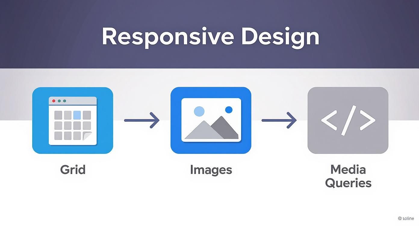
Following this flow helps your website intelligently adapt its layout to fit any screen, which is ground zero for a great mobile experience.
Master Advanced Image Optimization
Images are almost always the heaviest things on a webpage, making them public enemy number one for slow mobile load times. Getting this right is completely non-negotiable.
First up is compression. This is the art of reducing an image's file size without anyone noticing a drop in quality. You're looking for that sweet spot where the file is as lean as possible but still looks crisp on a high-resolution smartphone screen.
Beyond that, you need to use modern, next-gen image formats. Formats like WebP are a game-changer, offering significantly smaller file sizes than old-school JPEGs and PNGs at the same quality. Most modern browsers fully support WebP, so there's no reason not to use it. For a much deeper look, check out our full guide on how to optimize images for the web.
Leverage Browser Caching Effectively
Think about your loyal customers. Do they really need to re-download your logo, CSS file, and other static assets every single time they visit a new page? Of course not. This is where browser caching saves the day.
By setting up caching rules, you’re basically telling a user's browser to keep certain files stored locally on their phone for a set period. When they come back or click to another page, the browser grabs those files from its local cache instead of hitting your server again.
The result? Subsequent page loads feel almost instant. This dramatically improves the experience for returning visitors, reduces the load on your server, and even saves your users' mobile data. It's a win-win-win.
Browser caching is one of the highest-impact, lowest-effort optimizations you can make. It directly rewards user loyalty by providing a faster, smoother experience on every subsequent visit.
Minify Your Code and Scripts
Your website's code—HTML, CSS, and JavaScript—is often full of extra characters that are only there for humans to read, like spaces, line breaks, and comments. They’re helpful for developers, but to a browser, they’re just dead weight.
Minification is the process of automatically stripping all that fluff out. It creates a compact, optimized version of your code that is much smaller and faster for a mobile device to download and process.
This might sound like a tiny tweak, but when you have dozens of CSS and JavaScript files, the saved kilobytes add up fast. It’s a simple but incredibly effective way to trim your page weight and shave precious milliseconds off your load time.
Deploy a Content Delivery Network
A Content Delivery Network, or CDN, is a network of servers strategically placed all over the globe. Its entire job is to solve the problem of physical distance between your website's main server and your users.
Instead of every visitor connecting to your single server (wherever it may be), a CDN stores copies of your site's static assets—images, CSS, JavaScript—on its worldwide network. When someone visits your site, the CDN serves those files from the server that's physically closest to them.
If you have a national or global audience, a CDN is absolutely essential. A user in Sydney, Australia, will get your content from a local server instead of one in New York, which drastically cuts down latency and makes the site feel incredibly fast.
This is especially critical in e-commerce, where performance is directly tied to revenue. Projections show that by 2025, over 70% of all e-commerce traffic will come from mobile devices. As the rise of mobile e-commerce continues, every single performance tweak is vital for staying in the game.
Designing an Intuitive Mobile User Experience

A lightning-fast, responsive site is a huge win, but it's only half the battle. If users get there in record time only to find a clunky, confusing interface, they'll bounce just as quickly. This is where the real craft of mobile user experience (UX) and user interface (UI) comes into play.
Great mobile UX isn't about shrinking a desktop design. It’s about completely rethinking the experience for a smaller, touch-based world. You have to get inside the user's head: How are they holding their phone? What are they trying to accomplish right now?
Prioritize Touch-Friendly Design
On a desktop, we have a mouse for pinpoint accuracy. On a phone, we have thumbs. This simple difference is the root of the all-too-common "fat-finger" problem, where someone accidentally taps the wrong link because the targets are too small or crammed together.
To get this right, you have to design for fingers, not cursors. Every single clickable element—from buttons and links to menu icons—needs to be a comfortable target.
Here’s how to nail it:
Minimum Target Size: Make sure interactive elements are at least 48x48 pixels. This is the sweet spot for most people to tap accurately without getting frustrated.
Give Them Space: Don't crowd your buttons and links. A little bit of inactive space around each target goes a long way in preventing accidental taps.
Show Visual Feedback: When a user taps a button, it should react. A subtle color change or animation instantly confirms their action was registered and the site is working.
This focus on usability isn't just a "nice-to-have"; it directly impacts your bottom line. Optimizing for mobile can boost conversion rates by up to 40%. On top of that, 74% of users are more likely to come back to a site that works well on their phone. If you want to dig into the data, check out these insights on web design and user behavior.
Simplify Navigation and Forms
Mobile screens have limited real estate, making complex, multi-level navigation menus a user's worst nightmare. Your job is to simplify the journey so people can find what they need with the fewest taps possible.
The "hamburger" menu (the three-line icon) has become a standard for a reason—it tucks navigation away and keeps the interface clean. Just make sure the menu itself is well-organized. For the most critical pages, I often recommend a visible bottom navigation bar for instant, one-tap access.
Forms are another major source of friction on mobile. Nobody enjoys typing on a tiny keyboard, so your forms need to be as painless as you can make them.
A few tips for better mobile forms:
Be a Minimalist: Only ask for what is absolutely essential. Every extra field you add is another reason for someone to give up.
Use Smart Defaults: Pre-fill information where you can. Use mobile-friendly inputs, like a numeric keypad for phone numbers (
<input type="tel">), to make life easier for the user.Break It Down: For longer flows like a checkout process, split it into a multi-step form with a progress bar. It makes the whole task feel much more manageable.
An intuitive mobile interface isn’t about flashy design; it’s about removing obstacles. The best mobile UX is one that feels so natural the user doesn't even notice it.
Ensure Readability and Visual Clarity
What good is amazing content if no one can read it on their phone? Readability is a cornerstone of mobile UX, and it really boils down to two things: fonts and color contrast. You can learn more by reading about the fundamentals of user experience design.
When it comes to fonts, size matters. 16px is widely considered the baseline for comfortable reading on a mobile device. Anything smaller forces users to pinch and zoom, which is a classic sign of a poor mobile experience.
Contrast is just as critical. Your text needs to pop against its background. I always run my color schemes through a contrast checker tool to make sure they meet accessibility standards (WCAG AA is a solid target). High contrast doesn't just help users with visual impairments; it makes your content easier for everyone to read, especially when they're outside in bright sunlight.
How to Test and Validate Your Mobile Site
Getting your site mobile-ready isn't a one-and-done job. It's a constant process of testing, learning, and refining. You can follow all the right steps, but if you're not validating your work, you're essentially just guessing what your visitors experience.
Validation is how you confirm your efforts are actually working. It’s where you catch those tiny, frustrating issues that can tank your conversion rates. Think of it as a routine check-up to keep your mobile site in top shape.
Start with the Right Testing Tools
So, where do you begin? A great starting point is the collection of free, powerful tools available to everyone. You don't need to be a developer to get value from them; they give you clear, straightforward feedback on what to fix.
A handful of these tools are indispensable for any serious website owner. They help you diagnose issues with mobile-friendliness, performance, and overall user experience before they become major problems.
Essential Tools for Mobile Optimization Testing
Tool Name | Primary Function | Best For |
|---|---|---|
Mobile-Friendliness Check | Getting a quick, pass/fail verdict from Google’s perspective. This is a must for basic SEO. | |
Performance Analysis | Analyzing your site's speed on both mobile and desktop, based on Core Web Vitals. | |
Detailed Performance Metrics | Diving deep into performance waterfalls and identifying specific bottlenecks like slow scripts or large images. | |
Real Device Cloud Testing | Testing on thousands of real device, browser, and OS combinations without owning the hardware. |
Using a mix of these tools gives you a comprehensive diagnostic report, helping you move from wondering what's wrong to knowing exactly where to focus your energy.
Use Browser Emulators for Quick Checks
Every modern browser, from Chrome to Firefox, has developer tools with a built-in device emulator. This handy feature lets you instantly see how your website renders on a huge variety of virtual devices—from the newest iPhone to common Android models.
This is my go-to for real-time debugging. I can quickly see if my responsive design breakpoints are triggering correctly or spot an element that’s out of place on a specific screen size. You can even simulate different network conditions, like a spotty 3G connection, to feel how your site performs for users with slower internet.
While emulators are perfect for quick, iterative checks during development, they can't fully replicate the nuances of a real device. They are an essential part of the process but should never be the final step in your testing.
Nothing Beats Testing on Real Devices
Emulators are fantastic, but they don't catch everything. There are subtle quirks related to touch inputs, font rendering, or performance glitches that only pop up on actual hardware. That's why testing on physical mobile devices is non-negotiable if you're aiming for a truly polished user experience.
You don't need a lab full of phones. Just grab a couple of popular models—one iOS and one Android device is a great start. Better yet, ask a few friends or colleagues to navigate your site on their own phones and just watch what they do.
Are they struggling to tap a tiny button?
Does the page stutter or lag as they scroll?
Do they look confused trying to find the navigation menu?
This kind of real-world feedback is pure gold. It uncovers the exact friction points that automated tools and emulators will always miss. Watching how people actually use your site is incredibly insightful, and you can get even more of this data if you analyze your website traffic to see what mobile users are doing. When you combine that data with hands-on testing, you get the complete picture.
Answering Your Top Mobile Optimization Questions
Getting into mobile optimization always kicks up a lot of questions. You understand the big picture, but when it comes to the nitty-gritty, things can get a little fuzzy. I've put this section together to tackle those common "what if" and "why is it" moments that everyone runs into.
Think of it as your field guide for navigating the most frequent challenges and decisions you’ll face. We'll cover everything from technical choices to their very real impact on your SEO, giving you the confidence to make the right calls.
Should I Use Responsive Design or a Separate Mobile Site?
This is one of the oldest debates in the game: responsive design versus a separate mobile site (usually on an "m." subdomain). Let's settle it right now. For pretty much everyone today, the clear winner is responsive design.
Going with a separate mobile site means you're signing up for double the work. You’ll have two sets of code, two versions of your content, and two different SEO strategies to manage. It’s a logistical nightmare, especially when it comes time to update something.
Responsive design, on the other hand, is a much smarter approach. It uses a single URL and one set of content that automatically adjusts to fit the user's screen. Here's why it's the industry standard:
It’s Better for SEO: Google has been very clear that it prefers responsive design. You avoid messy duplicate content issues and keep all your ranking power, like backlinks, pointed at a single URL.
Maintenance is a Breeze: Need to update a product description or a blog post? You do it once, and it’s live for everyone, whether they're on a desktop or a smartphone.
It Creates a Cohesive Experience: Users get a consistent look and feel for your brand. Moving from a laptop to a phone feels natural and familiar, not like they've landed on a different website.
A separate mobile site was a workaround for an older, clunkier internet. These days, a well-built responsive design is simply a better, more efficient, and SEO-friendly way to go.
Does Mobile Optimization Really Affect My SEO Rankings?
Yes, absolutely. In fact, it's one of the most critical ranking factors out there today. Ever since Google shifted to mobile-first indexing, its search crawlers primarily evaluate the mobile version of your website to understand its content and decide where it should rank.
What does that mean for you? If your mobile site is sluggish, a pain to navigate, or missing content that your desktop site has, your search visibility will take a hit everywhere—even for people searching on a desktop.
Here’s a quick breakdown of how it all connects:
Optimization Area | How It Impacts Your SEO |
|---|---|
Page Speed | This is a huge part of Core Web Vitals, which Google uses to judge user experience. Slow sites simply don't rank as well. |
Mobile-Friendliness | This isn't just a suggestion; it's a confirmed ranking signal. If your site fails Google's mobile-friendly test, you're at a disadvantage. |
User Experience (UX) | When mobile users get frustrated and leave (a high bounce rate), it tells Google your site isn't a good answer to their query. |
Ignoring mobile isn't just a design oversight anymore. It's a business decision that directly affects whether or not customers can find you online.
How Fast Is "Fast Enough" for Mobile Users?
On mobile, patience is in short supply. While every millisecond counts, a solid technical goal is to get your Largest Contentful Paint (LCP)—the moment the most important content appears—under 2.5 seconds.
But real-world user behavior is even more demanding. One Google study found that 53% of mobile users will ditch a site if it takes more than three seconds to load. If you're running an e-commerce store, the pressure is even higher, as conversions can plummet with every extra second of waiting.
The real goal isn't just to pass a performance test; it's to create an experience that feels instant. This means focusing on what the user sees first. A great strategy is to make sure the content "above the fold" loads almost immediately, making the entire site feel faster, even while other elements are still loading in the background.
Ready to build a website that's perfectly optimized for mobile right out of the box? With Alpha, you can create a stunning, responsive site in hours, not weeks. Our AI-powered platform handles all the technical details, from responsive layouts to performance tuning, so you can focus on your business. Turn your vision into a high-performing website today. Get started with Alpha.
Build beautiful websites like these in minutes
Use Alpha to create, publish, and manage a fully functional website with ease.