How to Create Website Mockups People Actually Love
Learn how to create website mockups that bridge the gap between idea and reality. Our guide covers tools, principles, and developer handoff.

Build beautiful websites like these in minutes
Use Alpha to create, publish, and manage a fully functional website with ease.


Before you can tackle a high bounce rate, you need to know what a "good" one even looks like for your website. There's no magic number here. A healthy bounce rate is a moving target that changes completely depending on your industry and the kind of content you're creating.
For instance, an e-commerce site might celebrate a 25% bounce rate, while a blog could be doing just fine with a rate as high as 70%. It’s all about context.
What a Good Bounce Rate Actually Looks Like
Let's get one thing straight: a "bounce" is just a session where someone visits a single page and then leaves. A high bounce rate isn't automatically a disaster. Often, it just points to a gap between what a visitor thought they were getting and what your page actually delivered.
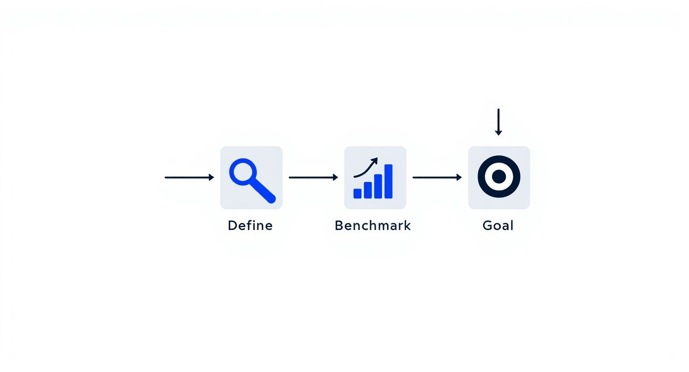
The trick is to stop chasing an arbitrary number and start thinking strategically. The process is pretty straightforward: figure out what a bounce means for your specific pages, see how you stack up against others in your space, and then set a realistic goal for improvement.
This simple framework keeps you focused on making changes that actually matter instead of getting hung up on a metric that might not even be a problem.
Setting Realistic Benchmarks
Different websites have different jobs, so it's only natural they have different bounce rates. Think about it: someone landing on a blog post to find a quick answer and then leaving has successfully completed their mission. But a visitor who lands on a product page and immediately leaves? That's a lost opportunity.
To give you a better idea of what to expect, here are some typical bounce rate benchmarks for various types of websites.
Typical Bounce Rate Benchmarks by Website Type
This table shows the average bounce rate ranges for different types of websites, helping you set realistic goals.
Website Type | Average Bounce Rate Range | What This Means |
|---|---|---|
E-commerce | 20% - 45% | Visitors are expected to browse multiple products, so a lower bounce rate is ideal. A high rate here could signal issues with product pages or navigation. |
B2B / SaaS | 25% - 55% | Users are often looking for specific solutions or information. A moderate bounce rate is normal, but key service and feature pages should encourage exploration. |
Lead Generation | 30% - 55% | The goal is to capture a lead. If users bounce from a landing page, the offer, form, or copy might not be compelling enough. |
Blogs / Content Sites | 65% - 90% | A high bounce rate is very common and often not a bad thing. Readers frequently find the answer they need on a single page and leave satisfied. |
As you can see, the numbers are all over the place. For a deeper look at industry averages, HostingAdvice offers detailed bounce rate statistics that can provide more context.
Your goal isn't to hit an impossibly low bounce rate on every single page. The real win is lowering the bounce rate on pages that are critical to your business goals—think product pages, service descriptions, and lead capture forms.
Connecting Bounce Rate to User Intent
The why behind a bounce is far more important than the number itself. A high bounce rate can mean a few different things:
Mission Accomplished: The user found exactly what they needed (like your phone number on the contact page) and left happy. That’s a good bounce!
A Total Mismatch: The page content had nothing to do with the ad, social media post, or search result that brought them there.
A Terrible Experience: The site was painfully slow, a nightmare to navigate on their phone, or just plain confusing.
Figuring out which of these is happening requires you to dig into your analytics. Once you understand the typical path your visitors take, you can diagnose the real cause of your bounces. A great place to start is learning how to analyze website traffic; this will give you the tools to separate the "good" bounces from the ones that are costing you business.
Make Your Website Faster to Keep Visitors
In our always-on world, patience is in short supply. This is especially true online. If your website takes more than a couple of seconds to load, you’ve already lost. Potential customers will hit the back button before they ever see your content or products.
Frankly, improving your site speed is one of the most powerful and direct ways to slash your bounce rate.
The numbers don't lie. We've seen that sites loading in 1 second can have bounce rates as low as 7%. But let that load time creep up to just 3 seconds, and the bounce rate can jump by a massive 32%. The BBC even found they lose 10% of their users for every extra second their site takes to load. Speed isn't just a "nice-to-have"; it's a must-have.
Pinpoint Your Speed Bottlenecks
Before you can start fixing things, you need to know what’s actually slowing you down. My go-to tool for this is Google's PageSpeed Insights. It's free, it's easy, and it gives you a treasure trove of data.
Just plug in your URL, and it will give you a full report card on both mobile and desktop performance, pointing out exactly what needs attention.
You’ll get clear, actionable suggestions like "Reduce initial server response time" or "Eliminate render-blocking resources." It's essentially a personalized roadmap for a faster website.
Key Strategies for a Faster Website
With your report in hand, it’s time to get to work. Don't get overwhelmed; focus on the changes that will give you the most bang for your buck.
Here are the three big areas I always tackle first:
Image Optimization: Nine times out of ten, massive, uncompressed images are the main culprit behind a slow site. I always run images through a tool like TinyPNG before I upload them. This one habit can shave seconds off your load time without any noticeable loss in quality.
Leverage Browser Caching: Caching is like giving a return visitor a VIP pass. It stores static parts of your site—like your logo, CSS files, and key images—in their browser. When they come back, the site loads almost instantly because their computer doesn't have to re-download everything. Most good caching plugins for WordPress handle this for you.
Use a Content Delivery Network (CDN): A CDN is a game-changer, especially if you have a global audience. It’s a network of servers spread across the world that stores copies of your website. When someone from, say, London visits your site hosted in Texas, the content is served from a server much closer to them. This simple change dramatically cuts down lag for international visitors.
These aren't just isolated fixes; they work together to create a zippy, responsive experience that makes people want to stick around. For a deeper dive, check out our complete guide on how to improve website loading speed.
When you prioritize speed, you're sending a clear message: you respect your visitors' time. And that's a surefire way to keep them on your site.
Create a Seamless User Experience
A fast-loading website is a great start, but it's only half the battle. If someone lands on your page and it's a jumbled, confusing mess, they’ll hit the back button just as fast as they would on a slow site. Creating a seamless user experience (UX) isn't about flashy bells and whistles; it’s about making your website effortless and even enjoyable to use.
When a visitor feels comfortable and can find what they're looking for without thinking, they're much more likely to stick around. This is where smart, intentional design becomes a powerful tool for cutting down your bounce rate.
Embrace Simplicity and Readability
You could have the most brilliant content in the world, but if it's crammed into a tiny font against a chaotic background, nobody is going to read it. A great user experience starts with the basics: clean design and text that’s easy on the eyes.
Think about how you can make your pages feel more inviting. White space, the empty area around your text and images, is your best friend. It gives your content room to breathe and subtly guides the reader's focus, preventing that overwhelming "wall of text" feeling.
Your font choices also make a huge difference. Here are a few quick wins:
Font Size: Aim for a body font of at least 16px. Honestly, 18px is often even better for comfortable reading on modern screens.
Line Spacing: Give your text some air. A line height of around 1.5 is a solid starting point to keep lines from blurring together.
Contrast: Make sure your text color stands out clearly from the background. Good contrast is essential for everyone, especially for visitors with visual impairments.
A great design doesn’t just look good—it gets out of the way. The best user experience is one the visitor doesn't even notice because everything just works as expected.
Prioritize Mobile-First Design
These days, designing for mobile isn't an option—it's the main event. With over 57% of all internet traffic now coming from mobile devices, a clunky, hard-to-use mobile site is a guaranteed way to send your bounce rate through the roof.
Adopting a "mobile-first" approach means you design for the smallest screen first and then adapt the layout for tablets and desktops. This forces you to focus on what’s truly essential, leading to a cleaner, more streamlined experience for everyone. You can get a quick snapshot of your site's performance with Google's Mobile-Friendly Test tool.
Build Intuitive Navigation
I’ve seen it a hundred times: a visitor gets frustrated because they can't find what they need, and they leave. Your website’s navigation should be a clear, simple roadmap, not a complex maze.
Here’s how to build a navigation structure that helps instead of hinders:
Keep Your Menu Simple: Limit your main menu to 5-7 core items. Use straightforward language people understand, like "Services" instead of "Our Strategic Offerings."
Make Your Search Bar Work: A prominent, effective search bar is a lifesaver. If someone can't find what they're looking for in the menu, search is often their last attempt before they bounce.
Use Smart Internal Links: Weave links to other relevant pages directly into your content. If you want to dive deeper, you can explore the core principles of user experience design fundamentals to build a truly user-centric site.
Remember, a great user experience in web design for business growth is all about respecting your visitor's time. A well-organized site encourages them to explore, which is exactly what you need to lower that bounce rate.
Give Visitors the Content They Expect

Think about the last time you clicked a search result. You had a specific question, a problem to solve. You landed on a page because its title promised you an answer. If that page didn't immediately deliver, what did you do? You hit the back button.
That's the core of it. A high bounce rate is often just a symptom of a broken promise. To fix it, your first job is to reassure the visitor they've landed in the right place, and you have to do it fast.
This starts with your headline and introduction. If someone searches for "best project management tools for small teams," your page title better not be something vague like "Boosting Team Productivity." It needs to mirror their exact query. This instant alignment tells them, "Yes, you're in the right spot," which is the first crucial step to getting them to stick around.
Make Your Content Instantly Scannable
Let’s be honest: people don’t read websites anymore. They scan. Faced with a massive wall of text, a visitor's first instinct is to flee. It just looks like too much work.
To keep them on the page, you have to break down that wall into something far more approachable. Think of it less like a novel and more like a well-organized memo.
Here’s how to do it:
Short Paragraphs: Stick to 1-3 sentences per paragraph. This creates breathing room and makes the content feel light and easy to get through.
Subheadings: Use clear H2s and H3s to guide the reader's eye. This lets them jump straight to the information they care about most.
Lists: Bulleted and numbered lists are your best friends. They are perfect for summarizing steps, features, or key takeaways in a way that’s incredibly easy to digest.
This isn’t about dumbing down your content. It's about respecting your visitor's time by helping them find what they need without friction.
The goal isn't just to publish information—it's to present it in a way that feels effortless to consume. When a visitor can easily find their answer, they have no reason to bounce.
Use Visuals to Clarify and Engage
Sometimes, a picture really is worth a thousand words. A well-chosen image, a sharp infographic, or a quick video can explain a complex idea much faster than text ever could. Instead of just describing how a new software feature works, why not show it with a screenshot or a short GIF?
There’s hard data to back this up. Just look at the top global websites. YouTube, a platform built entirely on video, has a remarkably low bounce rate of 34.29%. As you'll find in these bounce rate statistics from MyCodelessWebsite.com, text-heavy sites often struggle with much higher rates, showing a direct link between the content format and user engagement.
By adding compelling visuals, you're not just making your page look better. You're giving your visitors valuable shortcuts to understanding, which makes your content feel more valuable and worth their time.
Guide Users with Clear Next Steps
https://www.youtube.com/embed/zXPZ0L2cOw4
You’ve done the hard work. Your content is fantastic, the user experience is seamless, and the page loads in a blink. So why are people still leaving? Often, it’s because they’ve hit a dead end. When a visitor finishes reading and has nowhere to go, their only option is to hit the back button.
This is a classic mistake I see all the time: a site that doesn't show users what to do after they've consumed the content. A visitor's journey shouldn't just stop cold at the end of an article. It’s your job to guide them deeper into your site, turning that single-page visit into a longer, more engaged session.
The solution is to strategically place Calls to Action (CTAs) and internal links that feel like a natural next step, not an aggressive sales pitch. A simple, well-placed prompt can be the single thing that turns a bounce into a conversion.
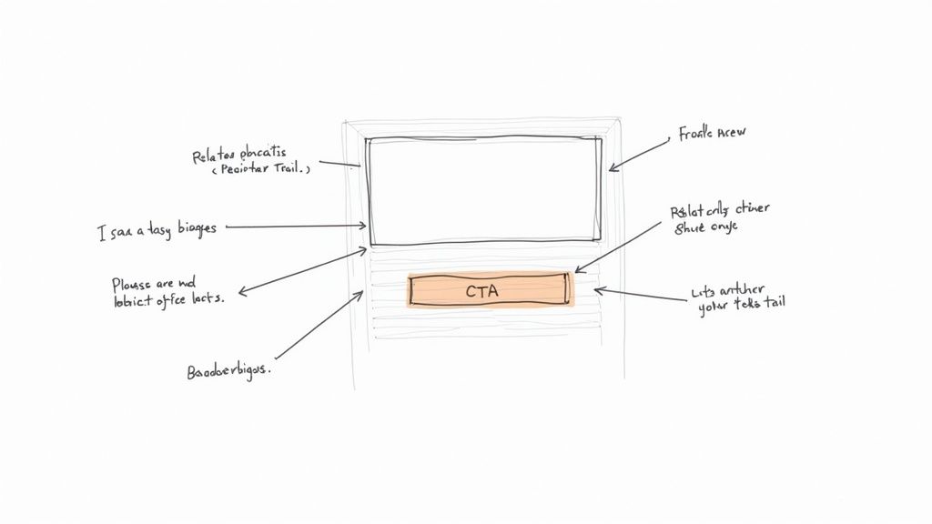
Design Compelling Calls to Action
A weak CTA is a huge missed opportunity. I’m talking about those generic, uninspired buttons like "Click Here" or "Submit." They just don't work anymore because they fail to communicate any real value. A truly effective CTA tells the user exactly what they're going to get and why they should care.
You need to use action-oriented language that’s specific to what you're offering. For example, instead of a button that just says "Download," try "Get My Free SEO Checklist." This small tweak changes everything. It’s specific, personal, and makes the benefit immediately obvious.
Here are a few more quick examples to get you thinking:
Instead of "Learn More," try "Explore Our Pricing Plans."
Instead of "Sign Up," try "Start Your 14-Day Free Trial."
Instead of "Contact Us," try "Request a Free Consultation."
The real secret is aligning your CTA with what the visitor is thinking about on that specific page. Someone reading a blog post about project management is far more likely to click on "Download Our Free Project Template" than a generic "Buy Now" button.
Your CTA isn't just a button; it's the answer to the user's silent question, "What's next?" Make that answer obvious, easy, and enticing.
Build a Smart Internal Linking Strategy
Beyond the big, flashy CTAs, internal links are your secret weapon for fighting bounce rate. By linking to other relevant articles and pages on your own site, you create a natural pathway for exploration. It's a simple way to keep people clicking, which keeps them on your site longer and tells search engines your content is deep and valuable.
But don't just throw links in randomly. That can look spammy and turn people off. The key is to use descriptive anchor text that sets clear expectations. A link that says "learn more about optimizing images" is infinitely more helpful and trustworthy than one that just says "click here."
This approach helps people discover more of your great content, which directly cuts down on single-page sessions. Remember, every click to another page on your site is, by definition, not a bounce. It’s a simple tactic, but it's incredibly effective at keeping your audience engaged and moving through your site.
Common Questions About Bounce Rate
Once you start digging into your website's analytics, a few questions about bounce rate always seem to pop up. Let's clear the air and tackle some of the most common ones I hear from clients and colleagues. Getting these answers straight will help you focus your energy on what actually moves the needle.
Can a Bounce Rate Ever Be 0%?
I see this one a lot, and the short answer is: if you see a 0% bounce rate, something is probably broken.
While it sounds like the ultimate goal, a 0% rate is almost always a red flag for a technical glitch, not a sign of perfect user engagement. The most common culprit is having your analytics tracking code installed twice on your pages. This mistake causes a single page visit to be recorded as two, making it impossible for a bounce to register.
A real, functioning website with any amount of traffic will never achieve a true 0% bounce rate. So if that number appears in your dashboard, your first move should be to audit your analytics setup.
How Do Pop-Ups Affect Bounce Rate?
Ah, pop-ups. They can be your best friend or your worst enemy.
An intrusive, poorly timed pop-up that blocks the content the second someone lands on your page is a surefire way to annoy them into leaving. That's an instant bounce. No one appreciates being interrupted before they even know if your page has what they're looking for.
On the other hand, a strategically used exit-intent pop-up can be a powerful tool to reduce your bounce rate. This type of pop-up only appears when a user's cursor moves towards the exit button. If you offer something genuinely valuable—a last-minute discount, a free guide, or a helpful resource—you can catch their attention and convince them to stick around.
The key is timing and value. A pop-up should solve a user's problem or offer a clear benefit, not create a new frustration.
Is Bounce Rate an Important SEO Ranking Factor?
This is a classic debate in the SEO world, and the answer isn't a simple yes or no. Officially, Google has stated that bounce rate is not a direct ranking signal their algorithm uses. They aren't looking at that specific percentage in your analytics account and moving you up or down.
However, a high bounce rate is a massive symptom of problems that absolutely tank your SEO.
Think about it: a high bounce rate often points to slow page speeds, a confusing user experience, or content that completely misses the mark on search intent. These are all things that Google does care about. Fixing the root causes of a high bounce rate—the things that make people leave—will almost always lead to better SEO performance.
So, while you aren't being directly penalized for the number itself, treating a high bounce rate as a critical health metric is just good SEO practice. For a closer look at the strategies we've covered, check out this excellent guide on How to Reduce Bounce Rate and Keep Visitors Hooked.
Ready to build a website designed for low bounce rates from the ground up? Alpha uses AI to create stunning, fast, and user-friendly websites in minutes, not months. Start building your high-engagement website today at https://www.alpha.page.
Build beautiful websites like these in minutes
Use Alpha to create, publish, and manage a fully functional website with ease.