


How to Create Website Mockups People Actually Love
Learn how to create website mockups that bridge the gap between idea and reality. Our guide covers tools, principles, and developer handoff.
Build beautiful websites like these in minutes
Use Alpha to create, publish, and manage a fully functional website with ease.
Ever clicked on an ad for a specific product and ended up on a company's confusing homepage? That's the problem a landing page solves.
Think of a landing page as a standalone web page built for a single, focused purpose. It’s the page a visitor "lands" on after clicking a targeted link from an email, a Google ad, or a social media post. Unlike your main website, which is a jack-of-all-trades, a landing page is a master of one. Its entire existence boils down to one goal and one call to action.
Your Website Is a Department Store; Your Landing Page Is a Pop-Up Shop
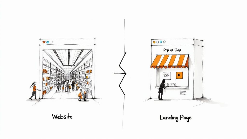
Imagine your main website is a huge department store. It's packed with different sections, endless aisles, and a ton of products. People can wander around, browse casually, read your company's history, or get lost in your blog. The goal is broad—it’s all about exploration and general brand discovery.
Now, picture a landing page as a sleek, modern pop-up shop. It’s set up for one reason and one reason only. It has a single product, a clear message, and one checkout counter. There are no other doors, no distracting side aisles, and nothing else to look at. When someone walks in, they're there to do one thing: engage with that very specific offer.
The Power of Laser-Like Focus
This single-minded approach is the secret sauce behind a landing page's effectiveness. By stripping away all the usual distractions—like navigation menus, sidebars, and links to other pages—you create an incredibly clear, direct path for the user. That path leads straight to the action you want them to take, which we call the Call to Action (CTA).
This focused environment is built from the ground up to drive conversions. Whether your goal is to get someone to:
Download a free ebook
Sign up for a webinar
Request a product demo
Purchase a specific item
The landing page gets rid of the "what should I do next?" paralysis and gently guides the visitor toward that single, valuable action. Every element, from the headline down to the final button, works together to persuade and convert.
A great landing page is a conversation with a single goal. It doesn't try to be everything to everyone; it tries to be the perfect solution for one specific person at one specific moment.
This clarity is precisely why businesses that use landing pages see much better results. In fact, studies show that companies with 30 or more landing pages generate seven times more leads than those with fewer than 10. The reason is simple: specificity sells. Each page is a finely-tuned machine built for a particular audience and campaign, making it an essential tool in any modern marketing strategy.
So, What's a Landing Page Really For?
Think of your website's homepage as the lobby of your business. It’s designed to welcome everyone, show them around, and let them explore different departments like your blog, services, or "About Us" page. A landing page, on the other hand, is a private meeting room with a single, clear agenda: action.
Its entire reason for existing is to be a conversion powerhouse. It’s a specialized tool built to take the interest sparked by an ad or email and turn it into a concrete result. There’s no main menu to distract visitors, no links to other articles. Every single element, from the headline down to the call-to-action button, is laser-focused on guiding the visitor toward one specific goal. This deliberate simplicity creates a smooth, frictionless path, making it incredibly easy for someone to say "yes."
And this focused approach gets results. The median conversion rate for landing pages across all industries is a solid 6.6%. That might not sound huge on its own, but compare it to other methods: pop-ups convert at just 0.9%, and those little signup boxes you see everywhere? A mere 0.6%. You can discover more insights about these conversion benchmarks, but the takeaway is clear: a dedicated page is built for performance.
Driving Two Key Marketing Goals
While the ultimate goal is always conversion, that action usually falls into one of two buckets. Figuring out which bucket your campaign fits into is the first step to building an effective page.
The two main objectives are:
Lead Generation: The goal here is simple: capture a visitor's information. You're turning an anonymous click into a valuable lead for your sales or marketing team. This is usually done by offering something valuable—like an ebook, a webinar seat, or a free template—in exchange for their contact details via a form.
Click-Through: Sometimes, the goal isn't to get info, but to get the visitor to the next step. A click-through page is designed to persuade someone to click through to another page, most often a product or checkout page. It effectively "warms up" the visitor, giving them the key details and benefits they need before they're asked to make a purchase.
How This Looks in the Real World
Let's make this tangible. Imagine you're running a flash sale on your best-selling product. You'd use a click-through landing page. It would feature stunning images of the product, highlight the amazing limited-time discount, and have a big, bold "Shop Now" button that takes the user straight to the payment screen. No other products, no distractions—just a direct path to the sale.
A landing page isn't just another web page; it's a finely-tuned engine for action. It respects the visitor's time by getting straight to the point and delivering on the exact promise made in the ad they clicked.
Now, let's say your goal is to grow your email newsletter. A lead generation page is your best friend. You might offer a free, downloadable guide to solving a common problem your audience faces. The page would spell out the guide's value and present a simple form asking for a name and email. They get the guide, and you get a new person to build a relationship with. This clean, focused exchange is the heart of what a landing page is.
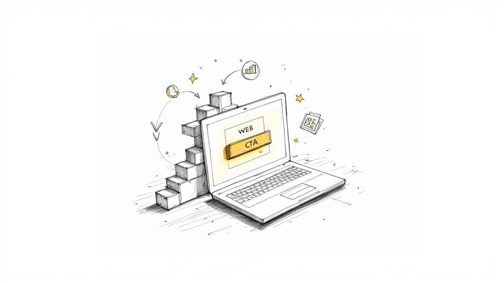
Anatomy of a High-Converting Landing Page
A great landing page isn't just a jumble of text and images. Think of it more like a well-oiled machine, where every single piece has a specific job, all working together to achieve one single goal. If one part is off, the whole thing can grind to a halt. Nailing this anatomy is the first step to building pages that actually turn visitors into leads and customers.
So, let's pull back the curtain and look at the essential parts that make up almost every landing page that works.
The Irresistible Offer
Everything starts with your offer. This is the heart of your page—the core reason someone should care enough to click, sign up, or buy. It's not just about what you're selling; it's about the undeniable value you're giving them in return for their attention and action.
The Headline: This is your first impression, and you only get one. It has to be powerful and crystal clear, instantly telling the visitor what’s in it for them. A great headline hooks them immediately and makes a promise the rest of the page needs to keep.
The Subheadline: This is the supporting act to your headline. It’s where you can add a bit more context or a persuasive nudge, expanding on that main benefit you just promised.
Visuals and Persuasive Copy
Once your headline has their attention, the rest of the page needs to deliver. This is where you combine compelling visuals with persuasive text to guide the visitor smoothly toward the finish line.
You need a strong hero shot—a high-quality image or video that shows your product or service in action. This makes your offer feel real and tangible, helping people visualize themselves benefiting from it. This visual needs to be backed up by sharp, benefit-focused copy that quickly explains the what, why, and how of your offer.
A landing page’s copy shouldn't just describe features; it should sell an outcome. Focus on how your offer solves a problem or improves the visitor's life, not just on what it does.
This flowchart shows how all the page elements are laser-focused on one of two main conversion goals.
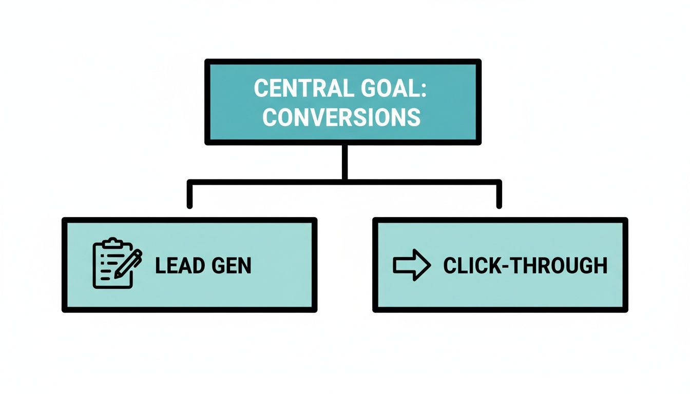
As you can see, everything is designed to either capture a lead or push someone to the next step in their journey with you.
Building Trust with Social Proof
Let's be honest, people are skeptical online. You have to earn their trust, and you have to do it fast. Social proof is your best tool for this job. It shows visitors that other real people have already gotten value from what you're offering. It comes in a few key forms:
Testimonials: Real quotes from happy customers.
Case Studies: Quick success stories that show off real-world results.
Trust Badges: Logos from well-known clients or security seals that build credibility.
The Unmistakable Call to Action
Finally, every road on your landing page leads to one destination: the Call to Action (CTA). This is the trigger. It’s the button that makes the conversion happen. A powerful CTA uses clear, action-oriented text like "Download My Free Ebook" or "Start My 14-Day Trial." It has to pop off the page, often using a contrasting color that makes it impossible to miss. If you want to dive deeper into crafting the perfect CTA, check out our guide on what is a call to action.
To really get good at this, it helps to study a few best practice landing page frameworks that top marketers use. When all these components work together in harmony, you create a smooth, frictionless path that makes it incredibly easy for your visitors to say "yes."
Common Types of Landing Pages with Examples
Landing pages aren't a one-size-fits-all solution. While they all push for a conversion, their design and purpose shift dramatically based on what you want the visitor to do. Think of them like specialized tools in your marketing workshop—you wouldn't use a hammer to saw a board.
Knowing the different types is key to picking the right tool for the job. So, let's move from theory to reality and look at the most common landing pages you'll see out there, along with some real-world examples of how they get results.
Squeeze Pages
The Squeeze Page is the minimalist of the group. Its one and only job is to "squeeze" an email address out of a visitor. This is almost always done in exchange for a valuable freebie, like a PDF guide, a checklist, or a spot on a newsletter list. These pages are incredibly short, to the point, and built around a can't-miss opt-in form.
Example: A marketing pro like Neil Patel is a master of the squeeze page. He'll offer a powerful guide with a killer headline, a quick rundown of the benefits, and a simple form asking for just an email. The entire page is laser-focused on that single value exchange.
Lead Capture Pages
A Lead Capture Page is the squeeze page's more ambitious sibling. It also aims to collect visitor info, but it digs a little deeper than just an email address. This is a common strategy for B2B companies or high-ticket offers where knowing more about a lead is crucial for the sales team.
These pages often act as a gateway to content like webinar registrations, in-depth industry reports, or free trial sign-ups. The form will likely ask for a name, company, job title, or phone number to give the sales team a head start on qualifying the lead.
A good rule of thumb: the length of your form should match the value of your offer. A simple newsletter signup only needs an email, but a detailed industry report can justify asking for more.
Click-Through Pages
Instead of a form, the Click-Through Page features a single, bold button as its main call to action. Its entire purpose is to warm up a visitor by selling them on the benefits of an offer before sending them to the page where the final transaction happens. This simple step can dramatically reduce friction and make people more likely to complete a purchase.
Example: Imagine an e-commerce brand launching a hot new gadget. They'd use a click-through page to show it off with stunning photos, persuasive copy, and glowing customer reviews. It all leads to one big "Buy Now" button that takes the user straight to the checkout cart, ready to buy.
Sales Pages
The Sales Page is the heavy hitter. These are often the longest and most detailed landing pages, using everything from storytelling and testimonials to feature breakdowns and powerful copy to persuade someone to make a purchase right then and there. This format is perfect for selling a specific product, an online course, or a service directly from the page.
A great sales page anticipates and answers every possible question or objection a potential customer might have. By the time they reach the bottom, there should be no reason left not to click the "Purchase" button. For more great ideas, check out these marketing landing page examples to see what's working for others.
How to Optimize Your Landing Page for Peak Performance
Getting a landing page live is a fantastic first step, but it’s never a "set it and forget it" project. The real magic happens with continuous optimization. Think of it like tuning a high-performance engine; even small, precise adjustments can deliver a huge boost in power and efficiency.
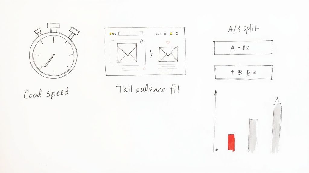
To really get your page firing on all cylinders, you need to zero in on what actually drives results. It boils down to three core pillars: speed, audience alignment, and relentless testing. Get these right, and you create an experience that doesn't just attract visitors, but truly persuades them to take action.
Accelerate Your Conversions With Speed
In our fast-paced digital world, every millisecond is precious. Your page's load speed is one of the most critical—and surprisingly overlooked—factors in its success. A slow page is a dead end. It creates instant frustration, causing impatient visitors to hit the back button before your message ever gets a chance.
The numbers are staggering. Pages that load in under 1 second see a massive 31.79% conversion rate. That figure drops off a cliff to just 13.93% at 2 seconds, and a dismal 9.68% at 5 seconds. Speed isn't just a technical nice-to-have; it's a fundamental part of your conversion strategy.
Align Your Message With Your Audience
Where your visitors come from tells you a lot about what they expect to see. Someone clicking a link in a targeted email is in a completely different headspace than someone who stumbled upon your ad while scrolling social media. One of the biggest mistakes you can make is showing everyone the exact same page.
Email Traffic: These visitors are already in your circle. They know your brand, so you can get straight to the point and assume a degree of familiarity.
Paid Search Traffic: These users are on a mission, actively searching for a specific solution. Your page needs to instantly reassure them they've found the answer, often by echoing the exact language from their search query.
Social Media Traffic: This audience is typically browsing casually, not actively looking to buy. You need to hook them fast with eye-catching visuals, compelling copy, and maybe even a video. In fact, learning the proven strategies for creating video landing pages that convert can be a true game-changer here.
Traffic Source Impact on Landing Page Conversions
Not all traffic is created equal. The channel that brings a visitor to your page has a direct impact on their likelihood to convert. This table breaks down the average conversion rates by traffic source, showing which channels tend to deliver the most motivated visitors.
Traffic Source | Average Conversion Rate |
|---|---|
Email Marketing | 13% |
Paid Search (PPC) | 9% |
Social Media (Paid) | 6% |
Organic Search | 5% |
Referral | 4% |
As you can see, visitors from email and paid search arrive with higher intent, which is why tailoring your landing page to their journey is so crucial for maximizing conversions.
Fine-Tune Your Approach With Testing
Do you know for sure if a different headline would work better? Or if a green button would outperform a blue one? The truth is, you don't—unless you test. This is where A/B testing (or split testing) comes in. It’s the simple but powerful process of pitting two versions of a page against each other to see which one gets better results.
Optimization isn't about guesswork; it's about data. A/B testing allows you to make informed decisions that systematically improve your page's performance over time.
By isolating and testing one element at a time—the headline, the call to action, the main image, or even the number of form fields—you can pinpoint exactly what resonates with your audience. This cycle of testing, learning, and refining is the heart of what we do. For a much deeper look at the process, check out our complete guide on conversion rate optimization strategies.
Landing Page FAQs: Your Questions, Answered
Once you start thinking about landing pages, the practical questions quickly follow. I get these all the time. Let's walk through some of the most common ones that come up when marketers are ready to get serious about building and optimizing their pages.
Think of this as a quick-start guide to clear up any lingering confusion so you can build with confidence.
So, How Many Landing Pages Do I Actually Need?
There isn't a single magic number here, but I can tell you this: it's almost always more than you have right now. The data is crystal clear on this point—there's a direct link between the number of landing pages you have and the leads you generate. In fact, businesses that jump from having fewer than 10 landing pages to 10-15 often see a 55% increase in leads.
The real goal isn't just to have more pages; it's to create a unique, focused page for every single offer, campaign, or audience you're targeting. When the message on the page perfectly matches the ad that brought someone there, conversions happen.
Should I Put My Website's Navigation Menu on My Landing Page?
In nearly every situation, the answer is a hard no. A landing page has one job and one job only. When you add a navigation menu, a full header, or a footer packed with links, you’re basically offering visitors a dozen escape routes. You're inviting them to wander off before they take the one action you want them to take.
Removing all that extra navigation keeps your visitor focused on the prize. It’s a surprisingly simple tweak that can boost conversion rates by as much as 100% because it creates a clear, frictionless path straight to your goal.
What's the Ideal Number of Fields for My Form?
Ah, the classic form field debate. It’s a delicate balance. You want to gather enough information to be useful, but you don’t want to intimidate visitors with a giant form. The golden rule is this: only ask for what is absolutely essential.
For a simple newsletter signup, an email is probably all you need. If someone's requesting a detailed sales demo, then sure, you'll need a name, company, and phone number.
Every single field you add is another hurdle for your visitor. Always start with the bare minimum and test from there. You might find that one extra "optional" field is costing you a lot of leads.
Just how much of an impact does this have? Studies have shown that cutting a form down from 11 fields to just 4 can lead to a whopping 120% increase in conversions. Always ask yourself if the data you're collecting is worth the potential loss of a conversion.
Which Traffic Source Converts Best on Landing Pages?
Not all visitors are created equal. Where someone comes from has a huge impact on whether they’ll convert. While paid search and social ads are great for bringing in new eyeballs, one channel consistently blows the others out of the water.
Email marketing is an absolute powerhouse, with an average conversion rate of 19.3%. That’s an incredible 77% higher than paid search (10.9%) and well ahead of paid social (12%). Why? It's simple: email traffic is warm. These people already know who you are and have a relationship with your brand, so they’re far more receptive to your offer. You can dig into more of this data on how a traffic source impacts landing page success on Backlinko.com. It’s a great reminder to always tailor your landing page's message to where your visitor is coming from.
Ready to build landing pages that get results without all the usual headaches? Alpha uses AI to help you create beautiful, professional pages in minutes. Just describe what you need, and our tools will take care of everything—from the design and copy right down to making sure it looks perfect on mobile.
Build beautiful websites like these in minutes
Use Alpha to create, publish, and manage a fully functional website with ease.