


How to Create Website Mockups People Actually Love
Learn how to create website mockups that bridge the gap between idea and reality. Our guide covers tools, principles, and developer handoff.
Build beautiful websites like these in minutes
Use Alpha to create, publish, and manage a fully functional website with ease.
At its core, mobile-first design is a straightforward concept: you start designing your website for the smallest screen—a smartphone—and then scale it up for tablets and desktops. It’s a complete reversal of the old way of doing things, where a big, complex desktop site was crammed and shrunk down to fit a mobile screen.
This approach forces you to prioritize what truly matters, creating a cleaner, faster, and more focused experience for the vast majority of people who will visit your site on their phone.
The Smartphone Revolution Redefining Web Design

When was the last time you looked up directions, checked a store's hours, or ordered food? Odds are, you reached for your phone. It's not just a passing trend; it's how we live now. With more than 67% of the world's population using mobile services, the smartphone isn't just a device—it's the primary device for accessing the internet. This massive shift in behavior demands a fundamental change in how we build websites.
The old method, often called graceful degradation, was to build a full-featured desktop site first and then cut pieces away to make it work on mobile. The result was almost always a clunky, slow, and frustrating experience. Think of it like trying to stuff a king-size mattress into a tent—something's got to give, and it’s usually the user's patience.
A New Philosophy for a Mobile World
Mobile-first design turns that whole process on its head. Instead of subtracting features, you start with the essentials and add them back in as screen size allows. This philosophy is known as progressive enhancement, and it forces you to focus on the absolute must-haves from the very beginning.
You have to ask the hard questions right away:
Core Content: What information is absolutely critical for someone on the go?
Key Functionality: What are the main tasks a user needs to complete?
Simple Navigation: How can someone find what they need in just a few taps?
By building this lean, efficient foundation first, you guarantee that the mobile experience is top-notch. From there, you can "progressively enhance" the design for larger screens by adding in secondary features, bigger graphics, and more complex layouts where you have the real estate to do so.
A mobile-first approach isn't about creating a stripped-down version of your website. It’s about building a better, more focused version that works perfectly for most of your audience, then extending that quality to every other device.
This strategic change is a direct response to how people actually use the web today. It puts the user first and, in doing so, creates a better site for everyone, no matter how they access it.
From Desktop Afterthought to Mobile Main Event
To really get why mobile-first design is such a big deal, you have to remember what the web used to be. For a long time, the internet was a desktop-only world. Websites were built for big screens, with sprawling layouts and menus designed for a mouse and keyboard. Mobile phones? They were an afterthought, a problem we’d figure out later.
When the first smartphones hit the scene, trying to use a desktop site on one was a nightmare. We’ve all been there, endlessly pinching and zooming just to read a line of text or trying to tap a link the size of a pinhead. It was painfully obvious that just shrinking a website wasn't going to cut it.
A Temporary Fix: Graceful Degradation
The first real attempt at a solution was responsive design. This was a game-changer, allowing one website to reflow its layout to fit different screens. But even with this new power, most teams still designed for the desktop first.
They followed a model called "graceful degradation." They’d build the full-blown, feature-heavy desktop site and then start stripping things away for smaller screens. This often left mobile users with a slow, clunky experience, bogged down by all the hidden code and heavy assets from its desktop parent. It was a patch, not a real strategy for a world that was quickly going mobile.
The Turning Point for the Mobile Web
The real mindset shift happened when everyone realized mobile wasn't just another way to browse the web—it was becoming the main way. This change was famously signaled way back in 2010 when Google’s then-CEO, Eric Schmidt, declared the company was moving to a mobile-centric strategy. This new direction culminated on July 1, 2019, when Google officially made mobile-first indexing the default for all new websites. You can read more about this strategic shift from AppsFlyer.
The old way was to build a mansion and try to fit it into a tiny apartment. The new, better way is to build a perfect, efficient apartment and then see how you can expand it into a mansion.
Google’s move forced the entire industry to flip its process on its head. Instead of graceful degradation, the standard became progressive enhancement. The new philosophy was simple: start with a rock-solid, fast, and complete mobile foundation. Then, as more screen space becomes available, you can progressively enhance the experience by adding more complex features and layout flourishes.
This evolution is what cemented mobile-first design. It's not a fad; it’s a fundamental strategy for building websites that work for how people use the internet today—on their phones.
Core Principles of Mobile First Design
To really get mobile-first design right, you have to internalize a few core principles. These aren't just abstract ideas; they're the practical rules of the road that should guide every decision you make. Sticking to them is what ensures you're truly building from the smallest screen up, not just shrinking a desktop site.
The whole approach starts with content-first thinking. It’s like packing for a weekend trip with only a small backpack—you’re forced to bring only what’s absolutely essential. This mindset makes you identify the most critical information and user actions right away, cutting out the noise that would clutter a small screen.
Progressive Enhancement: The Foundation
Once you've nailed down the essential content, the next step is progressive enhancement. I like to think of it as building a simple, solid log cabin first. It’s functional, sturdy, and provides shelter. Only after that’s complete do you start adding the fancy stuff, like a big front porch or a second-story balcony.
You start with a core experience that works for everyone, on every device, even with a spotty connection. Then, as you move to larger screens with more power, you progressively add in the richer graphics, complex features, and more expansive layouts. This makes sure the baseline experience is solid and fast for all users, while those on a desktop get an enhanced version. It's a big departure from older design methods, and you can learn more about how it differs from traditional approaches in our responsive web design tutorial.
Designing for a Hands-On Experience
A phone isn't a miniature computer; it's a personal, tactile device that fits in your hand. The way we design for it has to reflect that. The shift wasn't just about smaller screens, but about a completely different way of interacting with technology.
Think about how we got here. Early mobile apps were incredibly basic, limited by tiny black-and-white screens and weak processors. Then smartphones came along with their vibrant touchscreens, and everything changed. We went from clunky keypads to swiping, tapping, and pinching. This forced a total rethink of app design, one that prioritized fluid, intuitive experiences built for people on the go.
This new reality brings a few key considerations to the forefront:
Design for Touch: The mouse is gone. We're using our thumbs now. Buttons, links, and other interactive elements need to be big enough to tap accurately, with enough space around them to avoid frustrating mis-clicks.
Optimize for Speed: Mobile users are rarely on a perfect Wi-Fi connection. They’re on cellular networks that can be slow and unreliable. Every single kilobyte matters. Compressing images and streamlining code aren't just good habits—they're essential for keeping users from bouncing.
Create Simple Visual Hierarchies: On a small screen, clarity is everything. A strong visual hierarchy uses size, color, and positioning to guide the user's eye directly to what’s most important, creating a natural and effortless flow. For a deeper dive into what makes a great user interface, check out these App Design Best Practices.
This graphic does a great job of showing how our thinking has evolved over the years, from a desktop-first world to today’s mobile-first standard.
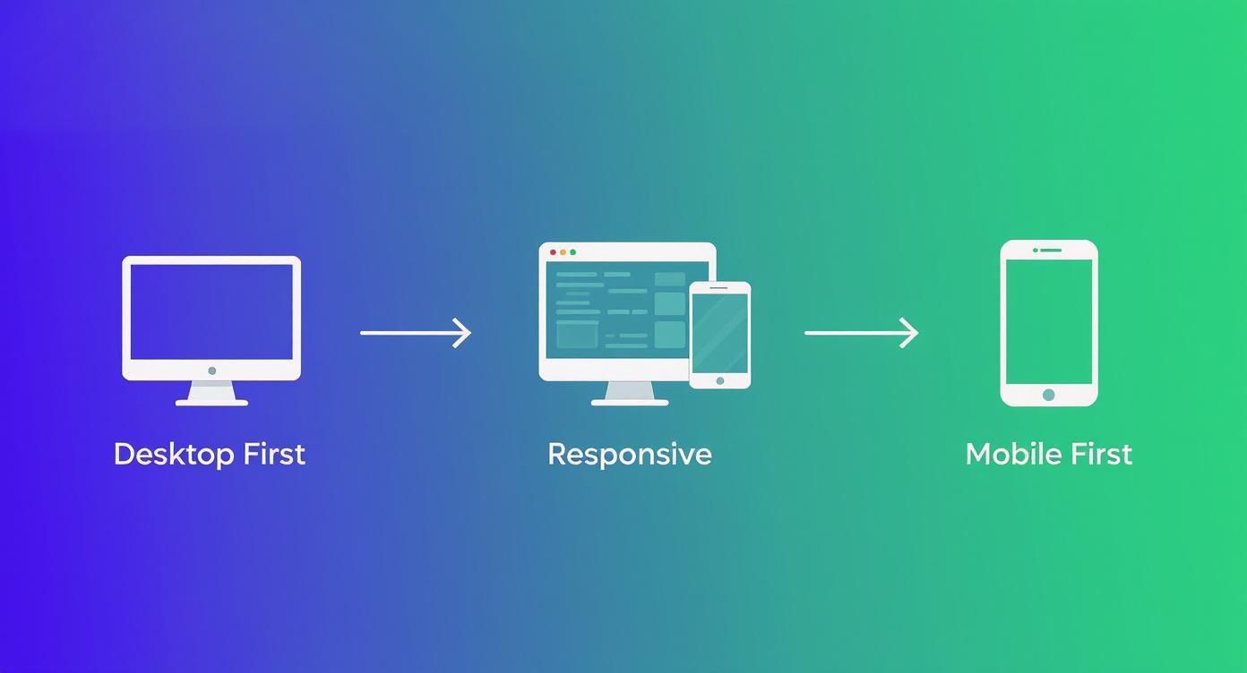
You can clearly see how the industry has moved from trying to cram a big experience onto a small screen to building up from a lean, focused mobile foundation.
Mobile First vs. Desktop First: A Comparison
To put it all into perspective, it helps to see the two approaches side-by-side. The difference in philosophy leads to dramatically different processes and end results.
Aspect | Mobile-First Design (Progressive Enhancement) | Desktop-First Design (Graceful Degradation) |
|---|---|---|
Starting Point | Designs for the smallest screen (mobile) first. | Designs for the largest screen (desktop) first. |
Core Philosophy | Start with a core, essential experience and add features as screen size increases. | Start with a full-featured experience and remove or adapt features as screen size decreases. |
Content Strategy | Forces a focus on core content and functionality from the beginning. | Can lead to including non-essential content that must be hidden or removed on smaller screens. |
Performance | Naturally prioritizes fast load times and efficiency for all users. | Often results in slower mobile experiences due to loading assets designed for desktop. |
User Experience | Creates a focused, uncluttered mobile experience. | Can result in a cluttered or compromised mobile experience as features are stripped away. |
Ultimately, mobile-first design is a proactive strategy. It confronts the constraints of the mobile experience head-on, which results in a better, more intentional product for every user, regardless of their device.
Measurable Benefits for Your Business and Users
Let's be clear: adopting a mobile-first strategy isn't just a trendy design choice. It's a fundamental business decision that pays real dividends. When you prioritize the experience for the device people use most—their phones—you start to see major improvements in everything from user engagement to your search engine visibility.
The benefits go way beyond just having a site that looks nice on a small screen. Think about the main reasons people leave a website. It’s almost always because it’s slow, clunky, or confusing to navigate. Mobile-first design forces you to build a lean, fast, and intuitive foundation from the very beginning, which directly translates to lower bounce rates and visitors who actually stick around.
Boost Your Search Engine Rankings
If you're looking for one killer reason to go mobile-first, it's SEO. Search engines like Google now operate on mobile-first indexing. In simple terms, this means they primarily look at the mobile version of your site to decide how to rank it. If your mobile site is an afterthought, your rankings will suffer. Period.
This gives you a powerful one-two punch for climbing the search results:
Better User Signals: A good mobile experience means fast loads and easy navigation. When people can find what they need without getting frustrated, they stay on your site longer. Google sees this positive engagement as a sign of a high-quality site and rewards you with better rankings.
Stronger Core Web Vitals: Mobile-first sites are naturally lighter and more stable. This directly improves your Core Web Vitals, the technical performance metrics Google now uses as a significant ranking factor.
By building your site the way search engines want to see it, you're setting yourself up to capture way more organic traffic.
Create a Better Experience for All Users
Here’s the interesting part: focusing on mobile doesn’t mean neglecting desktop users. In fact, it leads to a better experience for them, too. This is thanks to a concept called progressive enhancement. You start with only the essential features for the smallest screens, creating a design that is clean, focused, and free of clutter.
As you expand the design for tablets and desktops, you thoughtfully add features and complexity where they make sense. You’re not trying to cram a bloated desktop site onto a tiny screen; you’re elegantly scaling a solid foundation up.
This disciplined approach results in a more intentional and user-friendly design on every device. Your desktop site becomes the "enhanced" version, not a cluttered mess that has to be stripped down and compromised for mobile.
The sheer numbers make this impossible to ignore. As far back as 2022, about 73% of the world's population over the age of 10 owned a mobile phone. That stat alone shows why you have to build for the mobile experience if you want to reach the largest possible audience. You can find more great stats on the importance of mobile-first web design from Romain Berg.
Ultimately, designing for mobile first is just a smarter way to build for the future. It leads to cleaner code that’s easier to maintain and a flexible design that can adapt as new devices and screen sizes come along. It’s a cost-effective strategy for building a digital presence that lasts.
How AI Website Builders Simplify Mobile-First Design

Knowing the theory behind mobile-first design is a great start, but putting it into practice has always been the real challenge. The old way involved a ton of manual work—careful planning, detailed wireframing, and meticulous coding just to make sure the site scaled up gracefully from a phone to a desktop.
Thankfully, modern tools have completely changed the game, making professional results something anyone can achieve.
Leading this change are AI-powered website builders. These platforms do more than just give you a few templates; their entire approach is built on a mobile-first foundation. You don't have to manually wrestle with elements to fit a small screen because the AI handles all that heavy lifting right from the get-go.
Automated Optimization and Layout Generation
The single biggest perk of using an AI builder is how it automatically creates clean, responsive layouts. You provide the content and tell it your goals, and its algorithm designs a structure that’s already optimized for mobile viewing. It just gets content hierarchy and touch-friendly navigation, so you don't have to be a design guru.
This automation also takes care of critical, behind-the-scenes performance tasks:
Image Compression: The AI automatically resizes and compresses your images, making sure they load fast on a 5G or Wi-Fi connection without looking grainy.
Code Streamlining: It generates clean, efficient code built for the mobile experience, cutting out the bloat you often find in sites that were designed for desktops first.
Layout Structuring: It instinctively organizes your content into that ideal single-column layout, which makes for an intuitive, easy-to-scan flow for your visitors.
By taking care of these technical details for you, AI builders let you focus on what really matters—your content and your message—while being confident that the mobile experience is rock-solid.
Smart Features for a Better Mobile Experience
It's not just about the layout, either. AI platforms come packed with smart features designed to solve common mobile usability problems. For example, they can generate touch-friendly menus, make sure buttons are big enough to actually tap (the gold standard is at least 48x48 pixels), and choose fonts that are crisp and readable on a small screen.
This kind of built-in intelligence saves you from hours of frustrating tweaks and testing. The platform essentially becomes your partner in executing a flawless mobile-first strategy, making it an incredible asset for entrepreneurs and small businesses.
If you're wondering which platforms are at the top of their game, it's worth exploring some of the best AI website builders on the market. In the end, these tools make great design accessible to everyone, turning the complex theory of mobile-first into something you can actually build for any project.
Your Practical Mobile-First Design Checklist
Making the jump from knowing what mobile-first design is to actually doing it can feel daunting. To make it easier, I've put together a practical checklist that breaks the process down into manageable stages. Think of this as your roadmap, whether you're starting a new project from scratch or giving an existing site a mobile-first audit.
This framework helps you focus on what matters most at each step, ensuring you build a strong foundation that looks and works great on any device.
Stage 1: Content and Strategy
Before you even think about design, you have to get your strategy straight. This is all about ruthless prioritization—focusing only on what's absolutely essential for someone using their phone.
Nail Down the Core User Tasks: Figure out the top 2-3 things a visitor absolutely must be able to do on their phone. Is it finding your store hours? Buying a product? Booking a service? Everything you build should make these tasks as simple as possible.
Audit and Prioritize Your Content: Make a list of all the content you could have on your site, and then be brutal. Cut it down to what’s non-negotiable for completing those core tasks. Everything else is secondary and can be added back in for larger screens.
Map the Mobile User Journey: Sketch out a simple flowchart. How does a user get from point A to point B on a phone? Keep the path short, direct, and free of distractions.
Stage 2: Design and User Experience
With your content strategy locked in, it's time to start thinking visually. The main goal here is to design for thumbs on a small screen, not a mouse pointer on a giant monitor.
Remember, you're not just making a tiny version of your desktop site. You're building an experience that feels completely natural in someone's hand.
Wireframe for Mobile First: Your very first sketches and wireframes should be for the smallest screen size. This forces you to solve the trickiest layout and navigation problems right from the start.
Design for Thumbs: Make sure every button, link, and interactive element is at least 48x48 pixels. This simple rule makes them easy to tap accurately, which cuts down on user frustration and those annoying accidental clicks. For more tips, check out our guide on how to optimize a website for mobile.
Stage 3: Development and Testing
Now, it's time to bring your design to life with clean, efficient code. The name of the game here is speed and real-world performance.
Optimize Every Asset: Be relentless. Compress your images, minify your CSS and JavaScript, and use browser caching. You want your site to load in a flash, even if someone's on a shaky 4G connection.
Test on Real Phones: Simulators are a good starting point, but they're no substitute for the real thing. Testing on actual iPhones and Android devices is the only way to catch those subtle performance hiccups and interaction quirks that simulators miss.
Frequently Asked Questions
Even after getting the hang of the main ideas, a few questions usually pop up when it's time to put mobile-first design into practice. Let's tackle some of the most common ones so you can move forward with confidence.
Mobile-First vs. Responsive Design
So, is "mobile-first" just another name for "responsive design"? It's a great question, and the answer is no, but they are very closely related.
Think of it this way: responsive design is the technical capability that allows a website's layout to flex and adapt to different screen sizes. It's the "how." A site can be responsive whether you started with the desktop or the mobile view.
Mobile-first design, on the other hand, is the strategy or philosophy you follow. It's the "why" and "where you start." You deliberately begin with the smallest screen, focusing only on the absolute essentials, and then build up from there for tablets and desktops.
A site built desktop-first can still be responsive, sure, but it often ends up forcing the mobile version to shrink down a heavy, complex desktop site, which can be slow and clunky.
What Happens to the Desktop Experience?
A common worry is that if you focus so much on mobile, the desktop version will feel empty or neglected. But when you do it right, the opposite happens.
Starting with mobile forces you to be ruthless about prioritization. You have to decide what truly matters. This creates an incredibly clean and focused foundation.
Then, using the principle of progressive enhancement, you thoughtfully add more complex features or expansive layouts as screen space increases. The result isn't a compromised desktop site; it's a cleaner, more intentional, and less cluttered one.
How Does This Affect SEO?
This is where it gets really important. Adopting a mobile-first approach has a huge, positive impact on your search rankings.
For years now, Google has been operating on what it calls mobile-first indexing. This means it overwhelmingly uses the mobile version of your website to understand your content and decide how to rank it.
A website that was designed for mobile from the very beginning is naturally going to load faster and provide a better user experience on a phone. Search engines see these positive signals—like lower bounce rates and longer session times—and reward you with better visibility.
Ready to build a stunning, mobile-first website without the hassle? Alpha uses AI to generate professional, fully-responsive designs in minutes, taking the guesswork out of optimization. Turn your idea into a high-performing website today at https://www.alpha.page.
Build beautiful websites like these in minutes
Use Alpha to create, publish, and manage a fully functional website with ease.