


How to Create Website Mockups People Actually Love
Learn how to create website mockups that bridge the gap between idea and reality. Our guide covers tools, principles, and developer handoff.
Build beautiful websites like these in minutes
Use Alpha to create, publish, and manage a fully functional website with ease.
Imagine walking into a massive library with no signs, no catalog, and no librarian. Frustrating, right? That's precisely what users experience on a website with poor navigation. It's the digital equivalent of a dead end, a direct path to high bounce rates, user frustration, and lost business opportunities. Effective website navigation isn't just an aesthetic choice; it’s the foundational structure that guides visitors, supports search engine optimization (SEO), and ultimately drives conversions.
In a digital environment where user attention is fleeting, mastering website navigation best practices is non-negotiable for success. Poor navigation actively works against your goals, hiding valuable content and making it difficult for users to find what they need. Conversely, a well-designed navigation system acts as a trusted guide, seamlessly leading users to their desired destination, whether that's a product page, a contact form, or a critical piece of information. It builds trust, enhances usability, and directly impacts your bottom line.
This comprehensive roundup cuts through the noise to provide 10 essential, actionable strategies that will transform your site from a confusing maze into a clear, intuitive journey. We'll explore everything from implementing sticky headers and mega menus to ensuring mobile-first responsiveness and full accessibility. Each point is designed to provide clear, practical steps for creating a navigation experience that not only meets user expectations but also significantly improves your site's overall performance. Let's dive into the core principles that define exceptional website navigation.
1. Sticky/Fixed Navigation
A sticky or fixed navigation bar is a menu that stays in the same position on the screen, typically at the top, even as the user scrolls down the page. This design pattern ensures that the most important navigation links are always accessible, which significantly enhances user experience by eliminating the need to scroll all the way back to the top of a page to find a new section. Implementing this is a cornerstone of modern website navigation best practices.

This approach is particularly effective for content-heavy or long-scrolling pages, where it reduces user effort and keeps them engaged. Prominent examples include the top navigation bar on Amazon.com, which keeps the search bar, cart, and account links constantly in view, and the persistent header on LinkedIn, allowing users to navigate between their feed, network, and messages seamlessly.
Implementation Tips for Sticky Navigation
To implement sticky navigation effectively without compromising usability, consider the following actionable tips:
Minimize Vertical Space: A sticky header occupies valuable screen real estate. Keep its height minimal, especially on mobile devices, to avoid obscuring page content. Some sites even shrink the header height after the user starts scrolling.
Optimize for Mobile: On smaller screens, consider a "hide on scroll down, show on scroll up" behavior. This frees up screen space while reading but brings the navigation back instantly when the user signals intent to navigate.
Maintain Content Visibility: If your design uses a semi-transparent background for the sticky header, ensure the text links have enough contrast to remain readable against the content scrolling underneath.
Test Performance: Adding a fixed element can sometimes impact page rendering performance, particularly on older or less powerful devices. Test your implementation thoroughly to ensure a smooth scrolling experience for all users.
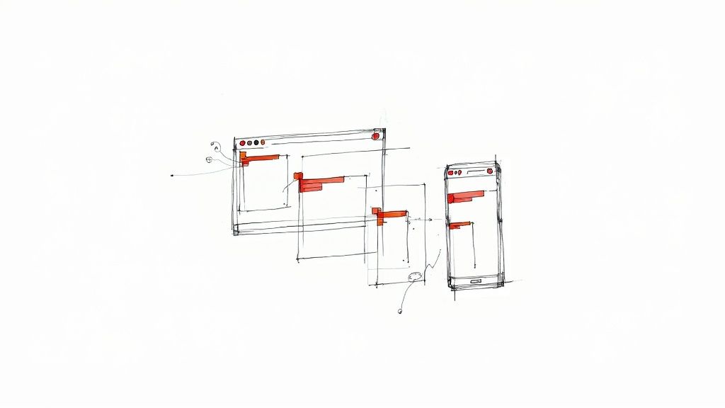
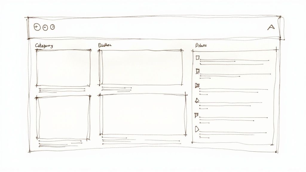
2. Mega Menus
For websites with a vast amount of content or a wide range of products, a mega menu is an invaluable tool. These are large, expandable dropdown panels that display multiple columns of navigation links, often grouped by category and sometimes enhanced with icons or images. Unlike traditional single-column dropdowns, mega menus allow you to present a comprehensive sitemap at a glance, helping users quickly find what they need without multiple clicks. Properly implemented, they are a powerful element of website navigation best practices.
This approach excels at organizing extensive hierarchies, making it a favorite for e-commerce and large corporate sites. Retail giants like Best Buy use them to showcase electronics categories with illustrative images, while Target effectively organizes its diverse product departments. These menus reduce scrolling and clicking, guiding users efficiently through complex site structures and preventing them from feeling overwhelmed by choice.
Implementation Tips for Mega Menus
To create a mega menu that aids rather than overwhelms, focus on clarity and thoughtful organization. Consider these actionable tips:
Group and Chunk Content: Organize links into logical categories with clear, descriptive headings. Use visual cues like typography, spacing, or icons to create a strong visual hierarchy and make the menu scannable.
Mind the Hover Delay: If the menu is triggered by a mouse hover, implement a slight delay (around 300 milliseconds). This prevents the menu from erratically appearing and disappearing as the user’s cursor moves across the main navigation bar.
Optimize for Mobile: Mega menus do not translate well to small screens. For mobile users, implement a touch-friendly alternative like a multi-level accordion menu or a dedicated navigation screen that is easy to tap and navigate.
Ensure Keyboard Accessibility: All menu items must be fully navigable using the Tab key. Users should be able to open, navigate within, and close the mega menu without needing a mouse, ensuring compliance with accessibility standards.
3. Breadcrumb Navigation
Breadcrumb navigation is a secondary navigation system that shows a user's location within a site's hierarchy. It provides a clear, clickable trail of links from the homepage to the current page they are viewing (e.g., Home > Category > Sub-Category > Product). This seemingly simple element significantly improves usability by helping users orient themselves and easily navigate back to higher-level pages, making it a critical component of effective website navigation best practices.
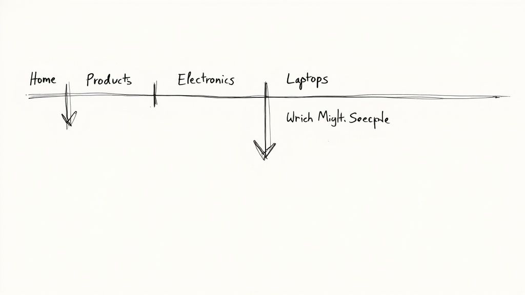
This method is exceptionally valuable for websites with deep and complex structures, such as large e-commerce stores or extensive resource libraries. For instance, Amazon.com uses breadcrumbs on every product page to show the category path, allowing users to effortlessly explore broader categories. Similarly, Wikipedia's article trails help users understand the context and hierarchy of information, reducing the chances of getting lost in a sea of content.
Implementation Tips for Breadcrumb Navigation
To implement breadcrumbs effectively and maximize their SEO and UX benefits, consider these actionable tips:
Integrate Structured Data: Use Schema.org markup for your breadcrumbs (
BreadcrumbList). This helps search engines understand your site structure, which can lead to your breadcrumb trail appearing directly in search results, improving click-through rates.Design for Mobile: Horizontal space is limited on mobile devices. Consider stacking the breadcrumb trail vertically or using truncation with an ellipsis (...) for longer paths to ensure the layout remains clean and functional.
Ensure Clickability and Consistency: Every level in the breadcrumb trail, except for the current page, should be a clickable link. The labels used in the breadcrumbs should match the labels in your primary navigation to maintain consistency and avoid user confusion.
Test for Accessibility: Ensure your breadcrumbs are accessible to all users. Test them with screen readers to confirm they are navigable and that the structure is announced clearly. Use proper HTML elements like
<nav>and an appropriatearia-label(e.g., "breadcrumb") to define their purpose.
4. Clear Visual Hierarchy
A clear visual hierarchy in navigation uses design principles like size, color, spacing, and styling to communicate the relative importance of menu items. It visually guides the user's attention, making it instantly clear which links are primary, secondary, or tertiary. This organizational clarity is a fundamental component of effective website navigation best practices, as it reduces cognitive load and helps users find what they need faster.
This principle is essential for any site with more than a handful of pages. It allows you to present a complex structure in a digestible way. For instance, Apple.com uses a clean, minimalist top bar for its main product categories, with less prominent utility links in a separate space. Similarly, Stripe.com effectively uses progressive disclosure in its mega menus, where primary items are bold and clear, while related sub-links are visually subordinate. This structured approach is a direct output of well-planned information architecture. To dive deeper into this foundational topic, you can learn more about information architecture here.
Implementation Tips for Clear Visual Hierarchy
To establish a strong and intuitive visual hierarchy in your navigation, focus on these actionable tips:
Follow Established Scanning Patterns: Design your layout with user scanning habits like the F-pattern and Z-pattern in mind. Place the most critical navigation links where the user's eye naturally goes first, such as the top and left areas of the screen.
Limit Primary Options: To avoid overwhelming users, restrict your main navigation bar to 5-7 essential items. This forces you to prioritize and group content logically, which is the core of a good hierarchy.
Use Spacing and Proximity: Group related items closer together and use generous spacing to separate distinct groups. Consistent spacing, such as using multiples of 8px, creates a predictable rhythm and reinforces the structure.
Ensure Sufficient Color Contrast: Your text links must be easily readable. Ensure that your color choices for text and backgrounds meet WCAG accessibility standards, and never rely on color alone to convey meaning or differentiate links.
Validate with User Testing: The ultimate test of your hierarchy is its effectiveness with real users. Conduct simple usability tests to observe if users can quickly and easily find key information.
5. Mobile-First/Responsive Navigation
A mobile-first or responsive navigation strategy involves designing and building the navigation experience for mobile devices first, then progressively enhancing it for larger screens like tablets and desktops. This approach prioritizes the user experience on the most constrained devices, ensuring core functionality and usability are solid before adding features for more expansive layouts. It's a fundamental pillar of modern website navigation best practices.
This method ensures your site is accessible and effective for the growing majority of users who browse on mobile. A prime example is Google.com, whose interface seamlessly adapts from a simple mobile search bar to a more complex desktop header. Social media platforms like Facebook and X (formerly Twitter) effectively use bottom tab bars on mobile for quick access to key features, which then transform into a side or top menu on larger screens. Learn more about how to optimize a website for mobile.
Implementation Tips for Mobile-First Navigation
To effectively implement mobile-first navigation that scales beautifully, focus on these actionable tips:
Ensure Adequate Touch Targets: On touchscreens, small links are frustrating. Ensure all clickable elements, like menu items and icons, have a minimum touch target size of 44x44 pixels to prevent accidental taps.
Prioritize Content: For mobile, decide which navigation links are absolutely essential and make them visible. Less critical items can be placed within a "hamburger" menu or another secondary navigation pattern.
Label Your Icons: While the three-line hamburger icon is widely recognized, adding a simple text label like "Menu" next to or below it can improve clarity and accessibility for all users.
Use Modern CSS for Layouts: Leverage CSS Flexbox and Grid to create fluid layouts that adapt gracefully to different screen sizes. This is far more efficient and reliable than using older, float-based techniques.
Test on Real Devices: Browser emulation is a great starting point, but nothing beats testing on actual physical smartphones and tablets. This helps you identify real-world performance issues and interaction quirks that emulators might miss.
6. Search-Integrated Navigation
Search-integrated navigation involves incorporating a prominent search bar directly within or alongside the main navigation menu. Instead of relying solely on users clicking through hierarchical menus, this approach empowers them to bypass traditional paths and find specific content instantly. For websites with extensive content, product catalogs, or large archives, this is a non-negotiable component of effective website navigation best practices.
This method directly addresses user intent, especially for visitors who know exactly what they are looking for. It reduces clicks, saves time, and significantly improves the user experience on content-heavy platforms. Industry giants like Amazon place their search bar at the very top and center of the page, using powerful autocomplete to guide users, while Netflix relies on search as a primary tool for content discovery beyond algorithmic recommendations.
Implementation Tips for Search-Integrated Navigation
To integrate search effectively and create a powerful user tool, consider these practical tips:
Implement Smart Autocomplete: Use an autocomplete or predictive search feature that suggests relevant pages, products, or articles as the user types. This can guide users to the correct page faster and help them discover related content.
Provide Advanced Filtering Options: On the search results page, allow users to refine their query with filters and sorting options. For an e-commerce site, this could include filtering by price, brand, or customer rating; for a blog, it might be by category or date.
Make the Search Bar Obvious: The search box should be easily identifiable and accessible, typically in the header. Use a clear magnifying glass icon and ensure the input field is large enough to accommodate typical search queries.
Analyze Search Query Data: Regularly review what users are searching for on your site. This data is a goldmine for understanding user needs, identifying content gaps, and discovering popular keywords that you can use to optimize your site's information architecture.
7. Descriptive Link Labels
Descriptive link labels involve using clear, specific, and contextual text for navigation links instead of generic phrases like 'Click Here' or 'Learn More'. This practice is fundamental to user experience and accessibility, as it clearly communicates the destination of a link before the user commits to clicking. It sets expectations correctly, reduces uncertainty, and is a critical component of effective website navigation best practices.
This approach not only aids sighted users scanning a page for information but is also essential for users of screen readers. Screen readers often present a list of links out of context, and a list of 'Click Here' labels is entirely meaningless. In contrast, a list of links like 'Download Our 2024 Industry Report' or 'View Our Web Design Portfolio' provides immediate value. A great example is the Nielsen Norman Group website, where in-text links are descriptive phrases like "mega menus work well for many sites" rather than a simple "click here."
Implementation Tips for Descriptive Link Labels
To create link text that is both user-friendly and effective, focus on clarity and context with these actionable tips:
Be Specific and Action-Oriented: Use text that describes the content of the destination page or the action the user will take. Instead of 'More', use 'Explore All Our Features'. Instead of 'Resources', specify 'Download PDF Case Studies'.
Front-Load Keywords: Place the most important, unique words at the beginning of the link text. This helps users quickly scan and differentiate between multiple links on a page.
Ensure Links are Unique: Avoid having multiple links on the same page with identical text that point to different URLs. This creates confusion for all users, especially those using assistive technologies.
Keep it Concise: While descriptive, link text should still be reasonably concise. Aim for a clear phrase, not a full sentence, to maintain scannability and avoid overwhelming the user with text.
8. Active State and Current Page Indication
An active state is a visual cue in your navigation menu that clearly highlights which page or section a user is currently viewing. This simple yet powerful feedback mechanism acts like a digital "You Are Here" sign, providing essential context and orientation. By visually distinguishing the current location, you reduce cognitive load and help users confidently understand their position within the site's hierarchy, making it a critical element of user-friendly website navigation best practices.
This practice is fundamental for preventing user disorientation, especially on large, complex websites. For instance, the table of contents sidebar on any Wikipedia page clearly highlights the section you're currently reading, making it easy to jump between related topics. Similarly, e-commerce sites like Target.com effectively use bold text and underlines in their category menus to show exactly which product department a shopper is browsing.
Implementation Tips for Active State Indication
To implement active state indicators that genuinely improve site navigation, follow these actionable tips:
Go Beyond Color Alone: Relying solely on color to indicate the active state can be an accessibility issue for users with color vision deficiencies. Combine color with another visual treatment, such as bold text, an underline, a background fill, or a graphical icon, to ensure clarity for all users.
Ensure Sufficient Contrast: The active state's text and background colors must meet accessibility standards, specifically a contrast ratio of at least 4.5:1 (WCAG AA). This ensures the link remains perfectly readable.
Use
aria-current="page"for Accessibility: For screen reader users, adding thearia-current="page"attribute to the active link programmatically announces it as the current page. This provides crucial navigational context for visually impaired users.Extend Logic to Breadcrumbs: Apply the same active state logic to your breadcrumb trail. The last item in the breadcrumb list, representing the current page, should be visually distinct (e.g., bolded and not a link) to reinforce the user's location.
9. Keyboard Navigation and Accessibility
Ensuring your website's navigation is fully operable via a keyboard is a fundamental aspect of web accessibility and a critical component of user-centric design. This practice caters to users with motor disabilities who cannot use a mouse, individuals who rely on screen readers, and power users who prefer keyboard shortcuts for efficiency. Accessible navigation ensures that all users can logically move through interactive elements like links, buttons, and form fields using the Tab key, which is a non-negotiable part of modern website navigation best practices.
This principle goes beyond mere compliance; it creates a more robust and user-friendly experience for everyone. For instance, GitHub offers extensive keyboard shortcuts for navigating repositories and issues, while Google Docs allows users to perform complex actions without touching a mouse. To ensure your website's navigation is truly inclusive and usable by all, including those with disabilities, refer to these essential guidelines for website accessibility.
Implementation Tips for Keyboard Navigation
To create a truly keyboard-friendly navigation system, focus on the underlying structure and visual feedback.
Provide Visible Focus Indicators: When a user tabs to a link or button, it must have a clear visual indicator, like a prominent outline. This "focus state" shows users exactly where they are on the page. Avoid removing default browser outlines without providing a better, more visible alternative.
Ensure Logical Tab Order: The order in which interactive elements are focused when using the Tab key should follow the visual layout of the page, typically from left-to-right and top-to-bottom. This is usually achieved by using semantic HTML and structuring the document logically.
Implement "Skip to Content" Links: For users tabbing through the navigation on every page, provide a "skip to main content" link at the very top. This allows them to bypass the repetitive header and navigation links and jump directly to the page's primary content.
Use Semantic HTML Correctly: Utilize native HTML elements like
<nav>,<a>, and<button>as they have built-in keyboard accessibility. Avoid using non-interactive elements like<div>with click handlers, as they are not keyboard-accessible by default and require extra work to function correctly. Learn more about how these elements contribute to making your website more accessible.
10. Contextual and Progressive Navigation
Contextual and progressive navigation is an advanced technique where navigation options adapt to the user's current context or are revealed gradually as needed. Instead of overwhelming users with every possible link at once, this approach intelligently presents only the most relevant choices, significantly reducing cognitive load and creating a more personalized and intuitive journey. It's a key strategy among website navigation best practices for complex sites.
This method shines on platforms where user needs are diverse and context-dependent. A prime example is Amazon.com, which personalizes navigation links and product suggestions based on a user's browsing and purchase history. Similarly, collaboration tools like Slack display specific menu options and shortcuts relevant only to the active channel or conversation, decluttering the interface and focusing the user’s attention on the task at hand.
Implementation Tips for Contextual and Progressive Navigation
To effectively implement this dynamic navigation without causing user confusion, consider these actionable guidelines:
Always Provide Full Access: While you're showing contextual links, ensure users can still easily find the full, global navigation menu. A persistent "Menu" button or a link in the footer can serve as a reliable escape hatch.
Use Clear Visual Cues: When employing progressive disclosure (revealing options upon interaction), use clear indicators like arrows, plus signs, or "Show More" labels. This manages user expectations and makes the interface feel predictable.
Prioritize Explicit User Data: Whenever possible, base personalization on explicit user preferences or inputs rather than relying solely on inferred behavior. This respects user agency and often leads to more accurate contextual suggestions.
Balance Personalization and Privacy: Be transparent about how you are using data to tailor the experience. A link to your privacy policy and clear consent mechanisms are crucial for building user trust, especially with highly personalized navigation.
Test with Real Users: Usability testing is critical to validate that your progressive and contextual patterns are intuitive. Observe whether users can find what they need and if the revealed options match their expectations.
Top 10 Website Navigation Best Practices Comparison
Navigation Pattern | Implementation Complexity 🔄 | Resource Requirements ⚡ | Expected Outcomes ⭐ | Ideal Use Cases 📊 | Key Advantages | Quick Tip 💡 |
|---|---|---|---|---|---|---|
Sticky / Fixed Navigation | 🔄🔄 (moderate) | ⚡⚡ (low–moderate) | ⭐⭐⭐⭐ — persistent access, higher conversions | Long-scrolling pages, e‑commerce, apps | Always-available navigation; reduces scroll friction; mobile-friendly when compact | 💡 Keep height minimal on mobile; consider auto-hide on scroll |
Mega Menus | 🔄🔄🔄 (high) | ⚡⚡⚡ (high) | ⭐⭐⭐⭐ — efficient catalog access, improved discoverability | Large catalogs, retail sites, marketplaces | Surfaces many links; supports imagery & promotions; reduces click depth | 💡 Limit columns; ensure keyboard & touch accessibility |
Breadcrumb Navigation | 🔄 (low) | ⚡ (low) | ⭐⭐⭐ — better orientation & SEO signal | Deep hierarchical sites, large product catalogs | Small footprint; aids navigation and search engines | 💡 Add Schema.org markup; stack or truncate on mobile |
Clear Visual Hierarchy | 🔄🔄 (moderate) | ⚡⚡ (low–moderate) | ⭐⭐⭐⭐⭐ — faster scanning; higher conversions | Almost any site; landing pages; dashboards | Reduces cognitive load; guides attention to primary actions | 💡 Follow WCAG contrast; limit primaries to 5–7 items |
Mobile‑First / Responsive Navigation | 🔄🔄🔄 (high) | ⚡⚡ (moderate) | ⭐⭐⭐⭐ — improved mobile retention & UX | Mobile-heavy audiences, progressive web apps | Touch‑friendly targets; adaptive layouts; saves space | 💡 Test on real devices; label hamburger when possible |
Search‑Integrated Navigation | 🔄🔄🔄 (high) | ⚡⚡⚡ (high) | ⭐⭐⭐⭐⭐ — faster goal completion for known items | Large content libraries, marketplaces, media sites | Bypasses hierarchy; provides intent data; boosts conversions | 💡 Implement autocomplete, logging, and keyboard shortcut (/) |
Descriptive Link Labels | 🔄 (low) | ⚡ (low) | ⭐⭐⭐⭐ — better accessibility & CTR | All websites, especially content-heavy sites | Improves clarity, accessibility, and SEO | 💡 Use action verbs; test labels with users |
Active State / Current Page Indication | 🔄🔄 (moderate) | ⚡ (low) | ⭐⭐⭐⭐ — stronger wayfinding & confidence | Multi-level sites, documentation, e‑commerce | Shows location context; reduces disorientation | 💡 Use color + non‑color cues; include aria-current="page" |
Keyboard Navigation & Accessibility | 🔄🔄🔄 (high) | ⚡⚡ (moderate) | ⭐⭐⭐⭐⭐ — wider reach; WCAG compliance | Public sector, enterprise, apps needing accessibility | Serves users with disabilities; improves UX for power users | 💡 Use semantic HTML, visible focus indicators, test with screen readers |
Contextual & Progressive Navigation | 🔄🔄🔄 (high) | ⚡⚡⚡ (high) | ⭐⭐⭐⭐ — personalized relevance & engagement | Personalized platforms (streaming, marketplaces), complex apps | Reduces choice overload; adapts to user context & behavior | 💡 Always offer access to full nav; be transparent about personalization |
Building Your Path to a Better User Experience
Navigating the digital landscape is much like exploring a new city; without clear signs and logical pathways, users quickly become lost, frustrated, and are likely to leave. Throughout this guide, we've explored the foundational pillars of effective site structure, transforming the abstract concept of navigation into a concrete set of actionable strategies. From the persistent guidance of sticky headers and the organizational power of mega menus to the clear orientation provided by breadcrumbs, each practice serves a singular goal: to make the user’s journey effortless and intuitive.
The true mastery of website navigation best practices lies not in simply implementing these elements, but in understanding how they work together to create a cohesive experience. A strong visual hierarchy draws the eye to primary actions, while descriptive labels eliminate ambiguity. A mobile-first approach ensures this clarity translates seamlessly to any device, and integrating a robust search function empowers users who prefer to take a direct route. These are not just design choices; they are commitments to respecting your visitor's time and attention.
From Blueprint to Reality: Your Actionable Next Steps
With these ten principles in hand, the path forward is clear. The journey to a superior user experience is an iterative one, built on a cycle of implementation, testing, and refinement. Don't feel pressured to overhaul your entire site overnight. Instead, adopt a methodical approach.
Start with a simple audit. Pull up your website and objectively evaluate it against the practices we've discussed:
Clarity and Consistency: Is your main navigation menu immediately understandable? Are labels consistent across the site?
Accessibility: Can a user navigate your site using only their keyboard? Is the active page clearly indicated, providing crucial context?
Mobile Experience: Does your navigation collapse gracefully on smaller screens, or does it become a cumbersome roadblock?
Contextual Support: Are you using contextual links or progressive navigation to guide users deeper into your site where relevant?
Answering these questions will reveal your most significant opportunities for improvement. Perhaps your first step is rewriting vague labels like "Solutions" to be more descriptive, like "E-commerce SEO Services." Or maybe it's implementing a 'sticky' header to keep key links accessible on long pages. Each small adjustment contributes to a much larger impact on user satisfaction and, ultimately, your conversion rates.
The Lasting Impact of Intuitive Design
Ultimately, great navigation is invisible. It’s the silent partner in your user’s journey, guiding them to their destination so seamlessly they don't even notice the mechanics behind it. This is the standard we should all strive for. By weaving these website navigation best practices into your design philosophy, you build more than just a functional website; you build trust, authority, and a digital home that visitors will want to return to.
Remember that navigation is a core component of a much broader discipline. To further enhance the overall user experience of your website, consider exploring broader UX best practices that complement and amplify the impact of a well-structured site. A holistic view ensures that every element, from your navigation bar to your button design, works in harmony to serve the user. This commitment is what separates good websites from truly exceptional ones, creating a powerful foundation for sustainable growth.
Ready to build a website where intuitive navigation is the default, not an afterthought? Alpha uses AI to create stunning, high-performance websites with responsive navigation, clear hierarchies, and mobile-first principles built right in. Stop wrestling with complex settings and let our platform handle the best practices for you. Get started with Alpha today and launch a website that guides your users effortlessly.
Build beautiful websites like these in minutes
Use Alpha to create, publish, and manage a fully functional website with ease.