How to Create Website Mockups People Actually Love
Learn how to create website mockups that bridge the gap between idea and reality. Our guide covers tools, principles, and developer handoff.

Build beautiful websites like these in minutes
Use Alpha to create, publish, and manage a fully functional website with ease.


A/B testing is pretty straightforward on the surface. You pit two versions of a landing page against each other—the original, or "control," and a new "variation"—to see which one gets more people to act. It’s a data-backed way to stop guessing and start making decisions based on what your visitors actually do. When done right, it's the surest path to improving sign-ups, generating more leads, and boosting sales.
Why Most A/B Tests on Landing Pages Fail
Let's be real for a moment: most A/B tests are just shots in the dark. It’s incredibly common for marketers to fall into the trap of testing random, superficial elements. They'll change a button from blue to green and cross their fingers, hoping for a magic conversion lift.
While these kinds of tests are easy to set up, they almost never deliver meaningful results. Why? Because they’re missing a strategic "why." This approach focuses on what to change, not why a change might be needed in the first place. True conversion rate optimization (CRO) isn't about throwing things at the wall; it's about systematically uncovering what makes your visitors tick.
The Mindset Shift: From Guessing to Learning
To run effective ab testing landing pages, you need to shift your entire perspective. Stop asking, "What should I test?" Instead, start asking, "What do I need to learn about my visitors?" This one change transforms testing from a random gamble into a scientific process.
Every test should be an experiment designed to answer a specific question about your audience. For example:
Does a headline focused on benefits outperform one that lists features?
Will adding customer testimonials build enough trust to increase form submissions?
Is our current form too long and intimidating for people on mobile?
A successful A/B test is one that teaches you something valuable about your audience, regardless of whether the variation wins or loses. The insight itself is the prize.
Establishing Your Control and Variation
The core of any A/B test is simple: you have your control (Version A) and your variation (Version B). The control is your current landing page—it's the champion you're trying to beat. The variation is the challenger, where you’ve changed one specific element based on a solid hypothesis.
It’s tempting to overhaul the headline, the call-to-action, and the hero image all at once, but that's a classic mistake. If you change too many things, you'll have no idea which change actually caused the shift in performance. Was it the new headline or the snazzier button? You’ll never know.
By isolating just one variable, you can confidently attribute any performance change directly to it. This discipline is what separates strategic optimization from random tinkering. It's no wonder that roughly 60% of companies are now testing their landing pages to gather these kinds of powerful insights. If you're curious, you can dig into more A/B testing stats to see the bigger picture.
Building a Test Hypothesis That Actually Works
Any A/B test is only as good as the question it's trying to answer. Without a solid hypothesis, you aren't really experimenting—you're just making educated guesses and hoping for the best. A strong hypothesis is your North Star. It ensures that every test, whether it wins or loses, teaches you something valuable about your audience.
This is how you move your ab testing landing pages strategy from making random tweaks to intentional, data-driven optimization. Forget about testing button colors just because you read a case study about it. The real breakthroughs start when you dig into your own data to find your problems.
Uncover Problems with Data
Let's be clear: your best testing ideas won't magically appear during a brainstorming session. They'll come from digging into user behavior and pinpointing the exact spots where people get stuck. Before you touch a single element on your page, you need to put on your detective hat and find where your visitors are struggling.
Your investigation should always start with a blend of quantitative and qualitative data.
Quantitative Data (The "What"): This is where you get your hands dirty in website analytics. Hunt for pages with unusually high exit rates, low time-on-page, or steep drop-offs in your conversion funnel. For instance, if you discover that 70% of mobile users bail on your checkout page, you've just found a massive, glaring problem to solve.
Qualitative Data (The "Why"): Analytics tell you what’s happening, but you need other tools to understand why. This is where things like heatmaps and session recordings come in. Heatmaps show you what people are clicking on (and, just as importantly, what they're ignoring), while session recordings let you watch anonymized user journeys. You'll be amazed at what you find—confusing navigation, broken elements, and moments of pure frustration.
When you put these two data sources together, you go from a vague feeling like "our conversions are low" to a specific, actionable problem like, "mobile visitors aren't scrolling past the hero section to see our value propositions."
Crafting an Actionable Hypothesis
Once you've identified a data-backed problem, it’s time to formulate a hypothesis. A weak hypothesis is just a simple prediction, something like, "Changing the CTA will increase clicks." It's not wrong, but it lacks the context and reasoning to be truly useful.
A powerful hypothesis, on the other hand, is a structured statement that connects your data, your proposed change, and the outcome you expect. It forces you to justify why you're running the test and clarifies what you're trying to learn.
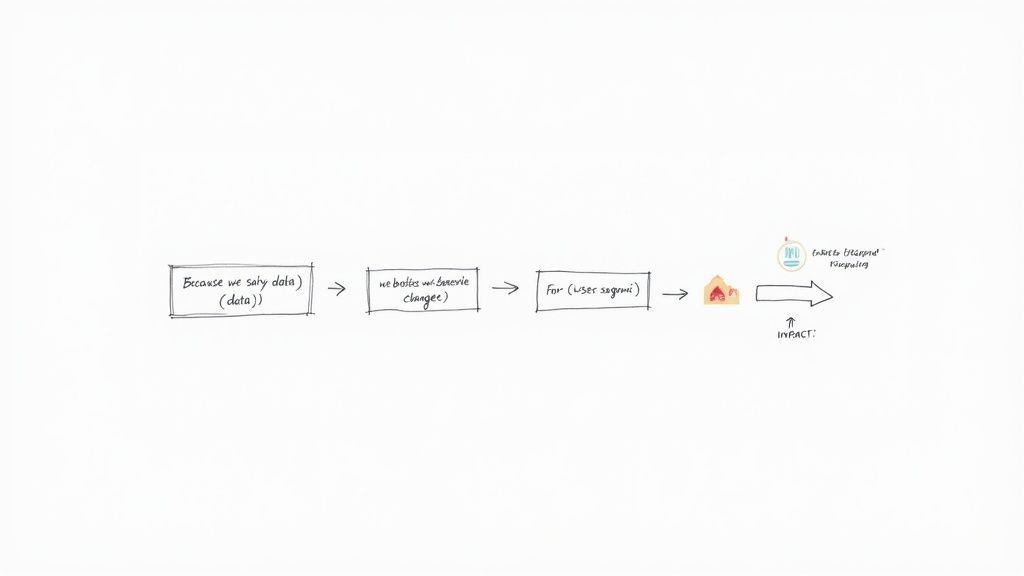
The Framework: Because we saw [data/observation], we believe that [change] for [user segment] will cause [impact]. We will measure this using [metric].
This simple structure is a game-changer. It anchors your test in reality, gives it a clear purpose, and defines what success looks like right from the start. It turns a fuzzy idea into a measurable experiment.
Putting the Hypothesis Framework into Practice
Let's walk through how this works with a real-world scenario. Imagine you run an e-commerce store that sells custom pet portraits.
Data Observation: You're looking through your Google Analytics and see that your main product page has a high bounce rate. To figure out why, you watch a few session recordings. A pattern emerges: a lot of visitors hover their mouse over the "Upload Your Pet's Photo" button, hesitate, and then leave without ever clicking.
Now, you can build a proper hypothesis.
Weak Hypothesis: "Adding a testimonial will improve conversions."
Strong Hypothesis: "Because we saw that users hesitate at the photo upload step, we believe that adding a small testimonial block directly beneath the button for all visitors will cause an increase in uploads by building trust at that critical moment. We'll measure this using the photo upload conversion rate."
See the difference? The second version is specific, rooted in actual user behavior, and completely testable.
If the variation wins, you've learned that building trust is a key lever at that stage of the journey. If it loses, you've learned that a testimonial isn't the right way to address that specific friction point, which prompts you to dig deeper into why they're hesitating. Either way, you gain a valuable insight that informs your very next move. This is how you stop guessing and start building a true learning engine for your business.
Designing and Launching Your Test Variants
Once you have a solid, data-backed hypothesis, it's time for the fun part: building your "challenger." This is the new version of your landing page that you believe will outperform the original. The single most important rule here is to be bold.
Tiny tweaks, like changing one word in a paragraph or nudging a button color a few shades, rarely give you a clear signal. They just get lost in the statistical noise. For your A/B test to tell you anything useful, the difference between your control (Version A) and your variant (Version B) needs to be distinct and tied directly to your hypothesis.
Pinpointing High-Impact Test Elements
Some parts of your page have a much bigger influence on a visitor's decision than others. To get the most bang for your buck, focus your design changes on these critical areas.
Headlines and Subheadings: This is your first impression. It's your one shot to hook them. Try testing a benefit-driven headline ("Finally Get a Full Night's Sleep") against a feature-focused one ("Our Mattress Has Patented Cooling Gel").
Call-to-Action (CTA): This is the final step. Don't overlook it. Experiment with the text ("Get My Free Trial" vs. "Start Building Now"), the button's color and size, and where you place it.
Hero Section Media: Is a product video more engaging than a powerful, high-quality photo? This is a classic test that can completely change the feel of the page and how people interact with it.
Form Length and Design: Is form fatigue killing your conversion rate? If you suspect it is, test a much shorter form. Going from five fields down to just two (name and email) can have a dramatic effect on how many people complete it.
Social Proof: How you show trust is just as important as showing it at all. Try moving your best testimonial right next to the CTA button, or test specific, number-driven results ("Increased ROI by 250%") against more general quotes.
The goal isn't just to change things for the sake of it. It's about making a strategic change that solves a specific user problem you've identified. It’s all part of mastering creating a high-converting landing page that actually moves the needle.
Real-World Scenario: Benefit vs. Feature
Let's say you're marketing a new project management tool. Your current headline—the control—is "The Ultimate Project Management Platform." It's descriptive, sure, but it doesn't really spark any emotion.
You've heard from user interviews that potential customers are completely overwhelmed by their current workload. So, you form a hypothesis: a headline that promises relief from that chaos will perform better. Your new challenger headline becomes, "Finally, End Project Chaos for Good."
This isn't just a word game. It's a strategic test to see if your audience responds more to an emotional promise than a simple description of what the tool is. For more ideas on structuring your page for maximum impact, check out our guide on landing page design best practices.
The Pre-Launch Technical Checklist
Before you hit "go," you absolutely must run through a final technical check. I've seen too many tests ruined by simple, avoidable mistakes. Rushing this step means your data will be worthless and you'll have wasted all that traffic.
A career college once saw a 336% conversion rate increase from a single A/B test. All they did was remove the main navigation and move their lead form above the fold. It’s proof that a bold change can deliver incredible results—but only if the test is running correctly.
Run through this checklist every single time:
Is Your Goal Tracking Correct? Double-check that your conversion goal—a form submission, a button click—is firing properly on both the control and the variant. Use your A/B testing tool's preview or debug mode to walk through the conversion flow yourself.
Is It Browser-Friendly? Your new design might look amazing in Chrome, but what about Safari or Firefox? A broken layout on one browser can tank your variant's performance. Use a cross-browser testing tool to be sure.
How Does It Look on Mobile? The majority of your traffic is probably on a phone. Your variant must be flawless on a small screen. Look for weirdly scaled text, buttons that are too small to tap, or anything that feels clunky.
Is the Page Speed Consistent? Your variant shouldn't be significantly slower than your control. A slow-loading page is a conversion killer. If the variant loses, you need to know if it was because of the design, not because it took five seconds longer to load.
Once you’ve gone through this list and everything checks out, you're ready to start your test. This upfront diligence is what separates a good guess from a reliable, data-driven insight.
Making Sense of the Numbers Behind Your A/B Test
You don't need a Ph.D. in statistics to run a solid A/B test, but a few core concepts are non-negotiable. Getting a handle on the stats is the only way to know if your results are a real win or just random noise. If you skip this, you could end up making critical business decisions based on faulty data.
The two big ideas you need to get comfortable with are statistical significance and confidence level. Think of them as a reliability score for your test. In most marketing and product circles, a 95% confidence level is the gold standard. This simply means you can be 95% certain that the results you're seeing aren't a fluke.
So, if your new landing page variant shows a 10% lift with 95% confidence, there's only a 5% chance that random luck created that improvement. That's the point where you can confidently pop the champagne, declare a winner, and roll out the new version.
The Single Biggest Mistake I See in A/B Testing
I’ve seen it a thousand times: someone runs a test for an arbitrary period, like "one week," and then immediately calls a winner based on the results. This is a recipe for disaster. Why? Because the calendar has absolutely no idea if you've collected enough data to make a reliable call.
The only right way to do this is to figure out your required sample size before you even think about launching the test. This involves calculating exactly how many people need to see each version of your page to reliably detect a meaningful change. Skipping this step is like pulling a cake out of the oven just because a timer went off, without ever checking if it's actually cooked.
To figure out your sample size, you'll need three key pieces of information:
Baseline Conversion Rate: This is simply your control page's current performance. You can pull this straight from your analytics.
Minimum Detectable Effect (MDE): This is the smallest improvement you care about detecting. A common starting point is a 10-20% lift.
Statistical Significance: As we covered, 95% is the standard for most tests.
Your test duration should be dictated by data, not the calendar. Run your experiment until you hit your pre-calculated sample size, not for a random number of days.
Once you have these numbers, you can plug them into a free online sample size calculator to get your magic number. This tells you exactly how many visitors you need per variation for a trustworthy result and is a fundamental part of understanding what website analytics is all about.
Calculating Your Sample Size in the Real World
Let's walk through a quick example. Imagine your current landing page (your "control") has a 4% conversion rate. You're hoping your new design can deliver at least a 20% uplift. A 20% relative lift would push your conversion rate from 4% to 4.8%.
When you plug those numbers into a calculator (with 95% significance), it will tell you that you need roughly 16,300 visitors per variation. That’s a total of over 32,000 visitors for a simple A/B test. Now you can see why running a test for "a week" on a page with low traffic is completely pointless—you’d be making a decision on a tiny, unreliable data set.
The traffic numbers you need can get big, fast, especially when you're testing for small improvements. The table below gives you a quick idea of how the required sample size changes based on the uplift you're trying to detect.
Sample Size Estimates for A/B Tests
This table shows the approximate number of visitors needed per variation to detect different conversion rate uplifts, assuming a 5% baseline conversion rate and 95% statistical significance.
Minimum Detectable Effect (Uplift) | Required Visitors Per Variation |
|---|---|
50% | 1,400 |
30% | 4,200 |
20% | 10,000 |
10% | 42,000 |
5% | 170,000 |
As you can see, detecting smaller, more subtle changes requires a massive amount of traffic. This is why it's crucial to prioritize tests that have the potential for a significant impact.
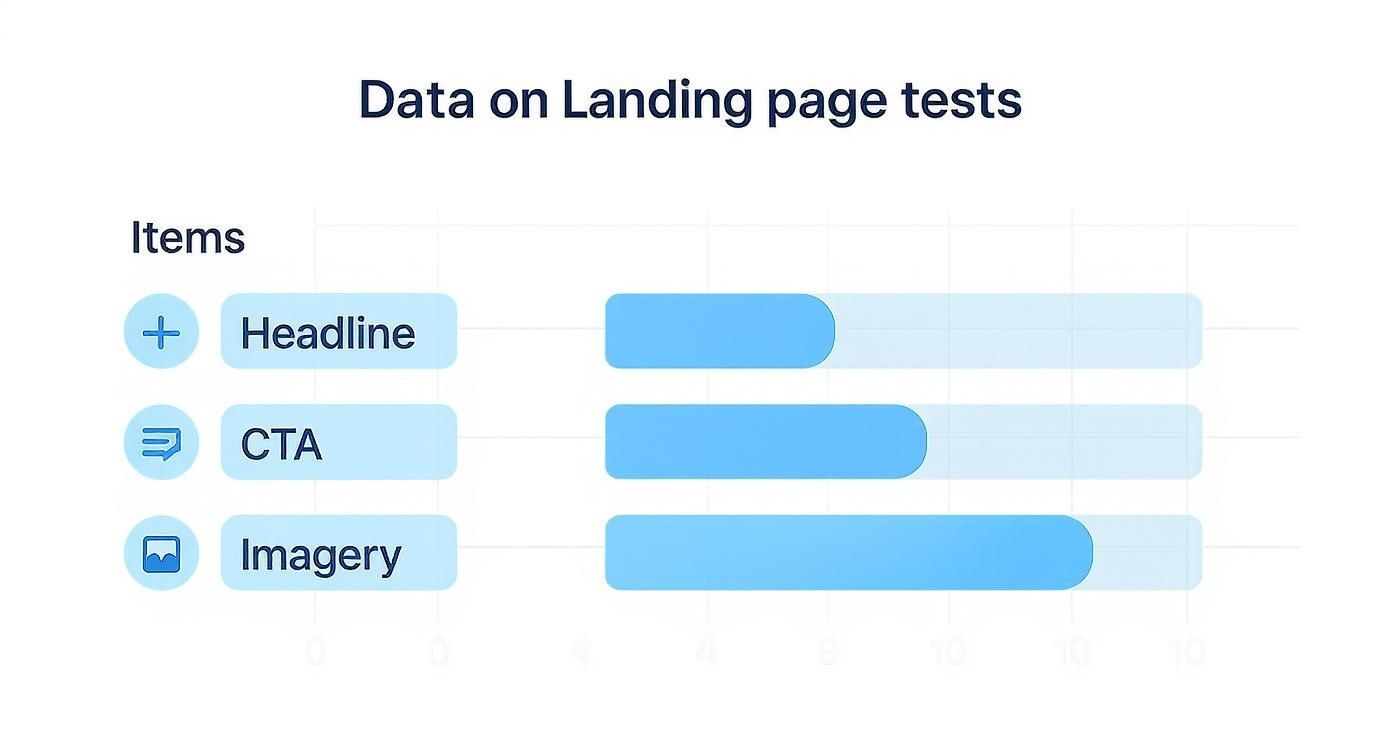
The elements you choose to test play a huge role here. High-impact elements like headlines, call-to-action buttons, and hero imagery are popular choices because they can produce bigger swings in performance.
By understanding the numbers and planning ahead, you can stop guessing and start making data-driven decisions that actually move the needle on your landing page performance.
Analyzing Your Results and Dodging Common Pitfalls
https://www.youtube.com/embed/KZe0C0Qq4p0
The numbers are in and your test has finally run its course. This is where the real learning kicks in, but it's also where a lot of marketers stumble. The aim isn't just to crown a winner; it's to figure out why one version came out on top. These are the insights that will sharpen your entire marketing strategy for months to come.
First thing's first: go straight back to your original hypothesis. What was the primary metric you wanted to move? If you bet that a benefit-driven headline would boost demo sign-ups, then that’s the only number you should be looking at to decide the winner.
It’s tempting to get sidetracked by secondary metrics like bounce rate or time on page, but those can send you down a rabbit hole. Stick to the goal you set from the start. This keeps your analysis clean and unbiased.
Go Deeper Than Just the Winner
Declaring a champion is just the beginning. The truly game-changing insights are almost always hiding in your audience segments. What looks like a tie or a minor win on the surface might actually be a massive success with a specific group of people.
Make sure you slice the data a few different ways:
By Device: Did your new design crush it on mobile but flop on desktop? This is a huge clue about usability issues or how user intent differs across devices.
By Traffic Source: How did visitors from paid ads react compared to organic search or email traffic? An audience primed by an ad might want a more direct pitch, whereas organic visitors may need more content to build trust.
By Visitor Type: New visitors might love the clarity of your new design, but returning users who know the old layout could find it confusing.
Spotting these patterns is what transforms a simple A/B test into a goldmine of customer intelligence. This is a core principle behind successful conversion rate optimization strategies—it’s all about understanding behavior, not just chasing a number.
The Traps That Will Ruin Your A/B Tests
Even experienced testers can fall into traps that completely derail their results. Knowing what they are is the best way to make sure your data is trustworthy and your conclusions are solid.
The most common mistake is peeking at your results too early. I get it, you’re excited. But A/B test results swing wildly at the beginning.
Seeing your variation ahead by 30% after two days is usually just statistical noise. Calling a winner before you’ve hit your predetermined sample size is a surefire way to make a terrible business decision based on shaky data.
Another killer is what I call test pollution. This happens when you run multiple tests on the same page at the same time. If you're testing a headline and a CTA button simultaneously, you have no way of knowing which element caused the change. The results get muddled, and you can’t confidently attribute a lift to any single change.
Finally, watch out for your own confirmation bias. We all do it. We naturally look for data that proves what we already believe. If you were really rooting for your new design, you might subconsciously focus on the metrics where it won and conveniently ignore the ones where it lost.
The best defense here is to be ruthless about sticking to your primary metric. The numbers don’t have opinions. Let the data tell the story, even if it's not the one you were hoping for. At the end of the day, testing is about learning what your audience truly wants so you can improve overall website conversion rates by giving it to them.
Common Questions (and Straight Answers) About Landing Page Testing
Even the most seasoned pros have questions when they get into the weeds of A/B testing. It's just part of the process. Getting a clear answer can be the difference between a test that yields real insights and one that just wastes traffic.
Let's walk through some of the questions that come up time and time again.
What’s the First Thing I Should Test on My Landing Page?
There's no single magic bullet, but you'll almost always get the most bang for your buck by starting with your headline or your main call-to-action (CTA). Think about the path your user takes.
Your headline is the first thing they see. You have maybe three seconds to hook them and convince them they're in the right place. If your headline falls flat, the rest of the page might as well be invisible. It's your highest-leverage element, period.
Then there's the CTA. This is the moment of truth—the final click that separates a browser from a customer. Tiny tweaks to the copy, color, or even the placement of that button can have a massive impact on your conversion rates. It's often the quickest way to see a meaningful lift.
How Long Does an A/B Test Need to Run?
This one's crucial. The short answer is: run the test until you hit your pre-calculated sample size, not for a set amount of time. Don't just run it for "a week" and call it a day. That's how you get fooled by random chance.
Ending a test early just because one version is "winning" is probably the most common and costly mistake you can make. Let the numbers dictate the timeline, not your gut or the calendar.
As a general rule of thumb, it's also smart to run any test for at least one full business cycle—usually a full week. This ensures your data captures the natural ups and downs of user behavior, like the difference between a Tuesday morning and a Saturday night. It gives you a much more reliable picture of what's actually happening.
What if My Test Doesn’t Show a Clear Winner?
First off, don't get discouraged. An inconclusive result isn't a failure; it’s a finding. It tells you that the change you made wasn't big enough to make a real difference, or that both versions are equally good (or bad).
This is your cue to head back to the drawing board. Dig into your original hypothesis again.
Did you correctly identify the problem you were trying to solve for the user?
Was your change too subtle? Maybe you changed a button from light blue to dark blue when you needed to change the entire headline.
Is there another element on the page that's the real source of friction?
An inconclusive test helps you cross something off the list. Use that knowledge to form a bolder, more creative hypothesis for your next experiment. Sometimes, finding out what doesn't work is the key to unlocking what does.
Can I Test More Than One Thing at Once?
You can, but it’s a different beast entirely. When you change multiple elements at once—like the headline, hero image, and CTA all in a single variation—you're running what’s called a multivariate test (MVT).
While MVT can be incredibly powerful, it comes with a huge catch: you need an enormous amount of traffic. That’s because the test has to show every possible combination of your changes to enough people to figure out which specific element made the difference.
For most businesses, sticking with a straightforward A/B test is the smarter play. Focus on one significant change at a time. It gives you clean, undeniable results and helps you build a library of proven insights about what your customers truly want. It's the simplest path to getting results you can trust.
Ready to stop guessing and start building landing pages that actually convert? With Alpha, you can spin up stunning, optimized websites in a matter of hours, not weeks. Let our AI design features generate variants, track everything with built-in analytics, and turn your best ideas into high-performing pages without the headache.
Build beautiful websites like these in minutes
Use Alpha to create, publish, and manage a fully functional website with ease.