


How to Create Website Mockups People Actually Love
Learn how to create website mockups that bridge the gap between idea and reality. Our guide covers tools, principles, and developer handoff.
Build beautiful websites like these in minutes
Use Alpha to create, publish, and manage a fully functional website with ease.
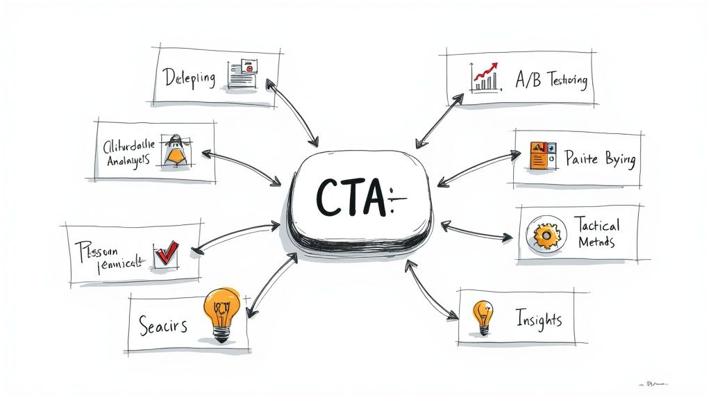
In the digital marketplace, a click isn't just a click; it's the start of a relationship, a sale, or a loyal follower. Yet, many entrepreneurs and small businesses struggle to turn passive website visitors into active customers. The secret often lies in one of the most critical elements of your website: the Call to Action (CTA). It’s more than just a button. A well-crafted CTA is a powerful psychological trigger that guides your audience toward the exact next step you want them to take.
This guide moves beyond generic advice to dissect some of the most effective call to action examples used today. We will break down the strategic rationale, provide A/B testing ideas, and deliver actionable takeaways you can implement immediately. Mastering your CTAs is fundamental to building a high-performing website, standing alongside other powerful Conversion Rate Optimization techniques that drive growth.
You will learn the 'why' behind what works, so you can craft compelling CTAs that don't just get seen, they get results. Whether you're a seasoned marketer looking to refine your approach or a solopreneur just launching your first site with a builder like Alpha, this blueprint will equip you to transform clicks into meaningful conversions. We'll explore everything from action-oriented verbs and FOMO-based urgency to benefit-driven language and curiosity-gap hooks that make clicking irresistible.
1. Action-Oriented Verbs (Buy Now, Sign Up, Learn More)
The foundation of any effective call to action is a powerful, action-oriented verb. These are command-based words that leave no room for ambiguity, telling users precisely what will happen when they click. Phrases like "Buy Now," "Sign Up," or "Download" are direct, instinctual, and have become the standard for a reason: they work by minimizing cognitive load and guiding the user to a specific, desired outcome.

This approach is about clarity and efficiency. When a user lands on a product page, their intent is often clear. Amazon’s iconic "Buy Now" button perfectly matches this intent, creating a frictionless path from consideration to conversion. Similarly, Spotify’s "Sign Up Free" immediately addresses a potential user's main questions: what do you want me to do (sign up) and what will it cost (it's free).
Strategic Analysis
Psychology: These CTAs tap into what psychologists call "processing fluency." The easier it is for the brain to process a command, the more likely a person is to comply. Simplicity reduces decision fatigue.
Clarity: An action verb sets a clear expectation. "Get Started" on HubSpot's homepage implies the beginning of a process, while "Subscribe" for a newsletter clearly defines the long-term engagement. This clarity builds trust.
Actionable Takeaways
For entrepreneurs and small businesses, using direct, action-oriented verbs is the most reliable way to start optimizing conversions. This is a core concept in CTA design, and for a deeper dive, you can explore this detailed breakdown of what a call to action is.
Here’s how to implement this strategy:
Match Verb to Value: Ensure the verb accurately reflects the user's next step. Use "Download Our Guide" instead of a generic "Click Here."
Add a Qualifier: Enhance your verb with a benefit or remove a barrier. For example, "Start Your Free Trial" is more compelling than just "Start Trial."
A/B Test Your Verbs: Test variations to see what resonates. Does "Get Your Quote" perform better than "Request a Quote"? Small changes in phrasing can lead to significant lifts in engagement.
2. FOMO-Based CTAs (Limited Time, Act Now, Only X Left)
Tapping into the fear of missing out (FOMO), these call-to-action phrases leverage scarcity and urgency to create psychological pressure for an immediate decision. By highlighting limited availability, whether by time or quantity, you compel users to act now rather than later. Phrases like "Only 2 spots remaining," "Sale ends tonight," or "Offer expires soon" disrupt the user's consideration phase and push them toward conversion.

This tactic is masterfully used by e-commerce and travel sites. Booking.com’s "Only 1 room left at this price" message creates a powerful sense of competition and scarcity, while Amazon's Prime Day countdown timers visually reinforce the fleeting nature of deals. These effective call to action examples work because they frame the decision not as "Should I buy this?" but as "Should I buy this now before it’s gone?"
Strategic Analysis
Psychology: FOMO is rooted in the psychological principle of loss aversion, where the pain of losing something is emotionally more powerful than the pleasure of gaining something of equal value. Scarcity implies high demand and value, making the offer more attractive.
Clarity: These CTAs add a critical "when" and "why now" to the user's decision-making process. "Secure Your Spot" is a good CTA, but "Secure Your Spot - Only 3 Left!" provides a compelling and urgent reason to click immediately.
Actionable Takeaways
For entrepreneurs, using scarcity and urgency can significantly boost short-term sales and sign-ups, especially for promotions or limited-edition products. For a deeper dive into the specific psychological triggers that drive immediate action, explore effective strategies for creating urgency and scarcity.
Here’s how to implement this strategy:
Be Specific and Honest: Vague urgency like "Act Now" is less powerful than "Offer Ends in 02:15:43." Use real numbers for inventory or specific deadlines. Authenticity is key to building long-term trust.
Add Visual Reinforcement: Don't just rely on text. Use countdown timers, animated stock level bars, or bold, contrasting colors (like red or orange) to draw attention to the time-sensitive nature of the offer.
Test Urgency vs. Scarcity: A/B test which trigger resonates more with your audience. Does a countdown timer (urgency) perform better than a "limited stock" alert (scarcity)? The answer can reveal valuable insights about your customers' motivations.
3. Benefit-Driven CTAs (Solve Your Problem, Save Money, Achieve More)
While action verbs tell users what to do, benefit-driven CTAs tell them why they should do it. This approach shifts the focus from the action itself to the value the user will receive. Instead of a simple "Subscribe," a benefit-driven CTA might say "Get Smarter in 5 Minutes," directly connecting the click to a desirable outcome. It answers the user's core question: "What's in it for me?"
This strategy is about aligning your CTA with the user's primary motivation. For example, a financial planning platform using "Start Retiring Early" is far more compelling than a generic "Sign Up." It taps into a deep-seated goal, transforming a simple button into a gateway for achieving a life aspiration. Similarly, a fitness app’s "Start Losing Weight Today" speaks directly to the user's pain point and offers an immediate solution.
Strategic Analysis
Psychology: This method leverages the "pleasure principle," the instinctual human drive to seek pleasure and avoid pain. By framing the CTA around a positive outcome (e.g., "Achieve Financial Freedom") or the elimination of a problem (e.g., "End Sleepless Nights"), you create a powerful emotional pull that motivates action.
Clarity: A benefit-driven CTA clarifies the value proposition right at the point of decision. A CTA like "Unlock 50% Savings" on a subscription box page leaves no doubt about the immediate reward, making the decision to click easier and more satisfying. This clarity is a cornerstone of successful conversion rate optimization.
Actionable Takeaways
For businesses wanting to move beyond basic commands, benefit-driven language is the next logical step. It connects your product directly to your customer's needs, creating a stronger incentive to convert. Explore more on this topic by reading these conversion rate optimization strategies.
Here’s how to implement this strategy:
Lead with the Outcome: Frame your CTA around the end result. Instead of "Download Our Ebook," try "Master Your Marketing Funnel."
Use Specific, Measurable Benefits: Vague promises are weak. "Save 3 Hours Every Week" is much stronger than "Save Time." Quantify the value whenever possible.
A/B Test Different Benefits: Your audience may be motivated by different things. Test whether "Grow Your Audience" performs better than "Increase Your Revenue" to find what truly resonates.
4. Question-Based CTAs (Ready to Succeed?, Want to Learn More?)
Instead of issuing a command, question-based CTAs invite users into a conversation, making the interaction feel less transactional and more collaborative. These effective call to action examples frame the desired action as an answer to a question the user is likely already asking themselves. This approach lowers psychological barriers by shifting from a direct demand ("Do this") to a collaborative suggestion ("Want this benefit?").
This technique excels in contexts where the user needs nurturing or is higher up in the marketing funnel. For instance, a B2B consultant might ask, "Ready to transform your business?" before presenting a "Book a Consultation" button. Similarly, a productivity tool's landing page could engage visitors with, "Want to double your productivity?" This primes the user to see the solution being offered not as a purchase, but as a logical next step to their own goals.
Strategic Analysis
Psychology: This method leverages the principle of consistency. By getting the user to mentally agree with a question ("Yes, I want to succeed"), they are more psychologically inclined to take the action that aligns with that agreement. It creates a "micro-commitment."
Engagement: A question is inherently more engaging than a statement. It prompts a mental response and pulls the user into the narrative, making them an active participant rather than a passive observer. This is a core tenet of conversational marketing platforms like Drift.
Actionable Takeaways
For businesses focused on building relationships and guiding users through a complex decision, question-based CTAs are a powerful tool. They are particularly effective for service-based businesses, software platforms, and content marketing funnels.
Here’s how to implement this strategy:
Align Question with User Intent: Ask a question that directly taps into your audience's primary pain point or desire. For a financial service, "Are you ready to take control of your finances?" is far more resonant than a generic statement.
Create a Clear Path to Action: The question should lead seamlessly to the button. Pair "Curious how others save 5 hours/week?" with a clear button like "See How It Works" or "Get the Case Study."
A/B Test Against a Command: Test a question-based CTA against a traditional action-oriented verb. For a waitlist, compare "Want early access?" + "Join the Waitlist" against a simpler "Join the Waitlist Now" to see which drives more engagement and signups.
5. Social Proof CTAs (Join 10,000+ Users, See What Others Are Doing)
This type of call to action leverages the powerful psychological principle of social proof. By showing a prospect that many others have already made the same choice, you reduce their perceived risk and increase their trust. Phrases like "Join 10,000+ Users" or "Trusted by Top Companies" tap into the basic human instinct to follow the crowd, suggesting that if so many people find value in a product, it must be a good decision.
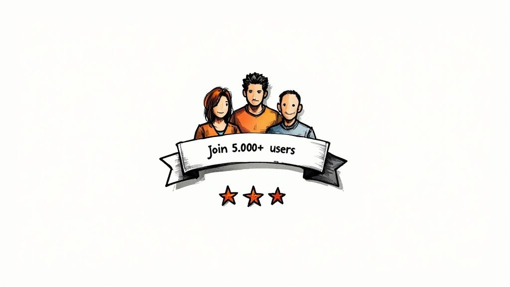
This approach transforms a simple directive into a compelling invitation to a proven community. Slack’s homepage, which often highlights its millions of daily active users, doesn't just ask you to sign up; it invites you to join a massive, thriving ecosystem of productive teams. Similarly, when Duolingo says "Join 500 million+ learners," it frames the act of signing up not as a transaction, but as becoming part of a global movement.
Strategic Analysis
Psychology: Social proof reduces uncertainty. According to researcher Robert Cialdini, when people are unsure how to act, they look to the behavior of others to guide their own decisions. A large user count serves as a powerful endorsement.
Credibility: Using specific numbers adds a layer of authenticity and authority. "Join 10,473 happy customers" is far more believable and impactful than "Join thousands of customers." This numerical proof builds immediate credibility.
Actionable Takeaways
For startups and small businesses, showcasing your growing user base is one of the most effective call to action examples you can deploy to build momentum and trust. Understanding the core concept is key, and you can explore more about how to apply what is social proof in marketing to your strategy.
Here’s how to implement this strategy:
Be Specific and Honest: Use real, verifiable numbers. If your numbers are small, frame them differently, such as "Join hundreds of businesses in Austin" to create a sense of niche community.
Place It Prominently: Position the social proof directly above or within the CTA button itself. This ensures the user sees the validation right as they are about to make a decision.
A/B Test Your Numbers: Test different ways of presenting your data. Does "Trusted by 5,000+ Marketers" convert better than "Join a Community of 5,000+ Peers"? The framing can significantly alter perception and performance.
6. Personal Value CTAs (Get Your Free Guide, Claim Your Discount)
Shifting the focus from the action to the user's reward is a powerful psychological tactic. Personal value CTAs use possessive language like "your" and "my" to create an immediate sense of ownership and highlight what the individual stands to gain. Instead of a generic command, phrases like "Get Your Free Guide" or "Claim Your Discount" make the offer feel exclusive and tailored specifically to the user.
This approach transforms the interaction from a simple transaction into a personal benefit. When a marketing agency offers to "Get Your Free Marketing Audit," it frames the service not just as a lead magnet but as a personalized asset the user is about to receive. Similarly, an e-commerce site using "Claim Your 40% Discount" makes the user feel proactive in securing a special deal meant for them, which is a key component of many effective call to action examples.
Strategic Analysis
Psychology: This technique leverages the "endowment effect," a cognitive bias where people place a higher value on things they own. Using "your" plants the seed of ownership before the user has even clicked, making them less likely to abandon the potential gain.
Clarity: Personal value CTAs clearly state the benefit. There's no ambiguity in "Download Your Free Checklist"; the user knows exactly what they will get, which reduces friction and builds trust by delivering on a specific promise.
Actionable Takeaways
For small businesses, framing CTAs around personal value is an excellent way to boost conversions for lead magnets, free trials, and special offers. It directly answers the user's core question: "What's in it for me?"
Here’s how to implement this strategy:
Lead with "Your" or "My": Start your CTA with possessive pronouns. Test "Get My Free Plan" against "Get Your Free Plan" to see which resonates more with your audience's perspective.
Be Highly Specific: The value must be concrete and desirable. "Claim Your 40% Discount" is more compelling than "Get Our Discount" because it quantifies the reward.
Ensure Incentive Relevance: The offer must align with your core product. A free, personalized recommendation for a SaaS tool is valuable because it directly relates to the user's potential long-term use of the platform.
7. Directional CTAs (Scroll Down, Discover More, Explore Collections)
Not every call to action needs to aim for an immediate conversion. Directional CTAs are designed to guide user flow, encouraging deeper exploration rather than a final commitment. Phrases like "Scroll Down," "Discover More," or "Explore Our Collections" act as gentle signposts, keeping users engaged and moving them seamlessly through the customer journey.
This approach is about maintaining momentum and managing attention. On a long-form landing page or a visually rich product showcase, a directional CTA prevents users from stalling or bouncing. Apple frequently uses this technique on its product pages, with subtle "scroll" cues and section breaks that invite users to continue learning about a device's features, building desire before presenting a "Buy" button.
Strategic Analysis
Psychology: These CTAs leverage curiosity and the Zeigarnik effect, where people remember uncompleted or interrupted tasks better than completed ones. A "Discover More" prompt creates an open loop, motivating the user to continue scrolling to close it.
Clarity: In complex or content-heavy layouts, directional cues reduce cognitive load by telling users what to do next. "See What's New" on a blog or "Browse Our Resources" on a knowledge base provides a clear, low-friction path for engagement. This is a core principle of good UX design.
Actionable Takeaways
For entrepreneurs with story-driven brands or extensive product lines, directional CTAs are essential for creating an immersive experience. They turn a passive viewing session into an active exploration, guiding visitors toward key value propositions.
Here’s how to implement this strategy:
Pair with Visual Cues: Enhance your text CTA with visual indicators like arrows, subtle animations, or background shifts that draw the eye downward. This combination of text and visuals is highly effective.
Place Strategically: Position directional CTAs at logical "pause points" between content sections. This gives the user a moment to digest information before being prompted to continue.
Ensure a Payoff: The content revealed after the CTA must be valuable and relevant. If a user scrolls down, reward them with compelling visuals, testimonials, or features that fulfill the promise of your prompt.
8. Curiosity-Gap CTAs (See The Results, Find Out Why, Reveal The Secret)
Humans are naturally curious. A curiosity-gap CTA leverages this psychological principle by intentionally withholding information, creating an "open loop" in the user's mind that can only be closed by clicking. Phrases like "See The Results," "Find Out Why," or "Reveal The Secret" don't state the outcome; instead, they promise a satisfying discovery, compelling users to engage to resolve their curiosity.
This technique, popularized by viral content sites like BuzzFeed, creates a powerful pull by making the unknown irresistible. When an online course sales page asks you to "Find out why 93% of students quit in week 1," it creates a sense of urgency and intrigue. The user isn't just clicking for information; they are clicking to solve a mystery, making this one of the most effective call to action examples for driving engagement.
Strategic Analysis
Psychology: This method is rooted in George Loewenstein's "information-gap theory," which states that curiosity arises when there's a gap between what we know and what we want to know. The CTA's purpose is to highlight that gap and offer a simple way to close it.
Engagement: Unlike direct benefit CTAs, curiosity-driven ones turn the click into a micro-commitment born from intrigue rather than pure logic. This can lead to higher initial click-through rates, especially for top-of-funnel content like blog posts or case studies.
Actionable Takeaways
For entrepreneurs, a well-crafted curiosity gap can significantly boost engagement with content, but it must be used ethically. The promised reveal must be valuable and directly related to the user's initial interest.
Here’s how to implement this strategy:
Promise a Payoff: Ensure the content behind the click genuinely satisfies the curiosity you created. Clickbait that doesn't deliver erodes trust instantly. If you ask users to "See The Surprising Results," the results must be genuinely surprising.
Be Specific, But Vague: The best curiosity CTAs hint at the value without giving it away. "Discover the #1 Mistake" is more compelling than a generic "Learn More." It creates a specific information gap.
Test Against a Direct CTA: Curiosity isn't always the winner. A/B test a curiosity-gap CTA ("Find Out Why We Switched") against a benefit-driven one ("Get 30% More Efficiency"). The best choice depends on the audience and their position in the funnel.
9. Conditional CTAs (If You Want Results..., For Those Ready to..., But Only If...)
Conditional CTAs create a powerful filtering mechanism, speaking directly to a highly motivated segment of your audience. Instead of a broad appeal, they set a prerequisite or condition, framing the offer as exclusive to those who meet specific criteria. This approach moves beyond a simple command by challenging the user to self-identify as part of an aspirational group.
This technique is common in high-ticket sales and premium coaching. A CTA like, "For entrepreneurs ready to 10x their revenue," isn't just asking for a click; it’s asking the user to affirm their ambition. It makes the subsequent action feel less like a conversion and more like a declaration of intent, which is a powerful psychological shift.
Strategic Analysis
Psychology: This method leverages the principles of commitment and consistency. By getting users to agree (even subconsciously) that they fit the stated condition ("I am serious about growth"), they are more psychologically primed to follow through with the action. It also creates a sense of exclusivity, making the offer feel more valuable.
Clarity: A conditional CTA pre-qualifies leads. "If you hate your current solution, try us" instantly filters for users experiencing a specific pain point. This ensures that the clicks you receive are from individuals who are not just curious but are actively seeking a solution and are therefore more likely to convert.
Actionable Takeaways
Conditional CTAs are among the most effective call to action examples for businesses selling transformative or high-value products and services. They weed out unqualified leads and attract highly motivated prospects.
Here’s how to implement this strategy:
Define the Ideal User: Clearly identify the mindset or situation of your perfect customer. Are they committed, frustrated, or ambitious? Build your condition around this core trait.
Frame with Aspiration: Structure the condition positively. "For those ready to lead" is more compelling than "If you aren't a follower." Focus on the desired identity the user wants to embrace.
Ensure Offer Alignment: The value of your offer must justify the condition. If you use a CTA like, "This is for committed founders only," the program or service that follows must deliver an exceptionally high level of value tailored specifically for that audience.
10. Comparison and Permission CTAs (See How We Compare, See If You Qualify, Check Your Results)
This type of call to action shifts the focus from immediate commitment to evaluation and validation. Instead of asking a user to "Buy" or "Sign Up," it invites them to "See How We Compare," "Check If You Qualify," or "Calculate Your Savings." These CTAs work by reducing perceived risk and appealing to the user's natural desire to make an informed, data-driven decision before committing.
By framing the next step as a low-stakes assessment, you empower the user. Financial service websites excel at this with "Check If You Qualify" buttons for loans, which provide personalized feedback without requiring a formal application. Similarly, SaaS companies often use "View Side-by-Side Comparison" CTAs to demonstrate clear advantages over competitors, guiding users toward a logical conclusion rather than pressuring them into one.
Strategic Analysis
Psychology: These CTAs leverage the principle of "reciprocity." By providing a valuable tool or personalized data (like a savings calculation) for free, you create a sense of obligation and goodwill, making users more likely to take the next step. It also addresses loss aversion by letting them see what they might gain or lose.
Clarity: The value proposition is explicitly tied to the action. "Calculate Your Potential Savings" clearly communicates that clicking will result in a tangible, personalized piece of information. This transparency builds trust and qualifies leads by attracting users who are genuinely interested in the outcome.
Actionable Takeaways
For businesses with a clear competitive advantage or a product that requires user qualification, these CTAs can be incredibly effective lead-generation tools. They turn a hard sell into a helpful consultation, warming up prospects for a later conversion.
Here’s how to implement this strategy:
Provide Genuine Value: The tool or comparison must deliver real, accurate insights. A loan pre-qualification tool or a savings calculator must be well-researched and functional to build credibility.
Gate the Results (Optionally): Offer the assessment freely but ask for an email to deliver the "full results." This turns the value exchange into a lead capture moment. For example, "Enter your email to see your detailed report."
Follow Up with a Conversion CTA: Once the user sees their positive results or how you stack up against the competition, immediately present them with a direct conversion CTA like "Apply Now" or "Start Your Free Trial." This capitalizes on the positive momentum you’ve just created.
Comparison of 10 Effective CTAs
CTA Type | Implementation Complexity 🔄 | Resource Requirements ⚡ | Expected Outcomes ⭐📊 | Ideal Use Cases 💡 | Key Advantages ⭐ |
|---|---|---|---|---|---|
Action-Oriented Verbs (Buy Now, Sign Up) | Low — simple copy/button change | Low — basic design & analytics | High immediate conversions; clear user intent | E‑commerce, SaaS signup, product pages | Direct, easy to A/B test |
FOMO-Based CTAs (Limited Time, Only X Left) | Low–Medium — add timers/scarcity copy | Medium — timers, inventory sync, honest data | Strong short‑term conversion spikes; urgency-driven | Flash sales, events, limited offers | Drives rapid action; reduces deliberation |
Benefit-Driven CTAs (Solve Your Problem, Save Money) | Medium — craft value propositions & tests | Medium — research, persuasive copy, proof | Higher engagement from considerate buyers; better-qualified leads | Landing pages, product detail pages, complex offers | Emphasizes value; builds emotional connection |
Question-Based CTAs (Ready to Succeed?) | Low — conversational copy change | Low — CTA + supporting follow-up flow | More engagement and lower resistance; sometimes lower CTR | Consultative selling, chatbots, awareness content | Feels personable; invites dialogue |
Social Proof CTAs (Join 10,000+ Users) | Low–Medium — validate & surface metrics | Medium — testimonials, verified numbers, design | Increases trust and conversions; reduces perceived risk | New brands, signup pages, SaaS adoption | Builds credibility; leverages herd behavior |
Personal Value CTAs (Get Your Free Guide) | Low–Medium — create relevant incentives | Medium — lead magnets, personalization, fulfillment | High opt‑in rates; good for list growth | Lead generation, email acquisition, trials | Clear personal benefit; strong incentive pull |
Directional CTAs (Scroll Down, Explore) | Low — UI placement and visual cues | Low — design assets and content mapping | Increases engagement and time on site; delays final conversion | Content‑heavy sites, product discovery funnels | Guides user journey; reduces early friction |
Curiosity‑Gap CTAs (See The Results, Reveal) | Low — teaser copy & creative assets | Low — copywriting, thumbnails | Very high CTR potential; risk of disappointment if content fails | Viral content, social, awareness campaigns | Captures attention; drives clicks |
Conditional CTAs (If You Want Results...) | Medium — careful framing & segmentation | Medium — targeting, messaging alignment | Lower volume but higher‑quality, committed leads | High‑ticket services, coaching, premium offers | Filters prospects; attracts committed users |
Comparison & Permission CTAs (See How We Compare) | High — interactive tools & accurate data | High — dev resources, data sources, UX design | Reduces purchase anxiety; produces qualified leads | Financial services, enterprise SaaS, consideration stage | Educates buyers; builds confidence before purchase |
Putting Theory into Practice: Your Next Steps to a Higher-Converting Website
We've explored a comprehensive arsenal of effective call to action examples, moving far beyond generic "Click Here" buttons. From the urgency of FOMO-based CTAs like "Act Now" to the reassuring power of social proof in "Join 10,000+ Users," the central theme is clear: a successful CTA is a conversation, not a command. It understands user psychology, communicates undeniable value, and provides a frictionless path to the next step.
The journey from a passive visitor to an active customer is paved with these small, strategic prompts. Your goal is not merely to get a click but to build momentum and guide users confidently toward a solution they genuinely need.
Synthesizing the Core Strategies
The most impactful CTAs are never an afterthought; they are the logical conclusion of the value you've just presented. They succeed by aligning perfectly with the user's mindset at that specific moment.
Think of it as a strategic checklist for every button on your site:
Clarity is King: Does the button's text, like "Get Your Free Guide," leave zero doubt about the outcome? Ambiguity kills conversion.
Value is the Magnet: Does your CTA, such as "Start Saving Today," clearly articulate the "what's in it for me?" Benefit-driven language is your most persuasive tool.
Context is Critical: A "Buy Now" button is perfect on a product page but premature on a blog post. Match the CTA's intensity to the user's position in your sales funnel. A "Learn More" or "See The Results" often serves as a better bridge.
Mastering these principles means shifting your perspective. You're not just adding buttons; you're engineering a seamless user experience that feels intuitive, helpful, and compelling.
Your Action Plan for CTA Optimization
Understanding these concepts is the first step, but implementation is where you'll see tangible growth. Here is a straightforward, actionable plan to transform your website's performance, starting today.
Conduct a CTA Audit: Begin by cataloging every primary and secondary call to action on your website. Use a simple spreadsheet to track the page, the CTA text, its color, and its current placement. Ask yourself: Is it action-oriented? Does it create urgency or curiosity? Is it specific?
Identify Low-Hanging Fruit: Find your most underperforming CTAs. Look for generic phrases like "Submit" or "Continue." These are your prime candidates for an immediate upgrade. Swap "Submit" on a contact form with "Get Your Free Quote" or change "Continue" in a checkout process to "Secure My Order."
Formulate a Hypothesis: Choose one CTA to test. Don't change everything at once. Create a clear hypothesis, such as: "Changing the button text from 'Sign Up' to 'Join Our Community' will increase newsletter subscriptions because it feels more inclusive and less transactional."
Embrace A/B Testing: This is the most crucial step. Use A/B testing tools to pit your original CTA against your new variation. Test one variable at a time:
Copy: "Start Your Trial" vs. "Start My 30-Day Free Trial"
Color: A high-contrast color vs. a brand-aligned color
Placement: Above the fold vs. at the end of the content
Measure and Iterate: Track key metrics like click-through rate (CTR) and conversion rate. Let the data guide you. If your new version wins, implement it and move on to the next test. If it doesn't, analyze why and formulate a new hypothesis. Continuous, data-driven iteration is how you build a high-performing website.
By systematically applying the lessons from these effective call to action examples and committing to a process of testing and refinement, you will steadily transform your website from a passive digital brochure into a powerful, automated conversion engine that works for your business 24/7.
Ready to stop guessing and start building? The examples we've covered are powerful, but implementing them quickly and testing variations used to be a technical headache. With Alpha, you can generate and embed high-converting CTAs just by describing what you want. Focus on your strategy, not on the code. Build your next high-performance website in minutes at Alpha.
Build beautiful websites like these in minutes
Use Alpha to create, publish, and manage a fully functional website with ease.