How to Create Website Mockups People Actually Love
Learn how to create website mockups that bridge the gap between idea and reality. Our guide covers tools, principles, and developer handoff.

Build beautiful websites like these in minutes
Use Alpha to create, publish, and manage a fully functional website with ease.


In an age where your audience views your website on everything from a pocket-sized phone to a sprawling desktop monitor, a static, one-size-fits-all design is no longer viable. This is where responsive web design becomes essential. Put simply, it’s an approach that allows a website’s layout to fluidly adapt to the screen size of any device, ensuring a seamless and intuitive user experience for everyone.
This adaptability is achieved through a combination of core principles: fluid grids that use relative units like percentages instead of fixed pixels, flexible images that resize within their containing elements, and media queries that apply different CSS styles based on the device's characteristics, primarily screen width. But truly great responsive design goes beyond just shrinking or rearranging content. It’s about thoughtfully curating the user journey for each context, optimizing navigation, readability, and interaction for every possible screen. A well-executed responsive site feels custom-built for the device you're using. Beyond just aesthetics, a great responsive design is crucial for search engine visibility. To learn more about how to ensure your responsive website ranks well on smaller screens, consider these mobile SEO best practices.
This article dives deep into stellar examples of responsive web design to show you exactly how it’s done. We will analyze award-winning portfolios, e-learning platforms, and template marketplaces to break down the specific strategies they use. For each example, you’ll find direct links and screenshots, along with actionable takeaways to help you implement these powerful techniques on your own projects.
1. Awwwards: The Pinnacle of Design Inspiration
Awwwards is not a single website but an entire ecosystem dedicated to recognizing and promoting the best in web design and development. For anyone seeking top-tier examples of responsive web design, it serves as an unparalleled, constantly updated gallery of inspiration. Its core function is to award standout websites, making it a living museum of digital innovation.
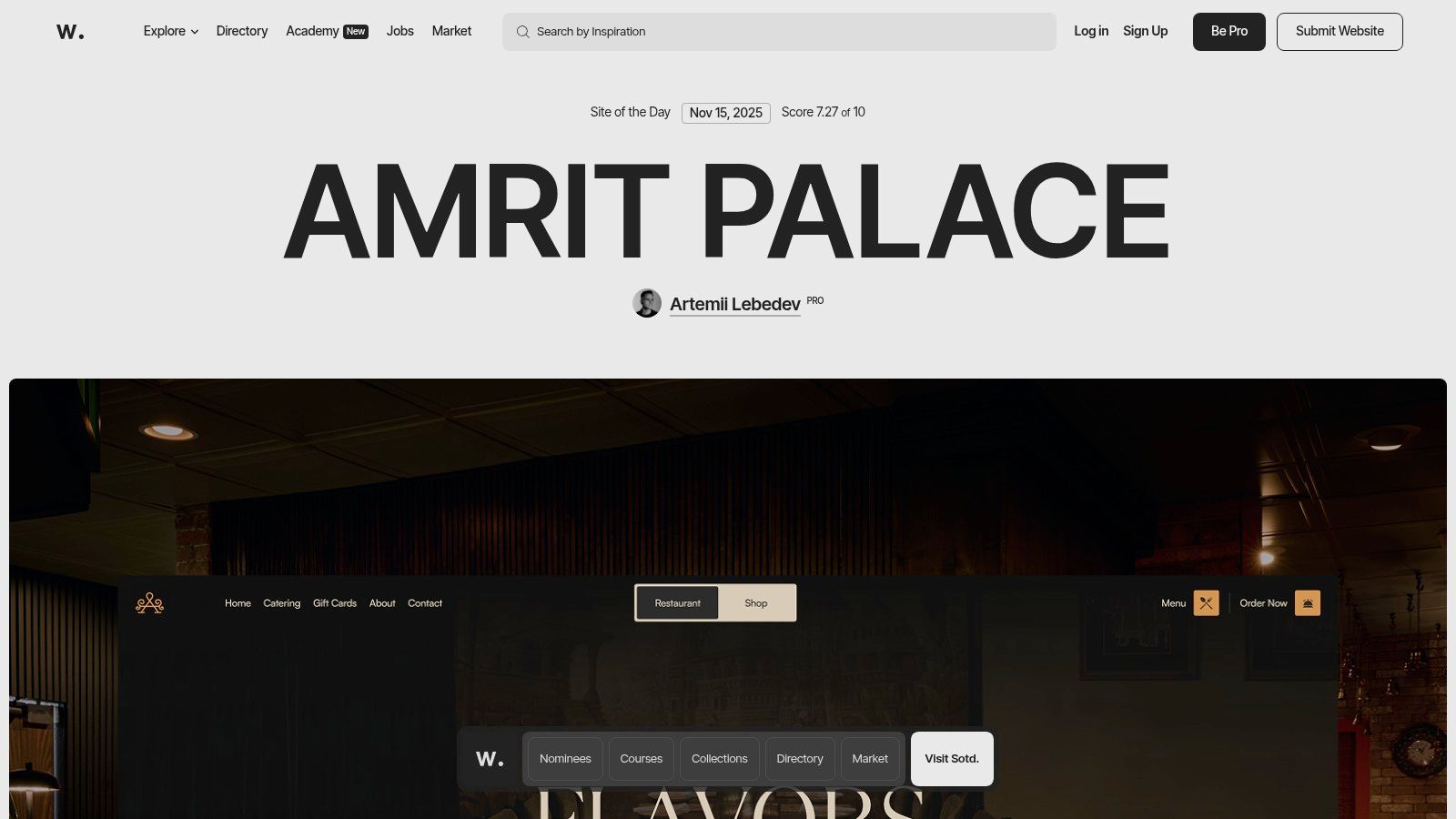
Unlike generic inspiration blogs, Awwwards provides a structured and vetted showcase. Each submitted site is meticulously scored by a jury of international designers, developers, and agency directors on criteria like UI, UX, innovation, and content. This transparent scoring system provides a clear quality signal, helping you understand why a design is effective.
Strategic Analysis: Beyond Inspiration to Education
Awwwards excels by bridging the gap between passive inspiration and active learning. It’s more than a collection of pretty pictures; it’s a platform for deconstructing excellence.
Curated Quality: The "Site of the Day" and "Site of the Month" awards act as powerful filters, surfacing only the most groundbreaking and technically sound responsive designs. This saves you from sifting through mediocre examples.
Detailed Breakdowns: Each awarded project features a dedicated page with scores, a technology stack breakdown, and links to the agency and designers behind the work. This offers a behind-the-scenes look at how elite digital experiences are built.
Trend Spotting: By consistently reviewing the winning sites, you can identify emerging patterns and technologies. To see how these patterns fit into a broader context, explore the latest website design trends on Alpha.page.
Actionable Takeaways for Your Projects
To get the most out of Awwwards, use it as an active research tool rather than a passive gallery.
Filter by Industry or Technology: Use the site's robust filtering to find relevant examples. If you're building an e-commerce site, filter for that category to see how top brands are handling responsive product grids and checkouts.
Analyze Mobile and Desktop Views: Don't just view the sites on your desktop. Open them on your phone or use browser developer tools to see how the layout, navigation, and interactions adapt to different screen sizes. Note how they handle typography, interactive elements, and content hierarchy on smaller viewports.
Explore the Awwwards Academy: For a deeper dive, the Academy offers paid courses on specific topics like responsive typography, WebGL, and advanced CSS animations taught by industry leaders.
Feature Comparison | Awwwards | Standard Design Blogs |
|---|---|---|
Quality Control | Jury-scored, curated awards | Editorial selection, often subjective |
Technical Insight | Tech stack and agency info provided | Typically focuses on visual aesthetics only |
Learning Path | Integrated courses (Awwwards Academy) | Usually limited to blog posts or tutorials |
Community | Professional directory and user profiles | Comment sections, limited interaction |
While many of the featured sites are high-concept and experimental, the underlying principles of their responsive design strategies are universally applicable. Access to the main gallery is free, but submitting a site, professional profiles, and Academy courses require payment.
Website: https://www.awwwards.com
2. CSS Design Awards: A Global Showcase of Technical Excellence
CSS Design Awards (CSSDA) is a leading awards platform that celebrates the world's best web design and development. For developers and designers looking for cutting-edge examples of responsive web design, it provides a daily feed of meticulously vetted projects that blend creative artistry with technical mastery. The platform’s focus on CSS-driven innovation makes it a prime resource for understanding modern, fluid, and interactive layouts.
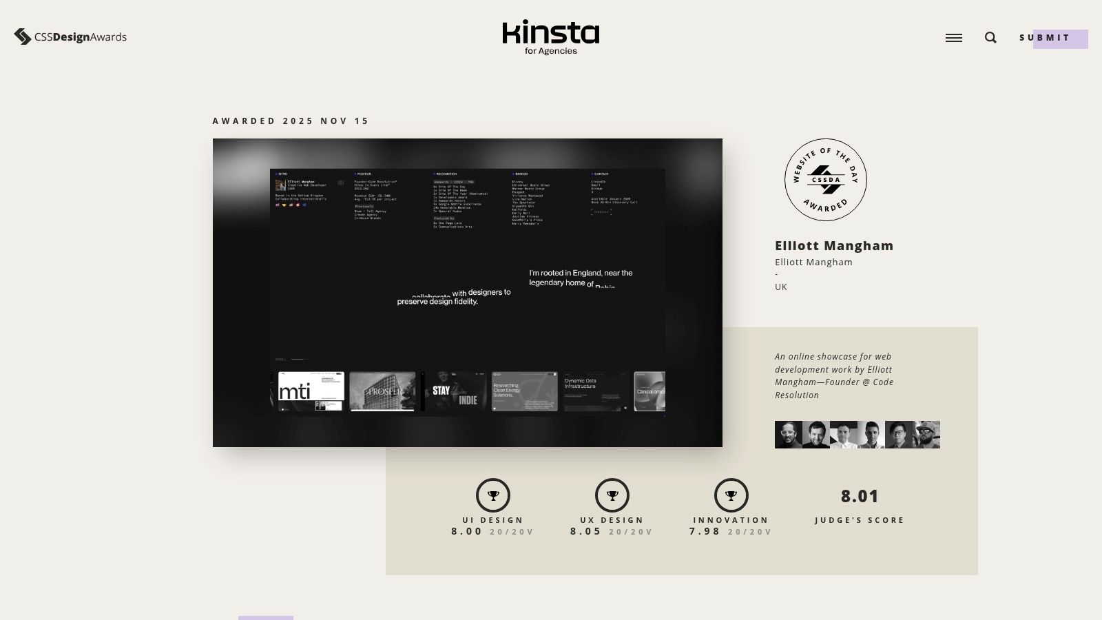
Similar to Awwwards, CSSDA uses a panel of expert judges to evaluate submissions, but it adds a unique layer with public voting. This dual-scoring system provides a balanced perspective, combining professional critique with user appeal. Every winning site is awarded a score broken down into UI, UX, and Innovation, offering transparent insight into what makes a design successful.
Strategic Analysis: Deconstructing Award-Winning Execution
CSSDA is more than just a gallery; it's a practical learning environment for analyzing how top-tier responsive websites are built and why their design choices are effective. It shines by making the evaluation process transparent and accessible.
Transparent Scoring: The breakdown of scores for UI, UX, and Innovation helps you dissect a site’s strengths. You can specifically analyze high-scoring UX examples to see how they handle mobile navigation or high-scoring Innovation examples for novel animations.
Live Nominee Feed: The "Website of the Day" nominees are visible in real-time, giving you access to a constant stream of fresh, unvetted work. This is an excellent way to spot emerging trends before they become mainstream.
Focus on Technical Craft: As the name suggests, there is a strong emphasis on the quality of the CSS and front-end execution. This makes it an invaluable resource for developers seeking to push the boundaries of what’s possible with modern code.
Actionable Takeaways for Your Projects
To leverage CSSDA effectively, go beyond browsing and adopt an analytical mindset. Use the platform's features to inform your own responsive design process.
Analyze Category Winners: Instead of just looking at the overall "Website of the Day," dive into the winners for specific categories like "Best UI Design" or "Best UX Design." This helps you focus your research on a particular aspect of responsive design.
Study the Mobile View: For every site you analyze, make it a point to check its mobile version. Pay close attention to how complex desktop interactions, hover effects, and large typographic elements are adapted for touch-based, smaller screens.
Reverse-Engineer the CSS: Use your browser's developer tools to inspect the code of winning sites. Look at how they structure their media queries, use CSS Grid or Flexbox for complex layouts, and implement fluid typography and spacing.
Feature Comparison | CSS Design Awards | General Inspiration Galleries |
|---|---|---|
Quality Control | Dual judging: expert panel + public vote | Curated by a single editor or team |
Technical Insight | UI/UX/Innovation score breakdown | Focuses primarily on visual appeal |
Freshness | Live feed of daily nominees | Updated weekly or less frequently |
Community | Public voting and profiles for designers | Often limited to comments or social shares |
While the platform is an incredible source of inspiration, it is not a tutorial-based site; the value comes from actively deconstructing the examples provided. Access to view the gallery is free, but submitting a site for consideration requires a fee.
Website: https://www.cssdesignawards.com
3. CSS Nectar: A Daily Dose of Real-World Implementation
CSS Nectar is a long-standing and highly respected web design gallery that showcases award-winning sites. For those looking for practical examples of responsive web design, it offers a steady stream of inspiration drawn from real-world business, e-commerce, and product websites. Its straightforward "Site of the Day" format makes it an accessible and reliable source for fresh ideas.
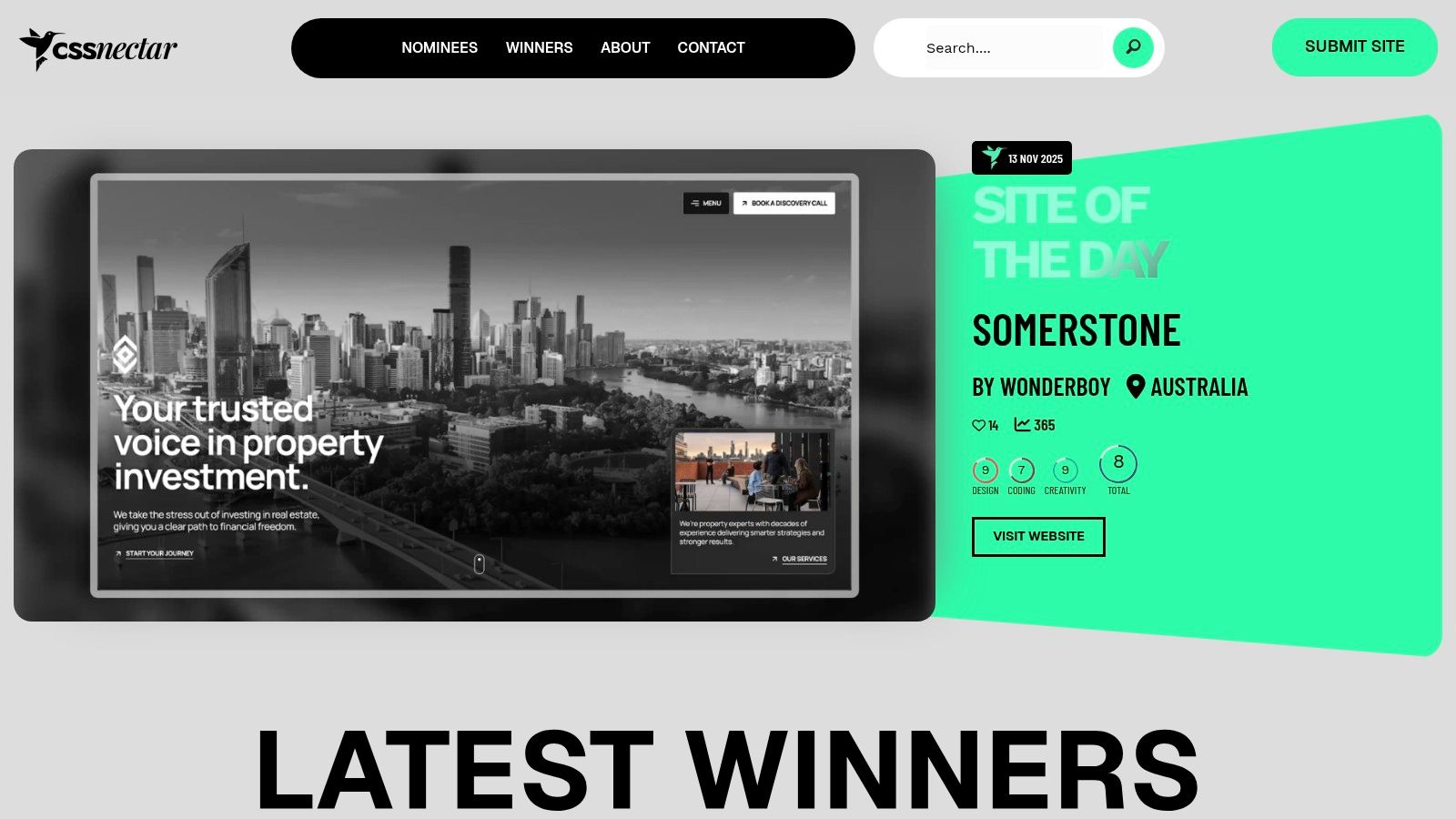
Unlike platforms that heavily feature experimental or portfolio sites, CSS Nectar is grounded in practicality. Each site is vetted and scored by a design team on three simple criteria: design, coding, and creativity. This no-frills approach focuses on functional, beautifully executed websites that solve real business problems, making it an excellent resource for commercial projects.
Strategic Analysis: Practicality Over Pomp
CSS Nectar's strength lies in its extensive, easily searchable archive of mainstream use cases. It excels as a tool for finding specific design patterns that have been successfully implemented in the wild, rather than just high-concept artistry.
Industry-Specific Solutions: The gallery is rich with examples from diverse industries like retail, technology, and hospitality. This allows you to see how different sectors handle common responsive challenges, from product grids to booking forms.
Component-Level Inspiration: Its powerful tagging and filtering system lets you search by feature (e.g., parallax, full-screen background), color, or industry. This makes it easy to find specific solutions for components like navigation menus, hero sections, or footers.
Focus on Execution: While it provides less in-depth analysis than Awwwards, its value comes from the sheer volume and accessibility of quality examples. It’s a repository of what works in the commercial world.
Actionable Takeaways for Your Projects
Use CSS Nectar as a pragmatic pattern library to solve specific design problems and validate your creative choices.
Filter by Category and Feature: Before starting a new project, use the filters to build a mood board of relevant examples. If you're designing for a law firm, filter by "Corporate" to see established layout conventions.
Deconstruct Common Patterns: Open several sites from the same category on both desktop and mobile. Pay close attention to how they consistently handle elements like calls-to-action, typography scaling, and image optimization across different viewports.
Validate Your Tech Stack: While it doesn't detail the full tech stack, you can use browser developer tools on the live sites to inspect the code, identify the CSS frameworks or JavaScript libraries being used, and learn from their implementation.
Feature Comparison | CSS Nectar | Generic Inspiration Galleries |
|---|---|---|
Curation Method | Team-scored based on set criteria | Often a single person's editorial choice |
Content Focus | Broad variety of commercial/business sites | Tends to favor agency/portfolio sites |
Searchability | Robust filters for color, feature, industry | Basic or non-existent filtering |
Technical Depth | Links directly to live, inspectable sites | Often just static screenshots |
Access to view the gallery is completely free. Web designers and agencies can submit their own sites for consideration for a nominal fee, which helps maintain the platform's curation quality. Its focus on functional, everyday design makes it an indispensable resource.
Website: https://cssnectar.com
4. Smashing Magazine (Books & eBooks): The Technical Blueprint
While visual galleries provide inspiration, Smashing Magazine’s collection of books and eBooks delivers the technical knowledge needed to execute complex designs. It stands as an essential resource for developers and designers who want to move beyond admiring examples of responsive web design and start building them with production-ready code and proven methodologies.
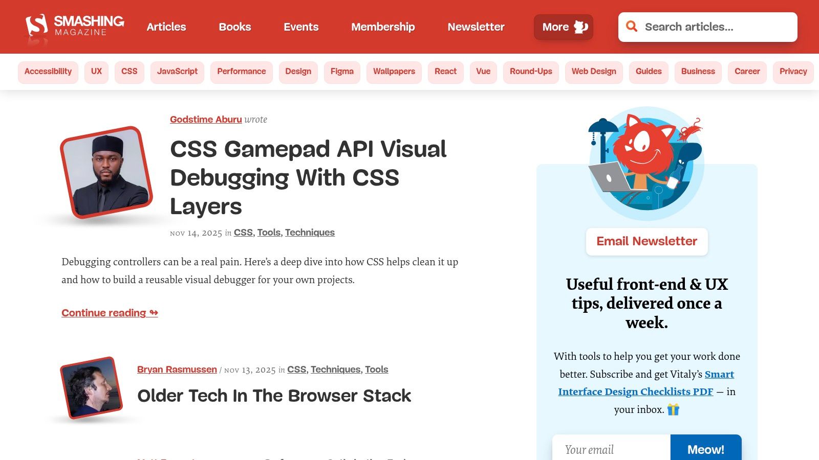
Unlike inspiration-focused platforms, Smashing Magazine offers deep, practical guidance from respected industry authors. Its publications break down abstract concepts like fluid grids, flexible images, and media queries into concrete techniques you can apply directly to your projects. This makes it an invaluable educational tool for mastering the nuts and bolts of responsiveness.
Strategic Analysis: From Theory to Application
Smashing Magazine excels at transforming high-level design principles into actionable, real-world development practices. It provides the "how-to" that complements the "what" you find in design galleries.
Dedicated Expertise: Titles like the Smashing Book series are dedicated to modern web design workflows, offering entire chapters on responsive design patterns, performance optimization, and accessibility.
DRM-Free Access: All eBooks are available in multiple DRM-free formats (PDF, ePub, Kindle), allowing you to build a permanent, accessible digital library that you can use across all your devices without restrictions.
Practical Frameworks: The content focuses on solving real-world problems, such as handling complex navigation on mobile, optimizing images for different viewports, and ensuring a seamless user experience. To better understand these concepts, read more about user experience design fundamentals on Alpha.page.
Actionable Takeaways for Your Projects
Use Smashing Magazine’s resources to build a solid technical foundation for your responsive design skills.
Start with a Foundational Text: Pick a comprehensive book like a recent Smashing Book to get a complete overview of modern responsive workflows before diving into more niche topics.
Target Specific Challenges: If you are struggling with responsive typography or image performance, search for books or chapters dedicated specifically to those topics. This targeted approach is an efficient way to solve immediate problems.
Check Publication Dates: The web evolves quickly. Before purchasing, always check the publication date to ensure the techniques and code examples are still relevant and follow current best practices.
Feature Comparison | Smashing Magazine Books | Typical Design Blogs |
|---|---|---|
Content Depth | In-depth, structured book-length coverage | Short-form articles, often surface-level |
Code Examples | Production-ready, explained in context | Snippets, often for demonstration only |
Authorship | Vetted, recognized industry experts | Varied quality, often anonymous or less-known |
Longevity | Serve as long-term reference material | Can become outdated or hard to find |
While some older titles may contain dated advice, the core principles in many of their flagship books remain timeless. The books are available for purchase individually or in bundles, with a Smashing Membership offering significant discounts. Print editions may have limited availability.
Website: https://www.smashingmagazine.com/books
5. Coursera: Structured Learning for Responsive Mastery
While other entries on this list provide inspiration through finished products, Coursera offers a fundamentally different approach: it provides the structured, foundational knowledge needed to build them. As an online learning platform, it hosts courses and multi-course Specializations from top universities and tech companies, making it a premier resource for systematically learning the principles behind the best examples of responsive web design.
Unlike passively browsing galleries, Coursera provides a deliberate learning path from basic HTML and CSS to advanced concepts like Flexbox, CSS Grid, and JavaScript frameworks. This turns abstract design principles into concrete, repeatable skills, empowering you to create your own high-quality responsive experiences rather than just admire others.
Strategic Analysis: From Theory to Practical Application
Coursera's strength lies in its curriculum-based format, which transforms the complex topic of responsive design into a series of manageable, sequential steps. It's an educational toolkit for deconstructing and mastering the craft.
Structured Pathways: The platform offers dedicated Specializations, such as "Responsive Website Development and Design" by the University of London, that guide learners from zero knowledge to professional competence. This eliminates guesswork about what to learn next.
Hands-on Projects: Most courses include peer-graded assignments where you build actual responsive web pages. This active learning approach ensures you can apply theoretical knowledge to real-world scenarios.
Industry-Recognized Credentials: Completing courses and Specializations earns you shareable certificates from reputable institutions, providing a credible way to showcase your skills to clients or employers.
Actionable Takeaways for Your Projects
To leverage Coursera effectively, approach it as a professional development tool that directly feeds into your project workflow.
Start with the Fundamentals: If you are new to the topic, enroll in a comprehensive Specialization. For a solid foundation, explore a detailed responsive web design tutorial on Alpha.page to understand core concepts before diving into advanced courses.
Audit Courses for Specific Skills: Use the "audit" feature to access course videos for free. This is perfect for a quick refresher on a specific topic like CSS media queries or Flexbox without committing to the full, paid certificate track.
Check Course Recency: Web technologies evolve quickly. Before enrolling, check the course's "last updated" date and read recent reviews to ensure the content covers modern best practices and is not outdated.
Feature Comparison | Coursera | Self-Taught (Blogs/Videos) |
|---|---|---|
Learning Path | Structured, sequential curriculum | Unstructured, requires self-direction |
Quality Control | University and industry-vetted content | Varies wildly, often unvetted |
Proof of Skill | Shareable, official certificates | No formal credentialing |
Support System | Peer forums and graded assignments | Comment sections, limited feedback |
Access to audit many courses is free, but earning certificates, completing graded assignments, and gaining full course access typically requires a Coursera Plus subscription or a per-course payment. Financial aid is also available for many programs.
Website: https://www.coursera.org
6. Udemy: A Practical University for Responsive Skills
Udemy is a massive online learning marketplace rather than a design showcase, but for those who want to move from observing to building, it is an essential resource. It provides a vast library of courses that teach the very principles behind the best examples of responsive web design. Instead of just showing you the final product, Udemy’s project-based courses let you build complex, responsive layouts from scratch.

Unlike academic platforms with rigid curriculums, Udemy offers a diverse, ever-growing catalog from thousands of industry professionals. This means you can find courses covering niche technologies like CSS Grid and Flexbox, popular frameworks like Bootstrap, and advanced JavaScript techniques for interactive designs, all in one place. Its model is built on providing practical, hands-on skills you can apply immediately.
Strategic Analysis: Learning by Doing
Udemy's strength lies in its action-oriented approach. It transforms inspiration into capability by providing structured, project-based learning paths that demystify how award-winning responsive websites are actually coded.
Project-Centric Learning: Most top-rated courses guide you through building real-world projects, such as a responsive e-commerce site or a modern agency portfolio. This context-driven learning is far more effective than isolated theoretical lessons.
Diverse Methodologies: With thousands of instructors, you can find a teaching style that clicks. Whether you prefer a fast-paced code-along or a deep-dive into theory first, there is likely a course tailored to your learning preference.
Skill Granularity: You can target hyper-specific skills. If you need to master responsive typography or fluid grid systems, you can find a dedicated course just for that, saving time and money.
Actionable Takeaways for Your Projects
To leverage Udemy effectively, treat it as a professional development tool to fill specific knowledge gaps in your responsive design workflow.
Vet Courses Rigorously: Don't just look at the overall rating. Filter by courses updated in the last year to ensure the techniques are current. Read recent reviews to gauge the instructor's responsiveness and the course's relevance.
Target Specific Frameworks or Techniques: Use the search function to find courses on exactly what you need. Searching for "Advanced CSS Flexbox" or "Bootstrap 5 responsive projects" will yield highly targeted and practical results.
Wait for Sales: Udemy is famous for its frequent, steep discounts. Full-price courses can be expensive, but sales often bring the cost down to a very affordable level. Add courses to your wishlist and wait for a promotion.
Feature Comparison | Udemy | Traditional Coding Bootcamps |
|---|---|---|
Cost | Low (especially during sales) | Very high (thousands of dollars) |
Pace | Self-paced, lifetime access | Fixed schedule, intensive pace |
Curriculum | Highly specialized, user-choice | Broad, predetermined curriculum |
Support | Q&A forums, instructor messages | Dedicated mentors, career services |
Udemy’s a-la-carte model, where you purchase individual courses with lifetime access, makes it an incredibly flexible and cost-effective way to master responsive web design. While the quality can be variable, a careful selection process unlocks a powerful resource for building tangible skills.
Website: https://www.udemy.com
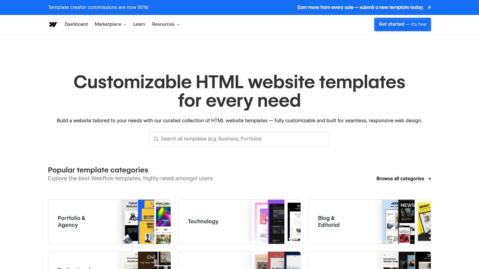
7. Webflow Templates Marketplace: A Hands-On Learning Library
The Webflow Templates Marketplace is more than just a place to buy pre-made designs; it's an interactive learning environment for mastering responsive web design. It offers a curated collection of fully responsive templates and free community-built "cloneable" projects that users can dissect, modify, and adapt. This makes it a powerful resource for studying professional-grade layout choices and interaction patterns in a live, editable setting.
Unlike static inspiration galleries, Webflow's marketplace provides a direct path from viewing a design to understanding its underlying structure. Every template is built to be inherently responsive, showcasing best practices for flexbox, grid, and adaptive layouts. Users can instantly preview how each design element behaves across different breakpoints, from mobile portrait to widescreen desktop.
Strategic Analysis: From Inspection to Implementation
Webflow's marketplace excels by turning passive browsing into an active, hands-on educational experience. It closes the loop between seeing a great responsive design and learning how to build it yourself.
Vetted for Quality: All official templates undergo a review by the Webflow team, ensuring they meet high standards for responsiveness, performance, and accessibility. This guarantees you are learning from well-crafted examples of responsive web design.
Cloneable Community Projects: The "Made in Webflow" section is a treasure trove of free, cloneable sites. This allows you to open a project directly in the Webflow Designer, inspect every setting, and see exactly how complex responsive interactions were created.
Transparent Structure: Each template page details its features, category, and support information. This transparency helps you find relevant examples for your specific industry or use case, from e-commerce product pages to agency portfolios.
Actionable Takeaways for Your Projects
To leverage the Webflow Templates Marketplace effectively, treat it as both an inspiration source and a technical sandbox.
Use the Preview Mode Extensively: Before cloning or buying, use the live preview feature to test the template on different device sizes. Pay close attention to how navigation menus collapse, how multi-column grids reflow, and how typography scales.
Clone and Deconstruct Free Projects: Find a free cloneable project with an interesting responsive feature. Open it in the Webflow Designer (a free account is sufficient) and analyze the style panel. See how the designer used relative units (%, VW, VH), set up grid layouts for different breakpoints, and configured interactions.
Filter by Use Case: Use the marketplace filters to find templates in your specific niche. This allows you to study how top designers solve common responsive challenges for your industry, such as complex data tables for SaaS dashboards or touch-friendly galleries for photographer portfolios.
Feature Comparison | Webflow Templates | Standard Theme Marketplaces |
|---|---|---|
Learning Path | Clone projects into a live editor | Live preview only; code is a black box |
Quality Control | Webflow team review for all templates | Varies widely by author |
Technical Insight | Full access to layout and style settings | Requires code inspection after purchase |
Community | Active "Made in Webflow" community | Typically limited to user ratings/reviews |
While using the platform to its fullest requires a free Webflow account, the ability to inspect and learn from professionally built, fully responsive projects is an invaluable resource. Templates are available for a one-time purchase, while thousands of cloneable projects are completely free.
Website: https://webflow.com/templates
Top 7 Responsive Design Resources Compared
Item | Implementation complexity 🔄 | Resource requirements ⚡ | Expected outcomes ⭐ | Ideal use cases 📊 | Key advantages & tips 💡 |
|---|---|---|---|---|---|
Awwwards | Low — browse & inspect; membership adds features | Moderate — free browsing; paid Academy/memberships | ⭐⭐⭐⭐ — top-tier inspiration; learning via courses | Benchmark high-end, mobile-first portfolio sites; professional upskilling | Curated, judged examples; use scores to benchmark; expect paywalls for premium content |
CSS Design Awards | Low — simple browsing and score review | Low — largely free; paid submissions | ⭐⭐⭐⭐ — fresh, judged examples with clear category scores | Discover modern layouts, motion, and mobile behaviors | Transparent judging and live nominees; good for reverse-engineering patterns |
CSS Nectar | Very low — straightforward gallery browsing | Low — free access to many live sites | ⭐⭐⭐ — broad, practical examples across industries | Find mainstream business/product site patterns and quick references | Direct live links for testing responsiveness; curation quality varies |
Smashing Magazine (Books & eBooks) | Moderate — study and apply techniques | Moderate — paid books/eBooks; occasional workshops | ⭐⭐⭐⭐ — production-ready, in-depth guidance | Deep dives into responsive workflows, performance, typography | Practical, long‑lived references; check publication date for relevance |
Coursera | Moderate — structured courses with assignments | Moderate–High — paid certificates/subscriptions; free audit options | ⭐⭐⭐⭐ — systematic learning with projects and credentials | End-to-end learning, credentials, guided projects with feedback | University/industry-backed content; verify course recency and syllabus |
Udemy | Low–Moderate — self-paced, project-based learning | Low — frequent discounts; lifetime access to purchases | ⭐⭐⭐ — variable quality; strong for hands-on projects | Affordable, short-to-mid length project courses and skill refreshers | Read recent reviews and update dates; choose high-rated instructors |
Webflow Templates Marketplace | Low to Moderate — previewing easy; customizing needs Webflow skills | Low–Moderate — free clones available; paid templates; Webflow account | ⭐⭐⭐ — practical, inspectable templates and cloneables | Study responsive layouts/interactions; quick project bootstraps | Live previews and cloneables for hands‑on learning; advanced edits require Webflow familiarity |
Building Your Own Responsive Masterpiece
Throughout this deep dive into premier examples of responsive web design, a clear narrative emerges. We've seen how industry leaders like Awwwards, Smashing Magazine, and Webflow's own marketplace don't just create websites that shrink to fit a screen; they craft adaptive, context-aware digital experiences. They prove that true responsiveness is not merely a technical feature but a core tenet of user-centric design philosophy.
From the pixel-perfect galleries of CSS Design Awards to the content-rich educational platforms of Coursera and Udemy, several unifying principles are evident. These sites prioritize a content-first approach, ensuring that the most critical information is always accessible and elegantly presented, regardless of viewport size. They champion performance optimization, recognizing that a mobile user's patience is finite and every millisecond counts. Their success is built on intelligent navigation that transforms from sprawling desktop menus to intuitive mobile-friendly patterns, and a commitment to touch-friendly design that makes interaction feel natural and effortless.
The key lesson is that responsive design has transcended from a "nice-to-have" feature to an absolute, non-negotiable standard for digital success. In today's multi-device world, your website's ability to adapt is directly tied to its ability to convert, engage, and retain users.
Actionable Takeaways and Your Next Steps
The journey from inspiration to implementation can seem daunting. The strategic breakdowns of the examples we've explored provide a powerful blueprint, but translating those concepts into a functional website requires the right approach and the right tools. Here’s how you can move forward with confidence.
Audit Your Existing Assets: Before you build or rebuild, analyze your current website on various devices. Use your browser's developer tools to simulate different screen sizes. Where does the experience break? Where is navigation clunky or content unreadable? This audit will inform your priorities.
Prioritize the Mobile Experience: Adopt a "mobile-first" or at least a "mobile-equal" mindset. Design your user journeys, navigation, and core interactions for the smallest screen first. This forces you to focus on what truly matters and ensures the foundation of your design is solid and performant.
Choose Your Toolkit Wisely: The examples from Webflow's marketplace showcase the power of modern no-code and low-code platforms. These tools abstract away much of the complex coding, like managing media queries and cross-browser compatibility, allowing you to focus on the strategic and creative aspects of design.
Finding the Right Tool for Your Vision
Selecting the right platform is critical. For entrepreneurs and small business owners, the ideal tool should balance power with simplicity, offering creative freedom without a steep learning curve. You need a solution that doesn't just let you build a site but helps you build a great site, one that embodies the responsive principles we’ve analyzed.
Consider factors like ease of use, design flexibility, performance, and scalability. Does the tool empower you to implement adaptive layouts and touch-friendly elements easily? Does it handle image optimization automatically? Most importantly, does it reduce the technical burden so you can concentrate on bringing your unique brand vision to life? This is where intelligent, AI-powered platforms are changing the game, making world-class responsive design accessible to everyone.
The examples of responsive web design we’ve reviewed are not just beautiful artifacts; they are achievable benchmarks. With a clear strategy rooted in user experience and a powerful tool to execute your vision, you have everything you need to build your own responsive masterpiece that captivates audiences on every screen.
Ready to turn inspiration into reality without getting lost in code? Alpha uses AI to instantly transform any idea into a fully responsive, production-ready website. Get inspired by the best examples of responsive web design, then use Alpha to build your own version with unparalleled speed and intelligence.
Build beautiful websites like these in minutes
Use Alpha to create, publish, and manage a fully functional website with ease.