


How to Create Website Mockups People Actually Love
Learn how to create website mockups that bridge the gap between idea and reality. Our guide covers tools, principles, and developer handoff.
Build beautiful websites like these in minutes
Use Alpha to create, publish, and manage a fully functional website with ease.
When we talk about the best image size for a website, we're really talking about a balancing act. You want stunning visuals, but you also need lightning-fast performance. A good rule of thumb is to aim for 1500 to 2500 pixels wide for big, full-width images like hero sections. For smaller graphics that sit within your content, anything under 1200 pixels usually does the trick.
The real goal, though, is to crush that file size. If you can keep your images under 300KB, you’re on the right track to giving every visitor a snappy, enjoyable experience.
Why Image Size Is Your Biggest Performance Killer
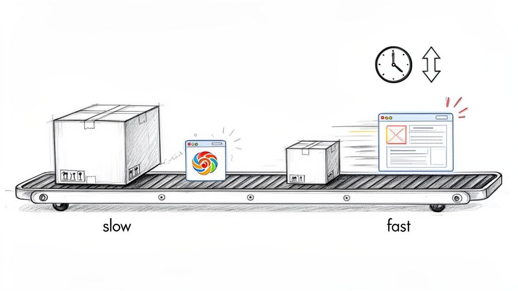
Let's be blunt: slow websites kill conversions. And the number one reason websites crawl instead of fly? Bloated, oversized images.
In the fight for your visitor's attention, every single millisecond matters. When someone lands on your page, they expect things to happen instantly. If they're stuck staring at a white screen waiting for a giant photo to download, they’re not just frustrated—they're gone.
This delay isn't just an annoyance; it's a direct hit to your business. It hurts your search rankings, too. Google knows people hate slow sites, so it prioritizes faster ones, potentially burying your page where no one will ever see it.
The Two Sides of Image Size
To really get this right, you need to know the difference between two things that often get mixed up:
Image Dimensions: This is the image's physical size, measured in pixels (like 1920px by 1080px). Think of it as the size of the picture frame on the wall.
File Size: This is the digital weight of the image, measured in kilobytes (KB) or megabytes (MB). This is what determines how long it takes to download.
Here’s a simple analogy: imagine you're shipping a package. The dimensions are the size of the box, while the file size is how much it weighs. A big box is usually heavy, but you could also have a small, dense box that weighs a ton. Your mission is to send the smallest, lightest package possible that still delivers exactly what the customer needs.
Just as image size can be your biggest performance killer for websites, careful attention to image resizing is crucial for mobile applications, where optimizing for speed directly impacts user experience and growth. Learn more about various Android image resize techniques to see how these principles apply in the mobile world.
The Impact on Your Business
Getting your image sizes right is one of the single most effective things you can do for your website. It’s a lever you can pull to immediately improve user experience, boost your conversion rates, and climb those search rankings. We dive deeper into this connection in our guide on how to improve website loading speed.
The good news is that you don't have to be a tech wizard to solve this. Modern platforms like Alpha are designed to handle the heavy lifting for you. Instead of making you manually resize and compress every photo, Alpha's built-in system does it all automatically in the background. It’s a smarter way to ensure your site is always fast and beautiful, freeing you up to focus on what really matters: growing your business.
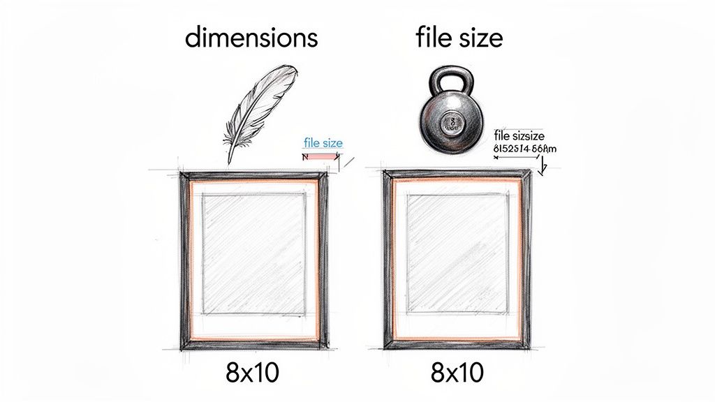
Understanding Dimensions vs. File Size
When we talk about image size on a website, it's easy to get two things mixed up: image dimensions and image file size. They're related, but they aren't the same thing. Nailing the difference is the first and most crucial step to building a site that's both beautiful and fast.
Let's use a real-world analogy. Think of a picture frame. The dimensions are its physical measurements—say, 8x10 inches. In the digital world, we measure this in pixels, like 1920px wide by 1080px tall. This is the space the image physically occupies on the screen.
The file size, however, is the frame's weight. That 8x10 frame could be made of light balsa wood or heavy, solid oak. Both have the exact same dimensions, but one is a lot heavier to carry and hang on the wall. An image that's 1920px wide can be a lean 150KB or a bloated 2MB. That difference in "weight" is what makes your website either fly or crawl.
How Dimensions Affect File Size
It's a simple rule: bigger dimensions mean a heavier file. An image at 4000px by 3000px is packed with millions more pixels than one at 800px by 600px. Every single one of those extra pixels adds to the image's digital weight, increasing its file size and slowing your page to a crawl.
This is why you have to match an image’s dimensions to its container on the page. If your blog post column is only 600 pixels wide, uploading a 3000-pixel-wide photo is total overkill. It’s like using a fire hose to water a houseplant—it gets the job done, but it makes a huge, unnecessary mess.
While web pros often suggest widths between 1280px and 1920px as a good general starting point, context is everything. A blog post image might be perfect at 1200px wide, but a massive hero image might need to be anywhere from 1280px to 2500px. Uploading images larger than they need to be is one of the most common performance mistakes—it’s something smart platforms like Alpha prevent by automatically resizing images to fit their containers. You can find more practical examples in this great guide on the best image size for a website.
The Role of Compression
Even with the right dimensions, an image can still be too heavy. That's where compression comes in. Compression is how we reduce the file size (the weight) without wrecking the visual quality.
"Think of compression as intelligently removing redundant information from your image file. It’s like summarizing a long story into a few key sentences—you get the main idea without needing every single word, making it much faster to read."
There are two flavors of compression you'll encounter:
Lossless: This method shrinks the file size with zero loss in quality. It’s like vacuum-sealing your clothes; they take up less space, but when you open the bag, they're exactly as you left them.
Lossy: This is where the magic happens. Lossy compression achieves huge file size reductions by permanently removing some data. When done right, the human eye can't even spot the difference, but the performance gains are massive.
Getting your images right is all about finding that perfect balance. First, you set the right dimensions for where the image will live. Then, you apply smart compression to make its file size as tiny as possible. That two-step combo is the secret to a site that looks amazing and loads in a flash.
Your Cheatsheet for Common Image Sizes
Figuring out the right image dimensions can feel like guesswork, so let's cut through the noise. Forget the abstract theory for a moment—here are the practical, real-world numbers you can start using right away for the most common images on your site.
Think of these as reliable starting points, not rigid rules. Your website's unique design might call for a few tweaks here and there, but these guidelines are a solid foundation for building a site that's both beautiful and blazingly fast. The name of the game is balancing visual punch with performance.
H3: Full-Width Hero and Background Images
Your hero image is the main event. It's the first thing visitors see, and it sets the tone for everything else. Since these images stretch across the entire screen, they need to be big enough to look sharp on large monitors, but not so big they bog down your load time.
Recommended Width: 1920px to 2560px
Aspect Ratio: 16:9 is the go-to ratio here, offering great versatility for most screens.
Target File Size: Aim to keep these beasts under 300KB. Some guides are more lenient, but keeping hero images lean provides a massive performance boost.
For most modern displays, an image 1920px wide is the sweet spot. You only really need to push it to 2560px if you're specifically targeting users with massive, high-resolution monitors.
Remember, file size is just as crucial as the pixel dimensions. A 2500px hero image that’s only 250KB will always outperform a 1920px image that weighs 1MB. Smart compression is your best friend here.
H3: Blog Post and In-Content Images
Images nestled within a blog post or alongside page text don't need anywhere near the same heft as a hero image. Their container is much smaller, and uploading a massive photo here is one of the easiest ways to kill your page speed.
A good rule of thumb is to size these images based on the maximum width of your site's content area.
Recommended Width: 1200px is a safe and effective maximum.
Aspect Ratio: 3:2 or 4:3 are standard and fit nicely within blocks of text.
Target File Size: Strive to get these under 100KB each.
This ensures your images look crisp without adding a ton of weight, which is critical for keeping your readers engaged and scrolling.
H3: E-commerce Product Photos
When it comes to e-commerce, your images are your sales pitch. Customers can’t touch or feel the product, so your photos have to do all the heavy lifting. They must be crystal clear and detailed enough to support a zoom function for closer inspection.
This means you'll need a higher resolution than you would for a standard blog image. Square images are also a popular choice because they create a clean, uniform grid on your category pages.
Recommended Dimensions: 1080px by 1080px (for a 1:1 square ratio) is a fantastic starting point. Some platforms recommend going as high as 2048px by 2048px for products that demand high-detail zoom.
Target File Size: Even at a higher resolution, keep individual product shots under 250KB.
Of course, different e-commerce platforms have their own quirks. For a deeper dive into platform-specific advice, checking out resources on the optimal Shopify product image size can provide more detailed recommendations.
To make things even easier, here’s a quick-reference table summarizing all these guidelines.
Recommended Image Dimensions and File Sizes by Website Element
This table serves as a handy guide for the ideal pixel dimensions and target file sizes for the most common website images.
Image Type | Recommended Width (Pixels) | Recommended Height (Pixels) | Aspect Ratio | Target File Size |
|---|---|---|---|---|
Hero/Background | 1920px - 2560px | 1080px - 1440px | 16:9 | < 300KB |
Blog/Content | 1200px | 800px | 3:2 or 4:3 | < 100KB |
Product Photos | 1080px - 2048px | 1080px - 2048px | 1:1 (Square) | < 250KB |
Thumbnails | 400px - 600px | 400px - 600px | 1:1 or 4:3 | < 50KB |
By keeping this cheatsheet handy, you can stop guessing and start making informed decisions. This consistent approach ensures every visual on your site contributes positively to both performance and the user experience.
Choosing the Right Image Format
Alright, you've nailed down your image dimensions. The next puzzle piece is picking the right file format. This is a bigger deal than it sounds—it directly impacts your image size for your website, which in turn affects how fast your pages load and how good they look.
Think of it like packing for a trip. You wouldn't use a giant suitcase for a weekend getaway, right? The goal here is the same: find the format that delivers the best visual quality in the smallest possible package. Shaving even a few kilobytes off each image adds up, potentially trimming seconds off your load time. That's a massive win for keeping visitors happy and for your SEO.
The Classic Contenders: JPEG and PNG
For a long time, JPEG and PNG were the undisputed champions of the web. They're still incredibly useful, but you need to know where each one shines.
JPEG (Joint Photographic Experts Group): This is your workhorse for photos. Any image with a rich tapestry of colors, gradients, and subtle tones—like a landscape shot or a product photo—is a perfect candidate for JPEG. It uses a clever "lossy" compression, which intelligently removes tiny bits of visual data your eye won't miss, resulting in a much smaller file.
PNG (Portable Network Graphics): Need a transparent background? PNG is your hero. It’s perfect for logos, icons, and illustrations where crisp lines and see-through backgrounds are non-negotiable. PNG uses "lossless" compression, meaning it keeps every single pixel intact. The trade-off for this perfect quality is a noticeably larger file size than a JPEG.
The choice is usually pretty clear-cut. If it looks like a photograph, start with JPEG. If it's a graphic with sharp edges or needs transparency, go with PNG.
The Modern Powerhouses: WebP and AVIF
While JPEG and PNG are reliable, the game has changed. Newer formats have arrived, and they are ridiculously efficient. Imagine them as vacuum-seal bags for your images, shrinking the file size way down without sacrificing quality.
WebP, a format developed by Google, is the new standard for a reason. It can create files that are 25-34% smaller than a similar JPEG, with no visual difference. Plus, it handles transparency just like a PNG, making it a fantastic all-rounder.
Then there's AVIF (AV1 Image File Format). It's the new kid on the block and it's even more powerful, often producing files that are significantly smaller than WebP. Its only real downside is that some older browsers don't support it yet, but that's changing fast.
Every single kilobyte counts, especially when you consider that mobile traffic now makes up 80% of all digital traffic. Speed is everything on a small screen. According to Figma, the median mobile homepage weight has ballooned by 202% in the last decade, making modern formats like WebP non-negotiable for a fast site. You can find more eye-opening web design statistics on Figma's blog.
A Simple Decision Framework
Feeling a bit lost in the acronyms? Don't sweat it. Here’s a straightforward way to approach this:
Does your website builder handle it for you? This is the ideal scenario. Modern platforms like Alpha are built for this. You just upload your image, and Alpha automatically converts it to a next-gen format like WebP for browsers that can handle it. You get maximum performance without having to think about it.
Do you need transparency? If your image needs a see-through background, your top choices are PNG or the more efficient WebP.
Is it a complex photograph? For detailed photos, WebP is the clear winner because of its tiny file sizes. If you need a fallback for ancient browsers, JPEG is still a safe bet.
Here’s a quick cheat sheet to make it even easier:
Format | Best For | Key Feature | File Size |
|---|---|---|---|
JPEG | Photographs, complex images | Excellent compression for photos | Small |
PNG | Logos, icons, graphics | Supports transparency, lossless quality | Large |
WebP | Everything (photos & graphics) | Superior compression, supports transparency | Very Small |
AVIF | Everything (future-proofing) | Cutting-edge compression, highest quality | Smallest |
Picking the right format ensures your website looks sharp without making your visitors wait. Honestly, for most people today, the easiest path to peak performance is using a smart platform that does the heavy lifting for you.
Creating Responsive Images for Every Device
How do you make an image look stunning on a massive 27-inch monitor and a 6-inch smartphone without making mobile users wait forever for it to load? The secret lies in a cornerstone of modern web design: responsive images.
Imagine you have a magical t-shirt that instantly resizes itself to fit perfectly on anyone who tries it on—small, medium, or large. That’s exactly what responsive images do. It’s a smart system that avoids the classic blunder of sending a huge desktop-sized image to a tiny phone screen, a mistake that wastes data and absolutely tanks your page speed.
Making Images Work for Everyone
It wasn't that long ago that websites would serve the exact same image file to every single visitor. A person on a giant 4K display got the same 2MB photo as someone trying to load your site on a spotty 4G connection. This created a miserable experience for mobile users, who now account for the vast majority of web traffic.
Responsive images fix this problem by giving the browser a set of different image sizes to choose from. The browser then acts like a savvy personal shopper, picking the best fit based on a few key factors:
Viewport size: How big is the browser window right now?
Screen resolution: Is it a high-density "Retina" screen that needs a sharper image?
Network conditions: Is the user on a slow mobile network or speedy Wi-Fi?
This way, a high-resolution screen gets a crystal-clear image, while a smaller phone gets a lightweight version that loads in a flash.
The Magic Behind the Scenes
The technology that powers this is all handled by a couple of simple HTML attributes: srcset and sizes. You don't need to be a developer to get the gist of it.
Let's say you have three versions of a hero image:
hero-small.jpg(400px wide)hero-medium.jpg(800px wide)hero-large.jpg(1600px wide)
The srcset attribute is like a menu that lists these options for the browser. The sizes attribute then acts as a guide, telling the browser how much space the image will take up on different screens. With this information, the browser can make the smartest choice from the menu.
Serving the right-sized image is a game-changer. It can dramatically cut down load times, which is critical when 59% of global traffic comes from mobile devices. This isn't just about speed; it's about delivering a better, more thoughtful experience for your visitors.
The Modern, Hands-Off Approach
Manually creating half a dozen versions of every image and writing all that HTML sounds like a nightmare. And honestly, it is. This is where a modern website builder like Alpha completely changes the equation.
Instead of all that tedious manual labor, the process is incredibly simple. You just upload your single, high-quality image, and Alpha’s platform does all the heavy lifting for you. It automatically:
Creates multiple, perfectly optimized sizes of your image.
Converts the image to a next-gen format like WebP for the best performance.
Generates all the necessary responsive code (
srcsetandsizes).Intelligently delivers the right version to every single visitor.
This automated workflow guarantees your site is blazing fast and looks fantastic on any device, all without you ever having to touch a line of code or open an image editor. To dive deeper into how to build sites that adapt seamlessly, check out our guide to responsive web design. It’s a core skill for anyone building for the web today.
A Simple Workflow for Perfect Website Images
Putting all this theory into practice doesn't have to be a headache. Once you get a clear process down, you can make sure every single image you add to your site is optimized for both looks and speed. It really just comes down to having a repeatable workflow.
Whether you're pulling a stock photo or exporting your own custom graphics, the manual process usually looks the same. Think of it as a pre-flight checklist; it takes a bit of attention to detail, but you get a great result every time.
Of course, the real game-changer is using a platform that does all this for you automatically.
The Manual Optimization Checklist
If you’re taking the hands-on approach to image optimization, you'll be going through a few key stages. This workflow is solid, but it means you have to actively manage each step for every image you want to use.
Here’s a look at the traditional, do-it-yourself method:
Select and Crop: Grab your original image. The first thing you need to do is crop it to the right aspect ratio for where it will live on your site. For example, a 16:9 ratio for a big hero image or a 1:1 square for a product thumbnail.
Resize the Dimensions: Next up, resize the image to its ideal pixel dimensions. If your blog’s main content column is 800px wide, there's absolutely no reason to upload a massive 4000px photo. Scale it down to fit its container.
Compress the File: With the dimensions sorted, it’s time for the most critical step: compression. Run the image through an online tool to shrink its file size (its digital "weight") as much as you can without it starting to look fuzzy or pixelated.
Upload to Your Site: Finally, with your perfectly sized and compressed image in hand, you can upload it to your website and place it on the page.
This checklist gets the job done, but it’s completely manual, eats up a lot of time, and is surprisingly easy to mess up. Forget just one of these steps, and you could be stuck with a slow, clunky page.
The Automated Workflow with Alpha
Modern builders like Alpha are built to make that manual checklist a thing of the past. The whole idea is to get rid of the tedious, repetitive work so you can spend your time on what matters—your content—not on technical chores. The workflow becomes refreshingly simple.
"I'm so impressed! It's really user friendly and does a great job uploading imagery which I have found with other AI web builders really challenging. The updates are quick to change and apply..." - Madeleine O'Carroll, Business Owner
Instead of a four-step process for every single image, an intelligent platform boils it all down to one action. You just pick your high-quality image and upload it. That's it.
Behind the scenes, Alpha’s system is doing all the heavy lifting for you:
Smart Resizing: It automatically creates multiple versions of your image to fit different screen sizes perfectly.
Next-Gen Conversion: Your image is converted into a fast, modern format like WebP.
Powerful Compression: It applies just the right amount of compression to get the file size down.
Responsive Delivery: It intelligently serves the right version to each visitor depending on their device.
This automated approach doesn’t just save you hours of manual work; it guarantees a high-performance result every single time, no guesswork needed. For a more detailed breakdown, check out our complete guide on how to optimize images for the web. It’s how you ensure your site is always fast, efficient, and looks incredible by default.
Got Questions About Image Sizes? We've Got Answers.
Even with the best guides, a few questions always seem to pop up once you start getting your hands dirty. Let's tackle some of the most common ones I hear from people trying to get their website images just right.
Think of this as your quick-hit cheat sheet to clear up any lingering confusion so you can get back to building.
What's This "Pixel Density" and "2x Image" Thing All About?
You've probably heard of "Retina" displays on Apple devices. It's just a brand name for a high-resolution screen that packs a ton of pixels into a small space. We call this pixel density.
To keep images looking sharp and not blurry on these screens, you sometimes need to serve up an image that's literally twice the size. So, if your image container on the page is 400px wide, you’d need an 800px wide image to look perfectly crisp on a "2x" high-density screen.
The good news? You probably don't have to worry about this. Modern website builders handle it all behind the scenes. For example, a platform like Alpha automatically creates these different versions when you upload a single high-quality image. It then intelligently sends the right one to the right device, so you don't have to lift a finger.
What's the Magic Number for Compression Quality?
When you export a JPEG, you'll see that "quality" slider, usually going from 0 to 100. It's tempting to crank it all the way up, but that creates a bloated file that will slow your site to a crawl. The trick is to find the point where you shrink the file size without actually seeing a drop in quality.
I've found the sweet spot for most web images is a quality setting between 60 and 80. This range hits the perfect balance, drastically cutting down the file size while keeping the image looking great to the naked eye.
My advice? Start at 75, export the image, and take a look. If it’s still sharp, you're golden. You’ve just saved a ton of kilobytes without sacrificing a thing.
Seriously, How Much Does Image Size Affect SEO?
More than you might think. Google is obsessed with user experience, and a huge part of that is how fast your site loads. Your images are often the heaviest things on a page, making them a prime suspect for slowdowns.
Here’s how it all connects:
Page Load Speed: This is the big one. Huge image files are a direct cause of slow load times, and Google penalizes slow sites. A snappy site is a happy site in Google's eyes.
Bounce Rate: If a visitor clicks on your site and has to wait for a giant hero image to load, they're gone. When people leave immediately—or "bounce"—it sends a signal to Google that your page isn't helpful, which can hurt your rankings.
Core Web Vitals: Google uses specific metrics like Largest Contentful Paint (LCP) to measure performance. LCP often tracks how quickly the biggest image on the screen loads. A heavy image tanks your LCP score, and by extension, your SEO.
Getting your image sizes right isn't just a technical chore; it's a core piece of any good SEO strategy.
Ready to stop worrying about image sizes and just build a beautiful, fast website? Alpha handles all the technical optimization for you. Our AI-powered platform automatically resizes, compresses, and delivers the perfect image for every visitor on any device. Start building your high-performance website in minutes.
Build beautiful websites like these in minutes
Use Alpha to create, publish, and manage a fully functional website with ease.