How to Create Website Mockups People Actually Love
Learn how to create website mockups that bridge the gap between idea and reality. Our guide covers tools, principles, and developer handoff.

Build beautiful websites like these in minutes
Use Alpha to create, publish, and manage a fully functional website with ease.


Of course you can. Building a professional website entirely from your mobile phone isn't just a possibility anymore—it's a reality. With modern AI-powered tools like Alpha, you can go from idea to a fully launched site in a matter of hours, all from the palm of your hand.
Why Building a Website on Your Phone Is a Game-Changer
Forget being chained to a desk to get your website live. The freedom to create your entire online presence from your phone represents a massive shift in how entrepreneurs and small business owners can work. This is all about speed, agility, and demolishing the technical hurdles that used to stand between a great idea and a live website.
Think about it. Inspiration for your new venture strikes while you're on a train or waiting for coffee. Instead of scrambling for a notebook and hoping you remember the details later, you can pull out your phone and start building right then and there. This is the new reality for anyone who needs to be productive on the move.
The Power of Pocket-Sized Creation
The biggest win here is immediacy. It closes the gap between having an idea and making it real online. This mobile-first approach is incredibly powerful for a few key groups:
Busy Entrepreneurs: When you're juggling a million things, you need tools that fit into your life, not the other way around.
On-the-Go Professionals: A photographer at a shoot or a consultant meeting a client can update their portfolio or services instantly.
Small Business Owners: Finding dedicated desk time is a luxury when you're managing inventory, staff, and customers.
A dedicated website gives your business credibility and a central hub for your customers. It’s a crucial step in moving beyond informal communication tools like WhatsApp, which just don't offer the same level of professionalism or control.
How AI Makes It All Possible
What really unlocks the ability to create a great website on a small screen is AI. Tools like Alpha have completely flattened the learning curve that came with traditional web design. You don't need to know a single line of code or wrestle with complicated design software anymore.
The old way involved fumbling with clunky drag-and-drop editors on a tiny screen. The new way is like having a conversation. You use simple, natural language to tell the AI what to change, turning a technical chore into a creative process.
For example, Alpha’s URL import feature lets you use a website you like as a design reference. It analyzes the layout and style, giving you a professional-grade starting point in seconds. This is a huge advantage, especially if you're not a designer by trade. This whole philosophy is rooted in a mobile-first design approach, which prioritizes the user experience on smaller screens from the very beginning. It's about giving everyone access to professional results, no matter their skill level or where they happen to be working.
Getting Your Website's Foundation Built with AI
Believe it or not, the hardest part of building a website—the initial design and structure—can be done in minutes, right from your phone. With a tool like Alpha, you have a couple of brilliant ways to get a professional-looking site off the ground. Your choice really just depends on whether you've already got some inspiration or if you're starting from scratch.
One of the slickest features is Alpha's URL import. If you’ve ever seen a competitor's site and thought, "I want something like that," this is for you. Just grab that website's URL, paste it into Alpha, and let the AI do its thing. It intelligently analyzes the layout, colors, and structure to create a brand-new, fully editable version for you.
It's not just a copy-paste job; it's more like a reverse-engineering process. You get a proven framework to build on, which saves a ton of time you’d otherwise spend agonizing over design choices.
"The website format copying function is a game-changer. So glad I came across the recommendation on reddit. Alpha has been super easy and responsive." - Doug Roper, Founder & CTO @ Talent Spring
Starting with a Mobile-Optimized Template
What if you don't have a site to clone? No problem. The other route is to browse Alpha's library of mobile-optimized templates. These aren't just pretty faces; they are battle-tested frameworks designed to look fantastic and work perfectly on a smartphone screen, which is where most of your visitors will be.
This visual really captures how the process has shifted from being stuck at a desk to launching a site from virtually anywhere.
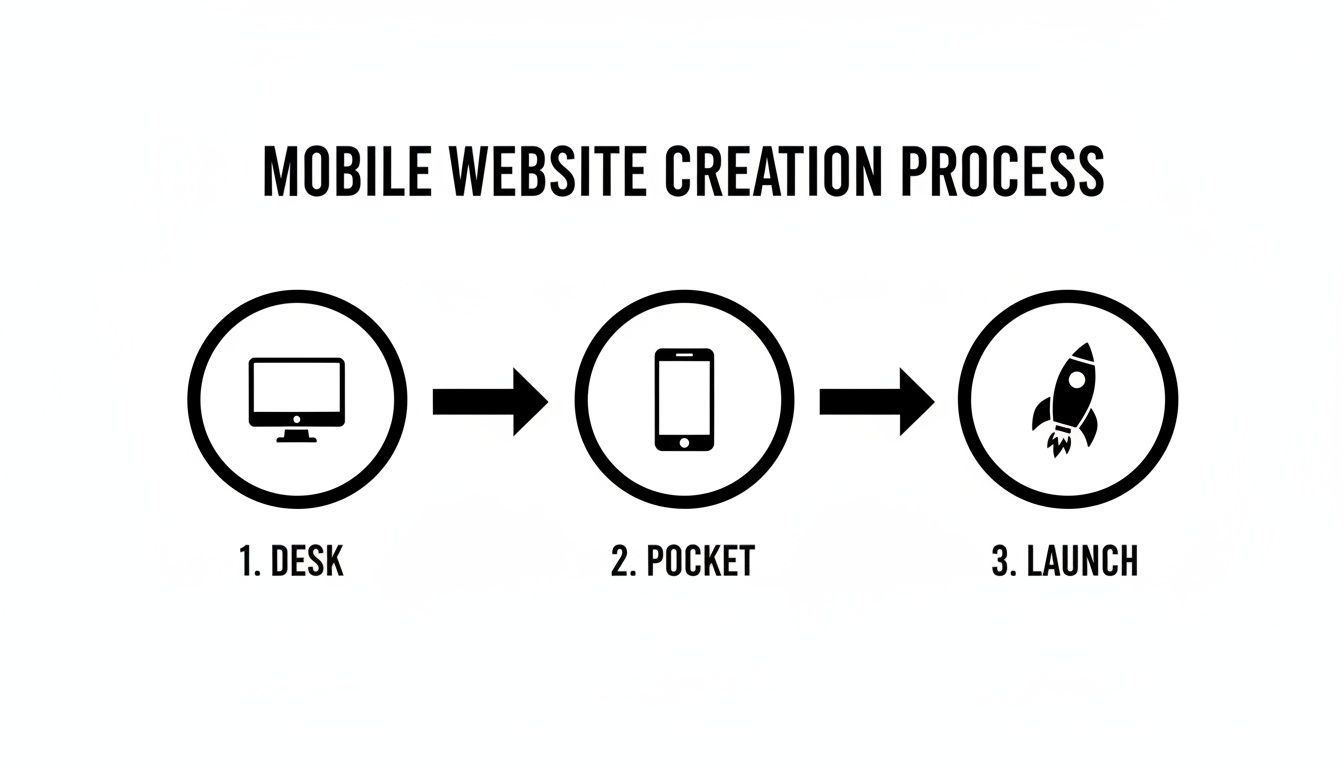
The real power here is efficiency. Being able to go from an idea to a live website, all from the device in your pocket, is a massive advantage for any entrepreneur on the move.
When picking a template, think about what you need your website to do. Is it selling a product? Capturing leads? Showing off your work? Your primary goal should guide your choice.
For E-commerce: Find templates that put product galleries front and center with obvious "Add to Cart" buttons.
For Service Businesses: You'll want layouts with strong calls-to-action and contact forms that are impossible to miss.
For Portfolios: Go for clean, minimalist designs that let your images and creative work do the talking.
Why Mobile Optimization Is Everything
Whether you start with a template or import a URL, every site generated in Alpha is responsive right out of the box. This isn't just a nice-to-have; it's absolutely critical. With mobile devices now accounting for up to 64% of all web traffic globally, a site that isn't mobile-friendly is basically invisible to most of your audience.
The numbers don't lie. Mobile-optimized sites see 6.8 times higher landing page conversion rates. That kind of lift can turn a sluggish 1.5% conversion rate into a healthy 10% or more, depending on your industry.
This built-in focus on mobile-first design means you're starting with a site that not only looks great but is already primed to turn visitors into customers. If you're intrigued by how this all works, our guide on using AI to build a website is a great read. It gets into the nitty-gritty of how AI can translate complex design ideas into a stunning website from your phone.
Editing Your Site with Simple Text Commands
Alright, once the AI has roughed out the basic structure of your site, this is where you get to roll up your sleeves and really make it yours. With a tool like Alpha, you’re not wrestling with clunky menus or trying to drag-and-drop elements with your thumb. Instead, you just… talk to it. Or, well, type to it. The entire editing process is conversational, which feels a lot more like texting a friend than building a website.
Forget the frustrating experience of pinching and zooming to hit a tiny button on a traditional editor. Here, you can literally just tell the AI what you want. Think about it—you could be sitting on the train and type, "Change the main headline to 'Artisanal Coffee, Delivered Fresh' and make the 'Shop Now' button orange." That’s not science fiction; it’s how you can make a website on your mobile right now.
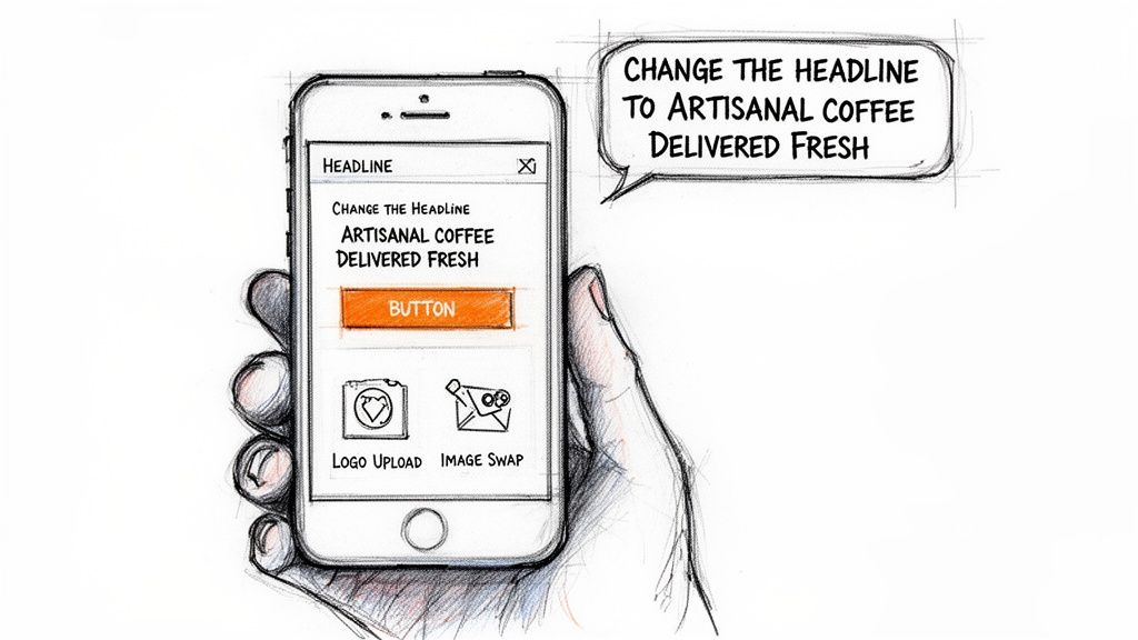
This completely removes the technical headache from the equation. You get to skip the "how" and focus entirely on the "what," making quick, meaningful updates to your site whenever you have a spare few minutes.
Personalizing Your Site with Plain English
So, what does this look like in practice? Let's go over a few real-world edits you’ll probably find yourself making.
Changing Text: Need to tweak your mission statement? Just type, "In the 'About Us' section, change the first paragraph to..." and then paste in your new text. Done.
Adjusting Colors: Maybe the initial color scheme isn't quite hitting the mark. No problem. A command like, "Make all the buttons a dark forest green," or "Change the background color of the whole site to a light gray," gets it done instantly.
Swapping Images: This is a big one. To replace a stock photo, you can just say, "Replace the main banner image with the picture of the smiling barista." The AI will then ask you to upload the new photo right from your phone's camera roll.
This intuitive process is a massive relief for anyone who's ever tried—and failed—to manage a website from a small screen.
"I'm so impressed! It's really user friendly and does a great job uploading imagery which I have found with other AI web builders really challenging. The updates are quick to change and apply." - Madeleine O'Carroll, Business Owner
Madeleine’s feedback nails a common frustration. Handling images on mobile is usually a nightmare, but conversational AI makes it simple. You can upload your logo, add product shots, and refresh your gallery without ever thinking about a desktop.
Fine-Tuning Your Design Elements
You’re not just stuck with big, sweeping changes, either. You can use text commands to get into the nitty-gritty details, making sure every pixel aligns with your vision. This is how you take a template and truly make it your own.
Here’s a quick breakdown of how you can direct specific design tweaks:
You Want to Change… | Just Type Something Like… | And The AI Will… |
|---|---|---|
Fonts | "Change all headings to the Poppins font and make them bold." | Instantly update your site's typography for a consistent look. |
Buttons | "Make the 'Learn More' button bigger and give it rounded corners." | Adjust the button's styling so it stands out and fits your brand. |
Section Layouts | "Add a three-column section with icons above the testimonials." | Generate a brand-new, structured section, ready for your content. |
Having this level of control through plain language changes the game. It’s less about learning a piece of software and more about just stating what you want to see. If you want to get a better feel for this, our guide on how to edit website text with AI has even more examples.
By leaning into a conversational editing model, you can build, refine, and perfect a professional website without ever feeling limited by your phone. It’s a faster, smarter, and honestly more enjoyable way to get your business online.
Optimizing Your Site for Search Engines
You've built a gorgeous website right from your phone. That's a huge win, but it's really just the beginning. If people can't find your site on Google, it might as well be invisible. This is where we get into Search Engine Optimization (SEO)—and yes, you can manage the most important parts from your mobile device.
First things first, let's talk about user experience. Alpha automatically makes your site responsive, but you should always put on your "visitor" hat and double-check. Use the preview mode to see how your site looks on different screen sizes. Is the text easy to read? Do the buttons work without having to zoom in? A clunky mobile site sends visitors running and tells Google your site isn't up to snuff.
Don't just take my word for it. Mobile devices now account for 60-64% of all global web traffic. Google noticed this trend years ago and switched to "mobile-first indexing" back in 2018. This means Google primarily uses the mobile version of your site to rank it in search results. A bad mobile experience isn't just a minor issue; it's a major roadblock to getting found.
Mastering SEO Basics from Your Phone
Now that you've confirmed your site is a dream to use on mobile, let's get into the nitty-gritty of on-page SEO. The great thing about using Alpha is that all these tools are baked right into the mobile editor. No need to switch to a desktop or use a complicated third-party app.
Here’s what you should tackle right away:
Page Titles: This is the clickable headline people see in search results. Make it catchy and include the main keyword for that page. Think "Handcrafted Leather Wallets – Your Brand Name" instead of just "Products."
Meta Descriptions: This is the little summary under your title in the search results. While it doesn't directly affect your rank, a compelling description acts like a mini-advertisement, convincing people to click on your link instead of someone else's.
Alt Text for Images: This is a short description of your images that helps search engines understand what they are. It’s also critical for accessibility. Instead of a generic "wallet," write something descriptive like "brown leather bifold wallet on a wooden table."
Don't overthink it. The goal of SEO is to make your website clear and helpful for both people and search engines. Start with these basics, and you'll be building a solid foundation for discoverability.
To help you stay on track, I've put together a simple checklist you can follow directly within the Alpha mobile editor.
Mobile SEO Checklist for Your New Website
Here's a quick rundown of essential on-page SEO tasks you can complete to give your site a better shot at ranking on Google.
SEO Task | What to Do | Why It Matters |
|---|---|---|
Page Title | Craft a unique, descriptive title for each page (50-60 characters). | This is the most important on-page ranking factor and what appears in browser tabs. |
Meta Description | Write a compelling summary of the page's content (150-160 characters). | This boosts your click-through rate from search results. |
Header Tags (H1, H2) | Use one H1 for your main heading and H2s for subheadings. | Organizes content for readers and helps search engines understand the page structure. |
Image Alt Text | Add descriptive alt text to every image you upload. | Improves accessibility and helps your images rank in Google Image Search. |
Internal Linking | Link to other relevant pages on your own website. | Helps visitors and search engines navigate your site and discover more content. |
Tackling this list puts you way ahead of the game.
Of course, building the site is one thing; marketing it is another. For a deeper dive into growing your audience, check out these SEO strategies for online businesses. By weaving these practices into your process as you make a website on your mobile, you’re not just creating a digital storefront—you’re building an engine for attracting new customers.
Launching and Tracking Your Website's Performance
You’ve put in the hard work, tweaked the design, and now you’re ready for the big moment: taking your website live. With a platform like Alpha, publishing is genuinely as easy as hitting a button on your phone. You can hook up a custom domain you already own or even grab a new one right from the app. This is where your project officially graduates from a draft to a live piece of the internet.
But going live isn't the finish line. In many ways, it's the starting gun. Now the real work begins—understanding what people actually do once they land on your site. Guesswork won't get you far; you need to see what’s working and what’s not.
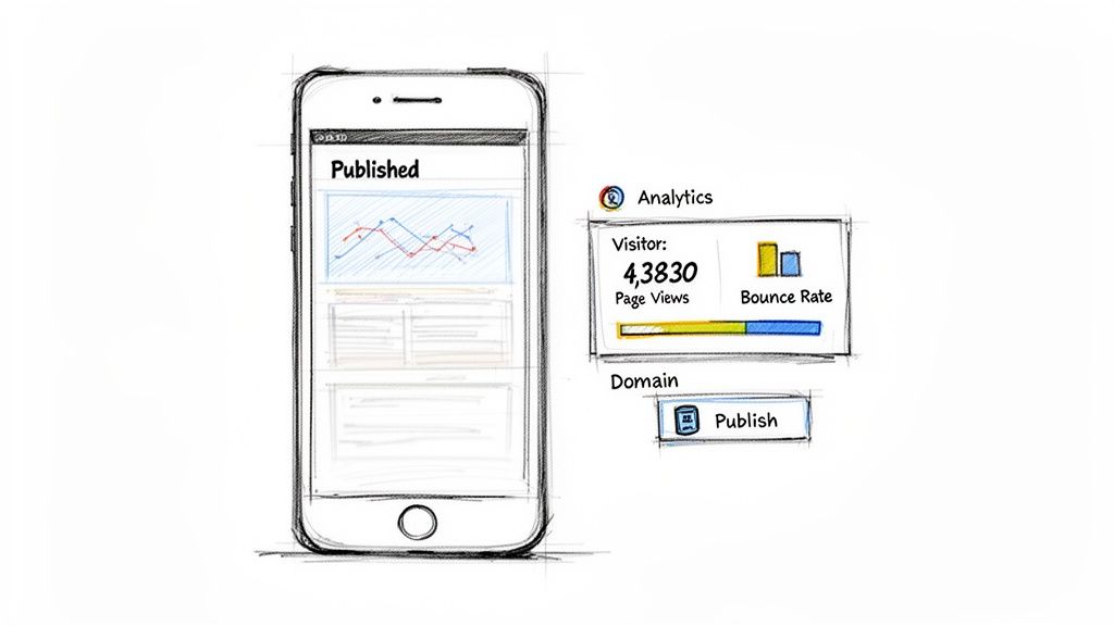
This is precisely why Alpha's built-in analytics dashboard is so crucial. It’s right there on your phone, giving you an immediate look at your site's performance without needing to log into another service or fire up a laptop.
Understanding Your Mobile Analytics
Keeping tabs on your site's performance shouldn't feel like a chore. The integrated dashboard makes it simple by showing you the most important data in a way that’s easy to understand. You can check in on your site's vitals anytime, from anywhere, and make quick decisions based on real information.
Here are the core metrics you'll want to watch right away:
Total Visitors: The fundamental count of how many people are visiting. Seeing this number climb is the first sign your promotional efforts are hitting the mark.
Page Views: This shows you which pages are getting the most attention. For example, a ton of traffic to your "Portfolio" page but very little to your "Contact" page could signal a problem with your call-to-action.
Bounce Rate: What percentage of people leave after seeing only one page? A high bounce rate can be a red flag that your landing page isn't compelling enough to make them stick around.
Session Duration: How long are people actually staying on your site? Longer sessions are a great sign that visitors find your content engaging and useful.
By checking these numbers regularly, you shift from just having a website to actively managing a powerful business asset. Data gives you the insights to make smart tweaks that can directly boost your results.
Let's say you notice a blog post about a niche service is getting a surprising amount of traffic. That’s your cue to feature that service more prominently on your homepage. This is how you let data guide your strategy.
The power to make a website on your mobile doesn't stop once it's published. It's about having that continuous loop of building, measuring, and refining right in your pocket.
Still Have Questions? Let's Clear a Few Things Up
Even with a straightforward process, the idea of building an entire website from your phone can feel a little... out there. I get it. It's a newer way of doing things, and it's natural to have questions.
Let's walk through some of the most common concerns I hear from people making the switch.
Is It Really Possible to Build a Good Website on a Phone?
The short answer? A definite yes. But the how is what matters.
This isn't about pinching and zooming your way through a clunky desktop editor on a tiny screen. Modern AI-powered builders like Alpha were built from the ground up for a mobile-first experience. You’re not fighting with the interface; you’re having a conversation with it. By using simple text commands, you can design, edit, and launch your site without ever touching a laptop.
Can a Site Built on Mobile Actually Look Professional?
Absolutely. The device you build on has zero impact on the final quality of your site—the tool you use is what counts.
Think of it this way: Alpha’s templates are already professionally designed, and its AI engine creates layouts inspired by some of the most successful websites on the internet. Since every site it generates is responsive by default, you can be confident it will look sharp and work perfectly on desktops, tablets, and phones. The professionalism is baked right in.
What Are the Real Limitations of Building on Mobile?
In the past, the biggest limitation was trying to manage complex design software on a small screen. It was a nightmare. Conversational AI has pretty much eliminated that headache.
Today, the main consideration is just personal workflow. If your day-to-day involves intensive, pixel-perfect graphic design or plugging in massive spreadsheets of data, you might still prefer the real estate of a larger monitor. It's just more comfortable for certain heavy-duty tasks.
However, for the majority of entrepreneurs and small business owners who need a great-looking site they can easily manage, there are no real functional roadblocks. You can handle everything from design tweaks and SEO to checking analytics and managing new leads, all from your phone.
How Hard Is It to Connect My Custom Domain?
This is one of those things that sounds intimidating but is actually incredibly simple now. The entire process is built right into the mobile platform.
Inside Alpha, you’ll find simple, guided steps to connect a domain you already own. If you don't have one, you can buy a new one directly through the app. You won't have to bounce between different services or mess with confusing settings to get your site live on a professional URL.
The whole point of a modern mobile builder is to tear down the old technical walls. Connecting your domain is now a task you can knock out in a few minutes, giving your brand the credibility it deserves right from the start.
Building a website from your phone isn't a compromise anymore—it’s a genuine advantage. It gives you the freedom to bring ideas to life the moment they strike, make quick updates on the go, and run your business from literally anywhere. You're no longer chained to your desk.
Ready to see for yourself? You can have a professional website up and running in minutes, right from the device in your pocket. Get started with Alpha and see just how easy it is. Start building for free.
Build beautiful websites like these in minutes
Use Alpha to create, publish, and manage a fully functional website with ease.