


How to Create Website Mockups People Actually Love
Learn how to create website mockups that bridge the gap between idea and reality. Our guide covers tools, principles, and developer handoff.
Build beautiful websites like these in minutes
Use Alpha to create, publish, and manage a fully functional website with ease.
Before you even think about colors, fonts, or layouts, we need to talk strategy. A powerful startup website isn't just a pretty digital storefront; it's a meticulously planned engine for growth. This initial groundwork—defining your value, knowing your customer, and sizing up the competition—is what separates a site that just exists from one that actually delivers results.
Building a Strategic Foundation for Your Startup Website
Jumping into web design without a strategy is like trying to build a house without a blueprint. You might end up with something that looks okay, but it's guaranteed to have a shaky foundation. For a startup, every decision, every dollar, and every minute counts. Getting the strategy right from the start is non-negotiable.
This phase is all about answering the tough questions first. When you nail this, every other part of the process—from writing copy to designing call-to-action buttons—becomes exponentially easier and more effective.
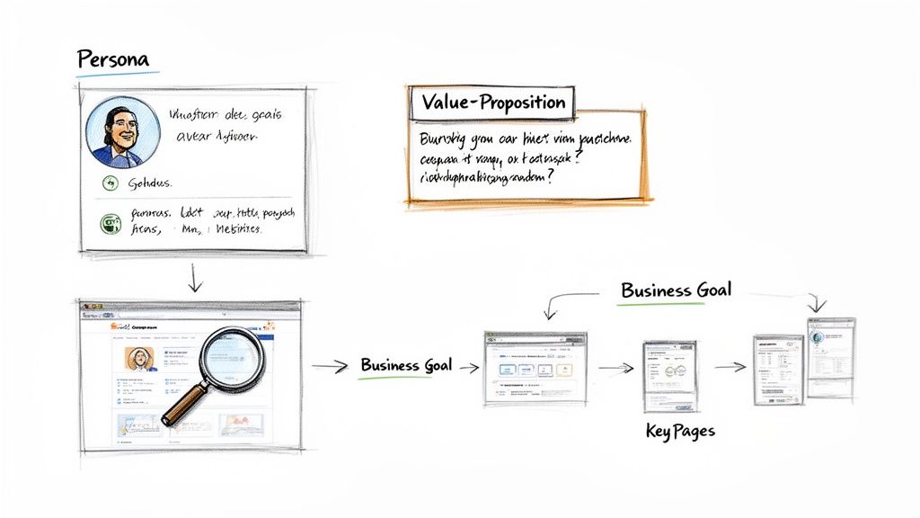
Define Your Unique Value Proposition
First things first: you need to be able to answer, "Why should anyone choose us over the other guys?" in a single, compelling sentence. That's your unique value proposition (UVP). It’s not just a catchy slogan; it's a clear, direct promise of the value you deliver.
Your UVP has to do its job the second someone lands on your homepage. It must instantly communicate:
Relevancy: How you solve your customer's biggest problem.
Real Value: The specific, tangible benefits they'll get.
Differentiation: What makes you the absolute best choice.
Think of it this way: a fintech startup could say "Easy Budgeting." Or, they could say, "Save an average of $500 a month by tracking subscriptions you forgot you had." The second one is specific, value-packed, and actually means something.
Identify Your Ideal Customer and Analyze Competitors
You can't build a website that resonates if you don't know who you're talking to. Creating an ideal customer profile (ICP) is about getting inside their head—understanding their frustrations, what motivates them, and even the words they use. This insight is gold, influencing everything from your messaging to your design choices.
Once you have a clear picture of your customer, it's time to spy on the competition. Pick 3-5 of your top competitors and dissect their websites. Don't just look at the visuals. Dig deeper:
What’s the main thing they want visitors to do (their CTA)?
How do they present their pricing? Is it confusing or clear?
What kind of proof are they using (testimonials, case studies, logos)?
Where are the obvious gaps in their message that you can fill?
This isn't about copying them. It's about spotting patterns, understanding what works in your market, and finding your opening. If every competitor uses dense, corporate jargon, you can stand out immediately with simple, human language. For a deeper dive, there are some great tips on web development for startups that can help frame this process.
This strategic flow—from defining who you are to analyzing the market—is the core of building a successful site.
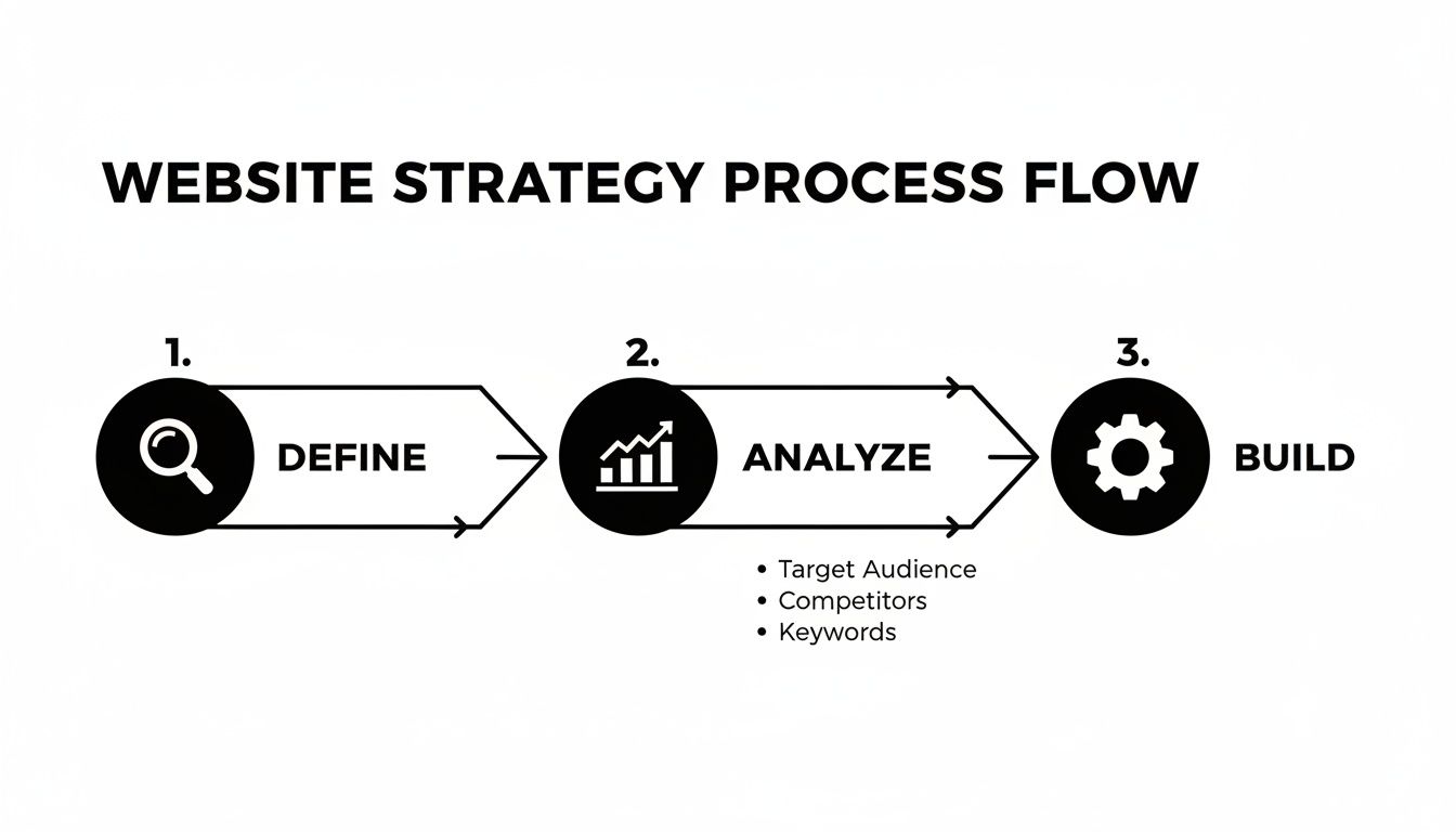
This structured approach ensures that every design choice you make is intentional and directly tied to a business goal. No more guessing games.
Key Takeaway: A website without a clear strategy is just a digital brochure. A strategic website is a growth engine that attracts, educates, and converts your ideal customers.
Comparing Startup Website Investment Models
Founders often face a tough choice: invest heavily in a traditional agency or explore more modern, efficient options. Here's a quick breakdown to help you decide where to allocate your precious capital.
Investment Area | Traditional Web Design Agency | AI-Powered Builder |
|---|---|---|
Discovery & Strategy | $5,000 - $15,000+ (Weeks of meetings, research, documentation) | Included in platform cost (AI-driven analysis in minutes) |
Design & Development | $15,000 - $50,000+ (Custom code, long timelines) | $0 - $500/mo (Pre-built, customizable, high-quality templates) |
Timeline to Launch | 3 - 6 months | 1 - 2 weeks |
Revisions & Iterations | $150+/hr for changes, often slow turnaround | Instant, self-serve changes at no extra cost |
As you can see, the financial and time commitments vary drastically. For startups that need to move fast and iterate based on real user feedback, the choice is often clear.
Modern tools completely change the game for this crucial research phase. With Alpha, for instance, you can instantly analyze what's working for the top players in your niche and use their proven layouts as your foundation. This means you’re not starting from a blank page; you’re starting with a battle-tested structure for conversions and information flow, giving you a massive head start. A huge piece of this puzzle is mapping out your pages, and you can learn more about how to plan website structure right here: https://www.alpha.page/blog/how-to-plan-website-structure.
Alright, you’ve got your strategy and positioning sorted. Now it’s time to start building the actual rooms of your digital house. Think of each page on your website as a dedicated member of your sales team, working around the clock. If those pages are weak, you're just leaking potential customers. But when they’re sharp, they guide visitors right from "just browsing" to "take my money."
The trick is to treat every page like a conversation, not a brochure. You have to get ahead of your visitor's questions and answer them before they even think to ask. This means an almost obsessive focus on clarity, building trust, and giving them one obvious next step—your call-to-action (CTA).
Nailing the High-Converting Homepage
Your homepage is your digital handshake. You get about 50 milliseconds—literally the blink of an eye—to make a good impression. Its one and only job is to answer three questions, instantly:
What is this? No jargon. Just tell them what you do.
How does it help me? Get straight to the primary benefit for the user.
What do I do next? Make the CTA button impossible to miss.
Most homepages that work follow a tried-and-true formula. You start with a powerful hero section that screams your unique value proposition. Right below that, flash some social proof like customer logos or a killer testimonial. Then, briefly explain how it all works, highlight a few key benefits, and hit them with another CTA. Keep it clean. Every single element on that page should be pushing the visitor toward that one critical action.
For instance, a project management tool shouldn't just say "Collaborate Better." That's lazy. It should hit them with something like, "Finish Projects 30% Faster by Bringing Your Team, Tasks, and Docs into One Place." See the difference? It's specific, packed with benefits, and makes perfect sense right away.
Crafting a Pricing Page That Feels Fair
The pricing page is often the last stop before you get a new customer. This is where they do the mental math, weighing what they get against what it costs. Any hint of confusion or friction here will send them straight to your competitor's website. Your goal isn't just to show prices; it's to make them feel like a bargain.
Here's how to build a pricing page that seals the deal:
Create Clear Tiers: Give your plans names that resonate with your users, like "Starter," "Pro," or "Enterprise," instead of generic labels.
Show, Don't Just Tell: Use a simple comparison table to lay out the key differences between plans. Make it dead simple for them to see which one fits best.
Guide Their Choice: Nudge them toward your preferred plan with a visual cue, like a colored border or a "Most Popular" tag. It works.
Handle Objections Upfront: Add a quick FAQ at the bottom to tackle common worries. "Can I cancel anytime?" "What if I go over my limit?" Answer these, and you'll dissolve their anxiety.
"Alpha built my website quickly and perfectly, nothing else I tried compared AT ALL. Highly recommend it for anyone looking for top-notch website creation!" - Rat Ramrath
This is the kind of social proof that hits home for a startup founder who needs speed and quality. Placing testimonials like this on your key pages makes the decision to sign up feel a lot less risky.
Designing Product Pages That Sell Outcomes, Not Features
This is the classic startup trap. We fall in love with our own tech and can't wait to list out every single feature. But here's the hard truth: your customers don't care about your "advanced AI algorithm." They care about what it does for them. Your product pages have to translate every feature into a real-world benefit.
So instead of saying: "Our software uses an advanced AI algorithm."
You say: "Save 10 hours a week by letting our AI automatically organize your files."
Structure your product pages around your customer's biggest headaches. Lead with the problem, position your product as the cure, and then use a mix of crisp text, visuals, and maybe a short video to show them exactly how it solves their pain. And, of course, sprinkle in testimonials from real people who have already used your tool to fix that exact problem. It’s a powerful one-two punch. Learning from the best practices in landing page design can give you even more frameworks to work with.
This is where a tool like Alpha really changes the game. You don't have to guess what a high-converting page looks like. You can just feed it the URL of a page you admire, and its AI will map out the structure for you, creating a proven blueprint. All you have to do is plug in your own value proposition and customer benefits. It’s a massive shortcut to a website that actually does its job.
Mobile-First Design & SEO Foundations: Get Found and Get Loved
You can build the most beautiful website in the world, but if it breaks on a phone or nobody can find it on Google, it might as well not exist. For a startup, getting mobile design and basic Search Engine Optimization (SEO) right isn't a "nice-to-have"—it's a fundamental part of staying in the game.
These two pieces work together. They make sure your site actually works for the majority of people visiting it and, just as importantly, that people can discover you when they're actively searching for a solution like yours.
Skipping this step is like opening a fantastic shop but forgetting to put up a sign or even build a front door. A great website design for startups has to be both functional and findable from day one.
Think Mobile First, Not Mobile-Friendly
The old way of doing things—designing a gorgeous desktop site and then trying to cram it onto a phone screen—is dead. That approach leads to a terrible user experience. Today, the only way forward is to design for the smallest screen first and then scale up. That's the heart of mobile-first design.
Why is this so non-negotiable? Because that's where your customers are. A clunky, slow, hard-to-read mobile site doesn't just annoy visitors; it actively tells them you don't respect their time, sending them running to a competitor.
A true mobile-first mindset forces you to think about how people actually use their phones:
They're often distracted and need info fast.
They're using their thumbs, so buttons need to be big enough to tap easily.
Screen space is precious, so every single word and image has to earn its spot.
This discipline forces you to prioritize ruthlessly, which usually results in a cleaner, more powerful experience on every device. If you want to go deeper, we've broken down what mobile-first design really means in another guide: https://www.alpha.page/blog/what-is-mobile-first-design.
Expert Insight: Think of your mobile site as the 'concentrated' version of your brand promise. If you can't communicate your value clearly and effectively on a 6-inch screen, you've already lost the battle for attention.
SEO for Founders: The Stuff That Actually Matters
SEO can sound like a dark art, but for a new startup, just nailing the basics can deliver massive wins. You don't need to be a technical wizard. You just need to understand what search engines like Google want: high-quality, relevant content that genuinely helps a user.
Getting these fundamentals right at launch sets you on a path for steady, long-term organic growth.
Here’s a quick-and-dirty checklist for your on-page SEO essentials:
Keyword Strategy: Figure out the main search term for each page. Your homepage might target "AI-powered scheduling tool," while a feature page targets "automated meeting reminders."
Title Tags & Meta Descriptions: Your title tag is the big blue link people see in search results. The meta description is the snippet of text underneath. Write them to be compelling and make sure they include your keyword.
Clean URLs: Your URLs should be simple and readable. Think
yoursite.com/pricinginstead of a jumbled mess likeyoursite.com/page?id=123. This helps both people and search bots understand what the page is about.Image Alt Text: Always add a short, descriptive text to your images. This is crucial for accessibility and gives Google another clue about your page's content.
The Overlooked SEO Factor: Raw Speed
All the keyword research on the planet won't help you if your site takes forever to load. Site speed is a massive ranking factor for Google and a deal-breaker for users.
We're talking serious numbers here. 53% of users abandon a mobile site if it takes longer than three seconds to load. For every extra second of delay, conversions can drop by around 7%.
This is where your choice of website builder really makes a difference. A modern platform like Alpha is built for performance from the ground up. It automatically handles things like image optimization, clean code generation, and fast infrastructure so you don't have to. It's a huge head start that lets you focus on building your business, not troubleshooting a slow website.
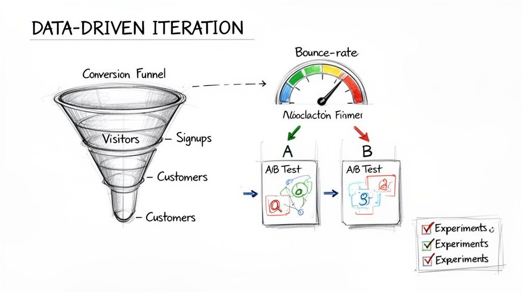
Using Data to Iterate and Improve Your Website
Hitting "publish" on your startup's website isn't crossing the finish line—it's the starting gun. So many founders make the mistake of treating their site like a static brochure, a "set it and forget it" project. But here's the reality: your website on day one is just your best-educated guess. Real growth kicks in when you start turning that guess into a dynamic, data-driven engine.
This means you need to shift your thinking from "launching" to "iterating." The goal is to build a constant feedback loop where real user behavior shapes every design choice and copy tweak you make. This is how your site evolves from a simple online presence into a powerful machine for learning and winning customers.
Setting Up Your Analytics Foundation
You can't improve what you don't measure. The absolute first step is to get a solid analytics tool installed. Google Analytics is the industry standard for a reason—it's free, powerful, and gives you a mountain of information. Getting it set up is a non-negotiable first step to understanding what’s actually happening on your site.
Once it's connected, you can stop guessing and start knowing. Instead of wondering where people are coming from, you’ll see the exact breakdown of your traffic sources—whether that's organic search, social media, or direct links. This is gold. It tells you exactly where to double down on your marketing efforts.
Key Metrics That Actually Matter for Startups
It’s incredibly easy to get lost in a sea of analytics. There are hundreds of data points, but for an early-stage startup, only a handful are truly vital. You want to focus on the metrics that tell you a story about how people are engaging with your site and whether they're converting.
Here’s a short list of what to keep your eyes on:
Bounce Rate: What percentage of visitors hit a page and leave without doing anything else? A high bounce rate on your homepage might mean your value proposition isn't landing.
Session Duration: How long are people sticking around? Longer sessions are a great sign that your content is hitting the mark and keeping them interested.
Pages per Session: Are people clicking around and exploring? This tells you if your navigation makes sense and if your content is compelling enough to pull them deeper into your site.
Conversion Rate: This is the big one. It's the percentage of visitors who actually do what you want them to do, like signing up for a trial or booking a demo.
Key Takeaway: Your initial website is a hypothesis. Data is how you test it. Don't get attached to your design; get attached to what the data tells you about what your customers actually want.
These numbers give you a quick health check for your website. If you notice that 80% of your mobile users are bouncing from your pricing page, you don't have a traffic problem—you have a design or messaging problem on that specific page for mobile users. That's an actionable insight.
Turning Insights into Action with A/B Testing
Once your analytics start pointing out the problem areas, it's time to start experimenting with solutions. This is where A/B testing is your best friend. It’s a straightforward but incredibly powerful method: you show two different versions of a page to your visitors to see which one performs better.
Let's say your data suggests the call-to-action (CTA) on your homepage is weak. You could run a test where 50% of visitors see the original "Learn More" button, and the other 50% see a new version that says "Start Your Free Trial." A week later, the data will show you which button drove more sign-ups. No more debates.
This approach strips ego and guesswork out of the website design for startups process. Decisions are no longer based on what the founder thinks looks best, but on what quantifiably converts more visitors into customers.
And modern tools have made this easier than ever. With Alpha, you don’t need to wait for a developer to make these changes. You can just describe the test you want to run—like "change the headline to be more benefit-focused"—and the AI generates the variant for you. This lets you run experiments fast, learn from them, and constantly tune your site for peak performance.
The Final Pre-Launch Sanity Check
You're almost there. Before you push that big red "launch" button, it's time for one last, meticulous run-through. This isn't just about ticking boxes; it's your last line of defense against those tiny, easy-to-miss mistakes that can trip you up and undermine an otherwise brilliant first impression. Think of it as moving from "builder" mode to "inspector" mode, making sure everything works exactly as you planned for every single visitor.
Sure, an AI builder like Alpha handles a ton of the heavy lifting and technical checks automatically, but nothing beats a final human review. This is where you catch the subtle stuff—the things only a person would notice—to ensure the user experience feels seamless and professional from the moment you go live.
Proofread Every Single Word
Nothing screams "amateur" faster than typos and sloppy grammar. They're instant credibility killers that can make your whole operation look careless, eroding the trust you’ve worked so hard to build. It's time to put on your editor's hat.
I always recommend reading every line of text out loud. It’s a simple trick, but it forces you to slow down and catch awkward phrasing and mistakes your brain might otherwise gloss over. While you're at it, check for consistency in your brand's voice and terminology. Did you use "Your Company" on one page and "your company" on another? Nail it down.
Test Every Click, Tap, and Form
A broken link or a form that goes nowhere isn't just a bug—it's a brick wall for a potential customer. Rigorous testing is about making sure every pathway on your site actually leads somewhere. Don't just click around; put every interactive piece through its paces.
Here's my go-to testing protocol:
All Links: Click every single link. Internal, external, navigation menu, footer links—all of them. Make sure they all land exactly where they should.
All Forms: Fill out and submit every form on the site. That means your contact form, your lead magnet download, and your newsletter signup. Did you get the submission notification? Did the user see a proper "thank you" message?
All CTAs: Check that every call-to-action button does what it promises, whether that's jumping down to a pricing table or popping up a demo request form.
"I'm so impressed! It's really user friendly and does a great job uploading imagery which I have found with other AI web builders really challenging. The updates are quick to change and apply, I copied the site from another website template and the sections carried over well." – Madeleine O'Carroll, Business Owner
This is the kind of smooth experience you’re aiming for. It's the direct result of being obsessive about testing before launch, ensuring the site just works for everyone.
Check How It Looks on Other Screens
Your site might look absolutely perfect on your MacBook in Chrome, but what about on a friend's Windows PC using Firefox? Or on your co-founder's Android phone? It's shocking how different a site can look across various browsers and devices.
You have to check. Use browser testing tools or, even better, just ask a few people to pull up the site on their own devices. You'll want to cover:
The big browsers: Chrome, Safari, Firefox, and Edge.
Different screen sizes: desktops, tablets, and smartphones.
Mobile operating systems: both iOS and Android.
The goal is a consistently great experience, no matter how someone finds you.
Run Those Final Technical Checks
Last but not least, a few behind-the-scenes items can make or break your launch day. This is your chance to make sure all the technical machinery is oiled and ready to go.
Here's what should be on your final tech checklist:
Image Optimization: Give your images one last look. Are they compressed for fast loading without looking pixelated? Slow load times are a conversion killer.
Favicon: Does your little brand icon show up in the browser tab? It’s a small detail, but it’s a hallmark of a professional site.
Analytics and Tracking: Double-check that your Google Analytics tag and any other marketing pixels are installed and firing correctly. You need to start collecting data from day one.
Getting through this checklist turns launch day from a nerve-wracking gamble into a confident, controlled event. This final polish is what separates a decent website design for startups from a truly great one.
Answering Your Top Questions About Startup Website Design
Even with a solid plan, building your first startup website inevitably brings up some tough, practical questions. Getting straight answers to these common worries can save you a ton of time, cash, and headaches down the road. Let's tackle the most frequent questions I hear from founders.
How Much Should a Startup Really Budget for a Website?
This is the million-dollar question, isn't it? The answer has thankfully changed a lot in recent years.
If you go the traditional route, a web design agency will likely quote you anywhere from $6,500 to $15,000+ just to get the site built. That's before you even think about the ongoing maintenance retainers that can easily tack on thousands more every year. For a startup trying to make every dollar count, that's a huge chunk of capital that could be going toward your product or first marketing hires.
A much leaner, and frankly smarter, approach is to sidestep that massive upfront cost. Modern AI-powered website builders have completely changed the game here. Instead of a huge one-time invoice, you're looking at a manageable subscription.
This shift lets you get a polished, conversion-ready website live in days, not months, all while keeping your cash where you need it most. The key is to stop thinking of your website as a static expense and start treating it like what it is: a dynamic, revenue-driving tool that needs to be effective from the get-go.
How Can I Make My Startup Website Actually Stand Out?
Making your site memorable isn't about wild animations or crazy fonts. It's about clarity and connection. If you want to stand out for the right reasons, you need to nail three things:
Crystalize Your Unique Value Prop: What’s the one big problem you solve better than anyone else? This needs to hit a visitor the second they land on your page. Don't be shy; be specific and bold.
Obsess Over the User Experience (UX): A clean layout, dead-simple navigation, and fast load times aren't just nice-to-haves anymore—they're the bare minimum. A smooth, frustration-free experience builds trust and is one of the easiest ways to lift your conversion rates.
Be Genuinely Authentic: Ditch the corporate-speak. Use your real brand voice. Show off real testimonials from happy customers, write up detailed case studies, and tell the story of why you even started this company. People connect with people.
While an AI tool can give you a head start with a proven, high-converting layout, it’s your unique brand personality and your customer success stories that will make the site feel different and trustworthy.
What Are the Absolute "Must-Have" Pages for a Startup Site?
For nearly every startup, there are five core pages that do all the heavy lifting. If you get these right, you'll have a strong foundation to guide visitors from just browsing to taking action.
Homepage: Think of it as your digital lobby. Its only job is to communicate your value in under five seconds and point people where they need to go next.
About Page: This is where you build a human connection. Tell your story, show off your team, and explain your "why."
Product/Service Pages: Get into the details here. Focus relentlessly on how your features solve your customer's biggest pain points.
Pricing Page: Be transparent and clear. Your pricing should communicate value and make the decision to buy feel simple and fair, not confusing.
Contact Page: Don't make people hunt for a way to get in touch. Whether they're a lead, an investor, or a potential partner, make it incredibly easy to reach you.
Each one of these pages needs a single, clear goal and a primary call-to-action. Trying to make a page do too many things at once is a recipe for confusion and inaction. Keep it focused.
Ready to build a website that stands out without the agency price tag? Alpha uses AI to help you launch a professional, conversion-optimized site in hours, not months. You can even use the URL of a site you love as a design reference. Start building for free at https://www.alpha.page.
Build beautiful websites like these in minutes
Use Alpha to create, publish, and manage a fully functional website with ease.