


How to Create Website Mockups People Actually Love
Learn how to create website mockups that bridge the gap between idea and reality. Our guide covers tools, principles, and developer handoff.
Build beautiful websites like these in minutes
Use Alpha to create, publish, and manage a fully functional website with ease.
Let's be blunt: having a mobile-friendly website isn't a "nice-to-have" anymore. It's table stakes. If your site doesn't work flawlessly on a phone, you're practically invisible to a huge chunk of your audience. The game today is all about delivering a clean, fast experience with thumb-friendly navigation and calls-to-action that are impossible to miss.
Why Your Business Lives or Dies on Mobile
We can skip the lecture on how a clunky mobile site is "bad for business." It's far worse than that—it's a silent killer. When a potential customer can't finish a purchase on their phone, they don't call you to complain. They just leave. And they take their money straight to a competitor who made things easier for them.
A bad mobile experience doesn't just annoy people; it actively sabotages your brand. It shatters user trust in seconds. Imagine a potential client trying to find your phone number but having to pinch and zoom around a desktop layout squished onto their screen. That initial burst of frustration is often the last interaction they'll ever have with your business.
The Unforgiving Mobile User
People behave differently on their phones. They're usually on the go, often distracted, and have zero patience for friction. They expect speed, simplicity, and immediate answers. Slow-loading pages, confusing menus, or forms that are a nightmare to tap out with a thumb are dealbreakers.
And the data doesn't lie. The internet's center of gravity has permanently shifted to handheld devices. Back in 2015, mobile accounted for under 35% of global web traffic. Fast forward to April 2025, and that figure has soared to 59.7%, with some reports putting it as high as 63.8%. That’s not a trend; it's a fundamental shift in how people access the internet. If you’re not building for mobile, you’re ignoring the majority of your potential customers.
Every second of delay, every frustrating pinch-to-zoom, and every hard-to-tap button directly correlates with lost revenue and opportunity. In the mobile world, convenience isn't a feature—it's the entire product.
Mobile Experience Is the New Brand Experience
For most people, your mobile site is your brand. It’s your digital storefront, your top salesperson, and your public relations team all rolled into one. When it fails, everything else fails right along with it.
Thinking about user expectations on different devices is a great starting point. What works on a large desktop monitor often fails miserably on a 6-inch phone screen.
Mobile vs Desktop User Expectations
Aspect | Mobile Experience | Desktop Experience |
|---|---|---|
User Goal | Quick, task-oriented (find info, buy, contact) | In-depth research, comparison, content consumption |
Attention Span | Extremely short, easily distracted | Longer, more focused |
Input Method | Touch, thumbs, voice | Keyboard and mouse (high precision) |
Screen Real Estate | Severely limited; one column is king | Ample space for complex layouts, sidebars |
Performance | Speed is critical; every kilobyte counts | Fast is good, but users are more tolerant of bigger pages |
Context | On the go, often with unstable connections | Stationary, usually with stable Wi-Fi/Ethernet |
Understanding these differences is key to building a mobile experience that doesn't just look good, but actually works for your users.
Let's look at the real-world consequences of getting this wrong:
Sky-High Bounce Rates: If your site doesn't load quickly and display properly, users are gone in a flash.
Damaged SEO Rankings: Google's mobile-first indexing means they prioritize sites that deliver a great mobile experience. If yours doesn't, you'll be pushed down in the search results.
Lost Sales and Leads: A complicated checkout process or a hard-to-find contact form is a direct path to abandoned carts and missed opportunities.
Ultimately, this isn't just about whether to create a mobile website. It's a decision about whether you want to meet your customers where they already are or risk being left behind. As you weigh your options, it's also helpful to understand the pros and cons of a native app vs. web app to make the best choice for your business goals.
Planning Your Mobile-First User Journey
Before you jump into picking colors or fonts, let's talk strategy. A great mobile website isn't just your desktop site squished onto a smaller screen. It's a completely different beast—a focused tool built for someone who's probably on the go, maybe a little distracted, and navigating with their thumb. Getting this initial planning right is what makes a site that converts, not one that frustrates.
First things first: you have to get inside the head of your mobile visitor. Who are they? What are they actually trying to do on your site from their phone? Think about it—the person casually browsing your e-commerce store on a laptop is in a different mindset. That same person on their phone is likely looking for an order status, your store's address, or a return policy. They want it, and they want it now.
Define Your Core User Actions
On a small screen, simplicity wins. Every single time. If you try to cram every feature from your desktop site onto a mobile view, you’ll end up with a cluttered mess. You have to be ruthless with your priorities. Pinpoint the one or two most critical actions a mobile user needs to accomplish.
For a local restaurant, this is probably:
Viewing the menu
Getting directions
For a SaaS company, it's more likely:
Signing up for a free trial
Booking a demo
Every single element on your mobile site should guide users toward these goals. Anything that doesn't is just noise and needs to go. This disciplined mindset is the heart of the mobile-first design philosophy. If you want to go deeper on this, we've got a whole guide that explores what is mobile-first design in more detail.
Craft a Simple Mobile Sitemap
Once you know what your users want to do, you can map out a simplified sitemap to help them do it. I'm not talking about a complex, branching flowchart. For mobile, think of it as the most direct path from your homepage to their goal, with the fewest taps possible.
Put yourself in their shoes. A user lands on your homepage. How many taps does it take to get to your contact form? If the answer is more than two, you're likely overcomplicating things. A good mobile sitemap is shallow, focusing only on the top-level pages that serve immediate needs.
A great mobile user journey feels intuitive and effortless. The user shouldn't have to think about where to go next—the path to their goal should be obvious, well-lit, and free of obstacles.
For instance, a service business might get by with a simple four-item navigation: "Services," "About," "Blog," and a hard-to-miss "Contact Us" button. Everything else can be tucked away in a footer menu.
Prioritize and Declutter Content
Finally, it's time to decide what content is absolutely essential. Mobile screens have zero tolerance for fluff. Go through your desktop site, page by page, and ask yourself a tough question: "Does a mobile user really need to see this right now?"
Homepage: Focus on a crystal-clear value proposition and a bold call-to-action right at the top.
Service Pages: Make the info scannable. Use bullet points, dropdown accordions, and super short paragraphs.
About Us: Keep it brief. A short mission statement and maybe a team photo is often all you need.
By focusing on your mobile audience's core tasks, simplifying your site structure, and cutting down content, you’re building the foundation for a mobile site that actually works for your users. This prep work ensures that when you get to the design and build phase, you’re creating something that doesn't just look good—you're creating something that gets the job done.
Bringing Your Mobile Site to Life with Smart Design Tools
With your strategy locked in, it’s time to roll up your sleeves and actually build the thing. This is where the rubber meets the road, moving from abstract plans to a tangible website. Thankfully, modern tools—especially AI-powered ones like Alpha—have completely changed this part of the process. You can now build a professional, responsive site without ever touching a line of code.
Gone are the days of painstakingly wireframing every screen, designing each element, and then handing it off for a lengthy coding phase. Today, you can kick things off with a simple text prompt.
For instance, you could tell Alpha’s AI, “Create a clean, modern website for a minimalist coffee shop in Brooklyn, focusing on online ordering and event promotion.” In seconds, the AI generates a complete, multi-section layout that’s already structured beautifully for mobile devices.
This AI-first approach isn't just about speed, though. It's about starting with a solid foundation. The generated designs are based on proven layouts that actually convert, helping you sidestep common design pitfalls from the get-go. The AI handles the heavy lifting, so you can focus on what really matters: your brand, your message, and your content.
Using Inspiration to Get a Head Start
Ever see a competitor's website and think, "I love that layout"? This is where smart design tools really shine. Instead of trying to recreate the structure from memory, you can use features like Alpha’s URL import tool.
Imagine you run a boutique marketing agency and are blown away by a competitor’s clean service page and slick case study section. Just feed their URL to Alpha. The tool analyzes the site’s structure—not the content or branding, of course—and instantly generates a similar, fully responsive template. It’s a huge shortcut for anyone who knows what good design looks like but doesn't have the technical chops to build it from scratch.
"I have tried so many other 'ai' enabled website building apps (Wix, Squarespace and a bunch of upstarts) and they all pretty much suck. Alpha has been super easy and responsive. The website format copying function is a game-changer.” - Doug Roper, Founder & CTO @ Talent Spring
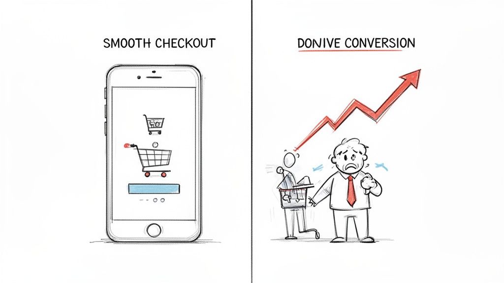
This entire build phase is the culmination of the planning process. You start by understanding your audience and the actions they need to take, which then informs the sitemap you build out.

As the visual shows, a great build is founded on a clear user journey. Smart tools are what let you execute that vision quickly and effectively.
Making the Design Your Own
Once you have that initial layout—whether from an AI prompt or a URL import—the fun begins. Now it’s time to infuse your brand’s personality into the design. This is more than just swapping out photos and text.
Here's how to approach it:
Dial in Your Palette and Fonts: Your brand's colors and typography are your digital handshake. Modern builders let you set these as global styles, so a few clicks ensure perfect consistency across the entire site.
Edit Content with Simple Commands: Instead of wrestling with clunky editors, you can use natural language. Try telling the AI, “Make this headline bolder and change the button text to ‘Book a Free Consultation.’” It’s more like having a conversation with a designer than fighting with software.
Rearrange with Drag-and-Drop: Need to move things around? Most modern platforms are built on a block-based system. You can easily add, remove, or reorder entire sections—testimonials, pricing tables, image galleries—without breaking the layout. This kind of flexibility is a core concept in any good responsive web design tutorial and is baked right into platforms like Alpha.
Weaving in High-Conversion Elements
A beautiful mobile site is nice. A mobile site that drives action is a business asset. This means being strategic about placing elements that capture leads and guide visitors toward your goals. For any business website, these are absolutely non-negotiable.
Focus on incorporating these essential conversion tools:
Clear Calls-to-Action (CTAs): Every page needs a primary CTA. Use punchy, action-oriented language like "Get Started Today" or "Download the Guide," and make your buttons pop with a contrasting color.
Simplified Forms: On mobile, less is always more. Ask only for the information you absolutely need. A single-column layout is a must, as it’s far easier to navigate on a small screen.
Click-to-Call Buttons: Don't make mobile users hunt for your number. A simple "Call Us Now" button that opens their phone's dialer can be a massive source of inbound leads.
Social Proof: Nothing builds trust faster. Integrate testimonials, reviews, or logos of clients you've worked with. This credibility is often the final nudge a visitor needs to take the next step.
As you explore building your site, you might also look into design to code automation platforms that can further streamline the process from a design concept to a live, functional site. By combining AI-powered generation, intuitive customization, and a relentless focus on conversion, you can go from a simple idea to a polished, high-performing mobile website faster than ever.
Making Your Mobile Site Fast and Findable
So, you’ve built a great-looking mobile site. That’s a fantastic start, but it's only half the job. If that site crawls at a snail's pace or is invisible on Google, all that design effort is for nothing. This is where performance and mobile search optimization (SEO) come in—they're what turn a pretty design into a real business asset.
Let's be blunt: mobile users are not patient. A few seconds of waiting can be the difference between gaining a new customer and having them bounce forever. Just imagine people giving up on your business simply because the website wouldn't load properly on their phone. It's a harsh reality for many, with 80% of users leaving if content doesn't load right, and 73.1% ditching sites that aren't responsive. The cost is massive, with retailers losing an estimated $2.6 billion every year just from slow-loading sites.
Squeezing Every Drop of Speed from Your Site
Page speed isn't just a nice-to-have; it's a core feature of a mobile site that people will actually use and that search engines will rank well. While a platform like Alpha handles a lot of the heavy lifting for you, there are still some key things you can do to make sure your site is as fast as possible.
The biggest offender, time and time again, is your imagery. Those beautiful, high-resolution photos can absolutely kill your load times.
Compress Your Images: Before you upload a single picture, run it through a compression tool. This shrinks the file size dramatically without any obvious loss in quality.
Use Modern Formats: Whenever you can, use next-gen image formats like WebP. They offer much better compression than old-school JPEGs and PNGs.
Embrace Lazy Loading: This is a clever trick that tells the browser to only load the images a user can actually see. As they scroll down, the other images load. This makes the initial page load feel almost instant.
A mobile site's performance isn't just a technical metric; it's a direct reflection of your respect for the user's time. A fast site says, "We value your attention," while a slow one screams, "Your time doesn't matter to us."
Beyond images, browser caching is your best friend. This lets a visitor's browser save parts of your site—like your logo, fonts, and stylesheets. When they come back, their browser doesn't have to download everything all over again. It’s a simple move that makes a huge difference for returning visitors. To get more into the weeds on this, check out our guide on how to improve website loading speed.
Mastering the Art of Mobile SEO
Google's switch to mobile-first indexing changed everything. It means Google now primarily looks at the mobile version of your website to decide how to rank you. If your mobile site is a mess, your search rankings will tank, no matter how perfect your desktop version is.
A huge part of mobile SEO is just making your content easy to read on a small screen. Nobody wants to face a wall of text on their phone.
Keep Paragraphs Short: Stick to one or two sentences. It makes a world of difference.
Use Subheadings: Break up your content with clear H2s and H3s so people can scan for what they need.
Lean on Bullet Points: Lists are your friend. They make information incredibly easy to digest.
This kind of structure doesn't just help your human visitors; it also gives search engine crawlers a clear map of your page's most important topics.
You also need to nail your titles and meta descriptions for the mobile crowd. With limited screen space, your titles have to be short and punchy—aim for under 60 characters so they don't get cut off in the search results. Your meta description needs to be a compelling little summary that makes someone want to tap through.
Finally, don't forget about local search. A massive chunk of mobile searches are from people looking for something nearby, like "pizza near me." Make sure your business name, address, and phone number (NAP) are easy to find and consistent across your mobile site. By focusing on both speed and search, you ensure your mobile website doesn't just look good—it gets results.
Your Pre-Launch Mobile Testing Checklist
After all the hard work planning, designing, and optimizing, you're almost at the finish line. But before you push that new mobile website live, there's one final, absolutely critical phase that separates a smooth launch from a frustrating one. Never, ever launch blind.
Rigorous testing is what guarantees the user experience you meticulously crafted on your screen translates perfectly to the real world. This isn't just about a quick glance on your own phone. It's a systematic hunt for the bugs, friction points, and broken elements that can completely sabotage a user's first impression. A single broken form or a link that leads to a dead end can be enough to lose someone forever.

Go Beyond Simulators—Test on Real Devices
Browser developer tools are fantastic for a first pass, I use them all the time. But they simply can't replicate the quirks of a physical device. Different operating systems, screen sizes, and especially older phone models can reveal some truly unexpected layout issues.
Your mission, should you choose to accept it, is to test your site on as many real phones and tablets as you can get your hands on. Don't be shy—ask friends, family, or colleagues for a few minutes of their time.
iOS Devices: Try to test on a recent iPhone and, if you can find one, an older model to check for backward compatibility.
Android Devices: This gets a little trickier because of the sheer variety (Samsung, Google Pixel, etc.). Aim to test on at least two different brands to cover your bases.
Tablets: Don't forget iPads and Android tablets! Make sure you check both portrait and landscape modes to ensure your layout adapts correctly.
Run Through a Functional and Navigational Sanity Check
Okay, now it's time to get into the nitty-gritty. This is where you methodically check every single interactive element on your site. The goal here is to make sure everything works exactly as a user would expect it to.
Here’s a practical checklist to run through:
Click Every Single Link: Go through all your internal and external links. You're hunting for broken links (404 errors), links that point to the wrong page, or buttons that are just too small to tap accurately on a small screen.
Test Every Form: Fill out your contact forms, newsletter signups, and checkout processes from start to finish. Did the confirmation message appear? Did the data actually arrive where it was supposed to?
Check All Your Buttons: Confirm that every call-to-action button does its job, from "Add to Cart" to "Learn More." No exceptions.
Verify the Navigation: Is your main menu easy to open and close? More importantly, can a user easily get back to the homepage from any deep page with a single tap?
Getting a fresh pair of eyes on your site is invaluable. Something that seems completely obvious to you, the creator, might be confusing to a first-time visitor. Ask a friend to complete a specific task on their phone and just watch—don't say a word or guide them. Their struggles will be incredibly revealing.
Bring in the Human Element with User Testing
Simulators can't tell you if your site is intuitive. For that, you need real people. The good news is this doesn't have to be some formal, expensive process.
Just ask a few people who haven't been involved in the project to complete a couple of specific tasks on their phones. Give them a simple prompt like, "Find the price for the premium service," or "Try to book a demo for next Tuesday." Then, watch them silently. You’ll be absolutely amazed at the hidden friction points you uncover just by observing someone else navigate your site for the first time.
This final check is non-negotiable because the mobile landscape is just so competitive. Mobile devices drove 62.54% of global traffic in Q2 2025, which tells you exactly where your audience is. And with 74% of users being more likely to return to a mobile site that’s easy to use, getting the experience right from day one is everything. You can dive deeper into the data by checking out the latest global mobile traffic trends on Statista.
Got Questions About Mobile Websites? We've Got Answers
Stepping into the world of mobile website creation, you're bound to have some questions. It’s totally normal. After all, shifting your mindset from a desktop-first world to a mobile-centric one means thinking about design, user experience, and performance in a whole new way. Let’s clear up some of the most common hurdles so you can build with confidence.
Even the terminology can be confusing. You’ll hear people throw around phrases like "mobile-friendly," "responsive," and "mobile-first," sometimes as if they're the same thing. They're not. Getting these definitions straight is the first step to making smart decisions for your project.
Mobile-Friendly vs. Mobile-First: What's the Real Difference?
So, what's the deal with mobile-friendly versus mobile-first design?
A mobile-friendly (or responsive) site is usually built for a desktop computer and then scaled down to fit smaller screens. The experience is designed for a big monitor, and the main goal is just to make sure it doesn't look broken on a phone. It’s a reactive approach.
Mobile-first flips that script entirely. You start by designing for the smallest screen—a smartphone. This forces you to be ruthless with your priorities, focusing only on the most critical content and actions. The result is a much cleaner, faster, and more intuitive experience for the majority of users. Once the mobile version is perfect, you then adapt the design up for tablets and desktops.
How Can I Make My Current Site Work on Mobile?
Maybe you're not ready for a complete teardown and rebuild. I get it. If you need to make your existing website more mobile-friendly without a massive overhaul, you can take a few small steps. Start with speed—compress your images and clean up your code. Then, bump up your font sizes and add more breathing room around buttons and links to make them easier to tap with a thumb.
But let's be honest, these are usually band-aid solutions. For a truly great mobile experience, a modern platform is almost always the faster and more effective route. For instance, a tool like Alpha can use its URL-copy feature to pull your existing site's content into a new, fully responsive framework. You get a mobile-optimized site without having to start completely from scratch.
Think of it this way: trying to retrofit an old desktop site for mobile is like renovating a single room when the building's foundation is cracked. It might look better for a little while, but a modern, mobile-first foundation will always be more stable and perform better in the long run.
Are Pop-Ups Okay on Mobile?
This is a big one. Pop-ups can be great for capturing leads, but on a mobile device, they require a delicate touch. Google can actually penalize sites that use what it calls "intrusive interstitials"—those are the annoying pop-ups that cover the whole screen and are nearly impossible to close with a thumb.
If you absolutely must use them, play by these rules:
Make them easy to close: The 'X' button needs to be large, obvious, and easy to tap.
Don't hide the content: The user should still be able to see the page behind the pop-up.
Time them right: Don't hit someone with a pop-up the second they land on your site. Trigger it after they’ve had a chance to engage, like after scrolling 50% down the page or when they signal they're about to leave.
A smarter alternative for mobile is often a simple embedded form or a less aggressive banner that sticks to the top or bottom of the screen.
What Metrics Should I Actually Be Tracking?
Once your new mobile site is live, the data you collect is your best friend. It’s time to stop guessing and start making decisions based on what your visitors are actually doing.
Here are the key performance indicators (KPIs) you should keep an eye on:
Mobile vs. Desktop Traffic: Get a clear picture of how many people are visiting from their phones. This number alone will show you why all this mobile optimization work is so important.
Mobile Bounce Rate: If people are landing on your mobile site and leaving immediately, something is wrong. A high bounce rate could point to slow load times, confusing navigation, or content that just isn't hitting the mark.
Mobile Conversion Rate: This is the bottom line. Are mobile visitors actually doing what you want them to do, like filling out a form or buying a product?
Page Load Time: Speed is everything on mobile. This metric impacts both user happiness and your SEO rankings, so you should constantly be working to make it faster.
Watching these numbers will give you a clear, actionable roadmap. You'll know what's working, what isn't, and where to focus your energy next.
Ready to stop wrestling with outdated tools and build a mobile website that truly performs? Alpha uses AI to help you create a stunning, fast, and conversion-focused site in a fraction of the time. Get started for free and see the difference.
Build beautiful websites like these in minutes
Use Alpha to create, publish, and manage a fully functional website with ease.