


How to Create Website Mockups People Actually Love
Learn how to create website mockups that bridge the gap between idea and reality. Our guide covers tools, principles, and developer handoff.
Build beautiful websites like these in minutes
Use Alpha to create, publish, and manage a fully functional website with ease.
Let's be honest, building a website that doesn't put mobile users first is like opening a store with no front door. Your customers are on their phones—discovering your brand, browsing your products, and making purchases. A mobile-optimized site isn't just a "nice-to-have"; it's the core of a successful online strategy. It ensures your website is fast, effortless to use on a small screen, and ultimately, drives more sales.
Why Mobile-First Is the Only Way Forward
The debate is officially over. Your customers live on their phones, and if your website isn't built for them, you're practically invisible. This isn't just about statistics; it's about how real people behave. Think about it: they're scrolling through social media on their commute, looking up reviews while standing in a competitor's store, or making an impulse buy from their couch.

Ignoring this reality leads to more than just a high bounce rate. It means lost revenue, frustrated potential customers, and a brand that feels completely out of touch.
Desktop vs Mobile What Your Users Expect
The way people use websites on their phones versus their desktops couldn't be more different. Recognizing these differences is the first step toward building a site that actually works for your audience. Here's a quick breakdown:
Aspect | Desktop User | Mobile User |
|---|---|---|
Context | Focused, multi-tab browsing, often for research or complex tasks. | On-the-go, often distracted, looking for quick answers or to complete a single task. |
Patience | More tolerant of longer load times and complex navigation. | Extremely impatient. A few seconds of delay can lead to a lost sale. |
Interaction | Uses a mouse and keyboard for precise clicks and typing. | Uses a thumb for tapping and swiping; prone to "fat-finger" errors. |
Goal | Often comparison shopping, in-depth reading, or detailed form fills. | Wants immediate information, simple checkout, or one-click actions. |
In short, a mobile user needs speed and simplicity above all else. A design that fails to deliver on these two fronts is doomed from the start.
The Overwhelming Shift in User Behavior
The change in how people get online has been nothing short of dramatic. Just think back to 2015, when mobile devices accounted for only about 35% of global web traffic. It felt significant then, but it was just the beginning.
Fast forward to today, and smartphones are responsible for a massive 59.7% to 64.35% of all website visits worldwide. That's nearly two-thirds of all internet activity happening on mobile screens, with 5.5 billion people actively using their phones to browse. This isn't some passing trend; it's the new standard.
"A desktop website that is simply shrunk to fit a mobile screen is not a mobile strategy. It's a recipe for user frustration and missed opportunities. True success comes from designing for the smaller screen first."
Embracing a Mobile-First Philosophy
Adopting a mobile-first philosophy means you stop treating the mobile version as an afterthought. Instead, you design for the smallest screen first, which forces you to focus on what’s absolutely essential: speed, clarity, and ease of use. To dig deeper into this concept, check out our guide on what is mobile-first design.
The good news is that modern tools make this easier than ever. For instance, Alpha's AI lets anyone build a high-performing mobile website without touching a line of code. You can even use a competitor's site as a starting point to ensure your layout is built on a proven foundation.
For those wanting to stay ahead of the curve, it's also worth understanding what a Progressive Web App can offer. This guide will walk you through it all, helping you avoid the common pitfalls and create a site that truly connects with your mobile audience.
Planning Your Website Around the Mobile User
Let's be honest: a great mobile website doesn't just happen. It's the result of a deliberate, user-first strategy. Before you get lost in the fun stuff like colors and fonts, you have to get inside the head of your mobile visitors. These people aren't lounging around with a 27-inch monitor; they're often on the move, trying to get something done right now, and their patience is paper-thin.
This reality forces you into a mode of ruthless prioritization. Stop trying to shrink your entire desktop site onto a tiny screen. It won't work. Instead, ask yourself: What is the one thing someone needs when they pull up my site on their phone? Make that one thing ridiculously easy to do.
Identify Core User Tasks
Every single pixel on your mobile site has to earn its place. To decide what makes the cut, nail down the top three things a visitor is trying to accomplish. Imagine you're building a site for a local restaurant. The user's goals are probably:
See the menu
Find the address or phone number
Make a reservation
That’s it. Everything else, like the founder's life story or a gallery of old photos, is secondary. That content can still be available, but it absolutely cannot get in the way of the main user journey. Your job is to clear the path and get them to their goal as quickly as possible.
Learn from Proven Layouts
You don't need to start from a blank slate. One of the smartest shortcuts you can take is to see what your successful competitors are doing. They've already spent the time and money figuring out what works (and what doesn't). This isn't about stealing their design; it's about understanding their information architecture.
For a mobile user, time is everything. Waste it by making them hunt for basic info, and they're gone. Forever. Your entire plan has to be built on speed and simplicity.
Thankfully, technology has made this kind of analysis incredibly easy. For instance, a platform like Alpha lets you drop in a competitor’s URL, and its AI will instantly deconstruct their site into a mobile-first blueprint. You get a clear, battle-tested layout showing how they structure their navigation, where they place their calls-to-action, and what content they prioritize on a small screen.
This approach gives you a massive head start in creating mobile websites that just feel right to users from the first tap. By blending a deep understanding of your mobile audience's needs with smart insights from existing designs, you create a strategic foundation that focuses on what actually matters: a fast, efficient, and valuable experience.
Bringing Your Mobile-First Design to Life
This is where the rubber meets the road—turning your careful planning into a real, working website. The magic behind this step is responsive design. It's a fancy way of saying your website automatically adjusts to look great and work perfectly on any screen, whether it’s a small phone, a tablet, or a huge desktop monitor. You build it once, and it just works everywhere.
Traditionally, making a site responsive was a heavy technical lift, demanding a deep understanding of things like fluid grids and flexible images. Today, that's changed. Modern AI tools have democratized the process, letting you guide the design with simple, natural language instead of wrestling with code.
Responsive Design, Powered by AI
Think about it this way: you can kickstart your design by pointing an AI tool like Alpha at a competitor's website you admire. From that starting point, you can tweak and perfect every little detail just by describing what you want.
Let's imagine a local bakery owner, Sarah, using this approach. She's got a decent layout to start with but wants to dial it in for her specific customers.
Highlighting the CTA: Sarah sees that her "Order Online" button doesn't pop on the mobile view. She can just tell the AI, "Make the call-to-action button bigger and change the text to 'Order Fresh Bread Now'."
Fixing the Gallery: On a phone, her beautiful pastry photos look crammed together. Her next instruction is simple: "On mobile, change the product gallery to a single-column scroll."
Simplifying Navigation: To help customers on the go, she wants to clean up her menu. She tells the AI, "Combine the 'About Us' and 'Our Story' menu items into one page called 'Our Bakery'."
In just a few moments, the AI reworks the site's structure. Everything looks and feels right on every device. This completely removes the technical roadblocks, letting Sarah focus on her business goals, not on learning how to code. The conversation shifts from how to build to what to build.
This kind of thinking—focusing on the user's needs first—is critical right from the start of your planning process.
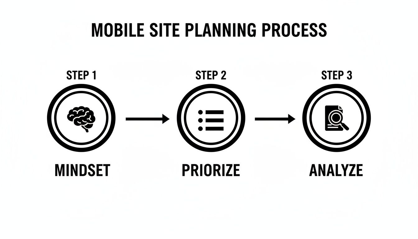
As the diagram shows, a great mobile experience begins long before you touch a line of code. It starts by getting inside your customer's head and understanding what they truly need from you when they're on their phone.
More Than Just Automation
This isn't just about building faster; it's about building with confidence. Business owners can now take their vision and make it a reality without a translator. They can ensure their site isn't just a pretty face but a powerful tool designed specifically for mobile users.
You are the expert on your business. AI simply acts as the skilled technician, bringing your expertise to life on a foundation of solid, mobile-first principles.
This hands-on, intuitive process takes the mystery out of creating a mobile website. It guarantees that what you build is not only functional and beautiful but also perfectly in sync with the mobile audience you worked so hard to understand.
Putting Speed and Accessibility First
Let’s be honest: a gorgeous mobile website that takes an eternity to load is just a pretty failure. When you're building for mobile, performance isn't some backend technicality—it's front and center in the user experience. For people on the go, every single millisecond matters, and a sluggish site is a direct hit to your reputation and your revenue.

The numbers don't lie. Unresponsive websites become digital ghost towns. A massive 73.1% of users will bail if a site performs poorly on their phone. It gets worse: 88.5% of people will abandon a site that’s slow to load, and if the experience is frustrating? A jaw-dropping 52% will write off that business for good.
Making Speed a Top Priority
So, what’s the usual culprit behind slow load times? Bloated code and massive, unoptimized images. These are two problems that are entirely fixable. In the past, developers would have to spend hours manually compressing every single image and meticulously cleaning up code.
Thankfully, we've moved past that. Modern platforms can automate this entire headache.
When you build with a tool like Alpha, for example, its AI engine automatically takes care of these technical optimizations behind the scenes. It intelligently compresses images to the perfect size without sacrificing quality and makes sure all the underlying code is as lean and efficient as possible. The result is a site that feels almost instant, delivering that snappy experience mobile users expect.
A one-second page load time can lead to a conversion rate nearly 40% higher than a site that takes just a few seconds longer. Speed isn't just a feature—it's your most effective sales tool.
This kind of automatic optimization is a huge advantage. It frees you from getting bogged down in technical details and lets you focus on what really matters: your content and your customers, all while knowing your site is built on a high-performance foundation.
Designing for Everyone: Why Accessibility Is Non-Negotiable
Just as important as speed is accessibility. An accessible website is one that everyone can use, including people with disabilities. This isn't just about ticking a compliance box; it's about opening your doors to a wider audience and creating an experience that's genuinely inclusive.
Making your site accessible comes down to a few core practices:
Use High-Contrast Colors: Make sure your text is easy to read against its background. That light gray text on a white background might look chic, but it’s a nightmare for many users.
Write Descriptive Alt Text: Every image needs a short, descriptive "alt text." This is what screen readers use to describe the image to visually impaired users, so it's essential context.
Keep Language Clear and Simple: Write content that's straightforward and easy to digest. Ditch the jargon and overly complicated sentences.
Create a Logical Structure: Use proper headings (H1, H2, H3) to organize your content. This gives both search engines and assistive technologies a clear roadmap to follow.
Accessibility is simply good design. We cover this in more detail in our complete guide on how to optimize your website for mobile. By making your site easy for everyone to use, you're not just doing the right thing—you're making a smart business move that ensures no potential customer is left behind.
Testing, Launching, and Measuring Your Success
Getting your website live isn't the finish line; it’s really just the starting block. After all the hard work planning, designing, and building, this is the moment your site finally meets the real world. A great launch isn’t about flipping a switch—it’s a process of careful testing, a smooth deployment, and then listening intently to what your users actually do.
The first, non-negotiable step is rigorous testing. Before any customer lays eyes on your site, you have to be confident it works flawlessly everywhere. Don't fall into the trap of thinking that just because it looks perfect on your new iPhone, it'll work on a three-year-old Android or a different browser. Building mobile sites that actually convert means creating a seamless experience for everyone.
Your Pre-Launch Testing Checklist
This is where you need to get your hands on as many physical devices as you can. Rope in friends, family, and colleagues—their phones are your best friends right now. For everything else, you can fill in the gaps with browser testing tools that emulate different screen sizes and operating systems. The goal here isn't just about squashing bugs; it's about finding those little frustrating UX hiccups before they start costing you sales.
Make sure you run through this essential checklist:
Device and Browser Compatibility: Get it working on popular iOS and Android devices. You absolutely need to check it on Chrome, Safari, Firefox, and Edge.
Core Functionality: Can people actually use the menu? Do all the buttons and links go where they're supposed to? Critically, can they fill out a form or complete a checkout without a single issue?
Performance Audit: Fire up a tool like Google's PageSpeed Insights and see how your site holds up on a simulated 4G connection. This is often where you find a massive image you forgot to compress.
Readability and Usability: Is the text big enough to read without squinting? Are the buttons and links spaced far enough apart to prevent those frustrating "fat-finger" mistakes?
A single broken link or a form that won’t submit on a Samsung phone can completely kill a customer's journey. Think of pre-launch testing as your insurance policy against easily preventable lost revenue.
Measuring What Matters After Launch
Once the site is live, your job shifts from building to understanding. Your analytics dashboard is no longer just a collection of numbers; it's direct, unfiltered feedback from your audience. Alpha makes this part easy with built-in analytics, so you can immediately start tracking the key performance indicators (KPIs) that show you how your mobile site is really doing.
Here are the key metrics you should be watching like a hawk:
Mobile Traffic vs. Desktop: What percentage of your visitors are actually on a mobile device? It's often more than you think.
Bounce Rate: Are mobile users hitting a page and leaving immediately? That’s a massive red flag for a bad user experience or slow load times.
Pages Per Session: Are people sticking around? A healthy number here shows your mobile visitors are engaged and exploring what you have to offer.
Conversion Rate: This is the big one. Are mobile users actually buying things, filling out forms, or doing what you want them to do? Knowing how to dig into this data is what separates a good site from a great one. For a deeper dive, check out our guide on how to increase website conversions.
This data-first mindset is what turns a website from a static digital brochure into a dynamic engine for growth. By constantly testing, measuring, and tweaking, you ensure your mobile site doesn't just launch well—it evolves with your customers, delivering a better experience and driving better results over time.
Frequently Asked Questions About Building for Mobile
Even with the best guide in hand, some questions always come up, especially when you're about to dive into building a new site. I hear the same handful of concerns from business owners all the time—mostly boiling down to cost, time, and technical headaches. Let's clear the air on those right now.
How Much Does It Cost to Create a Mobile Website?
This is usually the first question, and thankfully, the answer is a lot better than it used to be. Not too long ago, getting a custom, mobile-friendly website meant a bill for thousands of dollars and a team of pros on standby. That high-end custom route is still there for massive projects, but it's far from the only game in town.
Today, AI-powered builders have put professional-quality websites within reach for a tiny fraction of that cost. Instead of a huge upfront payment, you’re looking at a predictable monthly or annual subscription. This usually wraps in hosting, security, and updates, so you can budget effectively without worrying about surprise maintenance fees down the road.
Think of a mobile-first website not as an expense, but as an investment in your most important storefront. The right platform makes that investment smart and affordable from the jump.
How Long Does It Take to Build a Mobile-Optimized Site?
Time is money, right? The speed you can go from zero to a live site is probably the biggest advantage of modern web-building tech. A project that used to take weeks or even months of back-and-forth can now be knocked out in an afternoon. Seriously. With an AI platform like Alpha, you can have a complete, mobile-responsive first draft of your website generated in just a couple of minutes.
The whole process is incredibly straightforward:
Give it a prompt: Just describe your business in a sentence or two, or even paste a link to a website you like.
Let the AI work: The system instantly builds a structured, mobile-first layout filled with relevant text and images.
Tweak and personalize: From there, you just use simple text commands to make changes. Want a different color scheme? Need to add your own content? It's all done with plain English.
This new approach means you can go from a simple idea to a fully functional website, ready for launch, in just a few hours.
Do I Need to Know How to Code?
Nope. Not at all. This is probably the most profound change in web design over the past decade. The entire philosophy behind a platform like Alpha is to tear down the technical walls. You don't need to know the first thing about HTML, CSS, or JavaScript to create a site that looks and works great.
If you can write an email, you’ve got all the technical skill you need. The new way of building is simply describing what you want, like "make this button blue" or "add a section with three customer testimonials."
How Do I Make Sure My Site Works on All Phones?
That's a great question, and the answer is a concept called responsive design. Instead of trying to build dozens of different versions of your site for every phone and tablet out there, a responsive site automatically adjusts its layout to fit whatever screen it's on.
Good AI website builders, like Alpha, do this for you right out of the box. Every section, image, and button you add is built to be flexible from the start. This ensures a seamless experience whether someone is visiting on a tiny iPhone SE or a giant Android tablet. It leaves you free to focus on your business, knowing your website just works for every single visitor.
Ready to stop wondering and start building? With Alpha, you can create a stunning, high-performing mobile website in minutes. Just describe your business or drop in a URL you admire, and let our AI handle the rest.
Build beautiful websites like these in minutes
Use Alpha to create, publish, and manage a fully functional website with ease.