


How to Create Website Mockups People Actually Love
Learn how to create website mockups that bridge the gap between idea and reality. Our guide covers tools, principles, and developer handoff.
Build beautiful websites like these in minutes
Use Alpha to create, publish, and manage a fully functional website with ease.
Getting the right image size for web isn't some minor technical checkbox; it's one of the most important decisions you'll make for your site. More often than not, bloated, oversized images are the main culprit behind slow websites. And a slow site directly costs you visitors, conversions, and search engine rankings.
Think of it like trying to travel with way too much luggage. It slows you down, makes the journey frustrating, and you might miss your connection. Your website is that traveler, and impatient visitors definitely won't wait around.
Why Image Size Is a Critical Factor for Website Success

When people talk about "image size," they're usually talking about two different things that are closely related. Nailing this distinction is the first real step toward a faster, more effective website. It’s the foundation for everything else.
Dimensions vs. File Size
First, you have image dimensions, which we measure in pixels (px). This is simply how much space an image takes up on a screen—its width and height. A big, splashy hero image might be 1920 pixels wide, while a small product thumbnail could be just 300 pixels across.
Then you have file size, measured in kilobytes (KB) or megabytes (MB). This is the actual "weight" of the image file. It tells you how much data a visitor's browser has to download just to see that picture. It's entirely possible for two images to have the exact same dimensions but wildly different file sizes, all depending on the file type and how much it's been compressed.
The goal is to find that sweet spot: dimensions that look crisp and professional without creating a file so large it kills your site's performance.
Figuring this out isn't just a task for your developer; it has a real, measurable impact on your bottom line. Research has shown that a mere one-second delay in page load time can slash conversions by up to 7%. On an e-commerce site, that kind of delay can add up to thousands in lost sales. You can learn more about how to improve website loading speed in our detailed guide.
The Tangible Business Impact
When you get your image sizes right, the benefits go way beyond just looking good. You'll see real, tangible improvements in the areas that actually matter for your business.
Higher User Engagement: Pages that load instantly keep people on your site. When the experience is seamless, visitors are far more likely to click around, read your content, and actually engage with your brand.
Better SEO Rankings: Google has been very clear that page speed is a ranking factor. Faster websites create a better user experience, and search engines reward that with better visibility. It's as simple as that.
Increased Conversions: A fast, professional-looking website builds trust. Whether you're aiming for a sale, a lead, or a signup, a zippy experience removes friction and makes it easier for people to say "yes."
This guide is here to pull back the curtain on the whole process. We'll show you how to choose the right files from the start, even if you’re using a smart platform like Alpha that handles a lot of the heavy lifting for you. To really dig into the details, you can explore more on how to optimize images for web and boost both sales and SEO.
Choosing the Right Dimensions for Key Web Elements
Alright, let's move from theory to practice and figure out the right sizes for the most common images on your website. Every visual on your site has a specific job to do, and its dimensions need to match that purpose. This isn't about finding one perfect number; it's about understanding the thinking behind each recommendation.
A massive, full-width hero image has a completely different mission than a tiny product thumbnail. The hero image has to make a stunning first impression on a huge desktop monitor, while the thumbnail needs to be sharp and identifiable in a packed grid. Nailing these sizes from the get-go is a huge step toward a professional design and a fast-loading site.
One of the most important ideas to get comfortable with is aspect ratio. Just think of it as the shape of your image—the relationship between its width and height. A 16:9 ratio gives you that wide, cinematic feel, while a 1:1 ratio is a perfect square. Keeping your aspect ratios consistent stops your images from looking stretched or squished, which is a surefire way to look unprofessional.
Sizing Your Hero Image
Your hero image is your digital handshake. It’s often the first thing people see, so it has to look amazing. You’ll want it wide enough to stretch across modern desktop screens without turning into a pixelated mess. A good target for width is somewhere between 1920 pixels and 2560 pixels.
The height is a bit of a balancing act. It needs to feel grand, but not so tall that it shoves all your important content and call-to-action buttons "below the fold." The most common aspect ratio here is 16:9, which perfectly matches modern widescreen displays. So, for a 1920px wide image, the height would be 1080px.
Sizing Blog and Content Images
Images inside a blog post or on a service page don't need to be nearly as large as your main banner. Their job is to illustrate a point, break up walls of text, and add some visual interest. For a full-width image that sits inside your main content area, 1200 pixels wide is a great target.
This size is plenty big to look sharp on most screens but won't result in a massive file that drags down your page speed. For smaller images that sit next to a paragraph of text, you can shrink that down to 600-800 pixels wide.
Sizing E-commerce Product Photos
When it comes to e-commerce, consistency is everything. Your product photos should all share the same dimensions and aspect ratio to create a clean, organized, and shoppable grid. A square 1:1 aspect ratio is a hugely popular choice because it’s so versatile and looks great on both desktop and mobile.
A great starting point for product photos is 1080 x 1080 pixels. This provides enough detail for customers to zoom in and inspect your products without creating a massive file that slows down your category pages.
If you're trying to optimize images for very specific, high-resolution screens, it's always smart to check platform-specific guidelines. For instance, a detailed MacBook Wallpaper Size Guide can give you context on how to adapt visuals for different high-density displays.
Quick Reference for Common Web Image Dimensions
To make things even easier, I've put together a quick-reference table with my go-to dimensions. Think of this as a starting point to make sure every image on your site is perfectly sized for its role.
Image Type | Recommended Dimensions (Width x Height) | Common Aspect Ratio | Pro Tip |
|---|---|---|---|
Hero Image | 1920 x 1080 pixels | 16:9 | Ensure the main subject is centered so it doesn't get cropped on smaller screens. |
Blog Banner | 1200 x 630 pixels | ~1.91:1 | This size works perfectly for social media sharing previews on platforms like Facebook. |
Product Photo | 1080 x 1080 pixels | 1:1 | Use a consistent aspect ratio across all product images for a clean, uniform look. |
Logo | 250 x 100 pixels (rectangular) | 5:2 | Use a PNG file with a transparent background for maximum flexibility. |
Thumbnail | 400 x 400 pixels | 1:1 | Keep thumbnails small and efficient to ensure fast loading on gallery or blog pages. |
Use this cheat sheet as you build out your pages. Getting this right will contribute to a seamless and professional user experience that builds trust with your visitors.
Finding the Right Balance: Smart Compression and File Size
Even if you get the dimensions perfect, a bloated file size can still bring your site to a crawl. Think of it like a suitcase. You can pick the right size carry-on, but if you fill it with lead weights, you're not getting on the plane. Every visitor to your site has to "lift" that weight by downloading your images.
This is where image compression saves the day. It's the art of shrinking an image's file "weight"—its size in kilobytes (KB)—without a noticeable drop in visual quality. We're not changing the dimensions here; we're just making the file itself leaner and more efficient so it loads in a snap.
To pull this off, you have two main strategies. Understanding how they differ is the key to making your site's visuals both beautiful and fast.
Lossy vs. Lossless Compression
The two big players in the compression game are lossy and lossless. The names themselves give away the secret.
Lossy compression works by permanently tossing out some of the image data. It’s smart about it, though, ditching the bits of information our eyes are least likely to miss. This is what makes it so effective for photographs (like JPEGs and WebP), where you can achieve a massive reduction in file size without anyone noticing the difference.
Lossless compression, on the other hand, is more like a neat freak. It reorganizes all the image data into a more compact structure without throwing a single pixel away. When you open the file, it's put back together exactly as it was. This is perfect for logos, icons, and graphics with sharp lines and flat colors (like PNGs), where every detail counts. The catch? The file size reduction is much less dramatic.
A Simple Analogy: Think of lossy compression as a well-written summary of a novel—you get the full story, but some of the descriptive fluff is gone. Lossless is like vacuum-packing the book—all the pages are still there, just in a much tighter package.
The choice really comes down to the job the image is doing. For a complex hero photo, the huge file size savings from lossy compression are a no-brainer. But for your company logo, lossless is the only way to guarantee it stays perfectly crisp and artifact-free.
What's the "Right" File Size?
Okay, so what's the magic number? While there isn't one single answer, we have some solid benchmarks that will keep your pages snappy. Staying within these ranges is a huge part of good image size for web performance.
Here are some realistic targets to aim for:
Large Hero or Banner Images: Keep these heavy-hitters under 200 KB. They're the first thing people see and can be your biggest performance bottleneck.
Content and Blog Images: For those in-line visuals, shooting for under 150 KB is a great goal.
Product Photos: On e-commerce sites, every kilobyte counts. Aim for 100 KB or less to keep product grids loading instantly.
Thumbnails and Small Graphics: These should be feather-light, ideally under 50 KB.
Getting your images to hit these numbers used to involve a tedious cycle of exporting from a tool like Photoshop, checking the file size, and tweaking settings over and over.
Thankfully, we don't have to do that anymore. Modern platforms like Alpha have AI-powered optimizers built right in. You just upload your image, and the system automatically finds that perfect balance—applying the best compression to give you a lean, fast-loading visual without you having to lift a finger.
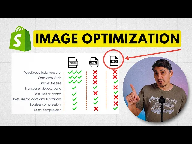
Choosing the Best Image Format: WebP vs. JPEG vs. PNG
Picking the right file format for your images is just as important as getting the dimensions right. It’s like choosing the right tool for a job. You wouldn't use a hammer to drive a screw, and you shouldn't use a PNG for a photograph.
Making the right choice between JPEG, PNG, and the newer WebP format is a strategic decision that directly impacts how fast your site loads and how good your visuals look. This isn’t just a technical footnote; it’s a core part of creating a great user experience.
The Classic Choices: JPEG and PNG
For a long time, JPEG and PNG were the two workhorses of the web, each serving a very different purpose.
JPEG (or JPG) has always been the standard for photographs. It uses a clever trick called "lossy" compression, which basically throws away tiny bits of image data that the human eye can't really detect. This makes file sizes much smaller, which is perfect for complex images with millions of colors, like a detailed product shot. The only real trade-off? JPEGs can't have a transparent background.
PNG, on the other hand, is the master of transparency. It uses "lossless" compression, which means it keeps every single pixel of the original data. This makes it the only real option for things like logos or icons that need to sit on a colored background without a clunky white box around them. The downside is that this dedication to quality often results in much larger files, especially for photos.
The Modern Champion: WebP
Then came WebP, a newer format from Google that completely changed the game. It was built from the ground up to be the best of both worlds, offering far better compression than JPEG while still supporting transparency like PNG.
The results are pretty staggering. WebP files are often 25-34% smaller than an equivalent JPEG image, with no noticeable difference in quality. For website speed—a known SEO ranking factor—that’s a massive win.
WebP handles transparency beautifully, too, often creating a much smaller file than a comparable PNG. For anyone using a modern platform like Alpha, this format is a secret weapon. The system automatically converts your uploads to WebP, giving you next-gen performance without you having to lift a finger. It’s a huge time-saver compared to older website builders where you'd be stuck managing and converting formats yourself.
Image Format Comparison: WebP vs. JPEG vs. PNG
To make the decision crystal clear, let's put these three formats side-by-side. Think of this table as your go-to reference for picking the perfect format for any situation.
Feature | WebP | JPEG | PNG |
|---|---|---|---|
Best Use Case | All web images | Photographs, complex images | Logos, icons, graphics with transparency |
File Size | Excellent (smallest) | Good (small) | Fair (can be large) |
Transparency | Yes | No | Yes |
Browser Support | ~97% of modern browsers | Universal | Universal |
Overall Quality | Excellent | Very Good | Excellent (lossless) |
While JPEG and PNG still have their specific uses, WebP is almost always the best choice for a modern website. With its near-universal browser support, the performance boost is just too good to pass up.
This is especially true for large, important visuals like background images. Most pros aim for a background image size of 1920 × 1080 pixels (a 16:9 aspect ratio) to cover common desktop screens. By saving an image of that size as a WebP, you can easily keep the file under 200 KB. That's a critical threshold for preventing the kind of slow load times that cause more than half of all mobile visitors to abandon a site. You can discover more insights about the practical guidelines that top e-commerce sites use to keep users engaged.
Delivering a Perfect Mobile Experience with Responsive Images
Ever tried to force a king-size mattress through a standard doorway? That’s pretty much what you’re doing when you send a huge desktop image to a mobile phone. It’s awkward, slow, and makes for a terrible experience. With over half of all web traffic now coming from mobile devices, you just can't afford to get this wrong.
This is where responsive images come into play. The whole idea is to serve up an image that’s just right for the user's screen, whether they're on a massive monitor or a small smartphone. You get a sharp, crisp visual that loads quickly without wasting a single kilobyte. The magic behind this is a handy bit of HTML called the srcset attribute.
Meet Srcset: Your Smart Image Waiter
Think of srcset as a clever waiter. A good waiter wouldn't just drop a family-sized feast in front of someone dining alone. They'd offer a small, medium, or large portion. The srcset attribute does the exact same thing for a web browser.
You give it a list of different-sized versions of the same image, each tagged with its width. The browser then looks at the user’s device, considers the screen size and connection speed, and picks the most suitable "portion" from the menu. The result? A lightning-fast experience for every visitor, which is a game-changer for mobile load times.
This flowchart shows how to pick the right starting format before you even start creating those different sizes.
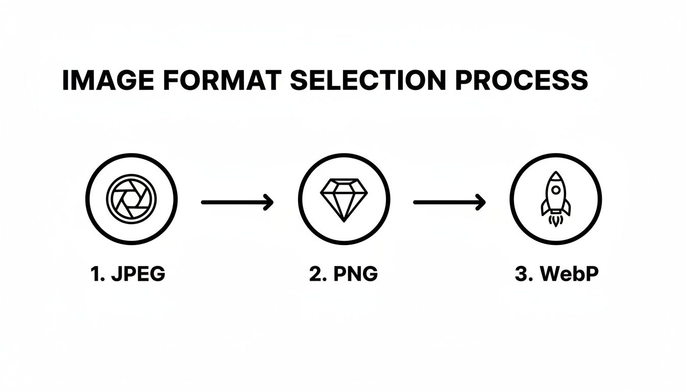
Starting with the best format means every single version in your srcset is already as lean as possible.
The Power of Automation in Modern Platforms
Let's be honest: creating multiple versions of every image and then hand-coding the srcset for each one would be a nightmare. We're talking about resizing images to widths like 400px, 800px, 1200px, and 1920px, and then wrestling with the HTML.
This is where a modern AI-powered platform like Alpha really shines. It handles this entire complex process for you, automatically. When you upload one high-quality image, the system gets to work behind the scenes.
Here’s what it does for you, instantly:
Automatic Resizing: It creates several perfectly optimized versions of your image at all the right dimensions.
Next-Gen Conversion: It converts these versions into the super-efficient WebP format where supported.
Code Generation: It writes all the
srcsetHTML for you, so browsers can instantly pick the right image.
This built-in automation guarantees a fast, tailored experience for everyone, on any device, without you having to lift a finger. You get all the SEO and user experience wins from responsive images with none of the manual grunt work.
To learn more about creating adaptable layouts, check out our complete responsive web design tutorial. This approach turns a daunting technical task into a seamless part of your workflow.
A Simple Workflow for Effortless Image Optimization
Putting all this theory into practice shouldn't feel like a chore. The real secret to keeping every image on your site lean, fast, and beautiful is building a simple, repeatable workflow. Having a solid process takes the guesswork out of the equation and, trust me, it saves a ton of time.
You can go one of two ways: manual, for those who love having precise control, or fully automated, for maximum efficiency. Neither approach is inherently better—it’s all about what works for you and your technical comfort level. The goal is to make optimization a natural part of your process, not an afterthought.
The Manual Control Route
If you're the type who likes to get hands-on, you'll want to prep your images before they ever get uploaded to your website. This method gives you total command over the final result.
Resize First: Before you do anything else, resize your image to match its final destination. A hero image doesn't need to be 5000 pixels wide if it's only displayed at 1920. Scale it down to what you actually need.
Compress Smartly: Once it's the right size, run the image through a compression tool. I'm a big fan of online services like TinyPNG or desktop apps like ImageOptim for shrinking file sizes without any noticeable drop in quality.
Upload and Deploy: Now you have a perfectly sized and compressed image, ready to upload. You can add it to your site knowing it's already optimized.
This method is fantastic for perfectionists, but it can get old fast if you're managing a site with hundreds of images. For that, automation is your friend.
The Automated Power Route
For pure efficiency, nothing beats letting a modern platform handle the heavy lifting. This "set it and forget it" approach delivers perfect results every time with zero manual effort.
Think of an automated system as your built-in optimization expert. You just give it a high-quality source image, and the platform intelligently handles resizing, compression, format conversion, and even generates all the responsive versions for you.
This is exactly how AI-powered builders like Alpha work. You upload one great image, and our system automatically creates perfectly optimized WebP versions for every device. It not only saves you hours of tedious work but also guarantees your image size for web is always on point for peak performance.
To see this in action, check out our complete guide on how to optimize images for the web. It's a workflow that delivers professional-grade results without the technical headache.
Your Top Web Image Sizing Questions, Answered
As we get to the end of this guide, you probably have a few specific questions buzzing around. Let's tackle some of the most common ones we hear from people building their own sites. Think of this as a quick cheat sheet to make sure you've got the key ideas down cold.
So, What's the Best All-Around Image Size?
If I had to give you one number, I'd say aim for 1200 pixels wide for most standard, full-width images on your site. For those big, impressive hero images that stretch across the whole screen, you'll want to bump that up to 1920 pixels wide.
There’s no single "magic" size, of course. The real trick is to think about the image's job on the page and size it accordingly.
What’s a Good Target for File Size?
This is where the rubber meets the road for site speed. You can have perfectly dimensioned images, but if they're huge in file size, they'll still drag your site down.
For most photos—like for a blog post or a product shot—try to keep them under 150 KB. For those larger hero images, do your best to stay under 200 KB. Hitting these numbers is all about smart compression, and it's totally achievable without making your images look grainy.
Your goal is always the smallest possible file size that still looks great. Nailing that balance is the absolute heart of image optimization.
Should I Be Using JPEG, PNG, or WebP?
Honestly, for almost everything on the web today, WebP is the way to go. It gives you the best of both worlds: it can handle photos with great compression like a JPEG and supports transparency like a PNG, but it does it all with a much smaller file size.
JPEGs still work fine for photos, and PNGs are great for simple logos, but switching to WebP is one of the easiest performance wins you can get.
Do I Need to Care About PPI or DPI?
Nope! You can completely ignore this. Pixels Per Inch (PPI) and Dots Per Inch (DPI) are terms for the printing world.
Web browsers couldn't care less about them. They only pay attention to the actual pixel dimensions (like 1200px wide by 800px tall). So, save yourself the headache and just focus on the pixel width and the final file size.
How Does All This Affect My SEO?
It has a huge impact. Google has been very clear that page speed is a ranking factor, and images are often the heaviest things on a page.
When you use properly sized, optimized images, your site loads faster. A fast, snappy site makes for a better user experience, which means people are less likely to get frustrated and leave. Search engines see those positive signals and reward you with better visibility.
Ready to build a website that handles all this optimization for you? With Alpha, you can upload your images and let our AI automatically resize, compress, and convert them for peak performance. Start building your high-speed website in minutes.
Build beautiful websites like these in minutes
Use Alpha to create, publish, and manage a fully functional website with ease.