How to Create Website Mockups People Actually Love
Learn how to create website mockups that bridge the gap between idea and reality. Our guide covers tools, principles, and developer handoff.

Build beautiful websites like these in minutes
Use Alpha to create, publish, and manage a fully functional website with ease.


In a multi-device world, a website that looks and functions flawlessly on any screen, from a 4K monitor to a smartphone, is no longer a luxury; it's the standard. Responsive design is the art and science of creating fluid layouts that adapt to the user's viewport, ensuring a seamless and engaging experience everywhere. But understanding the theory is one thing; seeing it executed masterfully is another.
What does exceptional responsive design actually look like in practice? It's more than just columns stacking on mobile. It's about thoughtful content prioritization, adaptive navigation, and performance optimization that feels intuitive to the end-user. The difference between a good website and a great one often lies in these subtle, device-aware adjustments. To further understand the foundational principles that make responsive design non-negotiable, explore these actionable tips on layout, responsiveness, and usability in web interface design.
This guide moves beyond generic praise to provide a tactical breakdown of what makes a design work. We have curated a list of platforms and resources where you can find thousands of powerful examples of responsive design. For each, we’ll analyze specific patterns, highlight strategic decisions, and present actionable takeaways you can apply to your own projects. You will find screenshots and direct links to see these designs in action. We'll explore how top-tier sites handle everything from complex data tables to immersive hero sections, giving you a blueprint for building truly user-centric digital experiences.
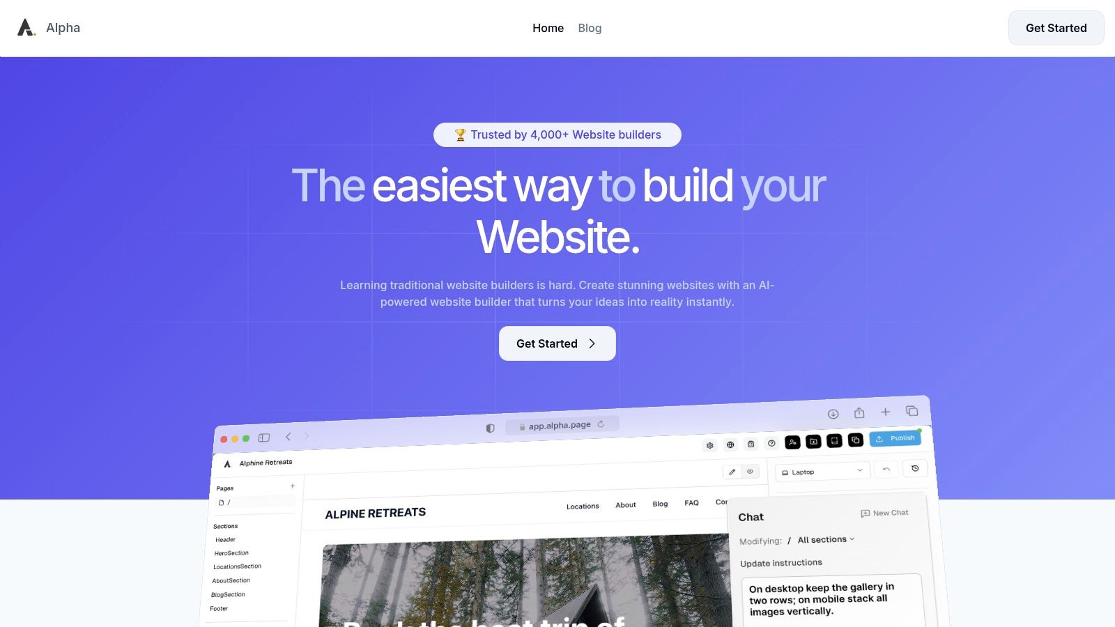
1. Alpha
Alpha represents a paradigm shift in how responsive websites are created, moving beyond manual adjustments to an AI-first, automated approach. While not a traditional "example" of a single finished website, Alpha is a powerful platform for generating countless examples of responsive design in minutes. Its core innovation lies in its ability to produce fluid, mobile-first layouts with minimal user input, making it an essential tool for entrepreneurs, startups, and marketers who need professional results without a steep learning curve.
The platform’s standout capability is its URL "copy" feature. Users can input the URL of any existing website, and Alpha’s AI analyzes its structure, content, and styling to generate a new, fully responsive, and customizable version. This process democratizes high-quality design, allowing anyone to replicate sophisticated layouts and adapt them to their own brand identity. By handling the complexities of breakpoints, media queries, and asset optimization automatically, Alpha ensures every site it produces looks and functions flawlessly across desktops, tablets, and smartphones by default.
Strategic Analysis: AI-Driven Responsive Architecture
Alpha’s approach provides a significant strategic advantage: speed and consistency. Traditional responsive design is often a process of iteration and compromise, requiring developers to manually test and tweak layouts for various screen sizes. Alpha automates this, ensuring that design integrity is maintained universally from the start.
Key Takeaway: The platform’s engine is engineered to prioritize a logical content hierarchy. It intelligently reflows complex multi-column desktop layouts into clean, single-column vertical stacks for mobile, ensuring that calls-to-action, key information, and navigation remain intuitive and accessible on smaller screens.
This built-in mobile optimization means users can focus on their content and business goals rather than technical implementation. The natural-language editing feature further simplifies the process; you can instruct the AI assistant with commands like, "Make this section's background blue and increase the font size of the header," and the changes are applied in real-time.
How to Replicate Its Patterns
While Alpha’s AI is proprietary, you can adopt its core principles in any project. The key is to build with a component-based, mobile-first mindset.
Start with Mobile: Design the single-column layout for the smallest screen first. This forces you to prioritize essential content and create a clean user flow.
Use a Fluid Grid: Employ a flexible grid system (like CSS Grid or Flexbox) that allows elements to resize and reflow gracefully as the viewport expands.
Implement Logical Breakpoints: Instead of targeting specific devices, add breakpoints where the content naturally "breaks" or looks crowded. This ensures your design adapts to any screen size, not just common ones.
Platform Breakdown & Pricing
Alpha’s offering is structured to scale with business needs, making it accessible for projects of all sizes. The transparent pricing and feature-rich plans provide a clear path from a simple landing page to a multi-page business site.
Plan | Monthly Price | Key Features | Best For |
|---|---|---|---|
Free Starter | $0 | 1 page, Alpha subdomain | Testing the platform or a personal project |
Mini | $9 | 2 pages, custom domain, 100 AI credits | Solopreneurs or a simple portfolio site |
Basic | $25 | Up to 15 pages, 300 AI credits, CMS (beta) | Small businesses and growing startups |
Note: Annual billing offers approximately a 20% discount.
Pros:
Unmatched Speed: Generate a fully responsive, professional site in minutes using AI.
No-Code Simplicity: Natural-language editing makes design accessible to non-technical users.
Conversion-Ready: Built-in forms, analytics, and optimized layouts help capture leads.
Affordable Entry: A free plan and low-cost tiers lower the barrier to a professional web presence.
Cons:
Limited Customization for Power Users: Fewer developer tools and plugins compared to platforms like WordPress.
Emerging Features: The CMS is still in beta, which may be a limitation for content-heavy sites.
For those looking for excellent examples of responsive design that can be created and deployed with maximum efficiency, Alpha is an indispensable tool. It proves that high-quality, adaptive web design is no longer exclusively the domain of seasoned developers.
Website: https://www.alpha.page
2. ThemeForest (Envato Market)
ThemeForest by Envato Market isn't a single website showcasing one design but rather a massive marketplace containing tens of thousands of them. It serves as a living library of responsive design patterns, making it an invaluable resource for anyone seeking inspiration, a pre-built foundation, or a clear look at current web trends across different industries and technologies. Instead of just one example, you get access to a near-infinite collection.
The platform's primary strength is its sheer volume and diversity. You can find production-ready responsive layouts for virtually any use case, from corporate portfolios and e-commerce stores to niche blogs and complex admin dashboards. This makes it one of the best places to see examples of responsive design applied in real-world business contexts.
Strategic Analysis: Using a Marketplace for Research
ThemeForest’s true value lies in its live preview and filtering capabilities. You can instantly see how a theme adapts to different viewport sizes by resizing your browser window on the "Live Preview" page. This hands-on interaction is far more insightful than static screenshots.
Key Takeaway: Use ThemeForest not just to buy themes, but as a competitive analysis tool. Filter by "best sellers" or "newest" in your specific industry to see what design patterns are currently popular and commercially successful. This gives you a direct line of sight into what customers are responding to right now.
The marketplace structure also provides built-in quality indicators. You can evaluate a theme's effectiveness by looking at its sales numbers, user ratings, and the recency of its last update. This data helps you distinguish between fleeting trends and battle-tested, reliable responsive layouts.
How to Leverage ThemeForest for Your Projects
Here are some practical tips for using the platform effectively:
Filter with Precision: Start by filtering by technology (e.g., WordPress, React, HTML/CSS) and then by category (e.g., Corporate, Retail, Technology). This narrows down the immense selection to relevant examples.
Study the "Live Preview": Don't just look at the desktop view. Drag the browser window to tablet and mobile widths. Pay close attention to how navigation menus collapse, how multi-column layouts stack, and how call-to-action buttons are prioritized on smaller screens.
Check Author History: A theme from an author with a long history of well-supported, highly-rated products is a safer bet. Check their portfolio and support response times in the comments section.
Understand Licensing: ThemeForest offers clear licensing (Regular vs. Extended) which is crucial if you plan to use a theme for a client project. The Regular License covers use in a single end product which is not sold.
Feature | Description |
|---|---|
Pricing | Varies by theme; typically $19 to $79 for a Regular License. |
Access | Free to browse and preview; purchase required to download files. |
Support | Typically 6 months of author support included, with options to extend. |
Selection | Massive, covering HTML, WordPress, React, Vue, Shopify, and more. |
By using ThemeForest as a research tool, you can gather a wealth of ideas and see proven examples of responsive design that are actively succeeding in the market.
Website: https://themeforest.net
3. Webflow (templates + Showcase/Cloneables)
Webflow is more than just a website builder; it's an interactive ecosystem for creating, sharing, and learning about professional-grade web design. Its combination of a curated template marketplace and a vibrant "Made in Webflow" Showcase makes it a unique destination for hands-on exploration. You aren't just looking at static images of layouts; you can clone entire, fully functional responsive projects directly into a visual editor to see precisely how they were built.
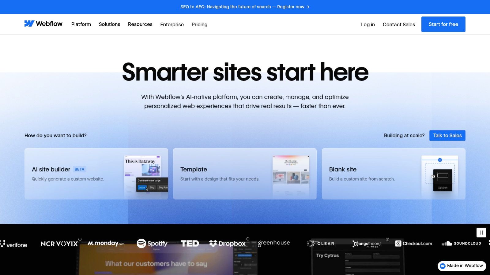
The platform’s major advantage is this direct bridge from inspiration to implementation. You can find beautiful examples of responsive design in the Showcase, filter for those that are "Cloneable," and with a single click, have the entire project in your own Webflow workspace. This allows for unparalleled reverse-engineering, letting you dissect complex interactions, fluid layouts, and breakpoint-specific adjustments without writing a line of code.
Strategic Analysis: Learning by Deconstruction
Webflow’s "Cloneables" turn responsive design from a theoretical concept into a tangible, editable system. Unlike a static theme where you can only see the final result, a cloneable project gives you full access to the underlying structure, styling, and interaction settings across all device breakpoints (desktop, tablet, mobile landscape, and mobile portrait). This is an incredibly powerful way to learn advanced techniques.
Key Takeaway: Use the "Made in Webflow" Showcase to find and clone projects that solve a specific responsive challenge you're facing. For instance, if you're struggling with a complex navigation bar or a grid-based portfolio, search for cloneables that have already perfected that element and learn from their structure.
This approach dramatically shortens the learning curve. Instead of starting from a blank canvas, you can build upon the work of experienced designers, ensuring your project incorporates proven, effective responsive patterns from the very beginning.
How to Leverage Webflow for Your Projects
Here are some practical tips for using the platform effectively:
Explore the Showcase: Filter the "Made in Webflow" section by "Cloneable" to find free projects you can duplicate. Look for designs that are tagged with keywords relevant to your needs, like "portfolio," "e-commerce," or "SaaS."
Deconstruct in the Designer: Once you clone a project, open it in the Webflow Designer. Use the device icons at the top of the canvas to switch between breakpoints. Click on different elements to see how their styles (like size, margin, or display settings) change for each view.
Study the Navigator Panel: Pay close attention to the Navigator panel on the left. This shows the HTML-like structure of the page. You can see how designers use divs, containers, and Flexbox or Grid settings to create fluid, adaptable layouts.
Start with a Template: If you need a full site, the official Template Marketplace offers high-quality, production-ready designs. These are guaranteed to be fully responsive and provide a solid foundation for any business. For a deeper understanding of the principles involved, you can follow this detailed responsive web design tutorial.
Feature | Description |
|---|---|
Pricing | Templates typically $49 to $149; many Cloneables are free. Site plans required for hosting. |
Access | Free to browse, sign up, and clone projects. Paid plans needed for custom domains and advanced features. |
Support | Strong community forum, Webflow University tutorials, and email support for paying customers. |
Selection | Hundreds of premium templates and thousands of free community-made Cloneable projects. |
By treating Webflow as an interactive learning lab, you can go beyond simple inspiration and gain practical skills from real-world examples of responsive design.
Website: https://webflow.com
4. Awwwards
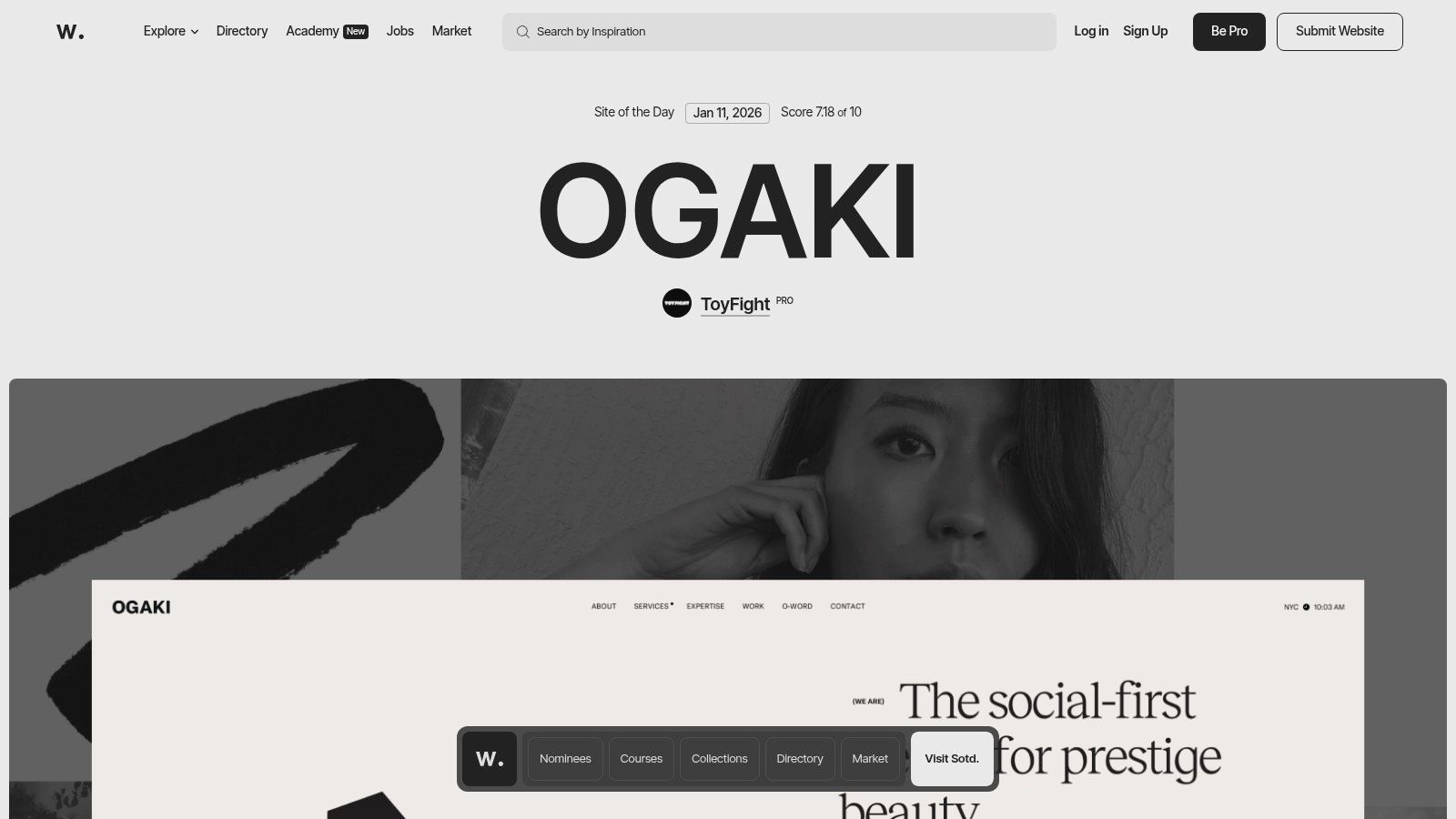
Awwwards is an internationally recognized awards body that highlights the talent and effort of the best web designers, developers, and agencies in the world. It operates as a curated inspiration hub rather than a marketplace, showcasing best-in-class websites that often push the boundaries of digital creativity and user experience. For those looking for cutting-edge examples of responsive design, Awwwards is an essential resource for seeing what's possible.
The platform's strength lies in its high editorial bar. Every featured site has been vetted by a jury of experts, ensuring that the examples you see are not just functional but are also at the forefront of modern design trends. Its dedicated "Responsive Design" collection provides a filtered view of projects that excel specifically in their multi-device implementation.
Strategic Analysis: Using an Awards Gallery for Trendspotting
Awwwards is most valuable as a trend forecasting and competitive research tool. By studying the "Site of the Day" or browsing collections, you can identify emerging patterns in responsive layouts, interactions, and animations before they become mainstream. It allows you to see how top-tier agencies and brands are solving complex design challenges on different screen sizes.
Key Takeaway: Use Awwwards to deconstruct award-winning designs. Analyze how they handle navigation on mobile versus desktop, what kind of typography scales effectively, and which interactive elements survive the transition to smaller viewports. This provides a masterclass in modern, sophisticated responsive techniques.
The platform also provides rich context for each submission, including the agency behind the work, the technologies used, and scores across different criteria like design, usability, and creativity. This insight helps you understand the 'why' behind the design choices, making it more than just a gallery of pretty pictures.
How to Leverage Awwwards for Your Projects
Here are some practical tips for using the platform effectively:
Explore the Collections: Dive into specific categories like "Responsive Design," "Mobile Excellence," or industry-specific tags to find highly relevant examples.
Study the Nuances: Pay close attention to micro-interactions, page transitions, and loading animations. See how these details are adapted or simplified for mobile to maintain performance. A deeper understanding of these techniques can help you optimize your website for mobile.
Follow Top Agencies: Identify agencies and designers whose work consistently resonates with you. Following their portfolios can provide a steady stream of high-quality inspiration.
Analyze Technology Stacks: Check the "Tech Specs" listed for each site to see what frameworks and libraries are being used to achieve these advanced responsive effects.
Feature | Description |
|---|---|
Pricing | Free to browse. Pro plans offer advanced features ($150/year). |
Access | Full public access to browse award-winning site examples. |
Support | Not applicable; it's a gallery, not a service or product marketplace. |
Selection | Highly curated, editorially chosen websites from top global talent. |
By treating Awwwards as an educational resource, you can stay ahead of design trends and gather inspiration from the best examples of responsive design on the web.
Website: https://www.awwwards.com
5. CodePen
CodePen is a social development environment for front-end designers and developers. It’s an online code editor and open-source learning environment, where developers can create and deploy a website, show off their work, build test cases to learn and debug, and find inspiration. For those studying responsive design, it functions as a vast, interactive library of live code snippets, components, and full-page layouts that can be examined, forked, and modified directly in the browser.
Unlike polished, production-ready marketplaces, CodePen is a raw, community-driven platform. It provides thousands of hands-on examples of responsive design, from simple CSS Grid layouts and fluid typography to complex animations and interactive components that adapt to different viewports. Its strength lies in this immediacy, allowing you to not just see the result but to instantly dissect and experiment with the underlying HTML, CSS, and JavaScript.
Strategic Analysis: Learning Through Direct Interaction
The core value of CodePen is its "fork" functionality. You can find a "Pen" demonstrating a responsive navigation menu, click "Fork," and immediately start changing CSS media queries, adjusting grid properties, or rewriting JavaScript to see how your changes affect the outcome. This active, hands-on approach dramatically speeds up the learning process for specific responsive patterns.
Key Takeaway: Use CodePen as a technical playground to deconstruct complex responsive techniques. Search for specific patterns like "responsive pricing table" or "CSS Grid mobile" to find working models. Forking these examples allows you to learn by doing, which is far more effective than just reading about them.
The community aspect also provides a constant stream of new ideas and solutions. Following talented developers or searching popular Pens keeps you updated on modern CSS properties and innovative JavaScript approaches to responsive challenges. Many Pens are experimental, pushing the boundaries of what’s possible in a browser.
How to Leverage CodePen for Your Projects
Here are some practical tips for using the platform effectively:
Search for Specific Components: Instead of looking for full websites, search for the individual components you need, such as "responsive card layout," "collapsible mobile nav," or "fluid SVG."
Use the "Fork" Feature Liberally: Don't be afraid to break things. Fork any Pen that interests you and experiment with its code. This is the fastest way to understand the logic behind a responsive solution.
Analyze Different Approaches: Search for the same component (e.g., "responsive gallery") and compare several popular Pens. You'll see different solutions using Flexbox, Grid, or even older float-based methods, giving you a broader understanding of the options.
Embed for Previews: Use the embed feature to share interactive mockups with clients or team members. This allows them to see and interact with a responsive component directly, rather than relying on static images.
Feature | Description |
|---|---|
Pricing | Free plan available with public Pens. PRO plans start from $8/month (billed annually) for private Pens, asset hosting, and collaboration features. |
Access | Free to browse, create public Pens, and fork. PRO account needed for advanced features. |
Support | Community-based support through forums and documentation. Direct support available for PRO users. |
Selection | Millions of user-generated Pens covering every imaginable front-end technique. |
By treating CodePen as an interactive code laboratory, you can quickly find and master the specific examples of responsive design needed to solve real-world problems in your own projects.
Website: https://codepen.io
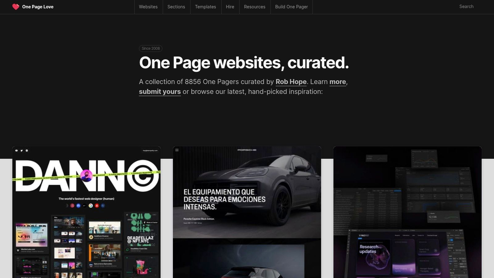
6. One Page Love
One Page Love is a highly curated gallery dedicated to the art of the single-page website. By focusing exclusively on this format, it has become an exceptional resource for studying conversion-focused and narrative-driven responsive design. It showcases how a complete user journey, from introduction to call-to-action, can be effectively contained within a single, scrolling experience, making it a goldmine for anyone building landing pages, portfolios, or event sites.
This platform excels at isolating specific, high-impact design patterns. Instead of analyzing entire complex websites, you can find hundreds of examples of responsive design focused on critical components like hero sections, pricing tables, and contact forms. This makes it an invaluable tool for designers and marketers who need to perfect these crucial conversion points.
Strategic Analysis: Mastering Conversion-Focused Patterns
The core strength of One Page Love is its tight curation and categorization. You can browse collections specifically dedicated to patterns like "Pricing Tables" or "Hero Sections," allowing you to compare dozens of different responsive solutions for the same problem. This focused approach helps you quickly identify effective layouts for guiding user attention and driving action on any device.
Key Takeaway: Use One Page Love to deconstruct successful conversion funnels. Analyze how top-rated single-page sites arrange their social proof, feature lists, and calls-to-action. Pay attention to how these elements are re-stacked and prioritized on mobile to maintain a clear narrative flow without overwhelming the user.
Many of the featured sites link directly to templates available on platforms like Webflow, Framer, or HTML marketplaces. This provides a direct path from inspiration to implementation, as you can see a proven design and then immediately access the tool or template used to build it.
How to Leverage One Page Love for Your Projects
Here are some practical tips for using the platform effectively:
Drill Down by Use Case: Don't just browse the main feed. Use the navigation to explore specific categories like "Landing Page" or "Portfolio" to find hyper-relevant examples for your project.
Study the "Most Loved" Section: This section acts as a crowdsourced filter for the most impactful and well-executed designs. It's a great starting point to see what resonates most with a design-savvy audience.
Analyze the Mobile-to-Desktop Flow: Open a featured site and resize your browser. Note how the navigation transforms from a sticky header to a hamburger menu and how multi-column feature blocks collapse into a single, digestible vertical list.
Follow the Template Links: When you find a design you like, click through to see the template it's based on. This can provide a fast track to building a similar layout and helps you understand the underlying technology (e.g., Webflow, Carrd).
Feature | Description |
|---|---|
Pricing | Free to browse all curated examples and articles. |
Access | Instant and free access to the entire inspiration gallery. |
Support | Not applicable for the gallery; support for templates is handled by the third-party creator. |
Selection | Hundreds of curated single-page websites and links to templates for HTML, Webflow, Framer, and more. |
By treating One Page Love as a pattern library for high-conversion elements, you can find proven examples of responsive design to build more effective landing pages and focused user experiences.
Website: https://onepagelove.com
7. Creative Market
Creative Market is more than just a template marketplace; it's a comprehensive ecosystem for digital assets. While it offers thousands of responsive website themes, its true strength lies in providing the supporting elements needed to build a complete brand identity, from UI kits and fonts to icons and mockups. This makes it a one-stop shop for projects that require a cohesive visual system alongside a functional, responsive layout.
The platform is an excellent place to find well-crafted examples of responsive design that are part of a larger, professionally designed family of assets. This holistic approach helps ensure brand consistency across all digital touchpoints, from the website's mobile view to the social media graphics promoting it.
Strategic Analysis: Sourcing a Complete Design System
Creative Market’s value proposition is its integration of templates with corresponding design assets. Many creators sell website themes alongside matching Figma UI kits, social media templates, and font pairings. This allows you to source a responsive website and the tools to manage its brand identity in one place, streamlining the entire design process.
Key Takeaway: Use Creative Market when your project demands more than just a template. Look for product "bundles" or creators who offer a suite of related assets. This approach is highly efficient for building a consistent brand experience and is particularly useful for projects that follow a mobile-first design philosophy. To learn more about this approach, you can explore the principles of a mobile-first design strategy.
The platform’s clear licensing tiers (Personal, Commercial, Extended Commercial) are also a significant advantage, especially for agency or client work. This transparency removes ambiguity around usage rights, making it simpler to deliver projects that are both well-designed and legally compliant.
How to Leverage Creative Market for Your Projects
Here are some practical tips for using the platform effectively:
Explore Creator Shops: Instead of just searching for templates, visit the storefronts of individual creators. High-quality shops often offer a consistent aesthetic across all their products, making it easy to find matching assets.
Review Live Demos Thoroughly: Like other marketplaces, always test the live preview. Pay attention to how the design adapts, but also note the typography, iconography, and overall visual language to see if it aligns with the brand you're building.
Check Ratings and Update History: Quality can vary between sellers. Prioritize products from established creators with high ratings and a record of recent updates to ensure you're getting a modern, well-supported asset.
Understand What's Included: Read the product descriptions carefully. Some templates may require you to purchase plugins or fonts separately to fully replicate the live demo.
Feature | Description |
|---|---|
Pricing | Varies by asset; templates often range from $29 to $99. |
Access | Free to browse; purchase required to download and use assets. |
Support | Varies by shop owner; check individual product pages for details. |
Selection | Diverse, including HTML, WordPress, Webflow, Figma, and brand assets. |
By approaching Creative Market as a source for complete design systems, you can find unique examples of responsive design that come with all the components needed for a polished final product.
Website: https://creativemarket.com
7-Example Responsive Design Comparison
Tool | Implementation Complexity 🔄 | Resource Requirements ⚡ | Expected Outcomes ⭐📊 | Ideal Use Cases 💡 | Key Advantages |
|---|---|---|---|---|---|
Alpha | 🔄 Very low — AI-driven, no coding required | ⚡ Low cost (Free → $25/mo); minimal technical skills; tier limits | ⭐⭐⭐⭐ — Fast, conversion-focused responsive sites with analytics 📊 | Small businesses, founders, quick landing pages, MVPs | URL “copy” + natural-language edits, one-click publish, built-in forms |
ThemeForest (Envato) | 🔄 Medium — template integration and possible customization | ⚡ Moderate — per-template purchase; may need dev time for setup | ⭐⭐⭐ — Production-ready templates vary by author; measurable with reviews 📊 | Agencies, developers, diverse stack projects needing quick starts | Massive selection across stacks; clear licensing and previews |
Webflow (templates & cloneables) | 🔄 Low–Medium — visual editor; platform lock-in for export | ⚡ Moderate — template cost + Webflow hosting/plan for publish | ⭐⭐⭐⭐ — High-fidelity live sites; CMS and hosting integrated 📊 | Designers wanting no-code deployment, learning via cloneables | Cloneables + visual editor, direct deploy to hosting, many free examples |
Awwwards | 🔄 Very low — browse-only inspiration and curated examples | ⚡ Low — free browsing; some paid pro/academy features | ⭐⭐⭐⭐ — High-quality, cutting-edge responsive pattern exposure 📊 | Research, competitive analysis, creative direction for agencies | Editorially curated, juried awards; trend-focused examples |
CodePen | 🔄 Low for prototyping; medium to productionize (refactoring often needed) | ⚡ Low — free for most use, PRO for private/collab features | ⭐⭐⭐ — Live, editable examples ideal for components; variable production readiness 📊 | Hands-on learning, prototyping UI patterns, demos | Forkable live code, rapid experimentation, strong community |
One Page Love | 🔄 Low — curated gallery of one-page designs | ⚡ Low — browse free; templates often link to external purchases | ⭐⭐⭐ — Focused conversion-ready one-page patterns 📊 | Landing pages, hero/pricing modules, campaign funnels | Curated one-page focus; practical UX patterns for conversion |
Creative Market | 🔄 Medium — templates plus design asset integration | ⚡ Moderate — per-item purchases; includes Figma/UI kits and assets | ⭐⭐⭐⭐ — Complete brand + template packages; requires assembly 📊 | Projects needing templates plus UI kits, branding assets | Wide asset variety (icons, fonts, Figma), clear license tiers |
Bringing Your Responsive Vision to Life
Throughout this deep dive into exceptional examples of responsive design, a clear pattern emerges. The most effective websites are not just mobile-friendly; they are device-agnostic, providing a seamless, intuitive, and engaging experience regardless of how a user accesses them. We've deconstructed layouts from a variety of industries and explored diverse patterns, from the mostly fluid grids seen on minimalist portfolios to the sophisticated column control used in complex e-commerce platforms.
The journey from inspiration to implementation is where many projects face their biggest hurdles. You've seen stunning designs on Awwwards and functional, replicable patterns on CodePen, but the critical question remains: how do you translate these ideas into a tangible, high-performing website for your own business without getting lost in technical complexities? The answer lies in bridging the gap with the right tools and a strategic workflow.
From Analysis to Action: Core Principles Revisited
Before you start building, let's crystallize the most important takeaways from the examples we've analyzed. Successful responsive design isn't just about shrinking content; it's about strategic adaptation.
Here are the core principles to carry forward:
Prioritize Performance: A responsive site that loads slowly on a mobile network is counterproductive. Optimize images, minify code, and prioritize loading above-the-fold content first. Fast-loading pages are a cornerstone of a positive user experience.
Embrace Strategic Simplification: Mobile users need a focused experience. The best designs gracefully hide or reconfigure secondary navigation, collapse complex forms, and ensure calls-to-action are prominent and easily tappable.
Maintain Brand Consistency: While the layout changes, your brand identity must not. Colors, typography, and tone should remain consistent across all devices to build trust and recognition.
Focus on Readability and Navigation: The primary goal is to help users find what they need. Pay close attention to font sizes, line height, and contrast on smaller screens. Ensure navigation is intuitive, whether it's a hamburger menu or a simplified header bar.
Choosing Your Implementation Path
The tools and platforms we've explored, such as Webflow's cloneables, ThemeForest's templates, and the snippets on CodePen, offer different pathways to achieving these goals. Your choice depends on your specific needs, technical comfort level, and project timeline.
Consider these factors when selecting your tool:
Speed vs. Customization: Are you looking to launch as quickly as possible, or do you require deep customization? Pre-built templates from ThemeForest or Creative Market offer speed, while platforms like Webflow provide a powerful visual canvas for more bespoke designs.
Learning Curve: How much time can you invest in learning a new platform? A solution like Alpha is designed for speed and ease of use, leveraging AI to handle the heavy lifting, whereas mastering the full potential of Webflow or custom coding requires a greater time commitment.
Future Scalability: Think about your business's future needs. Will you need to add e-commerce functionality, a blog, or complex integrations down the line? Ensure your chosen platform can grow with you.
The Final Step: Rigorous Testing
Once your responsive design is implemented, your work isn't finished. Rigorous testing is non-negotiable. A design that looks perfect on your desktop and a single mobile device might break on a different screen size or browser. This is where understanding how to test your website on different devices becomes absolutely crucial to guaranteeing a flawless and professional user experience for every visitor. Use a combination of browser developer tools, online emulators, and real-device testing to catch and fix any layout issues, ensuring your vision truly comes to life for everyone.
Ultimately, the best examples of responsive design serve as a powerful reminder that great design is about solving problems for the user. By focusing on clarity, speed, and usability across every touchpoint, you can create a digital presence that not only looks impressive but also drives results for your business.
Ready to stop studying and start building? Use the inspiration you’ve gathered today and let Alpha transform it into a fully responsive, production-ready website in minutes. Simply provide a URL of a design you admire, and let our AI engine generate the foundational code and layout, so you can focus on what matters most: your content and your customers. Try Alpha today and bring your vision to life.
Build beautiful websites like these in minutes
Use Alpha to create, publish, and manage a fully functional website with ease.