


How to Create Website Mockups People Actually Love
Learn how to create website mockups that bridge the gap between idea and reality. Our guide covers tools, principles, and developer handoff.
Build beautiful websites like these in minutes
Use Alpha to create, publish, and manage a fully functional website with ease.
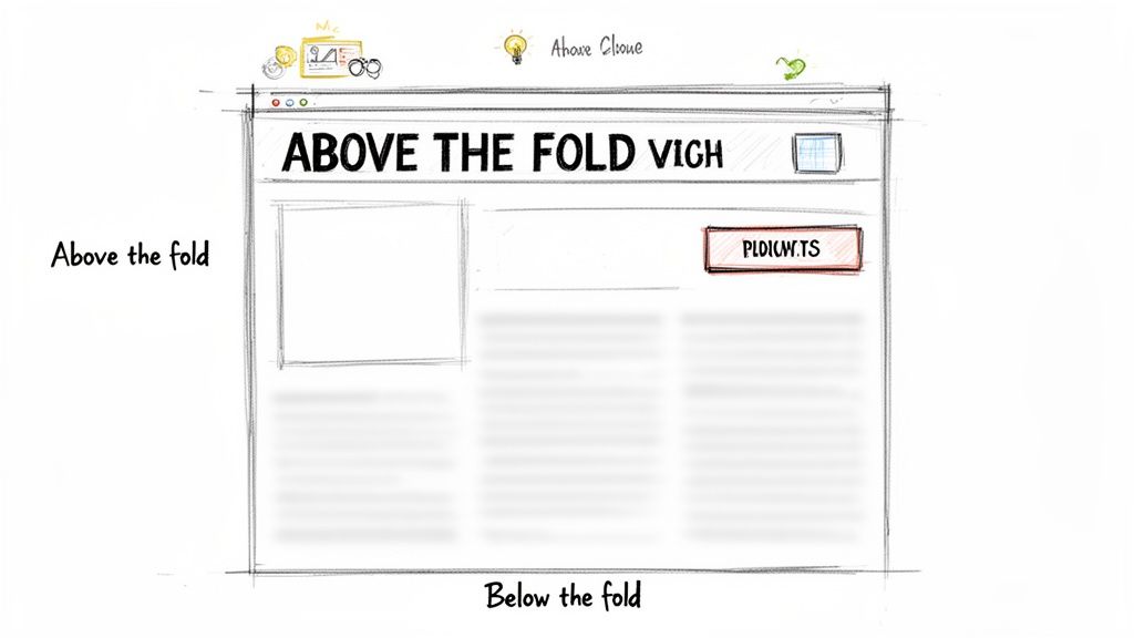
When we talk about what’s above the fold on a website, we’re referring to everything a person sees on their screen before they have to scroll down. Think of it as your website's first impression—that split-second chance to convince a visitor to stick around or click away.
Your Website's Most Valuable Real Estate
The term "above the fold" actually comes from the old-school newspaper business. Editors would strategically place their most gripping headlines and eye-catching photos on the top half of the front page. This was the part people saw when the paper was folded on the newsstand, and it had one job: grab your attention and make you buy the paper.
That same principle is alive and well online, but the timeline has shrunk dramatically. You don't have a few moments for a casual glance; you have milliseconds.
The 50 Millisecond Judgment
It's almost hard to believe, but research has shown that people form an opinion about your website in just 50 milliseconds (0.05 seconds). That's a snap judgment based almost entirely on what they see above the fold, often before they've even had a chance to read a full sentence. You can read more about this phenomenon on Arfadia.com.
This tiny window makes the above-the-fold section incredibly powerful. It's where you:
Set Expectations: Instantly show visitors they’ve landed in the right place by clearly stating what you do.
Drive Engagement: Give people a compelling reason to scroll down and see what else you have to offer.
Boost Conversions: Place your most important call-to-action (CTA) where it’s guaranteed to be seen, directly impacting your sign-ups and sales.
In essence, what users see first dictates their entire journey. A poorly designed above-the-fold section leads to high bounce rates, as visitors leave without ever seeing the valuable information you've placed further down the page.
The Foundation of Digital Success
Getting this prime digital real estate right isn’t just about making things look pretty; it's a core business strategy. It’s where you build trust, convey your brand's personality, and guide users toward the action you want them to take.
Every element, from the headline to the hero image, needs to work together to create a cohesive and persuasive first impression. This careful arrangement is the heart of a strong visual hierarchy in web design.
Ultimately, ignoring your above-the-fold content is like hiding the front door to your shop. It doesn't matter how amazing your products are inside if nobody can figure out why they should come in.
From Newspapers to Pixels: How the Fold Evolved
The whole idea of being "above the fold" comes from old-school newspapers. Editors knew that the most eye-catching headline had to sit on the top half of the front page—the part visible when the paper was folded in a newsstand. It was a simple, static rule for a physical product.
Fast forward to today, and that simple line has become a moving target. The core principle, though? It’s exactly the same. You have to grab attention with what people see first.
The first big leap was from print to desktop computers. For a long time, designers had a pretty good idea of what they were working with, usually a standard 1024x768 pixel screen. But then came the device explosion. Suddenly, we had massive monitors, tablets, and a dizzying array of smartphone sizes. The one-size-fits-all "fold" was gone forever; now, it’s a fluid boundary that’s different for almost every single visitor.
The Mobile-First World We Live In
This massive shift in screen sizes forced a new way of thinking: mobile-first design. With most people now browsing on their phones, it just makes sense to start with the smallest screen and work your way up. On a smartphone, the above-the-fold space is tiny. You've got just a few precious inches to make an impression.
This isn't a limitation; it's a filter. It forces you to be ruthlessly efficient with your message. Designing for mobile first means you have no choice but to nail down your most important headline, your main call-to-action, and the one visual that tells your story. Everything else gets pushed down or cut completely. If you want to dive deeper into this, we have a complete guide on what mobile-first design means for your website. Once you've perfected that small-screen experience, adapting it to a tablet or desktop is far easier.
Don't Fall for the "False Bottom" Trap
One of the sneakiest design mistakes you can make is creating a "false bottom." This happens when the content that’s initially visible ends so neatly at the edge of the screen that it looks like the page is done. A user sees a perfectly aligned image or a block of text and thinks, "Welp, that's it," and they never scroll down.
A false bottom is a silent conversion killer. It’s a visual stop sign that prevents users from ever seeing the great stuff you’ve placed just out of sight—like customer testimonials, key features, or special offers.
Think about it: a user lands on your site and sees a gorgeous, full-screen hero image. It looks great, but if there isn't a single visual hint that there's more to see—like the top of the next headline or an icon—they might just leave, completely unaware of what they missed.
Luckily, avoiding this is pretty straightforward. You just need to give people a reason to scroll.
Break the Fold: Intentionally design an element—a headline, a photo, a block of color—so it's partially cut off by the bottom of the screen. This creates a "peek-a-boo" effect that instinctively makes people want to see the rest of it.
Add Visual Cues: You can’t go wrong with a subtle, downward-pointing arrow or an animated "scroll" prompt. It’s a direct and clear invitation to keep going.
Establish a Vertical Rhythm: When your page has a clear visual flow from top to bottom, scrolling feels like the natural next step in the journey.
By keeping the fold's evolution in mind and actively designing to avoid traps like the false bottom, you make sure your entire story gets told. The goal isn’t to cram everything above the fold, but to make that first glimpse so intriguing that scrolling becomes second nature.
How the Fold Impacts Your Bounce Rates and Conversions
Think of a visitor landing on your page for the first time. You have mere seconds to make an impression. The "above the fold" section is your storefront window—if it's confusing, cluttered, or just plain boring, people aren't going to step inside. They'll simply turn around and leave.
In web terms, that's a bounce.
The content visible without scrolling has a massive, immediate impact on user behavior. A strong above-the-fold design instantly tells a visitor two things: "You're in the right place," and "Here's what you should do next." A clear value proposition and an obvious call-to-action (CTA) give them a compelling reason to stick around, slashing your bounce rate.
This isn't just a hunch; the numbers are eye-opening. Research from the Nielsen Norman Group found that the 100 pixels just above the fold get 102% more viewing time than the 100 pixels directly below it. Google's own data showed that ad visibility was 73% above the fold, but it nose-dived to just 44% below it. That study was about ads, but the principle holds true for any content. Placement is everything.
Turning Attention into Action
Getting someone to stay is only half the battle. The real goal is conversion. This is where the psychology of making things easy comes into play. When a user lands on your page and immediately sees a compelling offer with a clear path to get it—like a "Download Now" or "Get Started Free" button—they are far more likely to act on that impulse.
If you bury your main CTA below the fold, you're creating friction. You're making the user work for it, and that’s a losing game online. The best websites make the desired action feel completely effortless.
Your above-the-fold section isn't just an introduction; it's a complete, self-contained sales pitch. It needs to build trust, communicate value, and provide a clear next step—all within a single glance.
This is how you turn a flicker of interest into a real business outcome, whether that's a sale, a lead, or a new subscriber.
The infographic below shows just how this concept has evolved from old-school print to today's devices, reinforcing its timeless importance.
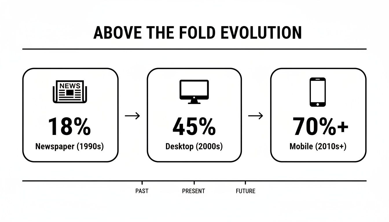
As you can see, while the screens have changed, the fundamental need to grab attention in that first view has only grown stronger.
Optimizing Your Most Valuable Real Estate
Making the most of this prime digital space is a science. Every element needs to work together to guide the user toward your primary goal. This isn't just about looking good; strategic optimization is a direct path to better revenue and user retention.
Here are the key components to get right:
A Magnetic Headline: It must instantly tell users what you do and why it matters to them.
A Supportive Subheading: Quickly expand on the headline, adding a bit more detail about the benefits.
Compelling Visuals: A high-quality image or a short video can convey emotion and context much faster than words ever could.
A Prominent Call-to-Action: Your main CTA button should be impossible to miss. Use clear, action-focused text and a color that pops.
Social Proof: A snippet from a testimonial, a few client logos, or a star rating can build trust and credibility in an instant.
Arranging these elements thoughtfully creates a powerful first impression that keeps people on your site and encourages them to convert. To really master this, it pays to dive into conversion rate optimization best practices. Getting this right isn't just a design choice—it's a business decision that directly impacts your bottom line.
Debunking Common Myths About the Fold
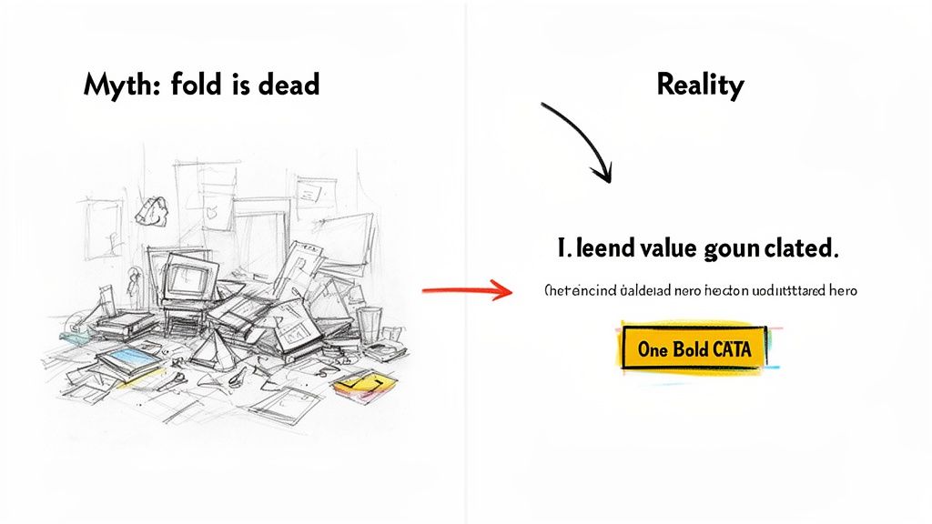
As web design has changed over the years, a few stubborn myths about the fold have stuck around. The biggest one you'll hear is that "the fold is dead" because everyone knows how to scroll now.
And yes, it’s true—scrolling is second nature. But that argument completely misses the point. The question was never if people scroll; it’s why they scroll. What they see above the fold is what convinces them to bother. Think of it as your website's movie trailer. If the trailer is a dud, no one's buying a ticket for the feature film.
Myth 1: The Fold Is Dead
This is easily the most common misconception. People do scroll, especially on mobile, where a thumb-flick is almost instinct. But their willingness to keep going depends entirely on that first impression.
That initial screen sets the stage. It has to instantly build trust and answer a visitor’s first, most important question: "Is this what I'm looking for?" If that first view fails to deliver a clear value proposition, there’s absolutely no reason for them to explore further. They’ll just leave.
The data backs this up. This prime digital real estate still commands 57% of a user's viewing time. That number directly impacts how people engage with your site and, in turn, how search engines see its value. You can dig into more stats on why the fold still dictates website success. This isn't about cramming everything at the top; it's about making that first glance matter.
Myth 2: You Must Put Everything Important Above the Fold
This is the kind of thinking that leads to the worst design mistake of all: clutter. Terrified that users won't see anything below the fold, some designers try to jam every feature, button, and snippet of info into that initial view.
The result? A visual train wreck. It's chaotic, overwhelming, and leaves the user completely paralyzed with too many choices. Instead of a clear path forward, you give them a confusing mess.
A successful above-the-fold design isn't about showing everything; it's about showing the most important thing. The goal is to present a single, clear objective that kicks off the user's journey.
Your mission is to create a focused, minimalist design that gets the visitor to take that first crucial step.
Best Practices for the Modern Fold
Instead of getting bogged down in old myths, let’s focus on what actually works today. The modern approach is all about clarity, not cramming.
Craft a Magnetic Headline: Your main H1 headline needs to nail your unique value proposition in just a few words. Make it clear, concise, and all about the user.
Use an Impactful Hero Image or Video: A picture really is worth a thousand words. A great visual supports your headline, sets the emotional tone, and communicates value way faster than text alone.
Place a Single, Primary CTA: Don't give them five things to do. Decide on the number one action you want a visitor to take and make that call-to-action button impossible to miss.
Embrace White Space: Negative space is your best friend. It gives your design room to breathe, makes text easier to read, and naturally draws the eye to your most important elements, like that CTA.
When you follow these principles, your above-the-fold content becomes a powerful launchpad for the rest of the page. It doesn't have to tell the whole story—just the first and most compelling chapter. Alpha's AI can analyze high-performing layouts to help you arrange these elements for maximum impact, ensuring your first impression is a great one.
Real-World Examples of Great Above-the-Fold Design
Theory is one thing, but seeing it in action is where the real learning happens. Let's break down how some of the most successful companies in the world absolutely nail their above-the-fold design. By dissecting their choices, we can pull back the curtain and find a blueprint for creating a powerful first impression that gets results.
These brands get it. They understand that the answer to "what is above the fold" isn't just a technical definition—it's a strategic opportunity. They use this prime real estate to tell a story, guide users, and hit specific business goals, all within seconds.
The wireframe sketches below show a few ways you can arrange key elements to build a clear, effective user journey right from the jump.
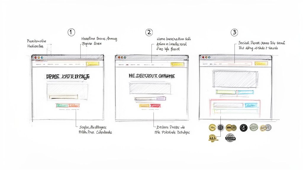
As you can see, the strategic placement of headlines, visuals, and calls-to-action can direct a visitor's attention exactly where you want it to go.
Slack: A Masterclass in Clarity and Simplicity
Slack’s homepage is a perfect example of a company that knows exactly what it wants you to understand and do. No wasted pixels, no confusion. When you look at their strategy, you're seeing some of the best homepage design best practices in action, all geared toward making that first-glance experience count.
Let’s dig into the elements that make Slack’s approach so effective:
The Headline: It’s short, benefit-driven, and speaks directly to a universal pain point—making teamwork more productive. It’s not about what the product is; it’s about what the product does for you.
The Sub-headline: This quickly follows up with a bit more detail, explaining how Slack delivers on the promise from the headline. It gives you just enough context to be intrigued, without bogging you down with jargon.
The Visual: Instead of a generic stock photo, Slack shows its product in action with a clean, dynamic animation. This instantly demonstrates the software’s collaborative feel and proves the headline’s claim visually.
The Call-to-Action (CTA): The primary CTAs are impossible to miss. They pop with a contrasting color and use simple, direct language like "Try for Free." But notice there’s also a secondary, less prominent CTA ("Talk to Sales"). This provides a path for different types of users without creating clutter.
Slack’s design is a powerful lesson in focus. Every element works together to answer three core questions for the visitor: "What is this?", "How does it help me?", and "What should I do next?"
Dropbox: Focusing on a Single Core Benefit
Dropbox is another pro at above-the-fold design, but their approach hinges on a single, powerful idea: simplifying your work life. It’s a slightly different take from Slack’s but follows the same core principles of clarity and user-focused messaging.
The whole design just breathes trust and ease of use.
Benefit-Oriented Headline: Dropbox avoids leading with technical terms like "cloud storage." Instead, they use phrases that resonate with their target audience, focusing on organization, collaboration, and keeping work flowing.
Minimalist Visuals: The hero image is often clean and aspirational, maybe showing people working together effortlessly. This reinforces the core benefit—making work feel less chaotic.
Clear and Obvious CTAs: Just like Slack, Dropbox uses a prominent, high-contrast button for its main CTA. The language is simple and low-commitment, making it easy for users to get started.
Subtle Social Proof: You’ll often spot a small line like "Trusted by over X million users" or logos of well-known companies. This small detail builds instant credibility without cluttering the main message. It's a quiet nod that tells new visitors they're in good company.
By keeping the focus tight and the design uncluttered, both Slack and Dropbox create an above-the-fold experience that feels welcoming and intuitive. They prove you don't need to shout every feature from the rooftops. You just need to solve one big problem for your user and make the solution look easy. That’s a strategy anyone can adapt to turn that crucial first glance into a meaningful step forward.
How to Measure and Optimize Your Above-the-Fold Content
Knowing your above-the-fold content is important is one thing. Actually doing something about it is the real challenge. Optimizing this prime real estate isn’t about guesswork; it's a cycle of measuring what your users do, testing new ideas, and making smart changes that lift engagement and conversions.
You have to see your page through your visitors' eyes. What are they clicking? Where does their attention drop off? Answering these questions is the only way to build a design that genuinely connects.
Visualizing User Behavior with Analytics Tools
The best way to figure out what's wrong is to actually see how people interact with your layout. Tools like Hotjar and Crazy Egg are fantastic for this, giving you a behind-the-scenes look at what grabs attention and what gets completely ignored. For a deeper dive, check out our guide on the best website heat mapping tools.
These platforms create visual reports that make complex user behavior simple to grasp:
Heatmaps: These color-coded maps show you exactly where people click, move their mouse, and pause. Bright "hot spots" point to your most popular elements, while "cold" blue areas show you what's being overlooked.
Scroll Maps: This is your secret weapon. A scroll map shows you how far down the page people actually go. A sudden color change from hot red to cool blue can pinpoint the exact spot where most of your audience gives up—that’s your effective fold line.
Looking at these maps, you might discover your main call-to-action is getting ignored or that a crucial selling point is sitting just an inch below where most people stop scrolling.
The goal is to stop guessing where the fold is. These tools give you the hard data, showing you the average fold line for your audience on their devices.
A Continuous Cycle of Testing and Improvement
Once you’ve spotted a few weak points, it’s time to test some fixes. This is where A/B testing comes into play. You create two versions of a page—an "A" version (the original) and a "B" version (the challenger)—and show them to different groups of visitors. The data will tell you which one works better.
The key is to not change everything at once. Test one element at a time for clean, undeniable results.
Test Your Headline: Does a headline that focuses on benefits outperform one that just lists features?
Experiment with Visuals: Pit a video hero section against a powerful static image to see which one holds attention longer.
Optimize Your CTA: Try changing the button text (like "Get Started" vs. "Sign Up Free"), its color, or its size.
While you're testing, keep a close eye on your key metrics in Google Analytics. You’ll want to watch the bounce rate and average engagement time on your important landing pages. If your "B" version has a lower bounce rate and a higher engagement time, you’ve got a winner. This cycle of measuring, testing, and refining is how you turn your website's most valuable real estate into a conversion machine.
Frequently Asked Questions
Got questions about "the fold"? You're not alone. Let's clear up some of the most common points so you can put these ideas into practice with confidence.
Does "Above The Fold" Mean The Same Thing On Every Device?
Not at all. The fold is a moving target, completely dependent on the user's screen. Think about the massive difference between a wide desktop monitor and a smartphone held upright. The desktop shows a huge amount of content, while the phone displays just a sliver.
This is exactly why so many designers swear by a mobile-first approach. When you start with the smallest screen, you're forced to be ruthless with your priorities. It ensures the most important parts of your message get seen, no matter what.
Should My Main Call-To-Action Always Be Above The Fold?
For most websites, placing your main CTA above the fold is a smart move. You want buttons like "Get Started Free" or "Shop Our Collection" to be immediately visible. It just makes sense—the more people who see it, the more people will click it.
But there are exceptions. If you're selling a complex service or a high-priced item, visitors need some convincing first. In those cases, the CTA might actually work better after you've laid out the persuasive details. A good rule of thumb is to always have your core value proposition and a clear path forward visible upfront, even if the final "buy" button is a little further down.
How Does Above-The-Fold Content Affect My SEO?
While not a direct ranking factor, your above-the-fold content has a huge indirect effect on your SEO. Google pays very close attention to user experience to figure out if a page is any good.
A great above-the-fold experience gives visitors exactly what they came for, right away. This makes them stick around longer (increasing dwell time) and less likely to hit the back button (reducing your bounce rate). Google sees these as strong signals that your page is high-quality, which can definitely help your rankings over time.
Plus, putting your H1 heading and primary keywords above the fold makes it dead simple for search engine crawlers to understand what your page is all about from the get-go.
Ready to create a website with a powerful first impression? Alpha uses AI to generate stunning, mobile-first layouts that are optimized to capture attention and drive conversions from the very first glance. Turn your idea into a high-performing website in minutes.
Build beautiful websites like these in minutes
Use Alpha to create, publish, and manage a fully functional website with ease.